Archive
Columbia Data Science course, week 5: GetGlue, time series, financial modeling, advanced regression, and ethics
I was happy to be giving Rachel Schutt’s Columbia Data Science course this week, where I discussed time series, financial modeling, and ethics. I blogged previous classes here.
The first few minutes of class were for a case study with GetGlue, a New York-based start-up that won the mashable breakthrough start-up of the year in 2011 and is backed by some of the VCs that also fund big names like Tumblr, etsy, foursquare, etc. GetGlue is part of the social TV space. Lead Scientist, Kyle Teague, came to tell the class a little bit about GetGlue, and some of what he worked on there. He also came to announce that GetGlue was giving the class access to a fairly large data set of user check-ins to tv shows and movies. Kyle’s background is in electrical engineering, he placed in the 2011 KDD cup (which we learned about last week from Brian), and he started programming when he was a kid.
GetGlue’s goal is to address the problem of content discovery within the movie and tv space, primarily. The usual model for finding out what’s on TV is the 1950’s TV Guide schedule, and that’s still how we’re supposed to find things to watch. There are thousands of channels and it’s getting increasingly difficult to find out what’s good on. GetGlue wants to change this model, by giving people personalized TV recommendations and personalized guides. There are other ways GetGlue uses Data Science but for the most part we focused on how this the recommendation system works. Users “check-in” to tv shows, which means they can tell people they’re watching a show. This creates a time-stamped data point. They can also do other actions such as like, or comment on the show. So this is a -tuple: {user, action, object} where the object is a tv show or movie. This induces a bi-partite graph. A bi-partite graph or network contains two types of nodes: users and tv shows. An edges exist between users and an tv shows, but not between users and users or tv shows and tv shows. So Bob and Mad Men are connected because Bob likes Mad Men, and Sarah and Mad Men and Lost are connected because Sarah liked Mad Men and Lost. But Bob and Sarah aren’t connected, nor are Mad Men and Lost. A lot can be learned from this graph alone.
But GetGlue finds ways to create edges between users and between objects (tv shows, or movies.) Users can follow each other or be friends on GetGlue, and also GetGlue can learn that two people are similar[do they do this?]. GetGlue also hires human evaluators to make connections or directional edges between objects. So True Blood and Buffy the Vampire Slayer might be similar for some reason and so the humans create an edge in the graph between them. There were nuances around the edge being directional. They may draw an arrow pointing from Buffy to True Blood but not vice versa, for example, so their notion of “similar” or “close” captures both content and popularity. (That’s a made-up example.) Pandora does something like this too.
Another important aspect is time. The user checked-in or liked a show at a specific time, so the -tuple extends to have a time-stamp: {user,action,object,timestamp}. This is essentially the data set the class has access to, although it’s slightly more complicated and messy than that. Their first assignment with this data will be to explore it, try to characterize it and understand it, gain intuition around it and visualize what they find.
Students in the class asked him questions around topics of the value of formal education in becoming a data scientist (do you need one? Kyle’s time spent doing signal processing in research labs was valuable, but so was his time spent coding for fun as a kid), what would be messy about a data set, why would the data set be messy (often bugs in the code), how would they know? (their QA and values that don’t make sense), what language does he use to prototype algorithms (python), how does he know his algorithm is good.
Then it was my turn. I started out with my data scientist profile:

As you can see, I feel like I have the most weakness in CS. Although I can use python pretty proficiently, and in particular I can scrape and parce data, prototype models, and use matplotlib to draw pretty pictures, I am no java map-reducer and I bow down to those people who are. I am also completely untrained in data visualization but I know enough to get by and give presentations that people understand.
Thought Experiment
I asked the students the following question:
What do you lose when you think of your training set as a big pile of data and ignore the timestamps?
They had some pretty insightful comments. One thing they mentioned off the bat is that you won’t know cause and effect if you don’t have any sense of time. Of course that’s true but it’s not quite what I meant, so I amended the question to allow you to collect relative time differentials, so “time since user last logged in” or “time since last click” or “time since last insulin injection”, but not absolute timestamps.
What I was getting at, and what they came up with, was that when you ignore the passage of time through your data, you ignore trends altogether, as well as seasonality. So for the insulin example, you might note that 15 minutes after your insulin injection your blood sugar goes down consistently, but you might not notice an overall trend of your rising blood sugar over the past few months if your dataset for the past few months has no absolute timestamp on it.
This idea, of keeping track of trends and seasonalities, is very important in financial data, and essential to keep track of if you want to make money, considering how small the signals are.
How to avoid overfitting when you model with time series
After discussing seasonality and trends in the various financial markets, we started talking about how to avoid overfitting your model.
Specifically, I started out with having a strict concept of in-sample (IS) and out-of-sample (OOS) data. Note the OOS data is not meant as testing data- that all happens inside OOS data. It’s meant to be the data you use after finalizing your model so that you have some idea how the model will perform in production.
Next, I discussed the concept of causal modeling. Namely, we should never use information in the future to predict something now. Similarly, when we have a set of training data, we don’t know the “best fit coefficients” for that training data until after the last timestamp on all the data. As we move forward in time from the first timestamp to the last, we expect to get different sets of coefficients as more events happen.
One consequence of this is that, instead of getting on set of coefficients, we actually get an evolution of each coefficient. This is helpful because it gives us a sense of how stable those coefficients are. In particular, if one coefficient has changed sign 10 times over the training set, then we expect a good estimate for it is zero, not the so-called “best fit” at the end of the data.
One last word on causal modeling and IS/OOS. It is consistent with production code. Namely, you are always acting, in the training and in the OOS simulation, as if you’re running your model in production and you’re seeing how it performs. Of course you fit your model in sample, so you expect it to perform better there than in production.
Another way to say this is that, once you have a model in production, you will have to make decisions about the future based only on what you know now (so it’s causal) and you will want to update your model whenever you gather new data. So your coefficients of your model are living organisms that continuously evolve.
Submodels of Models
We often “prepare” the data before putting it into a model. Typically the way we prepare it has to do with the mean or the variance of the data, or sometimes the log (and then the mean or the variance of that transformed data).
But to be consistent with the causal nature of our modeling, we need to make sure our running estimates of mean and variance are also causal. Once we have causal estimates of our mean 

Of course we may have other things to keep track of as well to prepare our data, and we might run other submodels of our model. For example we may choose to consider only the “new” part of something, which is equivalent to trying to predict something like 


There are lots of choices here, but the point is it’s all causal, so you have to be careful when you train your overall model how to introduce your next data point and make sure the steps are all in order of time, and that you’re never ever cheating and looking ahead in time at data that hasn’t happened yet.
Financial time series
In finance we consider returns, say daily. And it’s not percent returns, actually it’s log returns: if 


So if you start with S&P closing levels:

Then you get the following log returns:


What’s that mess? It’s crazy volatility caused by the financial crisis. We sometimes (not always) want to account for that volatility by normalizing with respect to it (described above). Once we do that we get something like this:

Which is clearly better behaved. Note this process is discussed in this post.
We could also normalize with respect to the mean, but we typically assume the mean of daily returns is 0, so as to not bias our models on short term trends.
Financial Modeling
One thing we need to understand about financial modeling is that there’s a feedback loop. If you find a way to make money, it eventually goes away- sometimes people refer to this as the fact that the “market learns over time”.
One way to see this is that, in the end, your model comes down to knowing some price is going to go up in the future, so you buy it before it goes up, you wait, and then you sell it at a profit. But if you think about it, your buying it has actually changed the process, and decreased the signal you were anticipating. That’s how the market learns – it’s a combination of a bunch of algorithms anticipating things and making them go away.
The consequence of this learning over time is that the existing signals are very weak. We are happy with a 3% correlation for models that have a horizon of 1 day (a “horizon” for your model is how long you expect your prediction to be good). This means not much signal, and lots of noise! In particular, lots of the machine learning “metrics of success” for models, such as measurements of precision or accuracy, are not very relevant in this context.
So instead of measuring accuracy, we generally draw a picture to assess models, namely of the (cumulative) PnL of the model. This generalizes to any model as well- you plot the cumulative sum of the product of demeaned forecast and demeaned realized. In other words, you see if your model consistently does better than the “stupidest” model of assuming everything is average.
If you plot this and you drift up and to the right, you’re good. If it’s too jaggedy, that means your model is taking big bets and isn’t stable.
Why regression?
From above we know the signal is weak. If you imagine there’s some complicated underlying relationship between your information and the thing you’re trying to predict, get over knowing what that is – there’s too much noise to find it. Instead, think of the function as possibly complicated, but continuous, and imagine you’ve written it out as a Taylor Series. Then you can’t possibly expect to get your hands on anything but the linear terms.
Don’t think about using logistic regression, either, because you’d need to be ignoring size, which matters in finance- it matters if a stock went up 2% instead of 0.01%. But logistic regression forces you to have an on/off switch, which would be possible but would lose a lot of information. Considering the fact that we are always in a low-information environment, this is a bad idea.
Note that although I’m claiming you probably want to use linear regression in a noisy environment, the actual terms themselves don’t have to be linear in the information you have. You can always take products of various terms as x’s in your regression. but you’re still fitting a linear model in non-linear terms.
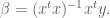
Advanced regression
The first thing I need to explain is the exponential downweighting of old data, which I already used in a graph above, where I normalized returns by volatility with a decay of 0.97. How do I do this?
Working from this post again, the formula is given by essentially a weighted version of the normal one, where I weight recent data more than older data, and where the weight of older data is a power of some parameter 

We are actually dividing by the sum of the weights, but the weights are powers of some number s, so it’s a geometric sum and the sum is given by

One cool consequence of this formula is that it’s easy to update: if we have a new return 

In fact this is the general rule for updating exponential downweighted estimates, and it’s one reason we like them so much- you only need to keep in memory your last estimate and the number

How do you choose your decay length? This is an art instead of a science, and depends on the domain you’re in. Think about how many days (or time periods) it takes to weight a data point at half of a new data point, and compare that to how fast the market forgets stuff.
This downweighting of old data is an example of inserting a prior into your model, where here the prior is “new data is more important than old data”. What are other kinds of priors you can have?
Priors
Priors can be thought of as opinions like the above. Besides “new data is more important than old data,” we may decide our prior is “coefficients vary smoothly.” This is relevant when we decide, say, to use a bunch of old values of some time series to help predict the next one, giving us a model like:

which is just the example where we take the last two values of the time series $F$ to predict the next one. But we could use more than two values, of course.
[Aside: in order to decide how many values to use, you might want to draw an autocorrelation plot for your data.]
The way you’d place the prior about the relationship between coefficients (in this case consecutive lagged data points) is by adding a matrix to your covariance matrix when you perform linear regression. See more about this here.
Ethics
I then talked about modeling and ethics. My goal is to get this next-gen group of data scientists sensitized to the fact that they are not just nerds sitting in the corner but have increasingly important ethical questions to consider while they work.
People tend to overfit their models. It’s human nature to want your baby to be awesome. They also underestimate the bad news and blame other people for bad news, because nothing their baby has done or is capable of is bad, unless someone else made them do it. Keep these things in mind.
I then described what I call the deathspiral of modeling, a term I coined in this post on creepy model watching.
I counseled the students to
- try to maintain skepticism about their models and how their models might get used,
- shoot holes in their own ideas,
- accept challenges and devise tests as scientists rather than defending their models using words – if someone thinks they can do better, than let them try, and agree on an evaluation method beforehand,
- In general, try to consider the consequences of their models.
I then showed them Emanuel Derman’s Hippocratic Oath of Modeling, which was made for financial modeling but fits perfectly into this framework. I discussed the politics of working in industry, namely that even if they are skeptical of their model there’s always the chance that it will be used the wrong way in spite of the modeler’s warnings. So the Hippocratic Oath is, unfortunately, insufficient in reality (but it’s a good start!).
Finally, there are ways to do good: I mentioned stuff like DataKind. There are also ways to be transparent: I mentioned Open Models, which is so far just an idea, but Victoria Stodden is working on RunMyCode, which is similar and very awesome.
Columbia Data Science course, week 4: K-means, Classifiers, Logistic Regression, Evaluation
This week our guest lecturer for the Columbia Data Science class was Brian Dalessandro. Brian works at Media6Degrees as a VP of Data Science, and he’s super active in the research community. He’s also served as co-chair of the KDD competition.
Before Brian started, Rachel threw us a couple of delicious data science tidbits.
The Process of Data Science
First we have the Real World. Inside the Real World we have:
- Users using Google+
- People competing in the Olympics
- Spammers sending email
From this we draw raw data, e.g. logs, all the olympics records, or Enron employee emails. We want to process this to make it clean for analysis. We use pipelines of data munging, joining, scraping, wrangling or whatever you want to call it and we use tools such as:
- python
- shell scripts
- R
- SQL
We eventually get the data down to a nice format, say something with columns:
name event year gender event time
Note: this is where you typically start in a standard statistics class. But it’s not where we typically start in the real world.
Once you have this clean data set, you should be doing some kind of exploratory data analysis (EDA); if you don’t really know what I’m talking about then look at Rachel’s recent blog post on the subject. You may realize that it isn’t actually clean.
Next, you decide to apply some algorithm you learned somewhere:
- k-nearest neighbor
- regression
- Naive Bayes
- (something else),
depending on the type of problem you’re trying to solve:
- classification
- prediction
- description
You then:
- interpret
- visualize
- report
- communicate
At the end you have a “data product”, e.g. a spam classifier.
K-means
So far we’ve only seen supervised learning. K-means is the first unsupervised learning technique we’ll look into. Say you have data at the user level:
- G+ data
- survey data
- medical data
- SAT scores
Assume each row of your data set corresponds to a person, say each row corresponds to information about the user as follows:
age gender income Geo=state household size
Your goal is to segment them, otherwise known as stratify, or group, or cluster. Why? For example:
- you might want to give different users different experiences. Marketing often does this.
- you might have a model that works better for specific groups
- hierarchical modeling in statistics does something like this.
One possibility is to choose the groups yourself. Bucket users using homemade thresholds. Like by age, 20-24, 25-30, etc. or by income. In fact, say you did this, by age, gender, state, income, marital status. You may have 10 age buckets, 2 gender buckets, and so on, which would result in 10x2x50x10x3 = 30,000 possible bins, which is big.
You can picture a five dimensional space with buckets along each axis, and each user would then live in one of those 30,000 five-dimensional cells. You wouldn’t want 30,000 marketing campaigns so you’d have to bin the bins somewhat.
Wait, what if you want to use an algorithm instead where you could decide on the number of bins? K-means is a “clustering algorithm”, and k is the number of groups. You pick k, a hyper parameter.
2-d version
Say you have users with #clicks, #impressions (or age and income – anything with just two numerical parameters). Then k-means looks for clusters on the 2-d plane. Here’s a stolen and simplistic picture that illustrates what this might look like:

The general algorithm is just the same picture but generalized to d dimensions, where d is the number of features for each data point.
Here’s the actual algorithm:
- randomly pick K centroids
- assign data to closest centroid.
- move the centroids to the average location of the users assigned to it
- repeat until the assignments don’t change
It’s up to you to interpret if there’s a natural way to describe these groups.
This is unsupervised learning and it has issues:
- choosing an optimal k is also a problem although
, where n is number of data points.
- convergence issues – the solution can fail to exist (the configurations can fall into a loop) or “wrong”
- but it’s also fast
- interpretability can be a problem – sometimes the answer isn’t useful
- in spite of this, there are broad applications in marketing, computer vision (partition an image), or as a starting point for other models.
One common tool we use a lot in our systems is logistic regression.
Thought Experiment
Brian now asked us the following:
How would data science differ if we had a “grand unified theory of everything”?
He gave us some thoughts:
- Would we even need data science?
- Theory offers us a symbolic explanation of how the world works.
- What’s the difference between physics and data science?
- Is it just accuracy? After all, Newton wasn’t completely precise, but was pretty close.
If you think of the sciences as a continuum, where physics is all the way on the right, and as you go left, you get more chaotic, then where is economics on this spectrum? Marketing? Finance? As we go left, we’re adding randomness (and as a clever student points out, salary as well).
Bottomline: if we could model this data science stuff like we know how to model physics, we’d know when people will click on what ad. The real world isn’t this understood, nor do we expect to be able to in the future.
Does “data science” deserve the word “science” in its name? Here’s why maybe the answer is yes.
We always have more than one model, and our models are always changing.
The art in data science is this: translating the problem into the language of data science
The science in data science is this: given raw data, constraints and a problem statement, you have an infinite set of models to choose from, with which you will use to maximize performance on some evaluation metric, that you will have to specify. Every design choice you make can be formulated as an hypothesis, upon which you will use rigorous testing and experimentation to either validate or refute.
Never underestimate the power of creativity: usually people have vision but no method. As the data scientist, you have to turn it into a model within the operational constraints. You need to optimize a metric that you get to define. Moreover, you do this with a scientific method, in the following sense.
Namely, you hold onto your existing best performer, and once you have a new idea to prototype, then you set up an experiment wherein the two best models compete. You therefore have a continuous scientific experiment, and in that sense you can justify it as a science.
Classifiers
Given
- data
- a problem, and
- constraints,
we need to determine:
- a classifier,
- an optimization method,
- a loss function,
- features, and
- an evaluation metric.
Today we will focus on the process of choosing a classifier.
Classification involves mapping your data points into a finite set of labels or the probability of a given label or labels. Examples of when you’d want to use classification:
- will someone click on this ad?
- what number is this?
- what is this news article about?
- is this spam?
- is this pill good for headaches?
From now on we’ll talk about binary classification only (0 or 1).
Examples of classification algorithms:
- decision tree
- random forests
- naive bayes
- k-nearest neighbors
- logistic regression
- support vector machines
- neural networks
Which one should we use?
One possibility is to try them all, and choose the best performer. This is fine if you have no constraints or if you ignore constraints. But usually constraints are a big deal – you might have tons of data or not much time or both.
If I need to update 500 models a day, I do need to care about runtime. these end up being bidding decisions. Some algorithms are slow – k-nearest neighbors for example. Linear models, by contrast, are very fast.
One under-appreciated constraint of a data scientist is this: your own understanding of the algorithm.
Ask yourself carefully, do you understand it for real? Really? Admit it if you don’t. You don’t have to be a master of every algorithm to be a good data scientist. The truth is, getting the “best-fit” of an algorithm often requires intimate knowledge of said algorithm. Sometimes you need to tweak an algorithm to make it fit your data. A common mistake for people not completely familiar with an algorithm is to overfit.
Another common constraint: interpretability. You often need to be able to interpret your model, for the sake of the business for example. Decision trees are very easy to interpret. Random forests, on the other hand, not so much, even though it’s almost the same thing, but can take exponentially longer to explain in full. If you don’t have 15 years to spend understanding a result, you may be willing to give up some accuracy in order to have it easy to understand.
Note that credit cards have to be able to explain their models by law so decision trees make more sense than random forests.
How about scalability? In general, there are three things you have to keep in mind when considering scalability:
- learning time: how much time does it take to train the model?
- scoring time: how much time does it take to give a new user a score once the model is in production?
- model storage: how much memory does the production model use up?
Here’s a useful paper to look at when comparing models: “An Empirical Comparison of Supervised Learning Algorithms”, from which we learn:
- Simpler models are more interpretable but aren’t as good performers.
- The question of which algorithm works best is problem dependent
- It’s also constraint dependent
At M6D, we need to match clients (advertising companies) to individual users. We have logged the sites they have visited on the internet. Different sites collect this information for us. We don’t look at the contents of the page – we take the url and hash it into some random string and then we have, say, the following data about a user we call “u”:
u = <xyz, 123, sdqwe, 13ms>
This means u visited 4 sites and their urls hashed to the above strings. Recall last week we learned spam classifier where the features are words. We aren’t looking at the meaning of the words. So the might as well be strings.
At the end of the day we build a giant matrix whose columns correspond to sites and whose rows correspond to users, and there’s a “1” if that user went to that site.
To make this a classifier, we also need to associate the behavior “clicked on a shoe ad”. So, a label.
Once we’ve labeled as above, this looks just like spam classification. We can now rely on well-established methods developed for spam classification – reduction to a previously solved problem.
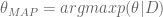
Logistic Regression
We have three core problems as data scientists at M6D:
- feature engineering,
- user level conversion prediction,
- bidding.
We will focus on the second. We use logistic regression– it’s highly scalable and works great for binary outcomes.
What if you wanted to do something else? You could simply find a threshold so that, above you get 1, below you get 0. Or you could use a linear model like linear regression, but then you’d need to cut off below 0 or above 1.
What’s better: fit a function that is bounded in side [0,1]. For example, the logit function

wanna estimate

To make this a linear model in the outcomes 

The parameter 
If you had no information except the base rate, the average prediction would be just that. In a logistical regression,

The slope 
Our immediate modeling goal is to use our training data to find the best choices for 
The likelihood function 


where we are assuming the data points 

We then search for the parameters that maximize this having observed our data:

The probability of a single observation is

where 
Similar to last week, we now take the log and get something convex, so it has to have a global maximum. Finally, we use numerical techniques to find it, which essentially follow the gradient like Newton’s method from calculus. Computer programs can do this pretty well. These algorithms depend on a step size, which we will need to adjust as we get closer to the global max or min – there’s an art to this piece of numerical optimization as well. Each step of the algorithm looks something like this:

where remember we are actually optimizing our parameters 


“Flavors” of Logistic Regression for convex optimization.
The Newton’s method we described above is also called Iterative Reweighted Least Squares. It uses the curvature of log-likelihood to choose appropriate step direction. The actual calculation involves the Hessian matrix, and in particular requires its inversion, which is a kxk matrix. This is bad when there’s lots of features, as in 10,000 or something. Typically we don’t have that many features but it’s not impossible.
Another possible method to maximize our likelihood or log likelihood is called Stochastic Gradient Descent. It approximates gradient using a single observation at a time. The algorithm updates the current best-fit parameters each time it sees a new data point. The good news is that there’s no big matrix inversion, and it works well with huge data and with sparse features; it’s a big deal in Mahout and Vowpal Wabbit. The bad news is it’s not such a great optimizer and it’s very dependent on step size.
Evaluation
We generally use different evaluation metrics for different kind of models.
First, for ranking models, where we just want to know a relative rank versus and absolute score, we’d look to one of:
Second, for classification models, we’d look at the following metrics:
- lift: how much more people are buying or clicking because of a model
- accuracy: how often the correct outcome is being predicted
- f-score
- precision
- recall
Finally, for density estimation, where we need to know an actual probability rather than a relative score, we’d look to:
In general it’s hard to compare lift curves but you can compare AUC (area under the receiver operator curve) – they are “base rate invariant.” In other words if you bring the click-through rate from 1% to 2%, that’s 100% lift but if you bring it from 4% to 7% that’s less lift but more effect. AUC does a better job in such a situation when you want to compare.
Density estimation tests tell you how well are you fitting for conditional probability. In advertising, this may arise if you have a situation where each ad impression costs $c and for each conversion you receive $q. You will want to target every conversion that has a positive expected value, i.e. whenever

But to do this you need to make sure the probability estimate on the left is accurate, which in this case means something like the mean squared error of the estimator is small. Note a model can give you good rankings but bad P estimates.
Similarly, features that rank highly on AUC don’t necessarily rank well with respect to mean absolute error. So feature selection, as well as your evaluation method, is completely context-driven.
Filter Bubble
[I’m planning on a couple of trips in the next few days and I might not be blogging regularly, depending on various things like wifi access. Not to worry!]
I just finished reading “Filter Bubble,” by Eli Pariser, which I enjoyed quite a bit. The premise that the multitude of personalization algorithms are limiting our online experience to the point that, although we don’t see it happening, we are becoming coddled, comfortable, insular, and rigid-minded. In other words, the opposite of what we all thought would happen when the internet began, and we had a virtual online international bazaar of different people, perspectives, and paradigms.
He focuses on the historical ethics (and lack thereof) of the paper press, and talks about how at the very least, as people skipped the complicated boring stories of Afghanistan to read the sports section, at least they knew the story they were skipping existed and was important; he compares this to now, where a “personalized everything online world” allows people to only ever read what they want to read (i.e. sports, or fashion, or tech gadget news) and never even know there’s a war going on out there.
Pariser does a good job explaining the culture of the modeling and technology set, and how they claim to have no moral purpose to their algorithms when it suits them. He goes deeply into the inconsistent data policy of Facebook and the search algorithm of Google, plumbing them for moral consequences if not intent.
Some of the Pariser’s conclusions are reasonable and some of them aren’t. He begs for more transparency, and uses Linux up as an example of that – so far so good. But when he claims that Google wouldn’t lose market share by open sourcing up their search algorithm, that’s just plain silly. He likes Twitter’s data policy, mostly because it’s easy to understand and well-explained, but he hates Facebook’s because it isn’t; but those two companies are accomplishing very different things, so it’s not a good comparison (although I agree with him re: Facebook).
In the end, cracking the private company data policies won’t happen by asking them to be more transparent, and Pariser realizes that: he proposes to appeal to individuals and to government policy to help protect individuals’ data. Of course the government won’t do anything until enough people demand it, and Pariser realizes the first step to get people to care about the issue is to educate them on what is actually going on, and how creepy it is. This book is a good start.
Columbia Data Science course, week 3: Naive Bayes, Laplace Smoothing, and scraping data off the web
In the third week of the Columbia Data Science course, our guest lecturer was Jake Hofman. Jake is at Microsoft Research after recently leaving Yahoo! Research. He got a Ph.D. in physics at Columbia and taught a fantastic course on modeling last semester at Columbia.
After introducing himself, Jake drew up his “data science profile;” turns out he is an expert on a category that he created called “data wrangling.” He confesses that he doesn’t know if he spends so much time on it because he’s good at it or because he’s bad at it.
Thought Experiment: Learning by Example
Jake had us look at a bunch of text. What is it? After some time we describe each row as the subject and first line of an email in Jake’s inbox. We notice the bottom half of the rows of text looks like spam.
Now Jake asks us, how did you figure this out? Can you write code to automate the spam filter that your brain is?
Some ideas the students came up with:
- Any email is spam if it contains Viagra references. Jake: this will work if they don’t modify the word.
- Maybe something about the length of the subject?
- Exclamation points may point to spam. Jake: can’t just do that since “Yahoo!” would count.
- Jake: keep in mind spammers are smart. As soon as you make a move, they game your model. It would be great if we could get them to solve important problems.
- Should we use a probabilistic model? Jake: yes, that’s where we’re going.
- Should we use k-nearest neighbors? Should we use regression? Recall we learned about these techniques last week. Jake: neither. We’ll use Naive Bayes, which is somehow between the two.
Why is linear regression not going to work?
Say you make a feature for each lower case word that you see in any email and then we used R’s “lm function:”
lm(spam ~ word1 + word2 + …)
Wait, that’s too many variables compared to observations! We have on the order of 10,000 emails with on the order of 100,000 words. This will definitely overfit. Technically, this corresponds to the fact that the matrix in the equation for linear regression is not invertible. Moreover, maybe can’t even store it because it’s so huge.
Maybe you could limit to top 10,000 words? Even so, that’s too many variables vs. observations to feel good about it.
Another thing to consider is that target is 0 or 1 (0 if not spam, 1 if spam), whereas you wouldn’t get a 0 or a 1 in actuality through using linear regression, you’d get a number. Of course you could choose a critical value so that above that we call it “1” and below we call it “0”. Next week we’ll do even better when we explore logistic regression, which is set up to model a binary response like this.
How about k-nearest neighbors?
To use k-nearest neighbors we would still need to choose features, probably corresponding to words, and you’d likely define the value of those features to be 0 or 1 depending on whether the word is present or not. This leads to a weird notion of “nearness”.
Again, with 10,000 emails and 100,000 words, we’ll encounter a problem: it’s not a singular matrix this time but rather that the space we’d be working in has too many dimensions. This means that, for example, it requires lots of computational work to even compute distances, but even that’s not the real problem.
The real problem is even more basic: even your nearest neighbors are really far away. this is called “the curse of dimensionality“. This problem makes for a poor algorithm.
Question: what if sharing a bunch of words doesn’t mean sentences are near each other in the sense of language? I can imagine two sentences with the same words but very different meanings.
Jake: it’s not as bad as it sounds like it might be – I’ll give you references at the end that partly explain why.
Aside: digit recognition
In this case k-nearest neighbors works well and moreover you can write it in a few lines of R.
Take your underlying representation apart pixel by pixel, say in a 16 x 16 grid of pixels, and measure how bright each pixel is. Unwrap the 16×16 grid and put it into a 256-dimensional space, which has a natural archimedean metric. Now apply the k-nearest neighbors algorithm.
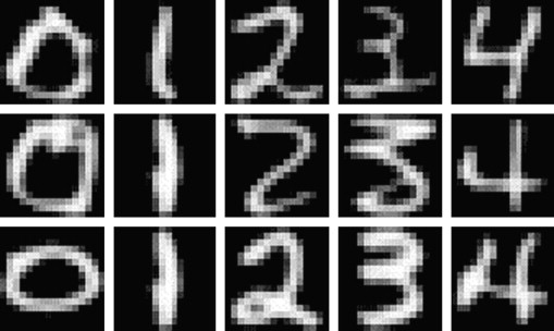
Some notes:
- If you vary the number of neighbors, it changes the shape of the boundary and you can tune k to prevent overfitting.
- You can get 97% accuracy with a sufficiently large data set.
- Result can be viewed in a “confusion matrix“.
Naive Bayes
Question: You’re testing for a rare disease, with 1% of the population is infected. You have a highly sensitive and specific test:
- 99% of sick patients test positive
- 99% of healthy patients test negative
Given that a patient tests positive, what is the probability that the patient is actually sick?
Answer: Imagine you have 100×100 = 10,000 people. 100 are sick, 9,900 are healthy. 99 sick people test sick, and 99 healthy people do too. So if you test positive, you’re equally likely to be healthy or sick. So the answer is 50%.
Let’s do it again using fancy notation so we’ll feel smart:
Recall

and solve for

The denominator can be thought of as a “normalization constant;” we will often be able to avoid explicitly calculuating this. When we apply the above to our situation, we get:

This is called “Bayes’ Rule“. How do we use Bayes’ Rule to create a good spam filter? Think about it this way: if the word “Viagra” appears, this adds to the probability that the email is spam.
To see how this will work we will first focus on just one word at a time, which we generically call “word”. Then we have:

The right-hand side of the above is computable using enough pre-labeled data. If we refer to non-spam as “ham”, we only need 

Example: go online and download Enron emails. Awesome. We are building a spam filter on that – really this means we’re building a new spam filter on top of the spam filter that existed for the employees of Enron.
Jake has a quick and dirty shell script in bash which runs this. It downloads and unzips file, creates a folder. Each text file is an email. They put spam and ham in separate folders.
Jake uses “wc” to count the number of messages for one former Enron employee, for example. He sees 1500 spam, and 3672 ham. Using grep, he counts the number of instances of “meeting”:
grep -il meeting enron1/spam/*.txt | wc -l
This gives 153. This is one of the handful of computations we need to compute

Note we don’t need a fancy programming environment to get this done.
Next, we try:
- “money”: 80% chance of being spam.
- “viagra”: 100% chance.
- “enron”: 0% chance.
This illustrates overfitting; we are getting overconfident because of our biased data. It’s possible, in other words, to write an non-spam email with the word “viagra” as well as a spam email with the word “enron.”
Next, do it for all the words. Each document can be represented by a binary vector, whose jth entry is 1 or 0 depending whether jth word appears. Note this is a huge-ass vector, we will probably actually represent it with the indices of the words that actually do show up.
Here’s the model we use to estimate the probability that we’d see a given word vector given that we know it’s spam (or that it’s ham). We denote the document vector 


The theta here is the probability that an individual word is present in a spam email (we can assume separately and parallel-ly compute that for every word). Note we are modeling the words independently and we don’t count how many times they are present. That’s why this is called “Naive”.
Let’s take the log of both sides:

[It’s good to take the log because multiplying together tiny numbers can give us numerical problems.]
The term 


We can now use Bayes’ Rule to get an estimate of 
Wait, this ends up looking like a linear regression! But instead of computing them by inverting a huge matrix, the weights come from the Naive Bayes’ algorithm.
This algorithm works pretty well and it’s “cheap to train” if you have pre-labeled data set to train on. Given a ton of emails, just count the words in spam and non-spam emails. If you get more training data you can easily increment your counts. In practice there’s a global model, which you personalize to individuals. Moreover, there are lots of hard-coded, cheap rules before an email gets put into a fancy and slow model.
Here are some references:
- “Idiot’s Bayes – not so stupid after all?” – the whole paper is about why it doesn’t suck, which is related to redundancies in language.
- “Naive Bayes at Forty: The Independence Assumption in Information“
- “Spam Filtering with Naive Bayes – Which Naive Bayes?“
Laplace Smoothing
Laplace Smoothing refers to the idea of replacing our straight-up estimate of the probability 

We might fix 

If we denote by 
In other words, we are asking the question, for what value of 

If you take the derivative, and set it to zero, we get

In other words, just what we had before. Now let’s add a prior. Denote by 
This similarly asks the question, given the data I saw, which parameter is the most likely?
Use Bayes’ rule to get 


Sometimes
Note: In the last 5 years people have started using stochastic gradient methods to avoid the non-invertible (overfitting) matrix problem. Switching to logistic regression with stochastic gradient method helped a lot, and can account for correlations between words. Even so, Naive Bayes’ is pretty impressively good considering how simple it is.
Scraping the web: API’s
For the sake of this discussion, an API (application programming interface) is something websites provide to developers so they can download data from the website easily and in standard format. Usually the developer has to register and receive a “key”, which is something like a password. For example, the New York Times has an API here. Note that some websites limit what data you have access to through their API’s or how often you can ask for data without paying for it.
When you go this route, you often get back weird formats, sometimes in JSON, but there’s no standardization to this standardization, i.e. different websites give you different “standard” formats.
One way to get beyond this is to use Yahoo’s YQL language which allows you to go to the Yahoo! Developer Network and write SQL-like queries that interact with many of the common API’s on the common sites like this:
select * from flickr.photos.search where text=”Cat” and api_key=”lksdjflskjdfsldkfj” limit 10
The output is standard and I only have to parse this in python once.
What if you want data when there’s no API available?
Note: always check the terms and services of the website before scraping.
In this case you might want to use something like the Firebug extension for Firefox, you can “inspect the element” on any webpage, and Firebug allows you to grab the field inside the html. In fact it gives you access to the full html document so you can interact and edit. In this way you can see the html as a map of the page and Firebug is a kind of tourguide.
After locating the stuff you want inside the html, you can use curl, wget, grep, awk, perl, etc., to write a quick and dirty shell script to grab what you want, especially for a one-off grab. If you want to be more systematic you can also do this using python or R.
Other parsing tools you might want to look into:
- lynx and lynx –dump: good if you pine for the 1970’s. Oh wait, 1992. Whatever.
- Beautiful Soup: robust but kind of slow
- Mechanize (or here) super cool as well but doesn’t parse javascript.
Postscript: Image Classification
How do you determine if an image is a landscape or a headshot?
You either need to get someone to label these things, which is a lot of work, or you can grab lots of pictures from flickr and ask for photos that have already been tagged.
Represent each image with a binned RGB – (red green blue) intensity histogram. In other words, for each pixel, for each of red, green, and blue, which are the basic colors in pixels, you measure the intensity, which is a number between 0 and 255.
Then draw three histograms, one for each basic color, showing us how many pixels had which intensity. It’s better to do a binned histogram, so have counts of # pixels of intensity 0 – 51, etc. – in the end, for each picture, you have 15 numbers, corresponding to 3 colors and 5 bins per color. We are assuming every picture has the same number of pixels here.
Finally, use k-nearest neighbors to decide how much “blue” makes a landscape versus a headshot. We can tune the hyperparameters, which in this case are # of bins as well as k.
Columbia data science course, week 2: RealDirect, linear regression, k-nearest neighbors
Data Science Blog
Today we started with discussing Rachel’s new blog, which is awesome and people should check it out for her words of data science wisdom. The topics she’s riffed on so far include: Why I proposed the course, EDA (exploratory data analysis), Analysis of the data science profiles from last week, and Defining data science as a research discipline.
She wants students and auditors to feel comfortable in contributing to blog discussion, that’s why they’re there. She particularly wants people to understand the importance of getting a feel for the data and the questions before ever worrying about how to present a shiny polished model to others. To illustrate this she threw up some heavy quotes:
“Long before worrying about how to convince others, you first have to understand what’s happening yourself” – Andrew Gelman
“Agreed” – Rachel Schutt
Thought experiment: how would you simulate chaos?
We split into groups and discussed this for a few minutes, then got back into a discussion. Here are some ideas from students:
- A Lorenzian water wheel would do the trick, if you know what that is.
- Question: is chaos the same as randomness?
- Many a physical system can exhibit inherent chaos: examples with finite-state machines
- Teaching technique of “Simulating chaos to teach order” gives us real world simulation of a disaster area
- In this class w want to see how students would handle a chaotic situation. Most data problems start out with a certain amount of dirty data, ill-defined questions, and urgency. Can we teach a method of creating order from chaos?
- See also “Creating order from chaos in a startup“.
Talking to Doug Perlson, CEO of RealDirect
We got into teams of 4 or 5 to assemble our questions for Doug, the CEO of RealDirect. The students have been assigned as homework the task of suggesting a data strategy for this new company, due next week.
He came in, gave us his background in real-estate law and startups and online advertising, and told us about his desire to use all the data he now knew about to improve the way people sell and buy houses.
First they built an interface for sellers, giving them useful data-driven tips on how to sell their house and using interaction data to give real-time recommendations on what to do next. Doug made the remark that normally, people sell their homes about once in 7 years and they’re not pros. The goal of RealDirect is not just to make individuals better but also pros better at their job.
He pointed out that brokers are “free agents” – they operate by themselves. they guard their data, and the really good ones have lots of experience, which is to say they have more data. But very few brokers actually have sufficient experience to do it well.
The idea is to apply a team of licensed real-estate agents to be data experts. They learn how to use information-collecting tools so we can gather data, in addition to publicly available information (for example, co-op sales data now available, which is new).
One problem with publicly available data is that it’s old news – there’s a 3 month lag. RealDirect is working on real-time feeds on stuff like:
- when people start search,
- what’s the initial offer,
- the time between offer and close, and
- how people search online.
Ultimately good information helps both the buyer and the seller.
RealDirect makes money in 2 ways. First, a subscription, $395 a month, to access our tools for sellers. Second, we allow you to use our agents at a reduced commission (2% of sale instead of the usual 2.5 or 3%). The data-driven nature of our business allows us to take less commission because we are more optimized, and therefore we get more volume.
Doug mentioned that there’s a law in New York that you can’t show all the current housing listings unless it’s behind a registration wall, which is why RealDirect requires registration. This is an obstacle for buyers but he thinks serious buyers are willing to do it. He also doesn’t consider places that don’t require registration, like Zillow, to be true competitors because they’re just showing listings and not providing real service. He points out that you also need to register to use Pinterest.
Doug mentioned that RealDirect is comprised of licensed brokers in various established realtor associations, but even so they have had their share of hate mail from realtors who don’t appreciate their approach to cutting commission costs. In this sense it is somewhat of a guild.
On the other hand, he thinks if a realtor refused to show houses because they are being sold on RealDirect, then the buyers would see the listings elsewhere and complain. So they traditional brokers have little choice but to deal with them. In other words, the listings themselves are sufficiently transparent so that the traditional brokers can’t get away with keeping their buyers away from these houses
RealDirect doesn’t take seasonality issues into consideration presently – they take the position that a seller is trying to sell today. Doug talked about various issues that a buyer would care about- nearby parks, subway, and schools, as well as the comparison of prices per square foot of apartments sold in the same building or block. These are the key kinds of data for buyers to be sure.
In terms of how the site works, it sounds like somewhat of a social network for buyers and sellers. There are statuses for each person on site. active – offer made – offer rejected – showing – in contract etc. Based on your status, different opportunities are suggested.
Suggestions for Doug?
Linear Regression
Example 1. You have points on the plane:
(x, y) = (1, 2), (2, 4), (3, 6), (4, 8).
The relationship is clearly y = 2x. You can do it in your head. Specifically, you’ve figured out:
- There’s a linear pattern.
- The coefficient 2
- So far it seems deterministic
Example 2. You again have points on the plane, but now assume x is the input, and y is output.
(x, y) = (1, 2.1), (2, 3.7), (3, 5.8), (4, 7.9)
Now you notice that more or less y ~ 2x but it’s not a perfect fit. There’s some variation, it’s no longer deterministic.
Example 3.
(x, y) = (2, 1), (6, 7), (2.3, 6), (7.4, 8), (8, 2), (1.2, 2).
Here your brain can’t figure it out, and there’s no obvious linear relationship. But what if it’s your job to find a relationship anyway?
First assume (for now) there actually is a relationship and that it’s linear. It’s the best you can do to start out. i.e. assume

and now find best choices for 


Before we find the general formula, we want to generalize with three variables now: 


Writing this with matrix notation we get:

How do we calculate 

where 
To minimize 
To use this, we go back to our linear form and plug in the values of
But wait, why did we assume a linear relationship? Sometimes maybe it’s a polynomial relationship.

You need to justify why you’re assuming what you want. Answering that kind of question is a key part of being a data scientist and why we need to learn these things carefully.
All this is like one line of R code where you’ve got a column of y’s and a column of x’s.:
model <- lm(y ~ x)
Or if you’re going with the polynomial form we’d have:
model <- lm(y ~ x + x^2 + x^3)
Why do we do regression? Mostly for two reasons:
- If we want to predict one variable from the next
- If we want to explain or understand the relationship between two things.
K-nearest neighbors
Say you have the age, income, and credit rating for a bunch of people and you want to use the age and income to guess at the credit rating. Moreover, say we’ve divided credit ratings into “high” and “low”.
We can plot people as points on the plane and label people with an “x” if they have low credit ratings.
What if a new guy comes in? What’s his likely credit rating label? Let’s use k-nearest neighbors. To do so, you need to answer two questions:
- How many neighbors are you gonna look at? k=3 for example.
- What is a neighbor? We need a concept of distance.
For the sake of our problem, we can use Euclidean distance on the plane if the relative scalings of the variables are approximately correct. Then the algorithm is simple to take the average rating of the people around me. where average means majority in this case – so if there are 2 high credit rating people and 1 low credit rating person, then I would be designated high.
Note we can also consider doing something somewhat more subtle, namely assigning high the value of “1” and low the value of “0” and taking the actual average, which in this case would be 0.667. This would indicate a kind of uncertainty. It depends on what you want from your algorithm. In machine learning algorithms, we don’t typically have the concept of confidence levels. care more about accuracy of prediction. But of course it’s up to us.
Generally speaking we have a training phase, during which we create a model and “train it,” and then we have a testing phase where we use new data to test how good the model is.
For k-nearest neighbors, the training phase is stupid: it’s just reading in your data. In testing, you pretend you don’t know the true label and see how good you are at guessing using the above algorithm. This means you save some clean data from the overall data for the testing phase. Usually you want to save randomly selected data, at least 10%.
In R: read in the package “class”, and use the function knn().
You perform the algorithm as follows:
knn(train, test, cl, k=3)
The output includes the k nearest (in Euclidean distance) training set vectors, and the classification labels as decided by majority vote
How do you evaluate if the model did a good job?
This isn’t easy or universal – you may decide you want to penalize certain kinds of misclassification more than others. For example, false positives may be way worse than false negatives.
To start out stupidly, you might want to simply minimize the misclassification rate:
(# incorrect labels) / (# total labels)
How do you choose k?
This is also hard. Part of homework next week will address this.
When do you use linear regression vs. k-nearest neighbor?
Thinking about what happens with outliers helps you realize how hard this question is. Sometimes it comes down to a question of what the decision-maker decides they want to believe.
Note definitions of “closeness” vary depending on the context: closeness in social networks could be defined as the number of overlapping friends.
Both linear regression and k-nearest neighbors are examples of “supervised learning”, where you’ve observed both x and y, and you want to know the function that brings x to y.
Pruning doesn’t do much
We spent most of Saturday at the DataKind NYC Parks Datadive transforming data into useful form and designing a model to measure the effect of pruning. In particular, does pruning a block now prevent fallen trees or limbs later?
So, for example, we had a census of trees and we had information on which blocks were pruned. The location of a tree was given as 
The bad events are also given with reference to a point 
So we decided on a block-specific model, and we needed to match a tree to a block and a fallen tree work order to a block. We used vectors and dot-products to do this, by finding the block (given by a line segment) which is closest to the tree or work order location.
Moreover, we only know which year a block is pruned, not the actual date. That led us to model by year alone.
Therefore, the data points going into the model depend on block and on year. We had about 13,000 blocks and about 3 years of data for the work orders. (We could possibly have found more years of work order data but from a different database with different formatting problems which we didn’t have time to sort through.)
We expect the impact of pruning to die down over time. Therefore the signal we chose to measure is the reciprocal of the number of years since the last pruning, or some power of it. The impact we are trying to measure is a weighted sum of work orders, weighted by average price over the different categories of work orders (certain events are more expensive to clean up than others, like if a tree falls into a building versus one limb falls into the street).
There’s one last element, namely the number of trees; we don’t want to penalize a block for having lots of work orders just because it has lots of trees (and irrespective of pruning). Therefore our “
Altogether our model is given as:

where
We ran the regression where we let 

In both cases we got very very small signal, with correlations less than 1% if I remember correctly.
To be clear, the signal itself depends on knowing the last year a block was pruned, and for about half our data we didn’t have a year at all for that- when this happened we assumed it had never been pruned, and we substituted the value of 50 for # of years since pruning. Since the impact of pruning is assumed to die off, this is about the same thing as saying it had never been pruned.
The analysis is all modulo the data being correct, and our having wrangled and understood the data correctly, and possibly stupid mistakes on top of that, of course.
Moreover we made a couple of assumptions that could be wrong, namely that the pruning had taken place randomly – maybe they chose to prune blocks that had lots of sad-looking broken down trees, which would explain why lots of fallen tree events happened afterwards in spite of pruning. We also assumed that the work orders occurred whenever a problem with a tree happened, but it’s possible that certain blocks contain people who are more aggressive about getting problems fixed on their block. It’s even possible that, having seen pruners on your block sensitizes you to your trees’ health as well as the fact that there even is a city agency who is in charge of trees, which causes you to be more likely to call in a fallen limb.
Ignoring all of this, which is a lot to ignore, it looks like pruning may be a waste of money.
Read more on our wiki here. The data is available so feel free to redo an analysis!
Another death spiral of modeling: e-scores
Yesterday my friend and fellow Occupier Suresh sent me this article from the New York Times.
It’s something I knew was already happening somewhere, but I didn’t know the perpetrators would be quite so proud of themselves as they are; on the other hand I’m also not surprised, because people making good money on mathematical models rarely take the time to consider the ramifications of those models. At least that’s been my experience.
So what have these guys created? It’s basically a modern internet version of a credit score, without all the burdensome regulation that comes with it. Namely, they collect all kinds of information about people on the web, anything they can get their hands on, which includes personal information like physical and web addresses, phone number, google searches, purchases, and clicks of each person, and from that they create a so-called “e-score” which evaluates how much you are worth to a given advertiser or credit card company or mortgage company or insurance company.
Some important issues I want to bring to your attention:
- Credit scores are regulated, and in particular the disallow the use of racial information, whereas these e-scores are completely unregulated and can use whatever information they can gather (which is a lot). Not that credit score models are open source: they aren’t, so we don’t know if they are using variables correlated to race (like zip code). But still, there is some effort to protect people from outrageous and unfair profiling. I never though I’d be thinking of credit scoring companies as the good guys, but it is what it is.
- These e-scores are only going for max pay-out, not default risk. So, for the sake of a credit card company, the ideal customer is someone who pays the minimum balance month after month, never finishing off the balance. That person would have a higher e-score than someone who pays off their balance every month, although presumably that person would have a lower credit score, since they are living more on the edge of insolvency.
- Not that I need to mention this, but this is the ultimate in predatory modeling: every person is scored based on their ability to make money for the advertiser/ insurance company in question, based on any kind of ferreted-out information available. It’s really time for everyone to have two accounts, one for normal use, including filling out applications for mortgages and credit cards and buying things, and the second for sensitive google searches on medical problems and such.
- Finally, and I’m happy to see that the New York Times article noticed this and called it out, this is the perfect setup for the death spiral of modeling that I’ve mentioned before: people considered low value will be funneled away from good deals, which will give them bad deals, which will put them into an even tighter pinch with money because they’re being nickeled and timed and paying high interest rates, which will make them even lower value.
- A model like this is hugely scalable and valuable for a given advertiser.
- Therefore, this model can seriously contribute to our problem of increasing inequality.
- How can we resist this? It’s time for some rules on who owns personal information.
Datadive weekend with DataKind September 7-9
I’ll be a data ambassador at an upcoming DataKind weekend, working with a team on New York City open government data.
DataKind, formerly known as Data Without Borders, is a very cool, not at all creepy organization that brings together data nerds with typically underfunded NGO’s in various ways, including datadive weekends, which are like hack-a-thons for data nerds.
I have blogged a few times about working with them, because I’ve done this before working with the NYCLU on stop-and-frisk data (check out my update here as well). By the way, stop-and-frisk events have gone down 34% in recent months. I feel pretty good about being even tangentially involved in that fact.
This time we’re working with mostly New York City parks data, so stuff like trees and storm safety and 311 calls.
The event starts on Friday, September 7th, with an introduction to the data and the questions and some drinks, then it’s pretty much all day Saturday, til midnight, and then there are presentations Sunday morning (September 9th). It’s always great to meet fellow nerds, exchange technical information and gossip, and build something cool together.
Registration is here, sign up quick!
I love whistleblowers
There’s something people don’t like about whistleblowers. I really don’t get it, but I know it’s true (I’m looking at you, Obama).
In particular, I hear all the time that you’re giving up on your career if you’re a whistleblower, that nobody would ever want to hire you again. But if I’m running a company, which I presumably want have run well, without corruption, and be successful, then I’m totally fine with whistleblowers! They will tell me truth and expose fraud. To say out loud that I don’t want to hire someone like that is basically admitting I’m okay with fraud, no?
I’m really missing something, and if you have an explanation I’d love to hear it.
In the meantime, though, I’ll say this: the web is great for anonymous whistleblowing (if anyone pays attention and follows up). Science Fraud is a great one that tells about scientific publishing fraud in the life sciences – see the “About” page of Science Fraud for more color. See also Retraction Watch for a broader look.
But then there’s another issue, which is that some people won’t seriously consider whistleblowers unless they identify themselves! What up? Facts are facts – if someone has given good evidence that can be checked independently, why should also submit themselves to being blacklisted for their efforts?
Here’s a good response to this crappy line of reasoning against anonymous whistleblowing by the Retraction Watch guys Ivan Oransky and Adam Marcus.
VAM shouldn’t be used for tenure
I recently read a New York Times “Room for Debate” discussion on the teacher Value-added model (VAM) and whether it’s fair.
I’ve blogged a few times about this model and I think it’s crap (see this prior post which is entitled “The Value Added Model Sucks” for example).
One thing I noticed about the room for debate is that the two most pro-VAM talking heads (this guy and this guy) both quoted the same paper, written by Dan Goldhaber and Michael Hansen, called “Assessing the Potential of Using Value-Added Estimates of Teacher Job Performance for Making Tenure Decisions,” which you can download here.
Looking at the paper, I don’t really think it’s a very good resource if you want to argue for tenure-decisions based on VAM, but I guess it’s one of those things, where they don’t expect you actually do the homework.
For example, they admit that year-to-year scores are only correlated between 20% and 50% for the same teacher (page 4). But then they go on to say that, if you average two or more years in a row, these correlations go up (page 4). I’m wondering if that’s just because they calculate the correlations that come from the same underlying data, in which case of course the correlations go up. They aren’t precise enough at that point to make me convinced they did this carefully.
But it doesn’t matter, because when teachers are up for tenure, they have one or two scores, that’s it. So the fact that 17 years of scores, on average, has actual information, even if true, is irrelevant. The point is that we are asking whether one or two scores, in a test that has 20-50% correlation year-to-year, is sufficiently accurate and precise to decide on someone’s job. And by the way, in my post the correlation of teachers’ scores for the same year in the same subject was 24%, so I’m guess we should lean more towards the bottom of this scale for accuracy.
This is ludicrous. Can you imagine being told you can’t keep your job because of a number that imprecise? I’m grasping for an analogy, but it’s something like getting tenure as a professor based on what an acquaintance you’ve never met head about your reputation while he was drunk at a party. Maddening. And I can’t imagine it’s attracting more good people to the trade. I’d walk the other way if I heard about this.
The reason the paper is quoted so much is that it looks at a longer-term test to see whether early-career VAM scores have predictive power for the students more than 11 years later. However, it’s for one data set in North Carolina, and the testing actually happened in 1995 (page 6), so before the testing culture really took over (an important factor), and they clearly exclude any teacher whose paperwork is unavailable or unclear, as well as small classes (page 7), which presumably means any special-ed kids. Moreover, they admit they don’t really know if the kids are actual students of the teacher who proctored the tests (page 6).
Altogether a different set-up than the idiosyncratic, real-world situation faced by actual teachers, whose tenure decision is actually being made based on one or two hugely noisy numbers.
I’m not a huge fan of tenure, and I want educators to be accountable to being good teachers just like everyone else who cares about this stuff, but this is pseudo-science.
I’m still obsessed with the idea that people would know how crappy this stuff is if we could get our hands on the VAM itself and set something up where people could test robustness directly, by putting in their information and seeing how their score would change based on how many kids they had in their class etc..
Is open data a good thing?
As much as I like the idea of data being open and free, it’s not an open and shut case. As it were.
I’m first going to argue against open data with three examples.
The first is a pretty commonly discussed concern of privacy. Simply put, there is no such thing as anonymized data, and people who say there is are either lying or being naive. The amount of information you’d need to remove to really anonymize data is not known to be different from the amount of data you have in the first place. So if you did a good job to anonymize a data set, you’d probably remove all interesting information anyway. Of course, you could think this is only important with respect to individual data.
But my next example comes from land data, specifically Tamil Nadu in Southern India. There’s an interesting Crooked Timber blogpost here (hat tip Suresh Naidu) explaining how “open data” has screwed a local population, the Dalits. Although you could (and I would) argue that the way the data is collected and disseminated, and the fact that the courts go along with this process, is itself politically motivated and disenfrachising, there are some important point made in this post:
Open data undermines the power of those who benefit from “the idiosyncracies and complexities of communities… Local residents [who] understand the complexity of their community due to prolonged exposure.” The Bhoomi land records program is an example of this: it explicitly devalues informal knowledge of particular places and histories, making it legally irrelevant; in the brave new world of open data such knowledge is trumped by the ability to make effective queries of the “open” land records.15 The valuing of technological facility over idiosyncratic and informal knowledge is baked right in to open data efforts.
The Crooked Timber blog post specifically called out Tim O’Reilly and his “Government as Platform” project as troublesome:
The faith in markets sometimes goes further among open data advocates. It’s not just that open data can create new markets, there is a substantial portion of the push for open data that is explicitly seeking to create new markets as an alternative to providing government services.
It’s interesting to see O’Reilly’s Mike Loukides’s reaction (hat tip Chris Wiggins), entitled the Dark Side of Data, here. From Loukides:
The issue is how data is used. If the wealthy can manipulate legislators to wipe out generations of records and folk knowledge as “inaccurate,” then there’s a problem. A group like DataKind could go in and figure out a way to codify that older generation of knowledge. Then at least, if that isn’t acceptable to the government, it would be clear that the problem lies in political manipulation, not in the data itself. And note that a government could wipe out generations of “inaccurate records” without any requirement that the new records be open. In years past the monied classes would have just taken what they wanted, with the government’s support. The availability of open data gives a plausible pretext, but it’s certainly not a prerequisite (nor should it be blamed) for manipulation by the 0.1%.
[Speaking of DataKind (formerly Data Without Borders), it’s also a problem, as I discovered as a data ambassador working with the NYCLU on Stop, Question and Frisk data, when the government claims to be open but withholds essential data such as crime reports.]
My final example comes from finance. On the one hand I want total transparency of the markets, because it sickens me to think about how nobody knows the actual price of bonds, or the correct interest rate, or the current default assumption of the market, how all of that stuff is being kept secret by Wall Street insiders so they can each skim off their little cut and the dumb money players get constantly screwed.
But on the other hand, if I imagine a world where everything really is transparent, then even in the best of all database situations, that’s just asstons of data which only the very very richest and most technologically savvy high finance types could ever munge through.
So who would benefit? I’d say, for some time, the average dumb money customer would benefit very slightly, by not paying extra fees, but that the edgy techno finance firms would benefit fantastically. Then, I imagine, new ways would be invented for the dumb money customers to lost that small amount of benefit altogether, probably by just inundating them with so much data they can’t absorb it.
In other words, open data is great for the people who have the tools to use it for their benefit, usually to exploit other people and opportunities. It’s not clearly great for people who don’t have those tools.
But before I conclude that data shouldn’t be open, let me strike an optimistic (for me) tone.
The tools for the rest of us are being built right now. I’m not saying that the non-exploiters will ever catch up with the Goldman Sachs and credit card companies, because probably not.
But there will be real tools (already are things like python and R, and they’re getting better every day), built out of the open software movement, that will help specific people analyze and understand specific things, and there are platforms like wordpress and twitter that will allow those things to be broadcast, which will have real impact when the truth gets out. An example is the Crooked Timber blog post above.
So yes, open data is not an unalloyed good. It needs to be a war waged by people with common sense and decency against those who would only use it for profit and exploitation. I can’t think of a better thing to do with my free time.
Free online classes: the next thing
I love the idea of learning stuff online, especially if it’s free.
So there’s this place called Code Academy. They teach you how to code, online, for free. They crowdsource both the content and the students. So far they focus on stuff to build websites, so javascript, html, and css.
I just found out about Udacity (hat tip Jacques Richer), which also seems pretty cool. They offer various classes online, also free unless you want an official certificate saying you finished the class. And they have 11 courses so far, including this one on basic statistics with Professor Thrun.
Then there’s Coursera, which is starting to have quite a few different options for free online classes. The thing I’d like to bitch about with this is that Andrew Ng’s Machine Learning class, which I took when it came out last year, is not being offered currently, which makes me confused. Why does it need scheduling if it’s already been made?
I also just discovered openculture, which lists lots of free online courses. When you search for “statistics,” it returns the Udacity course I already mentioned as well as a Berkeley stats course on YouTube, among others.
I know this stuff is the future, so I’m hoping there continues to be lots of competition from various small start-ups. We are bound to profit from such competition as a culture. What I’m worried about is that the model goes from “free” to “fee” if it gets crowded by large players who, say, pay their instructors a lot for the content.
Which is not to say the instructors shouldn’t get paid at all, but I hope the revenue can continue to come from advertising or through job matching.
Coding is like being in a band
I asked my friend Nikolai last week what I should learn if I want to be a really awesome data scientist (since I’m an alpha female I’m sure I phrased it more like, how can I be even more awesome than I already am?).
Being a engineer, Nik gave me the most obvious advice possible: become an engineer.
So this past weekend I’ve looked in to learning Scala, which is the language he and I agreed on as the most useful for large-scale machine learning, both because it’s designed to be scalable and because the guys at Twitter are open sourcing tons of new stuff all the time.
That begs the question, though, to what extent can I become an engineer by reading books about languages in my spare time? According to Nik, real coding is an experience you can’t do alone. It’s more like joining a band. So I need to read my books, and I need to practice on my computer, but I won’t really qualify as an engineer until I’ve coded within a group of engineers working on a product.
Similarly, a person can get really good at an instrument by themselves, they can learn to play the electric guitar, they can perfect the solos of Jimi Hendrix, but when it comes down to it they have to do it in conjunction with other people. This typically means adding lots of process they wouldn’t normally have to think about or care about, like making sure the key is agreed upon, as well as the tempo, as well as deciding who gets to solo when (i.e. sharing the show-offy parts). Not to mention the song list. Oh, and then there’s tuning up at the beginning, choosing a band name, and getting gigs.
It’s a similar thing for coders, and I’ve seen it working with development teams. When they bring in someone new, they have to merge their existing culture with the ideas and habits of the new person. This means explaining how unit tests and code reviews are done, how work gets divided and played, how people work together, and of course how success gets rewarded. Moreover, like musicians, coders tend to have reputations and egos corresponding to their skills and talents which, like a good band, a development team wants to nurture, without letting itself become a pure vehicle to it.
Which means that when you hire a superstar coder (and yes the word seems to be superstar- great coders can do the job of multiple mediocre coders), you tend to listen more carefully to their ideas on how to do things, and that includes how to change the system entirely and try something new, or switch languages etc. I imagine that bands who get to work with Eric Clapton would be the same way.
I’ve been in bands, usually playing banjo, as well as in chamber music groups back when I played piano, so this analogy works great for me. And it makes me more interested in the engineering thing rather than less: my experience was that, although my individual contribution was slightly less in a band setting, the product of the group was something I was always very proud of, and was impossible to accomplish alone.
Now I don’t want you to think I’ve done no coding at all. As a quant, I learned python, which I used extensively at D.E. Shaw and ever since, and some Matlab, as well as SQL and Pig more recently. But the stuff I’ve done is essentially prototyping models. That is, I work alone, playing with data through a script, until I’m happy with the overall model. Since I’m alone I don’t have to follow any process at all, and trust me you can tell by looking at my scripts. Actually I wrote some unit tests for the first time in python, and it was fun. Kind of like solving a Sudoku puzzle.
The part I don’t think works about the coding/ band analogy is that I don’t think coders have quite as good a time as bands. Where are the back-stage groupies? Where are the first two parts of sex, drugs, and rock ‘n’ roll? I think coding groups have their work cut out for them if they really want to play on that analogy.
Personal Democracy Hackathon today
This Morning I’m going to the CUNY Graduate School of Journalism to pitch the Credit Union Findr Webapp to a bunch of developers at today’s Personal Democracy Hackathon. Hopefully they’ll be interested enough to work on our geo-problem of credit union eligibility, namely taking in an address and finding the credit unions you become eligible for through your address. All open source of course.
Update: We’ve got two teams working, one on our webpage and our geo-locator project. Woohoo!
One language to rule them all
Right now there seems to be a choice one has to make in languages: either it’s a high level language that a data scientist knows or can learn quickly, or it’s fast and/or production ready.
So as the quant, I’ve gotten used to prototyping in matlab or python and then, if what I have been working on goes into production, it typically needs to be explained to a developer and rewritten in java or some such.
This is a pain in the ass for two reasons. First, it takes forever to explain it, and second if we later need to change it it’s very painful to work with a different developer than the one who did it originally, but people move around a lot.
Now that I’m working with huge amounts of data, it’s gotten even more complicated – there are three issues instead of two. Namely, there’s the map-reducing type part of the modeling, where you move around and aggregate data, which, if you’re a data scientist, means some kind of high-level language like pig.
Actually there are four issues – because the huge data is typically stored in the Amazon cloud or similar, there is also the technical issue of firing up nodes in a cluster and getting them to run the code and return the answers in a place where a data scientist can find it. This is kinda technical for your typical data scientist, at least one like me who specializes in model design, and has been solved only in specific situations i.e. for specific languages (Elastic-R and Mortar Data are two examples – please tell me if you know more).
Is there a big-data solution where all the modeling can be done in one open source language and then go into production as is?
People have been telling me Clojure/ Cascalog is the answer. But as far as I know there’s no super easy way to run this on the cloud. It would be great to see that happen.
An open source credit rating agency now exists!
I was very excited that Marc Joffe joined the Alternative Banking meeting on Sunday to discuss his new open source credit rating model for municipal and governmental defaults, called Public Sector Credit Framework, or PCSF. He’s gotten some great press, including this article entitled, “Are We Witnessing the Start of a Ratings Revolution?”.
Specifically, he has a model which, if you add the relevant data, can give ratings to city, state, or government bonds. I’ve been interested in this idea for a while now, although more at the level of publicly traded companies to start; see this post or this post for example.
His webpage is here, and you will note that his code is available on github, which is very cool, because it means it’s truly open source. From the webpage:
The framework allows an analyst to set up and run a budget simulation model in an Excel workbook. The analyst also specifies a default point in terms of a fiscal ratio. The framework calculates annual default probabilities as the the proportion of simulation trials that surpass the default point in a given year.
On May 2, we released the initial version of the software and two sample models – one for the US and one for the State of California – which are available on this page. For PSCF project to have an impact, we need developers to improve the software and analysts to build models. If you care about the implicatiions of growing public debt or you believe that transparent, open source technology can improve the standard of rating agency practice, please join us.
If you are a developer interested in helping him out, definitely reach out to him, his email is also available on the website.
He explained a few things on Sunday I want to share with you. They are all based on the kind of conflict of interest ratings agencies now have because they are paid by the people who they rate. I’ve discussed this conflict of interest many times, most recently in this post.
First, a story about California and state bonds. In the 2000’s, California was rated A, which is much lower than AAA, which is where lots of people want their bond ratings to be. So in order to achieve “AAA status,” California paid a bond insurer which was itself rated AAA. That is, through buying the insurance, the ratings status is transferred. In all, California paid $102 million for this benefit, which is a huge amount of money. What did this really buy though?
At some point their insurer, which was 139 times leveraged, was downgraded to below A level, and that meant that the California bonds were now essentially unbacked, so down to A level, and California had to pay higher interest payments because of this lower rating.
Considering the fact that no state has actually defaulted on their bonds in decades, but insurers have, Marc makes the following points. First, states are consistently under-rated and are paying too much for debt, either through these insurance schemes, where they pay questionable rates for questionable backing, or directly to the investors when their ratings are too low. Second, there is actually an incentive for ratings agencies to under-rate states, namely it gives them more business in rating the insurers etc. In other words they have an eco system of ratings rather than a state-by-state set of jobs.
How are taxpayers in California not aware of and incensed by the waste of $102 million? I would put this in the category of “too difficult to understand” for the average taxpayer, but that just makes me more annoyed. That money could have gone towards all sorts of public resources but instead went to insurance company executives.
Marc then went on to discuss his new model, which avoids this revenue model, and therefore conflict of interest, and takes advantage of the new format, XBRL, that is making it possible to automate ratings. It’s my personal belief that it will ultimately be the standardization of financial statements in XBRL format that will cause the revolution, more than anything we can do or say about something like the Volcker rule. Mostly this is because politicians and lobbyists don’t understand what data and models can do with raw standardized data. They aren’t nerdy enough to see it for what it is.
What about a revenue model for PCSF? Right now Marc is hoping for volunteer coders and advertising, but he did mention that there are two German initiatives that are trying to start non-profit, transparent ratings agencies essentially with large endowments. One of them is called INCRA, and you can get info here. The trick is to get $400 million and then be independent of the donors. They have a complicated governance structure in mind to insulate the ratings from the donors. But let’s face it, $400 million is a lot of money, and I don’t see Goldman Sachs in line to donate money. Indeed, they have a vested interest in having all good information kept internal anyway.
We also talked about the idea of having a government agency be in charge of ratings. But I don’t trust that model any more than a for-profit version, because we’ve seen how happy governments are at being downgraded, even when they totally deserve it. Any governmental ratings agencies couldn’t be trusted to impartially rate themselves, or systemically important companies for that matter.
I’m really excited about Marc’s model and I hope it really does start a revolution. I’ll be keeping an eye on things and writing more about it as events unfold.
Evil finance should contribute to open source
This is a guest post from an friend who wishes to remain anonymous.
I’ve been thinking lately that a great way for “evil finance” to partially atone for its sins is to pay a lot of money to improve open source libraries like numpy/scipy/R. They could appeal to the whole “this helps cancer research” theme, which I honestly believe is true to some extent. For example, if BigData programs ran 10% faster because of various improvements, and you think there’s any value to current medical research, and the cancer researchers use the tools, then that’s great and it’s also great PR.
To some extent I think places like Google get some good publicity here (I personally think of them as contributing to open source, not sure how true it really is), and it seems like Goldman and others could and should do this as well — some sliver of their rent collection goes into making everybody’s analysis run faster and some of that leads to really important research results.
Personally I think it’s true even now; Intel has been working for years on faster chips, partially to help price crazy derivatives but it indirectly makes everybody’s iPhone a little cheaper. Contributing directly to open source seems like a direct way to improve the world and somewhat honestly claim credit, while getting huge benefit.
And it simultaneously has nice capitalist and socialist components, so who wouldn’t be happy?
There are actual problems banks care about solving faster, a lot of which uses pretty general purpose open source libraries, and then there are the maintainers of open source libraries doing this nice altruistic thing but I’m sure could do even better if only they didn’t have a “day job” or whatever.
And if the banks don’t want to give away too much information, they can just make sure to emphasise the general nature of whatever they help fund.
The Value Added Teacher Model Sucks
Today I want you to read this post (hat tip Jordan Ellenberg) written by Gary Rubinstein, which is the post I would have written if I’d had time and had known that they released the actual Value-added Model scores to the public in machine readable format here.
If you’re a total lazy-ass and can’t get yourself to click on that link, here’s a sound bite takeaway: a scatter plot of scores for the same teacher, in the same year, teaching the same subject to kids in different grades. So, for example, a teacher might teach math to 6th graders and to 7th graders and get two different scores; how different are those scores? Here’s how different:

Yeah, so basically random. In fact a correlation of 24%. This is an embarrassment, people, and we cannot let this be how we decide whether a teacher gets tenure or how shamed a person gets in a newspaper article.
Just imagine if you got publicly humiliated by a model with that kind of noise which was purportedly evaluating your work, which you had no view into and thus you couldn’t argue against.
I’d love to get a meeting with Bloomberg and show him this scatter plot. I might also ask him why, if his administration is indeed so excited about “transparency,” do they release the scores but not the model itself, and why they refuse to release police reports at all.
Do not track vs. don’t track
There’s been some buzz about a new “do not track” button that will be installed in coming versions of browsers like google chrome. The idea is to allow people their privacy online, if they want it.
The only problem is, it doesn’t give people privacy. It only blocks some cookies (called third-party cookies) but allows others to stick.
Don’t get me wrong- without third-party cookies, the job I do and every other data scientist working in the internet space will get harder. But please don’t think you’re not being tracked simply by clicking on that.
And as I understand it, it isn’t even clear that third-party cookies won’t be added: I think it’s just an honor system thing, so third-party cookie pasters will be politely asked not to add their cookies.
But don’t believe me, visualize your own cookies as you travel the web. The guy (Atul Varma) who wrote this also open-sourced the code, which is cool. See also the interesting conversation in comments on his blog Toolness.
Let me suggest another option, which we can call “don’t track”. It’s when nothing about what you do is saved. There’s a good explanation of it here, and I suggest you take a look if you aren’t an expert on tracking. They make a great argument for this: if you’re googling “Hepatitis C treatments” you probably don’t want that information saved, packaged, and sold to all of your future employers.

They also have a search engine called “DuckDuckGo” which seems to work well and doesn’t track at all, doesn’t send info to other people, and doesn’t save searches.
I’m glad to see pushback on these privacy issues. As of now we have countless data science teams working feverishly in small companies to act as predators against consumers, profiling them, forecasting them, and manipulating their behavior. I’m composing a post about what a data science team working for consumers would have on their priority list. Suggestions welcome.
Open Models (part 2)
In my first post about open models, I argued that something needs to be done but I didn’t really say what.
This morning I want to outline how I see an open model platform working, although I won’t be able to resist mentioning a few more reasons we urgently need this kind of thing to happen.
The idea is for the platform to have easy interfaces both for modelers and for users. I’ll tackle these one at a time.
Modeler
Say I’m a modeler. I just wrote a paper on something that used a model, and I want to open source my model so that people can see how it works. I go to this open source platform and I click on “new model”. It asks for source code, as well as which version of which open source language (and exactly which packages) it’s written in. I feed it the code.
It then asks for the data and I either upload the data or I give it a url which tells the platform the location of the data. I also need to explain to the platform exactly how to transform the data, if at all, to prepare it for feeding to the model. This may require code as well.
Next, I specify the extent to which the data needs to stay anonymous (hopefully not at all, but sometimes in the case of medical data or something, I need to place security around the data). These anonymity limits will translate into the kinds of visualizations and results that can be requested by users but not the overall model’s aggregated results.
Finally, I specify which parameters in my model were obvious “choices” (like tuning parameters, or prior strengths, or thresholds I chose for cleaning data). This is helpful but not necessary, since other people will be able to come along later and add things. Specifically, they might try out new things like how many signals to use, which ones to use, and how to normalize various signals.
That’s it, I’m done, and just to be sure I “play” the model and make sure that the results jive with my published paper. There’s a suite of visualization tools and metrics of success built into the model platform for me to choose from which emphasize the good news for my model. I’ve created an instance of my model which is available for anyone to take a look at. This alone would be major progress, and the technology already exists for some languages.
User
Now say I’m a user. First of all, I want to be able to retrain the model and confirm the results, or see a record that this has already been done.
Next, I want to be able to see how the model predicts a given set of input data (that I supply). Specifically, if I’m a teacher and this is the open-sourced value added teacher model, I’d like to see how my score would have varied if I’d had 3 fewer students or they had had free school lunches or if I’d been teaching in a different district. If there were a bunch of different models, I could see what scores my data would have produced in different cities or different years in my city. This is a good start for a robustness test for such models.
If I’m also a modeler, I’d like to be able to play with the model itself. For example, I’d like to tweak the choices that have been made by the original modeler and retrain the model, seeing how different the results are. I’d like to be able to provide new data, or a new url for data, along with instructions for using the data, to see how this model would fare on new training data. Or I’d like to think of this new data as updating the model.
This way I get to confirm the results of the model, but also see how robust the model is under various conditions. If the overall result holds only when you exclude certain outliers and have a specific prior strength, that’s not good news.
I can also change the model more fundamentally. I can make a copy of the model, and add another predictor from the data or from new data, and retrain the model and see how this new model performs. I can change the way the data is normalized. I can visualize the results in an entirely different way. Or whatever.
Depending on the anonymity constraints of the original data, there are things I may not be able to ask as a user. However, most aggregated results should be allowed. Specifically, the final model with its coefficients.
Records
As a user, when I play with a model, there is an anonymous record kept of what I’ve done, which I can choose to put my name on. On the one hand this is useful for users because if I’m a teacher, I can fiddle with my data and see how my score changes under various conditions, and if it changes radically, I have a way of referencing this when I write my op-ed in the New York Times. If I’m a scientist trying to make a specific point about some published result, there’s a way for me to reference my work.
On the other hand this is useful for the original modelers, because if someone comes along and improves my model, then I have a way of seeing how they did it. This is a way to crowdsource modeling.
Note that this is possible even if the data itself is anonymous, because everyone in sight could just be playing with the model itself and only have metadata information.
More on why we need this
First, I really think we need a better credit rating system, and so do some guys in Europe. From the New York Times article (emphasis mine):
Last November, the European Commission proposed laws to regulate the ratings agencies, outlining measures to increase transparency, to reduce the bloc’s dependence on ratings and to tackle conflicts of interest in the sector.
But it’s not just finance that needs this. The entirety of science publishing is in need of more transparent models. From the nature article’s abstract:
Scientific communication relies on evidence that cannot be entirely included in publications, but the rise of computational science has added a new layer of inaccessibility. Although it is now accepted that data should be made available on request, the current regulations regarding the availability of software are inconsistent. We argue that, with some exceptions, anything less than the release of source programs is intolerable for results that depend on computation. The vagaries of hardware, software and natural language will always ensure that exact reproducibility remains uncertain, but withholding code increases the chances that efforts to reproduce results will fail.
Finally, the field of education is going through a revolution, and it’s not all good. Teachers are being humiliated and shamed by weak models, which very few people actually understand. Here’s what the teacher’s union has just put out to prove this point:


