Lagged autocorrelation plots
I wanted to share with you guys a plot I drew with python the other night (the code is at the end of the post) using blood glucose data that I’ve talked about previously in this post and I originally took a look at in this post.
First I want to motivate lagged autocorrelation plots. The idea is, given that you want to forecast something, say in the form of a time series (so a value every day or every ten minutes or whatever), the very first thing you can do is try to use past values to forecast the next value. In other words, you want to squeeze as much juice out of that orange as you can before you start using outside variable to predict future values.
Of course this won’t always work- it will only work, in fact, if there’s some correlation between past values and future values. To estimate how much “signal” there is in such an approach, we draw the correlation between values of the time series for various lags. At no (=0) lag, we are comparing a time series to itself so the correlation is perfect (=1). Typically there are a few lags after 0 which show some positive amount of correlation, then it quickly dies out.
We could also look at correlations between returns of the values, or differences of the values, in various situations. It depends on what you’re really trying to predict: if you’re trying to predict the change in value (which is usually what quants in finance do, since they want to bet on stock market changes for example), probably the latter will make more sense, but if you actually care about the value itself, then it makes sense to compute the raw correlations. In my case, since I’m interested in forecasting the blood glucose levels, which essentially have maxima and minima, I do care about the actual number instead of just the relative change in value.
Depending on what kind of data it is, and how scrutinized it is, and how much money can be made by betting on the next value, the correlations will die out more quickly. Note that, for example, if you did this with daily S&P returns and saw a nontrivial positive correlation after 1 lag, so the next day, then you could have a super simple model, namely bet that whatever happened yesterday will happen again today, and you would statistically make money on that model. At the same time, it’s a general fact that as “the market” recognizes and bets on trends, they tend to disappear. This means that such a simple, positive one-day correlation of returns would be “priced in” very quickly and would therefore disappear with new data. This tends to happen a lot with quant models- as the market learns the model, the predictability of things decreases.
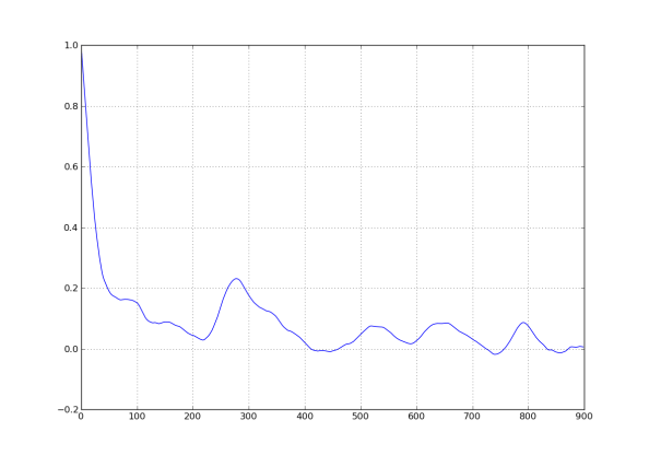
However, in cases where there’s less money riding on the patterns, we can generally expect to see more linkage between lagged values. Since nobody is making money betting on blood glucose levels inside someone’s body, I had pretty high hopes for this analysis. Here’s the picture I drew:
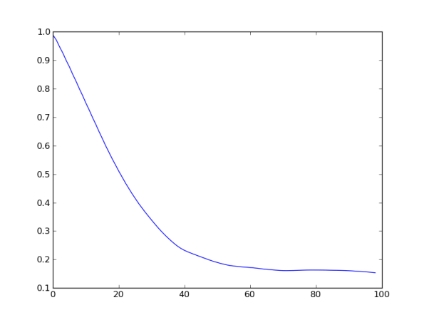
What do you see? Basically I want you to see that the correlation is quite high for small lags, then dies down with a small resuscitation near 300 (hey, it turns out that 288 lags equals one day! So this autocorrelation lift is probably indicating a daily cyclicality of blood glucose levels). Here’s a close-up for the first 100 lags:
We can conclude that the correlation seems significant to about 30 lags, and is decaying pretty linearly.
This means that we can use the previous 30 lags to predict the next level. Of course we don’t want to let 30 parameters vary independently- that would be crazy and would totally overfit the model to the data. Instead, I’ll talk soon about how to place a prior on those 30 parameters which essentially uses them all but doesn’t let them vary freely- so the overall number of independent variables is closer to 4 or 5 (although it’s hard to be precise).
On last thing: the data I have used for this analysis is still pretty dirty, as I described here. I will do this analysis again once I decide how to try to remove crazy or unreliable readings that tend to happen before the blood glucose monitor dies.
Here’s the python code I used to generate these plots:
#!/usr/bin/env python

import csv
from matplotlib.pylab import *
import os
from datetime import datetime

os.chdir('/Users/cathyoneil/python/diabetes/')

gap_threshold = 12

dataReader = csv.DictReader(open('Jason_large_dataset.csv', 'rb'), delimiter=',', quotechar='|')
i=0
datelist = []
datalist = []
firstdate = 4
skip_gaps_datalist = []
for row in dataReader:
    #print i, row["Sensor Glucose (mg/dL)"]
    if not row["Raw-Type"] == "GlucoseSensorData":continue
    if firstdate ==4:
        print i
        firstdate = \
         datetime.strptime(row["Timestamp"], '%m/%d/%y %H:%M:%S')
    if row["Sensor Glucose (mg/dL)"] == "":
        datalist.append(-1)
    else:
        thisdate = datetime.strptime(row["Timestamp"], '%m/%d/%y %H:%M:%S')
        diffdate = thisdate-firstdate
        datelist.append(diffdate.seconds + 60*60*24*diffdate.days)
        datalist.append(float(row["Sensor Glucose (mg/dL)"]))
        skip_gaps_datalist.append(log(float(row["Sensor Glucose (mg/dL)"])))
    i+=1
    continue

print min(datalist), max(datalist)
##figure()
##scatter(arange(len(datalist)), datalist)
##
##figure()
##hist(skip_gaps_datalist, bins = 100)
##show()

def lagged_correlation(g):
    d = dict(zip(datelist, datalist))
    s1 = []
    s2 = []
    for date in datelist:
        if date + 60*5 in datelist:
            s1.append(d[date])
            s2.append(d[date + 60*5])
    return corrcoef(s1, s2)[1, 0]

figure()
plot([lagged_correlation(f) for f in range(1,900)])


1) looking at data like your blood sugar levels I would want to do a Fourier transform and see whether there was a periodic component. If there was, would I expect to see a less smooth autocorrelation plot wit spikes at the periods?
2) I don’t agree with the premise. Looking for correlations without an underlying theory of causality is dangerous because given a sufficiently you should expect to find quite a large number of false significant correlations.We have evolved to find pattern and are much more likely to find pattern were none exists than to miss patterns that do exist (faces in cluds, for example)
LikeLike
1) Wait, how exactly would you do a Fourier transform? Can you be more precise?
2) Agreed that I wouldn’t believe just anything I see as a result of this plot. I have a strong prior that the most recent information *may* tell me something about the near future- it’s just a question of how much and for how long back. I wouldn’t trust a random large or very small value, at a high lag, to be anything but spurious. However, since I see smooth decay of positive correlation at small lags, this is good evidence of real signal.
LikeLike
My apologies for just wandering by an spouting off the first thing that popped into my head: The first graph is time series data that goes up and down, does it have a period? What kind of maths would I use to find out? And having asked myself those two questions I hit the keyboard without thinking much further. My excuse is that posting is a way of thanking you for blogging.
LikeLike