Archive
Columbia Data Science course, week 5: GetGlue, time series, financial modeling, advanced regression, and ethics
I was happy to be giving Rachel Schutt’s Columbia Data Science course this week, where I discussed time series, financial modeling, and ethics. I blogged previous classes here.
The first few minutes of class were for a case study with GetGlue, a New York-based start-up that won the mashable breakthrough start-up of the year in 2011 and is backed by some of the VCs that also fund big names like Tumblr, etsy, foursquare, etc. GetGlue is part of the social TV space. Lead Scientist, Kyle Teague, came to tell the class a little bit about GetGlue, and some of what he worked on there. He also came to announce that GetGlue was giving the class access to a fairly large data set of user check-ins to tv shows and movies. Kyle’s background is in electrical engineering, he placed in the 2011 KDD cup (which we learned about last week from Brian), and he started programming when he was a kid.
GetGlue’s goal is to address the problem of content discovery within the movie and tv space, primarily. The usual model for finding out what’s on TV is the 1950’s TV Guide schedule, and that’s still how we’re supposed to find things to watch. There are thousands of channels and it’s getting increasingly difficult to find out what’s good on. GetGlue wants to change this model, by giving people personalized TV recommendations and personalized guides. There are other ways GetGlue uses Data Science but for the most part we focused on how this the recommendation system works. Users “check-in” to tv shows, which means they can tell people they’re watching a show. This creates a time-stamped data point. They can also do other actions such as like, or comment on the show. So this is a -tuple: {user, action, object} where the object is a tv show or movie. This induces a bi-partite graph. A bi-partite graph or network contains two types of nodes: users and tv shows. An edges exist between users and an tv shows, but not between users and users or tv shows and tv shows. So Bob and Mad Men are connected because Bob likes Mad Men, and Sarah and Mad Men and Lost are connected because Sarah liked Mad Men and Lost. But Bob and Sarah aren’t connected, nor are Mad Men and Lost. A lot can be learned from this graph alone.
But GetGlue finds ways to create edges between users and between objects (tv shows, or movies.) Users can follow each other or be friends on GetGlue, and also GetGlue can learn that two people are similar[do they do this?]. GetGlue also hires human evaluators to make connections or directional edges between objects. So True Blood and Buffy the Vampire Slayer might be similar for some reason and so the humans create an edge in the graph between them. There were nuances around the edge being directional. They may draw an arrow pointing from Buffy to True Blood but not vice versa, for example, so their notion of “similar” or “close” captures both content and popularity. (That’s a made-up example.) Pandora does something like this too.
Another important aspect is time. The user checked-in or liked a show at a specific time, so the -tuple extends to have a time-stamp: {user,action,object,timestamp}. This is essentially the data set the class has access to, although it’s slightly more complicated and messy than that. Their first assignment with this data will be to explore it, try to characterize it and understand it, gain intuition around it and visualize what they find.
Students in the class asked him questions around topics of the value of formal education in becoming a data scientist (do you need one? Kyle’s time spent doing signal processing in research labs was valuable, but so was his time spent coding for fun as a kid), what would be messy about a data set, why would the data set be messy (often bugs in the code), how would they know? (their QA and values that don’t make sense), what language does he use to prototype algorithms (python), how does he know his algorithm is good.
Then it was my turn. I started out with my data scientist profile:

As you can see, I feel like I have the most weakness in CS. Although I can use python pretty proficiently, and in particular I can scrape and parce data, prototype models, and use matplotlib to draw pretty pictures, I am no java map-reducer and I bow down to those people who are. I am also completely untrained in data visualization but I know enough to get by and give presentations that people understand.
Thought Experiment
I asked the students the following question:
What do you lose when you think of your training set as a big pile of data and ignore the timestamps?
They had some pretty insightful comments. One thing they mentioned off the bat is that you won’t know cause and effect if you don’t have any sense of time. Of course that’s true but it’s not quite what I meant, so I amended the question to allow you to collect relative time differentials, so “time since user last logged in” or “time since last click” or “time since last insulin injection”, but not absolute timestamps.
What I was getting at, and what they came up with, was that when you ignore the passage of time through your data, you ignore trends altogether, as well as seasonality. So for the insulin example, you might note that 15 minutes after your insulin injection your blood sugar goes down consistently, but you might not notice an overall trend of your rising blood sugar over the past few months if your dataset for the past few months has no absolute timestamp on it.
This idea, of keeping track of trends and seasonalities, is very important in financial data, and essential to keep track of if you want to make money, considering how small the signals are.
How to avoid overfitting when you model with time series
After discussing seasonality and trends in the various financial markets, we started talking about how to avoid overfitting your model.
Specifically, I started out with having a strict concept of in-sample (IS) and out-of-sample (OOS) data. Note the OOS data is not meant as testing data- that all happens inside OOS data. It’s meant to be the data you use after finalizing your model so that you have some idea how the model will perform in production.
Next, I discussed the concept of causal modeling. Namely, we should never use information in the future to predict something now. Similarly, when we have a set of training data, we don’t know the “best fit coefficients” for that training data until after the last timestamp on all the data. As we move forward in time from the first timestamp to the last, we expect to get different sets of coefficients as more events happen.
One consequence of this is that, instead of getting on set of coefficients, we actually get an evolution of each coefficient. This is helpful because it gives us a sense of how stable those coefficients are. In particular, if one coefficient has changed sign 10 times over the training set, then we expect a good estimate for it is zero, not the so-called “best fit” at the end of the data.
One last word on causal modeling and IS/OOS. It is consistent with production code. Namely, you are always acting, in the training and in the OOS simulation, as if you’re running your model in production and you’re seeing how it performs. Of course you fit your model in sample, so you expect it to perform better there than in production.
Another way to say this is that, once you have a model in production, you will have to make decisions about the future based only on what you know now (so it’s causal) and you will want to update your model whenever you gather new data. So your coefficients of your model are living organisms that continuously evolve.
Submodels of Models
We often “prepare” the data before putting it into a model. Typically the way we prepare it has to do with the mean or the variance of the data, or sometimes the log (and then the mean or the variance of that transformed data).
But to be consistent with the causal nature of our modeling, we need to make sure our running estimates of mean and variance are also causal. Once we have causal estimates of our mean 

Of course we may have other things to keep track of as well to prepare our data, and we might run other submodels of our model. For example we may choose to consider only the “new” part of something, which is equivalent to trying to predict something like 


There are lots of choices here, but the point is it’s all causal, so you have to be careful when you train your overall model how to introduce your next data point and make sure the steps are all in order of time, and that you’re never ever cheating and looking ahead in time at data that hasn’t happened yet.
Financial time series
In finance we consider returns, say daily. And it’s not percent returns, actually it’s log returns: if 


So if you start with S&P closing levels:

Then you get the following log returns:


What’s that mess? It’s crazy volatility caused by the financial crisis. We sometimes (not always) want to account for that volatility by normalizing with respect to it (described above). Once we do that we get something like this:

Which is clearly better behaved. Note this process is discussed in this post.
We could also normalize with respect to the mean, but we typically assume the mean of daily returns is 0, so as to not bias our models on short term trends.
Financial Modeling
One thing we need to understand about financial modeling is that there’s a feedback loop. If you find a way to make money, it eventually goes away- sometimes people refer to this as the fact that the “market learns over time”.
One way to see this is that, in the end, your model comes down to knowing some price is going to go up in the future, so you buy it before it goes up, you wait, and then you sell it at a profit. But if you think about it, your buying it has actually changed the process, and decreased the signal you were anticipating. That’s how the market learns – it’s a combination of a bunch of algorithms anticipating things and making them go away.
The consequence of this learning over time is that the existing signals are very weak. We are happy with a 3% correlation for models that have a horizon of 1 day (a “horizon” for your model is how long you expect your prediction to be good). This means not much signal, and lots of noise! In particular, lots of the machine learning “metrics of success” for models, such as measurements of precision or accuracy, are not very relevant in this context.
So instead of measuring accuracy, we generally draw a picture to assess models, namely of the (cumulative) PnL of the model. This generalizes to any model as well- you plot the cumulative sum of the product of demeaned forecast and demeaned realized. In other words, you see if your model consistently does better than the “stupidest” model of assuming everything is average.
If you plot this and you drift up and to the right, you’re good. If it’s too jaggedy, that means your model is taking big bets and isn’t stable.
Why regression?
From above we know the signal is weak. If you imagine there’s some complicated underlying relationship between your information and the thing you’re trying to predict, get over knowing what that is – there’s too much noise to find it. Instead, think of the function as possibly complicated, but continuous, and imagine you’ve written it out as a Taylor Series. Then you can’t possibly expect to get your hands on anything but the linear terms.
Don’t think about using logistic regression, either, because you’d need to be ignoring size, which matters in finance- it matters if a stock went up 2% instead of 0.01%. But logistic regression forces you to have an on/off switch, which would be possible but would lose a lot of information. Considering the fact that we are always in a low-information environment, this is a bad idea.
Note that although I’m claiming you probably want to use linear regression in a noisy environment, the actual terms themselves don’t have to be linear in the information you have. You can always take products of various terms as x’s in your regression. but you’re still fitting a linear model in non-linear terms.
Advanced regression
The first thing I need to explain is the exponential downweighting of old data, which I already used in a graph above, where I normalized returns by volatility with a decay of 0.97. How do I do this?
Working from this post again, the formula is given by essentially a weighted version of the normal one, where I weight recent data more than older data, and where the weight of older data is a power of some parameter 

We are actually dividing by the sum of the weights, but the weights are powers of some number s, so it’s a geometric sum and the sum is given by

One cool consequence of this formula is that it’s easy to update: if we have a new return 

In fact this is the general rule for updating exponential downweighted estimates, and it’s one reason we like them so much- you only need to keep in memory your last estimate and the number

How do you choose your decay length? This is an art instead of a science, and depends on the domain you’re in. Think about how many days (or time periods) it takes to weight a data point at half of a new data point, and compare that to how fast the market forgets stuff.
This downweighting of old data is an example of inserting a prior into your model, where here the prior is “new data is more important than old data”. What are other kinds of priors you can have?
Priors
Priors can be thought of as opinions like the above. Besides “new data is more important than old data,” we may decide our prior is “coefficients vary smoothly.” This is relevant when we decide, say, to use a bunch of old values of some time series to help predict the next one, giving us a model like:

which is just the example where we take the last two values of the time series $F$ to predict the next one. But we could use more than two values, of course.
[Aside: in order to decide how many values to use, you might want to draw an autocorrelation plot for your data.]
The way you’d place the prior about the relationship between coefficients (in this case consecutive lagged data points) is by adding a matrix to your covariance matrix when you perform linear regression. See more about this here.
Ethics
I then talked about modeling and ethics. My goal is to get this next-gen group of data scientists sensitized to the fact that they are not just nerds sitting in the corner but have increasingly important ethical questions to consider while they work.
People tend to overfit their models. It’s human nature to want your baby to be awesome. They also underestimate the bad news and blame other people for bad news, because nothing their baby has done or is capable of is bad, unless someone else made them do it. Keep these things in mind.
I then described what I call the deathspiral of modeling, a term I coined in this post on creepy model watching.
I counseled the students to
- try to maintain skepticism about their models and how their models might get used,
- shoot holes in their own ideas,
- accept challenges and devise tests as scientists rather than defending their models using words – if someone thinks they can do better, than let them try, and agree on an evaluation method beforehand,
- In general, try to consider the consequences of their models.
I then showed them Emanuel Derman’s Hippocratic Oath of Modeling, which was made for financial modeling but fits perfectly into this framework. I discussed the politics of working in industry, namely that even if they are skeptical of their model there’s always the chance that it will be used the wrong way in spite of the modeler’s warnings. So the Hippocratic Oath is, unfortunately, insufficient in reality (but it’s a good start!).
Finally, there are ways to do good: I mentioned stuff like DataKind. There are also ways to be transparent: I mentioned Open Models, which is so far just an idea, but Victoria Stodden is working on RunMyCode, which is similar and very awesome.
Next-Gen Data Scientists
This is written by Rachel Schutt and crossposted from her Columbiadatascience blog
Data is information and is extremely powerful. Models and algorithms that use data can literally change the world. Quantitatively-minded people have always been able to solve important problems, so this is nothing new, and there’s always been data, so this is nothing new.
What is new is the massive amounts of data we have on all aspects of our lives, from the micro to the macro. The data we have from government, finance, education, the environment, social welfare, health, entertainment, the internet will be used to make policy-decisions and to build products back into the fabric of our culture.
I want you, my students, to be the ones doing it. I look around the classroom and see a group of thoughtful, intelligent people who want to do good, and are absolutely capable of doing it.
I don’t call myself a “data scientist”. I call myself a statistician. I refuse to be called a data scientist because as it’s currently used, it’s a meaningless, arbitrary marketing term. However, the existence of the term, and apparent “sexiness” of the profession draws attention to data and opens up opportunities. So we need Next-Gen Data Scientists. That’s you! Here’s what I mean when I say Next-Gen Data Scientist:
- Next-Gen Data Scientists have humility. They don’t lie about their credentials and they don’t spend most of their efforts on self-promotion.
- Next-Gen Data Scientists have integrity. Their work is not about trying to be “cool” or solving some “cool” problem. It’s about being a problem solver and finding simple, elegant solutions. (or complicated, if necessary)
- Next-Gen Data Scientists don’t try to impress with complicated algorithms and models that don’t work.
- Next-Gen Data Scientists spend a lot more time trying to get data into shape then anyone cares to admit.
- Next-Gen Data Scientists have the experience or education to actually know what they’re talking about. They’ve put their time in.
- Next-Gen Data Scientists are skeptical – skeptical about models themselves and how they can fail and the way they’re used or can be misused.
- Next-Gen Data Scientists make sure they know what they’re talking about before running around trying to show everyone else they exist.
- Next-Gen Data Scientsts have a variety of skills including coding, statistics, machine learning, visualization, communication, math.
- Next-Gen Data Scientists do enough Science to merit the word “Scientist”, someone who tests hypotheses and welcomes challenges and alternative theories.
- Next-Gen Data Scientists are solving a new breed of problem that surrounds the structure and exploration of data and the computational issues surrounding it.
- Next-Gen Data Scientists don’t find religion in tools, methods or academic departments. They are versatile and interdisciplinary.
- Next-Gen Data Scientists are highly skilled and ought to get paid well enough that they don’t have to worry too much about money
- Next-Gen Data Scientists don’t let money blind them to the point that their models are used for unethical purposes.
- Next-Gen Data Scientists seek out opportunities to solve problems of social value.
- Next-Gen Data Scientists understand the implications and consequences of the models they’re building.
- Next-Gen Data Scientists collaborate and cooperate.
- Next-Gen Data Scientists bring their humanity with them to problem solving, and algorithm/model-building.
What is a model?
I’ve been thinking a lot recently about mathematical models and how to explain them to people who aren’t mathematicians or statisticians. I consider this increasingly important as more and more models are controlling our lives, such as:
- employment models, which help large employers screen through applications,
- political ad models, which allow political groups to personalize their ads,
- credit scoring models, which allow consumer product companies and loan companies to screen applicants, and,
- if you’re a teacher, the Value-Added Model.
- See more models here and here.
It’s a big job, to explain these, because the truth is they are complicated – sometimes overly so, sometimes by construction.
The truth is, though, you don’t really need to be a mathematician to know what a model is, because everyone uses internal models all the time to make decisions.
For example, you intuitively model everyone’s appetite when you cook a meal for your family. You know that one person loves chicken (but hates hamburgers), while someone else will only eat the pasta (with extra cheese). You even take into account that people’s appetites vary from day to day, so you can’t be totally precise in preparing something – there’s a standard error involved.
To explain modeling at this level, then, you just need to imagine that you’ve built a machine that knows all the facts that you do and knows how to assemble them together to make a meal that will approximately feed your family. If you think about it, you’ll realize that you know a shit ton of information about the likes and dislikes of all of your family members, because you have so many memories of them grabbing seconds of the asparagus or avoiding the string beans.
In other words, it would be actually incredibly hard to give a machine enough information about all the food preferences for all your family members, and yourself, along with the constraints of having not too much junky food, but making sure everyone had something they liked, etc. etc.
So what would you do instead? You’d probably give the machine broad categories of likes and dislikes: this one likes meat, this one likes bread and pasta, this one always drinks lots of milk and puts nutella on everything in sight. You’d dumb it down for the sake of time, in other words. The end product, the meal, may not be perfect but it’s better than no guidance at all.
That’s getting closer to what real-world modeling for people is like. And the conclusion is right too- you aren’t expecting your model to do a perfect job, because you only have a broad outline of the true underlying facts of the situation.
Plus, when you’re modeling people, you have to a priori choose the questions to ask, which will probably come in the form of “does he/she like meat?” instead of “does he/she put nutella on everything in sight?”; in other words, the important but idiosyncratic rules won’t even be seen by a generic one-size-fits-everything model.
Finally, those generic models are hugely scaled- sometimes there’s really only one out there, being used everywhere, and its flaws are compounded that many times over because of its reach.
So, say you’ve got a CV with a spelling error. You’re trying to get a job, but the software that screens for applicants automatically rejects you because of this spelling error. Moreover, the same screening model is used everywhere, and you therefore don’t get any interviews because of this one spelling error, in spite of the fact that you’re otherwise qualified.
I’m not saying this would happen – I don’t know how those models actually work, although I do expect points against you for spelling errors. My point is there’s some real danger in using such models on a very large scale that we know are simplified versions of reality.
One last thing. The model fails in the example above, because the qualified person doesn’t get a job. But it fails invisibly; nobody knows exactly how it failed or even that it failed. Moreover, it only really fails for the applicant who doesn’t get any interviews. For the employer, as long as some qualified applicants survive the model, they don’t see failure at all.
Columbia Data Science course, week 4: K-means, Classifiers, Logistic Regression, Evaluation
This week our guest lecturer for the Columbia Data Science class was Brian Dalessandro. Brian works at Media6Degrees as a VP of Data Science, and he’s super active in the research community. He’s also served as co-chair of the KDD competition.
Before Brian started, Rachel threw us a couple of delicious data science tidbits.
The Process of Data Science
First we have the Real World. Inside the Real World we have:
- Users using Google+
- People competing in the Olympics
- Spammers sending email
From this we draw raw data, e.g. logs, all the olympics records, or Enron employee emails. We want to process this to make it clean for analysis. We use pipelines of data munging, joining, scraping, wrangling or whatever you want to call it and we use tools such as:
- python
- shell scripts
- R
- SQL
We eventually get the data down to a nice format, say something with columns:
name event year gender event time
Note: this is where you typically start in a standard statistics class. But it’s not where we typically start in the real world.
Once you have this clean data set, you should be doing some kind of exploratory data analysis (EDA); if you don’t really know what I’m talking about then look at Rachel’s recent blog post on the subject. You may realize that it isn’t actually clean.
Next, you decide to apply some algorithm you learned somewhere:
- k-nearest neighbor
- regression
- Naive Bayes
- (something else),
depending on the type of problem you’re trying to solve:
- classification
- prediction
- description
You then:
- interpret
- visualize
- report
- communicate
At the end you have a “data product”, e.g. a spam classifier.
K-means
So far we’ve only seen supervised learning. K-means is the first unsupervised learning technique we’ll look into. Say you have data at the user level:
- G+ data
- survey data
- medical data
- SAT scores
Assume each row of your data set corresponds to a person, say each row corresponds to information about the user as follows:
age gender income Geo=state household size
Your goal is to segment them, otherwise known as stratify, or group, or cluster. Why? For example:
- you might want to give different users different experiences. Marketing often does this.
- you might have a model that works better for specific groups
- hierarchical modeling in statistics does something like this.
One possibility is to choose the groups yourself. Bucket users using homemade thresholds. Like by age, 20-24, 25-30, etc. or by income. In fact, say you did this, by age, gender, state, income, marital status. You may have 10 age buckets, 2 gender buckets, and so on, which would result in 10x2x50x10x3 = 30,000 possible bins, which is big.
You can picture a five dimensional space with buckets along each axis, and each user would then live in one of those 30,000 five-dimensional cells. You wouldn’t want 30,000 marketing campaigns so you’d have to bin the bins somewhat.
Wait, what if you want to use an algorithm instead where you could decide on the number of bins? K-means is a “clustering algorithm”, and k is the number of groups. You pick k, a hyper parameter.
2-d version
Say you have users with #clicks, #impressions (or age and income – anything with just two numerical parameters). Then k-means looks for clusters on the 2-d plane. Here’s a stolen and simplistic picture that illustrates what this might look like:

The general algorithm is just the same picture but generalized to d dimensions, where d is the number of features for each data point.
Here’s the actual algorithm:
- randomly pick K centroids
- assign data to closest centroid.
- move the centroids to the average location of the users assigned to it
- repeat until the assignments don’t change
It’s up to you to interpret if there’s a natural way to describe these groups.
This is unsupervised learning and it has issues:
- choosing an optimal k is also a problem although
, where n is number of data points.
- convergence issues – the solution can fail to exist (the configurations can fall into a loop) or “wrong”
- but it’s also fast
- interpretability can be a problem – sometimes the answer isn’t useful
- in spite of this, there are broad applications in marketing, computer vision (partition an image), or as a starting point for other models.
One common tool we use a lot in our systems is logistic regression.
Thought Experiment
Brian now asked us the following:
How would data science differ if we had a “grand unified theory of everything”?
He gave us some thoughts:
- Would we even need data science?
- Theory offers us a symbolic explanation of how the world works.
- What’s the difference between physics and data science?
- Is it just accuracy? After all, Newton wasn’t completely precise, but was pretty close.
If you think of the sciences as a continuum, where physics is all the way on the right, and as you go left, you get more chaotic, then where is economics on this spectrum? Marketing? Finance? As we go left, we’re adding randomness (and as a clever student points out, salary as well).
Bottomline: if we could model this data science stuff like we know how to model physics, we’d know when people will click on what ad. The real world isn’t this understood, nor do we expect to be able to in the future.
Does “data science” deserve the word “science” in its name? Here’s why maybe the answer is yes.
We always have more than one model, and our models are always changing.
The art in data science is this: translating the problem into the language of data science
The science in data science is this: given raw data, constraints and a problem statement, you have an infinite set of models to choose from, with which you will use to maximize performance on some evaluation metric, that you will have to specify. Every design choice you make can be formulated as an hypothesis, upon which you will use rigorous testing and experimentation to either validate or refute.
Never underestimate the power of creativity: usually people have vision but no method. As the data scientist, you have to turn it into a model within the operational constraints. You need to optimize a metric that you get to define. Moreover, you do this with a scientific method, in the following sense.
Namely, you hold onto your existing best performer, and once you have a new idea to prototype, then you set up an experiment wherein the two best models compete. You therefore have a continuous scientific experiment, and in that sense you can justify it as a science.
Classifiers
Given
- data
- a problem, and
- constraints,
we need to determine:
- a classifier,
- an optimization method,
- a loss function,
- features, and
- an evaluation metric.
Today we will focus on the process of choosing a classifier.
Classification involves mapping your data points into a finite set of labels or the probability of a given label or labels. Examples of when you’d want to use classification:
- will someone click on this ad?
- what number is this?
- what is this news article about?
- is this spam?
- is this pill good for headaches?
From now on we’ll talk about binary classification only (0 or 1).
Examples of classification algorithms:
- decision tree
- random forests
- naive bayes
- k-nearest neighbors
- logistic regression
- support vector machines
- neural networks
Which one should we use?
One possibility is to try them all, and choose the best performer. This is fine if you have no constraints or if you ignore constraints. But usually constraints are a big deal – you might have tons of data or not much time or both.
If I need to update 500 models a day, I do need to care about runtime. these end up being bidding decisions. Some algorithms are slow – k-nearest neighbors for example. Linear models, by contrast, are very fast.
One under-appreciated constraint of a data scientist is this: your own understanding of the algorithm.
Ask yourself carefully, do you understand it for real? Really? Admit it if you don’t. You don’t have to be a master of every algorithm to be a good data scientist. The truth is, getting the “best-fit” of an algorithm often requires intimate knowledge of said algorithm. Sometimes you need to tweak an algorithm to make it fit your data. A common mistake for people not completely familiar with an algorithm is to overfit.
Another common constraint: interpretability. You often need to be able to interpret your model, for the sake of the business for example. Decision trees are very easy to interpret. Random forests, on the other hand, not so much, even though it’s almost the same thing, but can take exponentially longer to explain in full. If you don’t have 15 years to spend understanding a result, you may be willing to give up some accuracy in order to have it easy to understand.
Note that credit cards have to be able to explain their models by law so decision trees make more sense than random forests.
How about scalability? In general, there are three things you have to keep in mind when considering scalability:
- learning time: how much time does it take to train the model?
- scoring time: how much time does it take to give a new user a score once the model is in production?
- model storage: how much memory does the production model use up?
Here’s a useful paper to look at when comparing models: “An Empirical Comparison of Supervised Learning Algorithms”, from which we learn:
- Simpler models are more interpretable but aren’t as good performers.
- The question of which algorithm works best is problem dependent
- It’s also constraint dependent
At M6D, we need to match clients (advertising companies) to individual users. We have logged the sites they have visited on the internet. Different sites collect this information for us. We don’t look at the contents of the page – we take the url and hash it into some random string and then we have, say, the following data about a user we call “u”:
u = <xyz, 123, sdqwe, 13ms>
This means u visited 4 sites and their urls hashed to the above strings. Recall last week we learned spam classifier where the features are words. We aren’t looking at the meaning of the words. So the might as well be strings.
At the end of the day we build a giant matrix whose columns correspond to sites and whose rows correspond to users, and there’s a “1” if that user went to that site.
To make this a classifier, we also need to associate the behavior “clicked on a shoe ad”. So, a label.
Once we’ve labeled as above, this looks just like spam classification. We can now rely on well-established methods developed for spam classification – reduction to a previously solved problem.
Logistic Regression
We have three core problems as data scientists at M6D:
- feature engineering,
- user level conversion prediction,
- bidding.
We will focus on the second. We use logistic regression– it’s highly scalable and works great for binary outcomes.
What if you wanted to do something else? You could simply find a threshold so that, above you get 1, below you get 0. Or you could use a linear model like linear regression, but then you’d need to cut off below 0 or above 1.
What’s better: fit a function that is bounded in side [0,1]. For example, the logit function

wanna estimate

To make this a linear model in the outcomes 

The parameter 
If you had no information except the base rate, the average prediction would be just that. In a logistical regression,

The slope 
Our immediate modeling goal is to use our training data to find the best choices for 
The likelihood function 


where we are assuming the data points 

We then search for the parameters that maximize this having observed our data:

The probability of a single observation is

where 
Similar to last week, we now take the log and get something convex, so it has to have a global maximum. Finally, we use numerical techniques to find it, which essentially follow the gradient like Newton’s method from calculus. Computer programs can do this pretty well. These algorithms depend on a step size, which we will need to adjust as we get closer to the global max or min – there’s an art to this piece of numerical optimization as well. Each step of the algorithm looks something like this:

where remember we are actually optimizing our parameters 


“Flavors” of Logistic Regression for convex optimization.
The Newton’s method we described above is also called Iterative Reweighted Least Squares. It uses the curvature of log-likelihood to choose appropriate step direction. The actual calculation involves the Hessian matrix, and in particular requires its inversion, which is a kxk matrix. This is bad when there’s lots of features, as in 10,000 or something. Typically we don’t have that many features but it’s not impossible.
Another possible method to maximize our likelihood or log likelihood is called Stochastic Gradient Descent. It approximates gradient using a single observation at a time. The algorithm updates the current best-fit parameters each time it sees a new data point. The good news is that there’s no big matrix inversion, and it works well with huge data and with sparse features; it’s a big deal in Mahout and Vowpal Wabbit. The bad news is it’s not such a great optimizer and it’s very dependent on step size.
Evaluation
We generally use different evaluation metrics for different kind of models.
First, for ranking models, where we just want to know a relative rank versus and absolute score, we’d look to one of:
Second, for classification models, we’d look at the following metrics:
- lift: how much more people are buying or clicking because of a model
- accuracy: how often the correct outcome is being predicted
- f-score
- precision
- recall
Finally, for density estimation, where we need to know an actual probability rather than a relative score, we’d look to:
In general it’s hard to compare lift curves but you can compare AUC (area under the receiver operator curve) – they are “base rate invariant.” In other words if you bring the click-through rate from 1% to 2%, that’s 100% lift but if you bring it from 4% to 7% that’s less lift but more effect. AUC does a better job in such a situation when you want to compare.
Density estimation tests tell you how well are you fitting for conditional probability. In advertising, this may arise if you have a situation where each ad impression costs $c and for each conversion you receive $q. You will want to target every conversion that has a positive expected value, i.e. whenever

But to do this you need to make sure the probability estimate on the left is accurate, which in this case means something like the mean squared error of the estimator is small. Note a model can give you good rankings but bad P estimates.
Similarly, features that rank highly on AUC don’t necessarily rank well with respect to mean absolute error. So feature selection, as well as your evaluation method, is completely context-driven.
Evaluating professor evaluations
I recently read this New York Times “Room for Debate” on professor evaluations. There were some reasonably good points made, with people talking about the trend that students generally give better grades to attractive professors and easy grading professors, and that they were generally more interested in the short-term than in the long-term in this sense.
For these reasons, it was stipulated, it would be better and more informative to have anonymous evaluations, or have students come back after some time to give evaluations, or interesting ideas like that.
Then there was a crazy crazy man named Jeff Sandefer, co-founder and master teacher at the Acton School of Business in Austin, Texas. He likes to call his students “customers” and here’s how he deals with evaluations:
Acton, the business school that I co-founded, is designed and is led exclusively by successful chief executives. We focus intently on customer feedback. Every week our students rank each course and professor, and the results are made public for all to see. We separate the emotional venting from constructive criticism in the evaluations, and make frequent changes in the program in real time.
We also tie teacher bonuses to the student evaluations and each professor signs an individual learning covenant with each student. We have eliminated grade inflation by using a forced curve for student grades, and students receive their grades before evaluating professors. Not only do we not offer tenure, but our lowest rated teachers are not invited to return.
First of all, I’m not crazy about the idea of weekly rankings and public shaming going on here. And how do you separate emotional venting from constructive criticism anyway? Isn’t the customer always right? Overall the experience of the teachers doesn’t sound good – if I have a choice as a teacher, I teach elsewhere, unless the pay and the students are stellar.
On the other hand, I think it’s interesting that they have a curve for student grades. This does prevent the extra good evaluations coming straight from grade inflation (I’ve seen it, it does happen).
Here’s one think I didn’t see discussed, which is students themselves and how much they want to be in the class. When I taught first semester calculus at Barnard twice in consecutive semesters, my experience was vastly different in the two classes.
The first time I taught, in the Fall, my students were mostly straight out of high school, bright eyed and bushy tailed, and were happy to be there, and I still keep in touch with some of them. It was a great class, and we all loved each other by the end of it. I got crazy good reviews.
By contrast, the second time I taught the class, which was the next semester, my students were annoyed, bored, and whiny. I had too many students in the class, partly because my reviews were so good. So the class was different on that score, but I don’t think that mattered so much to my teaching.
My theory, which was backed up by all the experienced Profs in the math department, was that I had the students who were avoiding calculus for some reason. And when I thought about it, they weren’t straight out of high school, they were all over the map. They generally were there only because they needed some kind of calculus to fulfill a requirement for their major.
Unsurprisingly, I got mediocre reviews, with some really pretty nasty ones. The nastiest ones, I noticed, all had some giveaway that they had a bad attitude- something like, “Cathy never explains anything clearly, and I hate calculus.” My conclusion is that I get great evaluations from students who want to learn calculus and nasty evaluations from students who resent me asking them to really learn calculus.
What should we do about prof evaluations?
The problem with using evaluations to measure professor effectiveness is that you might be a prof that only has ever taught calculus in the Spring, and then you’d be wrongfully punished. That’s where we are now, and people know it, so instead of using them they just mostly ignore them. Of course, the problem with not ever using these evaluations is that they might actually contain good information that you could use to get better at teaching.
We have a lot of data collected on teacher evaluations, so I figure we should be analyzing it to see if there really is a useful signal or not. And we should use domain expertise from experienced professors to see if there are any other effects besides the “Fall/Spring attitude towards math” effect to keep in mind.
It’s obviously idiosyncratic depending on field and even which class it is, i.e. Calc II versus Calc III. If there even is a signal after you extract the various effects and the “attractiveness” effect, I expect it to be very noisy and so I’d hate to see someone’s entire career depend on evaluations, unless there was something really outrageous going on.
In any case it would be fun to do that analysis.
Filter Bubble
[I’m planning on a couple of trips in the next few days and I might not be blogging regularly, depending on various things like wifi access. Not to worry!]
I just finished reading “Filter Bubble,” by Eli Pariser, which I enjoyed quite a bit. The premise that the multitude of personalization algorithms are limiting our online experience to the point that, although we don’t see it happening, we are becoming coddled, comfortable, insular, and rigid-minded. In other words, the opposite of what we all thought would happen when the internet began, and we had a virtual online international bazaar of different people, perspectives, and paradigms.
He focuses on the historical ethics (and lack thereof) of the paper press, and talks about how at the very least, as people skipped the complicated boring stories of Afghanistan to read the sports section, at least they knew the story they were skipping existed and was important; he compares this to now, where a “personalized everything online world” allows people to only ever read what they want to read (i.e. sports, or fashion, or tech gadget news) and never even know there’s a war going on out there.
Pariser does a good job explaining the culture of the modeling and technology set, and how they claim to have no moral purpose to their algorithms when it suits them. He goes deeply into the inconsistent data policy of Facebook and the search algorithm of Google, plumbing them for moral consequences if not intent.
Some of the Pariser’s conclusions are reasonable and some of them aren’t. He begs for more transparency, and uses Linux up as an example of that – so far so good. But when he claims that Google wouldn’t lose market share by open sourcing up their search algorithm, that’s just plain silly. He likes Twitter’s data policy, mostly because it’s easy to understand and well-explained, but he hates Facebook’s because it isn’t; but those two companies are accomplishing very different things, so it’s not a good comparison (although I agree with him re: Facebook).
In the end, cracking the private company data policies won’t happen by asking them to be more transparent, and Pariser realizes that: he proposes to appeal to individuals and to government policy to help protect individuals’ data. Of course the government won’t do anything until enough people demand it, and Pariser realizes the first step to get people to care about the issue is to educate them on what is actually going on, and how creepy it is. This book is a good start.
Columbia Data Science course, week 3: Naive Bayes, Laplace Smoothing, and scraping data off the web
In the third week of the Columbia Data Science course, our guest lecturer was Jake Hofman. Jake is at Microsoft Research after recently leaving Yahoo! Research. He got a Ph.D. in physics at Columbia and taught a fantastic course on modeling last semester at Columbia.
After introducing himself, Jake drew up his “data science profile;” turns out he is an expert on a category that he created called “data wrangling.” He confesses that he doesn’t know if he spends so much time on it because he’s good at it or because he’s bad at it.
Thought Experiment: Learning by Example
Jake had us look at a bunch of text. What is it? After some time we describe each row as the subject and first line of an email in Jake’s inbox. We notice the bottom half of the rows of text looks like spam.
Now Jake asks us, how did you figure this out? Can you write code to automate the spam filter that your brain is?
Some ideas the students came up with:
- Any email is spam if it contains Viagra references. Jake: this will work if they don’t modify the word.
- Maybe something about the length of the subject?
- Exclamation points may point to spam. Jake: can’t just do that since “Yahoo!” would count.
- Jake: keep in mind spammers are smart. As soon as you make a move, they game your model. It would be great if we could get them to solve important problems.
- Should we use a probabilistic model? Jake: yes, that’s where we’re going.
- Should we use k-nearest neighbors? Should we use regression? Recall we learned about these techniques last week. Jake: neither. We’ll use Naive Bayes, which is somehow between the two.
Why is linear regression not going to work?
Say you make a feature for each lower case word that you see in any email and then we used R’s “lm function:”
lm(spam ~ word1 + word2 + …)
Wait, that’s too many variables compared to observations! We have on the order of 10,000 emails with on the order of 100,000 words. This will definitely overfit. Technically, this corresponds to the fact that the matrix in the equation for linear regression is not invertible. Moreover, maybe can’t even store it because it’s so huge.
Maybe you could limit to top 10,000 words? Even so, that’s too many variables vs. observations to feel good about it.
Another thing to consider is that target is 0 or 1 (0 if not spam, 1 if spam), whereas you wouldn’t get a 0 or a 1 in actuality through using linear regression, you’d get a number. Of course you could choose a critical value so that above that we call it “1” and below we call it “0”. Next week we’ll do even better when we explore logistic regression, which is set up to model a binary response like this.
How about k-nearest neighbors?
To use k-nearest neighbors we would still need to choose features, probably corresponding to words, and you’d likely define the value of those features to be 0 or 1 depending on whether the word is present or not. This leads to a weird notion of “nearness”.
Again, with 10,000 emails and 100,000 words, we’ll encounter a problem: it’s not a singular matrix this time but rather that the space we’d be working in has too many dimensions. This means that, for example, it requires lots of computational work to even compute distances, but even that’s not the real problem.
The real problem is even more basic: even your nearest neighbors are really far away. this is called “the curse of dimensionality“. This problem makes for a poor algorithm.
Question: what if sharing a bunch of words doesn’t mean sentences are near each other in the sense of language? I can imagine two sentences with the same words but very different meanings.
Jake: it’s not as bad as it sounds like it might be – I’ll give you references at the end that partly explain why.
Aside: digit recognition
In this case k-nearest neighbors works well and moreover you can write it in a few lines of R.
Take your underlying representation apart pixel by pixel, say in a 16 x 16 grid of pixels, and measure how bright each pixel is. Unwrap the 16×16 grid and put it into a 256-dimensional space, which has a natural archimedean metric. Now apply the k-nearest neighbors algorithm.
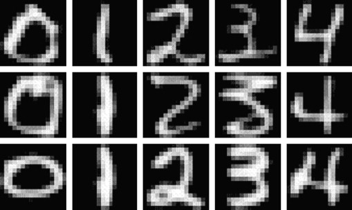
Some notes:
- If you vary the number of neighbors, it changes the shape of the boundary and you can tune k to prevent overfitting.
- You can get 97% accuracy with a sufficiently large data set.
- Result can be viewed in a “confusion matrix“.
Naive Bayes
Question: You’re testing for a rare disease, with 1% of the population is infected. You have a highly sensitive and specific test:
- 99% of sick patients test positive
- 99% of healthy patients test negative
Given that a patient tests positive, what is the probability that the patient is actually sick?
Answer: Imagine you have 100×100 = 10,000 people. 100 are sick, 9,900 are healthy. 99 sick people test sick, and 99 healthy people do too. So if you test positive, you’re equally likely to be healthy or sick. So the answer is 50%.
Let’s do it again using fancy notation so we’ll feel smart:
Recall

and solve for

The denominator can be thought of as a “normalization constant;” we will often be able to avoid explicitly calculuating this. When we apply the above to our situation, we get:

This is called “Bayes’ Rule“. How do we use Bayes’ Rule to create a good spam filter? Think about it this way: if the word “Viagra” appears, this adds to the probability that the email is spam.
To see how this will work we will first focus on just one word at a time, which we generically call “word”. Then we have:

The right-hand side of the above is computable using enough pre-labeled data. If we refer to non-spam as “ham”, we only need 

Example: go online and download Enron emails. Awesome. We are building a spam filter on that – really this means we’re building a new spam filter on top of the spam filter that existed for the employees of Enron.
Jake has a quick and dirty shell script in bash which runs this. It downloads and unzips file, creates a folder. Each text file is an email. They put spam and ham in separate folders.
Jake uses “wc” to count the number of messages for one former Enron employee, for example. He sees 1500 spam, and 3672 ham. Using grep, he counts the number of instances of “meeting”:
grep -il meeting enron1/spam/*.txt | wc -l
This gives 153. This is one of the handful of computations we need to compute

Note we don’t need a fancy programming environment to get this done.
Next, we try:
- “money”: 80% chance of being spam.
- “viagra”: 100% chance.
- “enron”: 0% chance.
This illustrates overfitting; we are getting overconfident because of our biased data. It’s possible, in other words, to write an non-spam email with the word “viagra” as well as a spam email with the word “enron.”
Next, do it for all the words. Each document can be represented by a binary vector, whose jth entry is 1 or 0 depending whether jth word appears. Note this is a huge-ass vector, we will probably actually represent it with the indices of the words that actually do show up.
Here’s the model we use to estimate the probability that we’d see a given word vector given that we know it’s spam (or that it’s ham). We denote the document vector 


The theta here is the probability that an individual word is present in a spam email (we can assume separately and parallel-ly compute that for every word). Note we are modeling the words independently and we don’t count how many times they are present. That’s why this is called “Naive”.
Let’s take the log of both sides:

[It’s good to take the log because multiplying together tiny numbers can give us numerical problems.]
The term 


We can now use Bayes’ Rule to get an estimate of 
Wait, this ends up looking like a linear regression! But instead of computing them by inverting a huge matrix, the weights come from the Naive Bayes’ algorithm.
This algorithm works pretty well and it’s “cheap to train” if you have pre-labeled data set to train on. Given a ton of emails, just count the words in spam and non-spam emails. If you get more training data you can easily increment your counts. In practice there’s a global model, which you personalize to individuals. Moreover, there are lots of hard-coded, cheap rules before an email gets put into a fancy and slow model.
Here are some references:
- “Idiot’s Bayes – not so stupid after all?” – the whole paper is about why it doesn’t suck, which is related to redundancies in language.
- “Naive Bayes at Forty: The Independence Assumption in Information“
- “Spam Filtering with Naive Bayes – Which Naive Bayes?“
Laplace Smoothing
Laplace Smoothing refers to the idea of replacing our straight-up estimate of the probability 

We might fix 

If we denote by 
In other words, we are asking the question, for what value of 

If you take the derivative, and set it to zero, we get

In other words, just what we had before. Now let’s add a prior. Denote by 
This similarly asks the question, given the data I saw, which parameter is the most likely?
Use Bayes’ rule to get 


Sometimes
Note: In the last 5 years people have started using stochastic gradient methods to avoid the non-invertible (overfitting) matrix problem. Switching to logistic regression with stochastic gradient method helped a lot, and can account for correlations between words. Even so, Naive Bayes’ is pretty impressively good considering how simple it is.
Scraping the web: API’s
For the sake of this discussion, an API (application programming interface) is something websites provide to developers so they can download data from the website easily and in standard format. Usually the developer has to register and receive a “key”, which is something like a password. For example, the New York Times has an API here. Note that some websites limit what data you have access to through their API’s or how often you can ask for data without paying for it.
When you go this route, you often get back weird formats, sometimes in JSON, but there’s no standardization to this standardization, i.e. different websites give you different “standard” formats.
One way to get beyond this is to use Yahoo’s YQL language which allows you to go to the Yahoo! Developer Network and write SQL-like queries that interact with many of the common API’s on the common sites like this:
select * from flickr.photos.search where text=”Cat” and api_key=”lksdjflskjdfsldkfj” limit 10
The output is standard and I only have to parse this in python once.
What if you want data when there’s no API available?
Note: always check the terms and services of the website before scraping.
In this case you might want to use something like the Firebug extension for Firefox, you can “inspect the element” on any webpage, and Firebug allows you to grab the field inside the html. In fact it gives you access to the full html document so you can interact and edit. In this way you can see the html as a map of the page and Firebug is a kind of tourguide.
After locating the stuff you want inside the html, you can use curl, wget, grep, awk, perl, etc., to write a quick and dirty shell script to grab what you want, especially for a one-off grab. If you want to be more systematic you can also do this using python or R.
Other parsing tools you might want to look into:
- lynx and lynx –dump: good if you pine for the 1970’s. Oh wait, 1992. Whatever.
- Beautiful Soup: robust but kind of slow
- Mechanize (or here) super cool as well but doesn’t parse javascript.
Postscript: Image Classification
How do you determine if an image is a landscape or a headshot?
You either need to get someone to label these things, which is a lot of work, or you can grab lots of pictures from flickr and ask for photos that have already been tagged.
Represent each image with a binned RGB – (red green blue) intensity histogram. In other words, for each pixel, for each of red, green, and blue, which are the basic colors in pixels, you measure the intensity, which is a number between 0 and 255.
Then draw three histograms, one for each basic color, showing us how many pixels had which intensity. It’s better to do a binned histogram, so have counts of # pixels of intensity 0 – 51, etc. – in the end, for each picture, you have 15 numbers, corresponding to 3 colors and 5 bins per color. We are assuming every picture has the same number of pixels here.
Finally, use k-nearest neighbors to decide how much “blue” makes a landscape versus a headshot. We can tune the hyperparameters, which in this case are # of bins as well as k.
Am I the sexiest thing about the 21st century?
Hey, I didn’t say it – mathbabe is much too modest!
It was the Harvard Business Review’s Data Scientist: The Sexiest Job of the 21st Century.
I kind of like it how they refer to us data scientists as wanting to “be on the bridge” with Captain Kirk: true. And they refer to the “care and feeding” of data scientists like we are so many bison. Turns out we need to be free-range bison. Mooo (do bison moo?).
I’m blogging about the third week of the Data Science course at Columbia later this morning, but I couldn’t resist this title.
Two rants about hiring a data scientist
I had a great time yesterday handing out #OWS Alternative Banking playing cards to press, police, and protesters all over downtown Manhattan, and I’m planning to write a follow-up post soon about whether Occupy is or is not dead and whether we do or do not wish it to be and for what reason (spoiler alert: I wish it were because I wish all the problems Occupy seeks to address had been solved).
But today I’m taking a break to do some good and quick, old-fashioned venting.
——-
First rant: I hate it when I hear business owners say they want to hire data scientists but only if they know SQL, because for whatever reason they aren’t serious if they don’t learn something as important as that.
That’s hogwash!
If I’m working at a company that has a Hive, why would I bother learning SQL? Especially if I’ve presumably got some quantitative chops and can learn something like SQL in a matter of days. It would be a waste of my time to do it in advance of actually using it.
I think people get on this pedestal because:
- It’s hard for them to learn SQL so they assume it’s hard for other smart people. False.
- They have only worked in environments where a SQL database was the main way to get data. No longer true.
By the way, you can replace “SQL” above with any programming language, although SQL seems to be the most common one where people hold it against you with some kind of high and mighty attitude.
——-
Second rant: I hate it when I hear data scientists dismiss domain expertise as unimportant. They act like they’re such good data miners that they’ll find out anything the domain experts knew and then some within hours, i.e. in less time than it would take to talk to a domain expertise carefully about their knowledge.
That’s dumb!
If you’re not listening well, then you’re missing out on the best signals of all. Get over your misanthropic, aspy self and do a careful interview. Pay attention to what happens over time and why and how long effects take and signals that they have begun or ended. You will then have a menu of signals to check and you can start with them and move on to variations of them as appropriate.
If you ignore domain expertise, you are just going to overfit weird noisy signals to your model in addition to finding a few real ones and ignoring others that are very important but unintuitive (to you).
——-
I wanted to balance my rants so I don’t appear anti-business or anti-data scientist. What they have in common is understanding the world a little bit from the other person’s point of view, taking that other view seriously, and giving respect where it’s due.
Emanuel Derman’s Apologia Pro Vita Sua
Why, if I’m so aware of the powers and dangers of modeling, do I still earn my living doing mathematical modeling? How am I to explain myself?
It’s not an easy question, and I’m happy to see that my friend Emanuel Derman has addressed this a couple of weeks ago in an essay published by the Journal of Derivatives, of all places (h/t Chris Wiggins). Its title is Apologia Pro Vita Sua, which means “in defense of one’s life.” Please read it – as usual, Derman has a beautiful way with words.
Before going into the details of his reasoning, I’d like to say that any honest attempt at trying to answer this question by someone intrigues and attracts me to them – what is more threatening and interesting that examining your life for its flaws? Never mind publishing it for all to see and to critique.
Emanuel starts his essay by listing off the current flaws in finance better than any Occupier I’ve ever met:

After giving some background about himself and setting up the above question of justifying oneself as a modeler, Derman reveals himself to be a Blakean, by which he means that “part of our job on earth is to perceptively reveal the way the world really works”.
And how does the world work? According to Norman Mailer, anyway, it’s an enormous ego contest – we humans struggle to compete and to be seen as writers, scientists, and, evidently, financial engineers.
It’s not completely spelled out but I understand his drift to be that the corruption and crony capitalism we are seeing around us in the financial system is understandable from that perspective – possibly even obvious. As an individual player inside this system, I naturally compete in various ways with the people around me, to try to win, however I define that word.
On the one hand you can think of the above argument as weak, along the lines of “because everybody else is doing it.” On the other hand, you could also frame it as understanding the inevitable consequences of having a system which allows for corruption, which has built-in bad incentives.
From this perspective you can’t simply ask people not to be assholes or not to use lobbyists to get laws passed for their benefit. You need to actually change the incentive system itself.
Derman’s second line of defense is that the current system isn’t ideal but he uses his experience to carefully explain the dangers of modeling to his students, thereby training a generation not to trust too deeply in the idea of financial engineering as a science:
Unfortunately, no matter what academics, economists, or banks tell you, there is no truly reliable financial science beneath financial engineering. By using variables such as volatility and liquidity that are crude but quantitative proxies for complex human behaviors, financial models attempt to describe the ripples on a vast and ill-understood sea of ephemeral human passions. Such models are roughly reliable only as long as the sea stays calm. When it does not, when crowds panic, anything can happen.
Finally, he quotes the Modelers’ Hippocratic Oath, which I have blogged about multiple times and I still love:

Although I agree that people are by nature tunnel visioned when it comes to success and that we need to set up good systems with appropriate incentives, I personally justify my career more along the lines of Derman’s second argument.
Namely, I want there to be someone present in the world of mathematical modeling that can represent the skeptic, that can be on-hand to remind people that it’s important to consider the repercussions of how we set up a given model and how we use its results, especially if it touches a massive number of people and has a large effect on their lives.
If everyone like me leaves, because they don’t want to get their hands dirty worrying about how the models are wielded, then all we’d have left are people who don’t think about these things or don’t care about these things.
Plus I’m a huge nerd and I like technical challenges and problem solving. That’s along the lines of “I do it because it’s fun and it pays the rent,” probably not philosophically convincing but in reality pretty important.
A few days ago I was interviewed by a Japanese newspaper about my work with Occupy. One of the questions they asked me is if I’d ever work in finance again. My answer was, I don’t know. It depends on what my job would be and how my work would be used.
After all, I don’t think finance should go away entirely, I just want it to be set up well so it works, it acts as a service for people in the world; I’d like to see finance add value rather than extract. I could imagine working in finance (although I can’t imagine anyone hiring me) if my job were to model value to people struggling to save for their retirement, for example.
This vision is very much in line with Derman’s Postscript where he describes what he wants to see:
Finance, or at least the core of it, is regarded as an essential service, like the police, the courts, and
the firemen, and is regulated and compensated appropriately. Corporations, whose purpose is relatively straightforward, should be more constrained than individuals, who are mysterious with possibility.
People should be treated as adults, free to take risks and bound to suffer the consequent benefits and disadvantages. As the late Anna Schwartz wrote in a 2008 interview about the Fed, “Everything works much better when wrong decisions are punished and good decisions make you rich.”
No one should have golden parachutes, but everyone should have tin ones.
Why are the Chicago public school teachers on strike?
The issues of pay and testing
My friend and fellow HCSSiM 2012 staff member P.J. Karafiol explains some important issues in a Chicago Sun Times column entitled “Hard facts behind union, board dispute.”
P.J. is a Chicago public school math teacher, he has two kids in the CPS system, and he’s a graduate from that system. So I think he is qualified to speak on the issues.
He first explains that CPS teachers are paid less than those in the suburbs. This means, among other things, that it’s hard to keep good teachers. Next, he explains that, although it is difficult to argue against merit pay, the value-added models that Rahm Emanuel wants to account for half of teachers evaluation, is deeply flawed.
He then points out that, even if you trust the models, the number of teachers the model purports to identify as bad is so high that taking action on that result by firing them all would cause a huge problem – there’s a certain natural rate of finding and hiring good replacement teachers in the best of times, and these are not the best of times.
He concludes with this:
Teachers in Chicago are paid well initially, but face rising financial incentives to move to the suburbs as they gain experience and proficiency. No currently-existing “value added” evaluation system yields consistent, fair, educationally sound results. And firing bad teachers won’t magically create better ones to take their jobs.
To make progress on these issues, we have to figure out a way to make teaching in the city economically viable over the long-term; to evaluate teachers in a way that is consistent and reasonable, and that makes good sense educationally; and to help struggling teachers improve their practice. Because at base, we all want the same thing: classes full of students eager to be learning from their excellent, passionate teachers.
Test anxiety
Ultimately this crappy model, and the power that it yields, creates a culture of text anxiety for teachers and principals as well as for students. As Eric Zorn (grandson of mathematician Max Zorn) writes in the Chicago Tribune (h/t P.J. Karafiol):
The question: But why are so many presumptively good teachers also afraid? Why has the role of testing in teacher evaluations been a major sticking point in the public schools strike in Chicago?
The short answer: Because student test scores provide unreliable and erratic measurements of teacher quality. Because studies show that from subject to subject and from year to year, the same teacher can look alternately like a golden apple and a rotting fig.
Zorn quotes extensively from Math for America President John Ewing’s article in Notices of the American Mathematical Society:
Analyses of (value-added model) results have led researchers to doubt whether the methodology can accurately identify more and less effective teachers. (Value-added model) estimates have proven to be unstable across statistical models, years and classes that teachers teach.
One study found that across five large urban districts, among teachers who were ranked in the top 20 percent of effectiveness in the first year, fewer than a third were in that top group the next year, and another third moved all the way down to the bottom 40 percent.
Another found that teachers’ effectiveness ratings in one year could only predict from 4 percent to 16 percent of the variation in such ratings in the following year.
The politics behind the test
I agree that the value-added model (VAM) is deeply flawed; I’ve blogged about it multiple times, for example here.
The way I see it, VAM is a prime example of the way that mathematics is used as a weapon against normal people – in this case, teachers, principals, and schools. If you don’t see my logic, ask yourself this:
Why would a overly-complex, unproved and very crappy model be so protected by politicians?
There’s really one reason, namely it serves a political function, not a mathematical one. And that political function is to maintain control over the union via a magical box that nobody completely understands (including the politicians, but it serves their purposes in spite of this) and therefore nobody can argue against.
This might seem ridiculous when you have examples like this one from the Washington Post (h/t Chris Wiggins), in which a devoted and beloved math teacher named Ashley received a ludicrously low VAM score.
I really like the article: it was written by Sean C. Feeney, Ashley’s principal at The Wheatley School in New York State and president of the Nassau County High School Principals’ Association. Feeney really tries to understand how the model works and how it uses data.
Feeney uncovers the crucial facts that, on the one hand nobody understands how VAM works at all, and that, on the other, the real reason it’s being used is for the political games being played behind the scenes (emphasis mine):
Officials at our State Education Department have certainly spent countless hours putting together guides explaining the scores. These documents describe what they call an objective teacher evaluation process that is based on student test scores, takes into account students’ prior performance, and arrives at a score that is able to measure teacher effectiveness. Along the way, the guides are careful to walk the reader through their explanations of Student Growth Percentiles (SGPs) and a teacher’s Mean Growth Percentile (MGP), impressing the reader with discussions and charts of confidence ranges and the need to be transparent about the data. It all seems so thoughtful and convincing! After all, how could such numbers fail to paint an accurate picture of a teacher’s effectiveness?
(One of the more audacious claims of this document is that the development of this evaluative model is the result of the collaborative efforts of the Regents Task Force on Teacher and Principal Effectiveness. Those of us who know people who served on this committee are well aware that the recommendations of the committee were either rejected or ignored by State Education officials.)
Feeney wasn’t supposed to do this. He wasn’t supposed to assume he was smart enough to understand the math behind the model. He wasn’t supposed to realize that these so-called “guides to explain the scores” actually represent the smoke being blown into the eyes of educators for the purposes of dismembering what’s left of the power of teachers’ unions in this country.
If he were better behaved, he would have bowed to the authority of the inscrutable, i.e. mathematics, and assume that his prize math teacher must have had flaws he, as her principal, just hadn’t seen before.
Weapons of Math Destruction
Politicans have created a WMD (Weapon of Math Destruction) in VAM; it’s the equivalent of owning an uzi factory when you’re fighting a war against people with pointy sticks.
It’s not the only WMD out there, but it’s a pretty powerful one, and it’s doing outrageous damage to our educational system.
If you don’t know what I mean by WMD, let me help out: one way to spot a WMD is to look at the name versus the underlying model and take note of discrepancies. VAM is a great example of this:
- The name “Value-Added Model” makes us think we might learn how much a teacher brings to the class above and beyond, say, rote memorization.
- In fact, if you look carefully you will see that the model is measuring exactly that: teaching to the test, but with errorbars so enormous that the noise almost completely obliterates any “teaching to the test” signal.
Nobody wants crappy teachers in the system, but vilifying well-meaning and hard-working professionals and subjecting them to random but high-stakes testing is not the solution, it’s pure old-fashioned scapegoating.
The political goal of the national VAM movement is clear: take control of education and make sure teachers know their place as the servants of the system, with no job security and no respect.
Columbia data science course, week 2: RealDirect, linear regression, k-nearest neighbors
Data Science Blog
Today we started with discussing Rachel’s new blog, which is awesome and people should check it out for her words of data science wisdom. The topics she’s riffed on so far include: Why I proposed the course, EDA (exploratory data analysis), Analysis of the data science profiles from last week, and Defining data science as a research discipline.
She wants students and auditors to feel comfortable in contributing to blog discussion, that’s why they’re there. She particularly wants people to understand the importance of getting a feel for the data and the questions before ever worrying about how to present a shiny polished model to others. To illustrate this she threw up some heavy quotes:
“Long before worrying about how to convince others, you first have to understand what’s happening yourself” – Andrew Gelman
“Agreed” – Rachel Schutt
Thought experiment: how would you simulate chaos?
We split into groups and discussed this for a few minutes, then got back into a discussion. Here are some ideas from students:
- A Lorenzian water wheel would do the trick, if you know what that is.
- Question: is chaos the same as randomness?
- Many a physical system can exhibit inherent chaos: examples with finite-state machines
- Teaching technique of “Simulating chaos to teach order” gives us real world simulation of a disaster area
- In this class w want to see how students would handle a chaotic situation. Most data problems start out with a certain amount of dirty data, ill-defined questions, and urgency. Can we teach a method of creating order from chaos?
- See also “Creating order from chaos in a startup“.
Talking to Doug Perlson, CEO of RealDirect
We got into teams of 4 or 5 to assemble our questions for Doug, the CEO of RealDirect. The students have been assigned as homework the task of suggesting a data strategy for this new company, due next week.
He came in, gave us his background in real-estate law and startups and online advertising, and told us about his desire to use all the data he now knew about to improve the way people sell and buy houses.
First they built an interface for sellers, giving them useful data-driven tips on how to sell their house and using interaction data to give real-time recommendations on what to do next. Doug made the remark that normally, people sell their homes about once in 7 years and they’re not pros. The goal of RealDirect is not just to make individuals better but also pros better at their job.
He pointed out that brokers are “free agents” – they operate by themselves. they guard their data, and the really good ones have lots of experience, which is to say they have more data. But very few brokers actually have sufficient experience to do it well.
The idea is to apply a team of licensed real-estate agents to be data experts. They learn how to use information-collecting tools so we can gather data, in addition to publicly available information (for example, co-op sales data now available, which is new).
One problem with publicly available data is that it’s old news – there’s a 3 month lag. RealDirect is working on real-time feeds on stuff like:
- when people start search,
- what’s the initial offer,
- the time between offer and close, and
- how people search online.
Ultimately good information helps both the buyer and the seller.
RealDirect makes money in 2 ways. First, a subscription, $395 a month, to access our tools for sellers. Second, we allow you to use our agents at a reduced commission (2% of sale instead of the usual 2.5 or 3%). The data-driven nature of our business allows us to take less commission because we are more optimized, and therefore we get more volume.
Doug mentioned that there’s a law in New York that you can’t show all the current housing listings unless it’s behind a registration wall, which is why RealDirect requires registration. This is an obstacle for buyers but he thinks serious buyers are willing to do it. He also doesn’t consider places that don’t require registration, like Zillow, to be true competitors because they’re just showing listings and not providing real service. He points out that you also need to register to use Pinterest.
Doug mentioned that RealDirect is comprised of licensed brokers in various established realtor associations, but even so they have had their share of hate mail from realtors who don’t appreciate their approach to cutting commission costs. In this sense it is somewhat of a guild.
On the other hand, he thinks if a realtor refused to show houses because they are being sold on RealDirect, then the buyers would see the listings elsewhere and complain. So they traditional brokers have little choice but to deal with them. In other words, the listings themselves are sufficiently transparent so that the traditional brokers can’t get away with keeping their buyers away from these houses
RealDirect doesn’t take seasonality issues into consideration presently – they take the position that a seller is trying to sell today. Doug talked about various issues that a buyer would care about- nearby parks, subway, and schools, as well as the comparison of prices per square foot of apartments sold in the same building or block. These are the key kinds of data for buyers to be sure.
In terms of how the site works, it sounds like somewhat of a social network for buyers and sellers. There are statuses for each person on site. active – offer made – offer rejected – showing – in contract etc. Based on your status, different opportunities are suggested.
Suggestions for Doug?
Linear Regression
Example 1. You have points on the plane:
(x, y) = (1, 2), (2, 4), (3, 6), (4, 8).
The relationship is clearly y = 2x. You can do it in your head. Specifically, you’ve figured out:
- There’s a linear pattern.
- The coefficient 2
- So far it seems deterministic
Example 2. You again have points on the plane, but now assume x is the input, and y is output.
(x, y) = (1, 2.1), (2, 3.7), (3, 5.8), (4, 7.9)
Now you notice that more or less y ~ 2x but it’s not a perfect fit. There’s some variation, it’s no longer deterministic.
Example 3.
(x, y) = (2, 1), (6, 7), (2.3, 6), (7.4, 8), (8, 2), (1.2, 2).
Here your brain can’t figure it out, and there’s no obvious linear relationship. But what if it’s your job to find a relationship anyway?
First assume (for now) there actually is a relationship and that it’s linear. It’s the best you can do to start out. i.e. assume

and now find best choices for 


Before we find the general formula, we want to generalize with three variables now: 


Writing this with matrix notation we get:

How do we calculate 

where 
To minimize 
To use this, we go back to our linear form and plug in the values of
But wait, why did we assume a linear relationship? Sometimes maybe it’s a polynomial relationship.

You need to justify why you’re assuming what you want. Answering that kind of question is a key part of being a data scientist and why we need to learn these things carefully.
All this is like one line of R code where you’ve got a column of y’s and a column of x’s.:
model <- lm(y ~ x)
Or if you’re going with the polynomial form we’d have:
model <- lm(y ~ x + x^2 + x^3)
Why do we do regression? Mostly for two reasons:
- If we want to predict one variable from the next
- If we want to explain or understand the relationship between two things.
K-nearest neighbors
Say you have the age, income, and credit rating for a bunch of people and you want to use the age and income to guess at the credit rating. Moreover, say we’ve divided credit ratings into “high” and “low”.
We can plot people as points on the plane and label people with an “x” if they have low credit ratings.
What if a new guy comes in? What’s his likely credit rating label? Let’s use k-nearest neighbors. To do so, you need to answer two questions:
- How many neighbors are you gonna look at? k=3 for example.
- What is a neighbor? We need a concept of distance.
For the sake of our problem, we can use Euclidean distance on the plane if the relative scalings of the variables are approximately correct. Then the algorithm is simple to take the average rating of the people around me. where average means majority in this case – so if there are 2 high credit rating people and 1 low credit rating person, then I would be designated high.
Note we can also consider doing something somewhat more subtle, namely assigning high the value of “1” and low the value of “0” and taking the actual average, which in this case would be 0.667. This would indicate a kind of uncertainty. It depends on what you want from your algorithm. In machine learning algorithms, we don’t typically have the concept of confidence levels. care more about accuracy of prediction. But of course it’s up to us.
Generally speaking we have a training phase, during which we create a model and “train it,” and then we have a testing phase where we use new data to test how good the model is.
For k-nearest neighbors, the training phase is stupid: it’s just reading in your data. In testing, you pretend you don’t know the true label and see how good you are at guessing using the above algorithm. This means you save some clean data from the overall data for the testing phase. Usually you want to save randomly selected data, at least 10%.
In R: read in the package “class”, and use the function knn().
You perform the algorithm as follows:
knn(train, test, cl, k=3)
The output includes the k nearest (in Euclidean distance) training set vectors, and the classification labels as decided by majority vote
How do you evaluate if the model did a good job?
This isn’t easy or universal – you may decide you want to penalize certain kinds of misclassification more than others. For example, false positives may be way worse than false negatives.
To start out stupidly, you might want to simply minimize the misclassification rate:
(# incorrect labels) / (# total labels)
How do you choose k?
This is also hard. Part of homework next week will address this.
When do you use linear regression vs. k-nearest neighbor?
Thinking about what happens with outliers helps you realize how hard this question is. Sometimes it comes down to a question of what the decision-maker decides they want to believe.
Note definitions of “closeness” vary depending on the context: closeness in social networks could be defined as the number of overlapping friends.
Both linear regression and k-nearest neighbors are examples of “supervised learning”, where you’ve observed both x and y, and you want to know the function that brings x to y.
Pruning doesn’t do much
We spent most of Saturday at the DataKind NYC Parks Datadive transforming data into useful form and designing a model to measure the effect of pruning. In particular, does pruning a block now prevent fallen trees or limbs later?
So, for example, we had a census of trees and we had information on which blocks were pruned. The location of a tree was given as 
The bad events are also given with reference to a point 
So we decided on a block-specific model, and we needed to match a tree to a block and a fallen tree work order to a block. We used vectors and dot-products to do this, by finding the block (given by a line segment) which is closest to the tree or work order location.
Moreover, we only know which year a block is pruned, not the actual date. That led us to model by year alone.
Therefore, the data points going into the model depend on block and on year. We had about 13,000 blocks and about 3 years of data for the work orders. (We could possibly have found more years of work order data but from a different database with different formatting problems which we didn’t have time to sort through.)
We expect the impact of pruning to die down over time. Therefore the signal we chose to measure is the reciprocal of the number of years since the last pruning, or some power of it. The impact we are trying to measure is a weighted sum of work orders, weighted by average price over the different categories of work orders (certain events are more expensive to clean up than others, like if a tree falls into a building versus one limb falls into the street).
There’s one last element, namely the number of trees; we don’t want to penalize a block for having lots of work orders just because it has lots of trees (and irrespective of pruning). Therefore our “
Altogether our model is given as:

where
We ran the regression where we let 

In both cases we got very very small signal, with correlations less than 1% if I remember correctly.
To be clear, the signal itself depends on knowing the last year a block was pruned, and for about half our data we didn’t have a year at all for that- when this happened we assumed it had never been pruned, and we substituted the value of 50 for # of years since pruning. Since the impact of pruning is assumed to die off, this is about the same thing as saying it had never been pruned.
The analysis is all modulo the data being correct, and our having wrangled and understood the data correctly, and possibly stupid mistakes on top of that, of course.
Moreover we made a couple of assumptions that could be wrong, namely that the pruning had taken place randomly – maybe they chose to prune blocks that had lots of sad-looking broken down trees, which would explain why lots of fallen tree events happened afterwards in spite of pruning. We also assumed that the work orders occurred whenever a problem with a tree happened, but it’s possible that certain blocks contain people who are more aggressive about getting problems fixed on their block. It’s even possible that, having seen pruners on your block sensitizes you to your trees’ health as well as the fact that there even is a city agency who is in charge of trees, which causes you to be more likely to call in a fallen limb.
Ignoring all of this, which is a lot to ignore, it looks like pruning may be a waste of money.
Read more on our wiki here. The data is available so feel free to redo an analysis!
NYC Parks datadive update: does pruning prevent future fallen trees?
After introducing ourselves, we subdivided our pruning problem into 5 problems:
- mapping tree coordinates to block segments
- defining the expected number of fallen tree events based on number of trees, size and age of trees, and species,
- accounting for weather,
- designing the model assuming the above sub-models are in shape, and
- getting the data in shape to train the model (right now the data is in pieces with different formats).
After a few hours of work, there was real progress on 1 and 5, and we’d noticed that we don’t have the age of trees, but only the size, which we can use as a proxy. Moreover, the size measurements weren’t updated after they were taken once in 2005. So it would require much more domain expertise that we currently had to incorporate a model of how fast trees grow, which we don’t have time for this weekend.
Before lunch we realized we really needed to talk about 4, namely the design of the model, so we scheduled pow-wow for after lunch.
After some discussion, we settled on a univariate regression model where the basic unit is a block of trees in Brooklyn for a given year:
So for each street block and for each year of data, we define:
Going back to the 


We ended up deciding that we can’t really account for weather in our model, since we won’t have any idea how many storms will pass through Brooklyn next year.
I left last night before we’d gotten all the data in shape so I’m eager to go back this morning to the presentation event and see if we have any hard results. Even if we don’t, I think we have a reasonable model and a very good start on it, and I think we will have helped the NYC Parks department with the question. I’ll update soon with the final results.
Datadive: NYC Park data
I’m excited to be a data ambassador this weekend for DataKind’s NYC Parks datadive. The event is sadly sold out, but you can follow along to some extent through the wiki and through this blog.

This weekend I’m in charge of herding people who are interested in the pruning project; for that reason I’ve dubbed my self the Prune Queen, which is nice and gross sounding so I love it.
The Parks department is a New York City agency that’s in charge of our urban forest here in New York. They deal with planting trees, keeping track of what trees exist, how many trees exist, and the health of all the trees in the five boroughs. When there’s a storm, and a tree falls, they get a “request order” coming from 311 calls (or occasionally other means) and if and when they decide to go deal with the problem, a “work order” is created and a team of people is sent out to fix the problem.
A fallen tree is an expensive proposition, although unavoidable considering how many trees there are in the city. The question we are trying to address this weekend is, can we mitigate the “fallen trees” problem by pruning beforehand.
In fact, there’s been lots of tree pruning already, so we can use our data science magic to see whether or not we think pruning helps. Namely:
- We’ve had various sized budgets which resulted in various levels of pruning activity in the past decade.
- When they do prune, they prune an entire block, so from one corner to the next corner. They describe these as “block segments.”
- Our data tells us when which block segments were pruned, at the year level. That is to say, we’ll be able to see if a given block segment was pruned in 2003, but we won’t know which month during 2003 it was pruned.
The first iteration of the model is this: does a block segment have fewer (than expected) “fallen tree” events right after being pruned?
We’d expect the answer to be yes, and we’d also expect the effect to decay over time. Maybe a block segment is protected from fallen tree events for a couple years after pruning, for example, but after about 7 or 8 years the effect has worn off. Something like that.
But then, if you think about it, the “expected” number of fallen tree events is actually kind of tricky.
If there are only 2 trees on a block, then even if there’s no pruning on that block, there are not likely to be lots of fallen tree events compared to another block that has 100 trees. So it would be great to have a sense of the density of trees on a given block segment.
Luckily, we do: we have a tree census, which is to say we know more or less where all the trees are in the five boroughs. This is a pretty crazy awesome data set when you think about it. This will allow us to define the tree density per block segment (once we establish a map between existing trees and block segments) and will therefore also allow us to have a first stab at what the “expected” rate of fallen tree events should be on a block-by-block basis.
Are there other things we should normalize for besides number of trees per block segment? Well, there have also been a number of severe storms, and even tornadoes, that have gone through Brooklyn in the last decade (and for some reason even more in the past few years). We also might want to account for a block which was directly in the path of a tornado, because we shouldn’t blame pruning or lack of pruning for an asston of fallen tree events if it was actually caused by a natural disaster.
Finally, we recently found out that a student at SIPA worked on a similar but different project: namely, whether pruning blocks mitigates future pruning requests. In other words, the same pruning (x) but a different effect (y). They actually had the dollar costs in mind and figured out how cost-effective pruning is. But then again, they didn’t account for the more expensive fallen tree events, so the project this weekend could change the results (I don’t actually know what their findings were, so far I’ve only heard this third hand).
How is math used outside academia?
Help me out, beloved readers. Brainstorm with me.
I’m giving two talks this semester on how math is used outside academia, for math audiences. One is going to be at the AGNES conference and another will be a math colloquium at Stonybrook.
I want to give actual examples, with fully defined models, where I can explain the data, the purported goal, the underlying assumptions, the actual outputs, the political context, and the reach of each model.
The cool thing about these talks is I don’t need to dumb down the math at all, obviously, so I can be quite detailed in certain respects, but I don’t want to assume my audience knows the context at all, especially the politics of the situation.
So far I have examples from finance, internet advertising, and educational testing. Please tell me if you have some more great examples, I want this talk to be awesome.
The ultimate goal of this project is probably an up-to-date essay, modeled after this one, which you should read. Published in the Notices of the AMS in January 2003, author Mary Poovey explains how mathematical models are used and abused in finance and accounting, how Enron booked future profits as current earnings and how they manipulated the energy market. From the essay:
Thus far the role that mathematics has played in these financial instruments has been as much inspirational as practical: people tend to believe that numbers embody objectivity even when they do not see (or understand) the calculations by which particular numbers are generated. In my final example, mathematical principles are still invisible to the vast majority of investors, but mathematical equations become the prime movers of value. The belief that makes it possible for mathematics to generate value is not simply that numbers are objective but that the market actually obeys mathematical rules. The instruments that embody this belief are futures options or, in their most arcane form, derivatives.
Slightly further on she explains:
In 1973 two economists produced a set of equations, the Black-Scholes equations, that provided the first strictly quantitative instrument for calculating the prices of options in which the determining variable is the volatility of the underlying asset. These equations enabled analysts to standardize the pricing of derivatives in exclusively quantitative terms. From this point it was no longer necessary for traders to evaluate individual stocks by predicting the probable rates of profit, estimating public demand for a particular commodity, or subjectively getting a feel for the market. Instead, a futures trader could engage in trades driven purely by mathematical equations and selected by a software program.
She ends with a bunch of great questions. Mind you, this was in 2003, before the credit crisis:
But what if markets are too complex for mathematical models? What if irrational and completely unprecedented events do occur, and when they do—as we know they do—what if they affect markets in ways that no mathematical model can predict? What if the regularity that all mathematical models assume effaces social and cultural variables that are not subject to mathematical analysis? Or what if the mathematical models traders use to price futures actually influence the future in ways the models cannot predict and the analysts cannot govern? Perhaps these are the only questions that can challenge the financial axis of power, which otherwise threatens to remake everything, including value, over in the image of its own abstractions. Perhaps these are the kinds of questions that mathematicians and humanists, working together, should ask and try to answer.
Columbia data science course, week 1: what is data science?
I’m attending Rachel Schutt’s Columbia University Data Science course on Wednesdays this semester and I’m planning to blog the class. Here’s what happened yesterday at the first meeting.
Syllabus
Rachel started by going through the syllabus. Here were her main points:
- The prerequisites for this class are: linear algebra, basic statistics, and some programming.
- The goals of this class are: to learn what data scientists do. and to learn to do some of those things.
- Rachel will teach for a couple weeks, then we will have guest lectures.
- The profiles of those speakers vary considerably, as do their backgrounds. Yet they are all data scientists.
- We will be resourceful with readings: part of being a data scientist is realizing lots of stuff isn’t written down yet.
- There will be 6-10 homework assignments, due every two weeks or so.
- The final project will be an internal Kaggle competition. This will be a team project.
- There will also be an in-class final.
- We’ll use R and python, mostly R. The support will be mainly for R. Download RStudio.
- If you’re only interested in learning hadoop and working with huge data, take Bill Howe’s Coursera course. We will get to big data, but not til the last part of the course.
The current landscape of data science
So, what is data science? Is data science new? Is it real? What is it?
This is an ongoing discussion, but Michael Driscoll’s answer is pretty good:
Data science, as it’s practiced, is a blend of Red-Bull-fueled hacking and espresso-inspired statistics.
But data science is not merely hacking, because when hackers finish debugging their Bash one-liners and Pig scripts, few care about non-Euclidean distance metrics.
And data science is not merely statistics, because when statisticians finish theorizing the perfect model, few could read a ^A delimited file into R if their job depended on it.
Data science is the civil engineering of data. Its acolytes possess a practical knowledge of tools & materials, coupled with a theoretical understanding of what’s possible.
Driscoll also refers to Drew Conway’s Venn diagram of data science from 2010:

We also may want to look at Nathan Yau’s “sexy skills of data geeks” from his “Rise of the Data Scientist” in 2009:
- Statistics – traditional analysis you’re used to thinking about
- Data Munging – parsing, scraping, and formatting data
- Visualization – graphs, tools, etc.
But wait, is data science a bag of tricks? Or is it just the logical extension of other fields like statistics and machine learning?
For one argument, see Cosma Shalizi’s posts here and here and my posts here and here, which constitute an ongoing discussion of the difference between a statistician and a data scientist.
Also see ASA President Nancy Geller’s 2011 Amstat News article, “Don’t shun the ‘S’ word,” where she defends statistics.
One thing’s for sure, in data science, nobody hands you a clean data set, and nobody tells you what method to use. Moreover, the development of the field is happening in industry, not academia.
In 2011, DJ Patil described how he and Jeff Hammerbacher, in 2008, coined the term data scientist. However, in 2001, William Cleveland wrote a paper about data science (see Nathan Yau’s post on it here).
So data science existed before data scientists? Is this semantics, or does it make sense?
It begs the question, can you define data science by what data scientists do? Who gets to define the field, anyway? There’s lots of buzz and hype – does the media get to define it, or should we rely on the practitioners, the self-appointed data scientists? Or is there some actual authority? Let’s leave these as open questions for now.
Columbia just decided to start an Institute for Data Sciences and Engineering with Bloomberg’s help. The only question is why there’s a picture of a chemist on the announcement. There are 465 job openings in New York for data scientists last time we checked. That’s a lot. So even if data science isn’t a real field, it has real jobs.
Note that most of the job descriptions ask data scientists to be experts in computer science, statistics, communication, data visualization, and to have expert domain expertise. Nobody is an expert in everything, which is why it makes more sense to create teams of people who have different profiles and different expertise, which together, as a team, can specialize in all those things.
Here are other players in the ecosystem:
- O’Reilly and their Strata Conference
- DataKind
- Meetup groups
- VC firms like Union Square Ventures are pouring big money into data science startups
- Kaggle hosts data science competitions
- Chris Wiggins, professor of applied math at Columbia, has been instrumental in connecting techy undergrads with New York start-ups through his summer internship program HackNY.
Note: wikipedia didn’t have an entry on data science until this 2012. This is a new term if not a new subject.
How do you start a Data Science project?
Say you’re working with some website with an online product. You want to track and analyse user behavior. Here’s a way of thinking about it:
- The user interacts with product.
- The product has a front end and a back end.
- The user starts taking actions: clicks, etc.
- Those actions get logged.
- The logs include timestamps; they capture all the key user activity around the product.
- The logs then get processed in pipelines: that’s where data munging, joining, and mapreducing occur.
- These pipelines generate nice, clean, massive data sets.
- These data sets are typically keyed by user, or song (like if you work at a place like Pandora), or however you want to see your data.
- These data sets then get analyzed, modeled, etc.
- They ultimately give us new ways of understanding user behavior.
- This new understanding gets embedded back into the product itself.
- We’ve created a circular process of changing the user interaction with the product by starting with examining the user interaction with the product. This differentiates the job of the data scientist from the traditional data analyst role, which might analyze users for likelihood of purchase but probably wouldn’t change the product itself but rather retarget advertising or something to more likely buyers.
- The data scientist also reports to the CEO or head of product what she’s seeing with respect to the user, what’s happening with the user experience, what are the patterns she’s seeing. This is where communication and reporting skills, as well as data viz skills and old-time story telling skills come in. The data scientist builds the narrative around the product.
- Sometimes you have to scrape the web, to get auxiliary info, because either the relevant data isn’t being logged or it isn’t actually being generated by the users.
Profile yourself
Rachel then handed out index cards and asked everyone to profile themselves (on a relative rather than absolute scale) with respect to their skill levels in the following domains:
- software engineering,
- math,
- stats,
- machine learning,
- domain expertise,
- communication and presentation skills, and
- data viz
We taped the index cards up and got to see how everyone else thought of themselves. There was quite a bit of variation, which is cool – lots of people in the class are coming from social science.
And again, a data science team works best when different skills (profiles) are represented in different people, since nobody is good at everything. It makes me think that it might be easier to define a “data science team” than to define a data scientist.
Thought experiment: can we use data science to define data science?
We broke into small groups to think about this question. Then we had a discussion. Some ideas:
- Yes: google search data science and perform a text mining model
- But wait, that would depend on you being a usagist rather than a prescriptionist with respect to language. Do we let the masses define data science (where “the masses” refers to whatever google’s search engine finds)? Or do we refer to an authority such as the Oxford English Dictionary?
- Actually the OED probably doesn’t have an entry yet and we don’t have time to wait for it. Let’s agree that there’s a spectrum, and one authority doesn’t feel right and “the masses” doesn’t either.
- How about we look at practitioners of data science, and see how they describe what they do (maybe in a word cloud for starters), and then see how people who claim to be other things like statisticians or physics or economics describe what they do, and then we can try to use a clustering algorithm or some other model and see if, when it takes as input “the stuff I do”, it gives me a good prediction on what field I’m in.
Just for comparison, check out what Harlan Harris recently did inside the field of data science: he took a survey and used clustering to define subfields of data science, which gave rise to this picture:

It was a really exciting first week, I’m looking forward to more!
Videos and a love note
A quick post today because I gotta get these kids off to their first day of school. WOOHOOO!!
- I just learned about this video which was made at the first DataKind datadive I went to (it was called Data Without Borders then). The datadive coverage is in the first 6 minutes. It’s timely because I’m doing it again this coming weekend with NYC Parks data. I hope I see you there!
- Next, please check out my friend and fellow occupier Katya’s two videos, which she produced herself: here and here. She has a gift, no?
- Finally, readers, thanks for all the awesome comments lately (and always). I really appreciate the feedback and the thought you’ve put into them, and I’ve been learning a lot. Plus I have a lot of books to read based on your suggestions.
Stuff you might want to know about
I have a backlog of things to tell you about that I think are either awesome or scary but important:
- In the awesome category, my friend Anupam just started a new company that helps get volunteers get connected with animal shelters. It’s called BarkLoudly , and you can learn more about it here.
- Again in the awesome category, there’s been progress on seeing if scientific claims can be reproduced. This is for lab experiments, which I’d think would be harder than what I want to do for data models, but what do I know. It’s called The Reproducibility Initiative, run by the Science Exchange, and you can also read about it in this article from Slate.
- On the scary side, read this article by my friend Moe on the questionable constitutionality of student debt laws in this country, and this article on how hard it is to get rid of student debt even through the “undue hardship” route, which involves a “certainty of hopelessness” test. Outrageous.
- Also in the scary category, an argument against the new pill for HIV, written by an entertaining blogger.
NSA mathematicians
When I was a promising young mathematician in college, I met someone from the NSA who tried to recruit me to work for the spooks in the summer. Actually, “met someone” is misleading- he located me after I had won a prize.
I didn’t know what to think, so I accepted his invitation to visit the institute, which was in La Jolla, in Southern California (I went to UC Berkeley so it wasn’t a big trip).
When I got to the building, since I didn’t have clearance, everybody had to stop working the whole time I was there. It wasn’t enough to clean their whiteboards, one of them explained, they had to wash them down with that whiteboard spray stuff, because if you look at a just-erased whiteboard in a certain way you can decipher what had been written on it.
I met a bunch of people, maybe 6 or 7. They all told me how nice it was to work there, how the weather was beautiful, how the math problems were interesting. It was strangely consistent, but who knows, perhaps also true.
One thing I’d already learned before coming is that there are many layers of work that happen before the math people in La Jolla are given problems to do. First, the actual problem is chosen, then the “math” of the problem is extracted from the problem, and third it’s cleansed so that nobody can tell what the original application is.
Knowing this (and I was never contradicted when I explained that process), I asked each of them the same question: how do you feel about the fact that you don’t know what problem you’re actually solving?
Out of the 6 or 7 people I met, everyone but one person responded along the lines, “I believe everything the United States Government does is good.” The last guy said, “yeah, that bothers me. I am honestly seriously considering leaving.”
Needless to say, I didn’t take the job. I wasn’t yet a major league skeptic, but I was skeptical enough to realize I could not survive in such an environment, with colleagues that oblivious. They also mentioned that I’d have to stop dating my Czech boyfriend and that I’d need to submit information about all my roommates for the past 10 years, which was uber creepy.
Nowadays I hear estimates that 600 mathematicians work at the NSA, and of course many more stream through during the summer when school’s not in session, both at La Jolla and Princeton. Somehow they don’t mind not knowing how their work actually gets used. I’m not sure how that’s possible but it clearly is.
This mindset came back to me, and not in a good way, when I read this opinion piece and watched this video in the New York Times a couple of days ago.
William Binney, a mathematician, was working on Soviet Union spying software that got converted to domestic spying after 9/11. In other words, they used his foreign spying algorithm on a new data source, namely American citizen’s raw data. He objected to that, so strongly that he’s come out against it publicly.
The big surprise is how come they let him know what they were actually up to. My guess is he was high enough up the chain that they thought he’d be okay with it – he’d been there 32 years, and I guess he was considered an insider.
In any case, watch the video: this is a courageous man. The FBI came into his house with guns drawn to intimidate him against his whistleblowing activities and yet he hasn’t been cowed. Indeed, after getting dressed (he was coming out of the shower when they exploded into his house), he explained to them the crimes of George Bush and Dick Cheney on his back porch.
As he explains, “the purpose is to monitor what people are doing”. He explains how people’s social media data and other kinds of data are linked over domains and over time to build profiles of Americans over time: “you have 10 years of their life that you can lay out in a timeline, that involves anybody in the country”.
Describing the dangers of this program, Binney was extremely articulate:
- “The danger here is that we could fall into a totalitarian state like East Germany”
- “We can’t have secret interpretations of laws and run them in secret and not tell anybody. We can’t make up kill lists and not tell anybody what the criterion is for being on the kill list”
- “Just because we call ourselves a democracy doesn’t mean we will stay that way.”
There you have it. The good news is that that guy is no longer helping the NSA do their thing.
But the bad news is, plenty of mathematicians still are. And if you want to find a community more trusting and loyal than mathematicians, I think you’d have to go to a kindergarten somewhere. Not to mention the fact that, as I described above, the problems are intentionally cleaned to look innocuous.
Another example, possibly the most important one of all, of mathematics being manipulated to potentially evil ends. We will have trouble proving actual evil consequences, of course, since there’s no transparency. The only update we will get is via the next whistleblower who can handle guns pointed at him as he leaves his shower.


