Archive
Causal versus causal
Today I want to talk about the different ways the word “causal” is thrown around by statisticians versus finance quants, because it’s both confusing and really interesting.
But before I do, can I just take a moment to be amazed at how pervasive Gangnam Style has become? When I first posted the video on August 1st, I had no idea how much of a sensation it was destined to become. Here’s the Google trend graph for “Gangnam” versus “Obama”:

It really hit home last night as I was reading a serious Bloomberg article take on the economic implications of Gangnam Style whilst the song was playing in the background at the playoff game between the Cardinals and the Giants.
Back to our regularly scheduled program. I’m first going to talk about how finance quants think about “causal models” and second how statisticians do. This has come out of conversations with Suresh Naidu and Rachel Schutt.
Causal modeling in finance
When I learned how to model causally, it basically meant something very simple: I never used “future information” to make a prediction about the future. I was strictly using information from the past, or that was available and I had access to, to make predictions about the future. In other words, as I trained a model, I always had in mind a timestamp explaining what the “present time” is, and all data I had access to at that moment had timestamps of availability for before that present time so that I could use this information to make a statement about what I think would happen after that present time. If I did this carefully, then my model was termed “causal.” It respected time, and in particular it didn’t have great-looking predictive power just because it was peeking ahead.
Causal modeling in statistics
By contrast, when statisticians talk about a causal model, they mean something very different. Namely, they mean whether the model shows that something caused something else to happen. For example, if we saw certain plants in a certain soil all died but those in a different soil lived, then they’d want to know if the soil caused the death of the plants. Usually to answer this kind of questions, in an ideal situation, statisticians set up randomly chosen experiments where the only difference between the treatments is that one condition (i.e. the type of soil, but not how often you water it or the type of sunlight it gets). When they can’t set it up perfectly (say because it involves people dying instead of plants) they do the best they can.
The differences and commonalities
On the one hand both concepts refer and depend on time. There’s no way X caused Y to happen if X happened after Y. But whereas in finance we only care about time, in statistics there’s more to it.
So for example, if there’s a third underlying thing that causes both X and Y, but X happens before Y, then the finance people are psyched because they have a way of betting on the direction of Y: just keep an eye on X! But the statisticians are not amused, since there’s no way to prove causality in this case unless you get your hands on that third thing.
Although I understand wanting to know the underlying reasons things happen, I have a personal preference for the finance definition, which is just plain easier to understand and test, and usually the best we can do with real world data. In my experience the most interesting questions relate to things that you can’t set up experiments for. So, for example, it’s hard to know whether blue-collar presidents would be impose less elitist policy than millionaires, because we only have millionaires.
Moreover, it usually is interesting to know what you can predict for the future knowing what you know now, even if there’s no proof of causation, and not only because you can maybe make money betting on something (but that’s part of it).
Columbia Data Science course, week 6: Kaggle, crowd-sourcing, decision trees, random forests, social networks, and experimental design
Yesterday we had two guest lecturers, who took up approximately half the time each. First we welcomed William Cukierski from Kaggle, a data science competition platform.
Will went to Cornell for a B.A. in physics and to Rutgers to get his Ph.D. in biomedical engineering. He focused on cancer research, studying pathology images. While working on writing his dissertation, he got more and more involved in Kaggle competitions, finishing very near the top in multiple competitions, and now works for Kaggle. Here’s what Will had to say.
Crowd-sourcing in Kaggle
What is a data scientist? Some say it’s someone who is better at stats than an engineer and better at engineering than a statistician. But one could argue it’s actually someone who is worse at stats than a statistician. Being a data scientist is when you learn more and more about more and more until you know nothing about everything.
Kaggle using prizes to induce the public to do stuff. This is not a new idea:
- the Royal Navy in 1714 couldn’t measure longitude, and put out a prize worth $6 million in today’s dollars to get help. John Harrison, an unknown cabinetmaker, figured it out how to make a clock to solve the problem.
- In the U.S. in 2002 FOX issued a prize for the next pop solo artist, which resulted in American Idol.
- There’s also the X-prize company; $10 million was offered for the Ansari X-prize and $100 million was lost in trying to solve it. So it doesn’t always mean it’s an efficient process (but it’s efficient for the people offering the prize if it gets solved!)
There are two kinds of crowdsourcing models. First, we have the distributive crowdsourcing model, like wikipedia, which as for relatively easy but large amounts of contributions. Then, there’s the singular, focused difficult problems that Kaggle, DARPA, InnoCentive and other companies specialize in.
Somee of the problems with some crowdsourcing projects include:
- they don’t always evaluate your submission objectively. Instead they have a subjective measure, so they might just decide your design is bad or something. This leads to high barrier to entry, since people don’t trust the evaluation criterion.
- Also, one doesn’t get recognition until after they’ve won or ranked highly. This leads to high sunk costs for the participants.
- Also, bad competitions often conflate participants with mechanical turks: in other words, they assume you’re stupid. This doesn’t lead anywhere good.
- Also, the competitions sometimes don’t chunk the work into bite size pieces, which means it’s too big to do or too small to be interesting.
A good competition has a do-able, interesting question, with an evaluation metric which is transparent and entirely objective. The problem is given, the data set is given, and the metric of success is given. Moreover, prizes are established up front.
The participants are encouraged to submit their models up to twice a day during the competitions, which last on the order of a few days. This encourages a “leapfrogging” between competitors, where one ekes out a 5% advantage, giving others incentive to work harder. It also establishes a band of accuracy around a problem which you generally don’t have- in other words, given no other information, you don’t know if your 75% accurate model is the best possible.
The test set y’s are hidden, but the x’s are given, so you just use your model to get your predicted y’s for the test set and upload them into the Kaggle machine to see your evaluation score. This way you don’t share your actual code with Kaggle unless you win the prize (and Kaggle doesn’t have to worry about which version of python you’re running).
Note this leapfrogging effect is good and bad. It encourages people to squeeze out better performing models but it also tends to make models much more complicated as they get better. One reason you don’t want competitions lasting too long is that, after a while, the only way to inch up performance is to make things ridiculously complicated. For example, the original Netflix Prize lasted two years and the final winning model was too complicated for them to actually put into production.
The hole that Kaggle is filling is the following: there’s a mismatch between those who need analysis and those with skills. Even though companies desperately need analysis, they tend to hoard data; this is the biggest obstacle for success.
They have had good results so far. Allstate, with a good actuarial team, challenged their data science competitors to improve their actuarial model, which, given attributes of drivers, approximates the probability of a car crash. The 202 competitors improved Allstate’s internal model by 271%.
There were other examples, including one where the prize was $1,000 and it benefited the company $100,000.
A student then asked, is that fair? There are actually two questions embedded in that one. First, is it fair to the data scientists working at the companies that engage with Kaggle? Some of them might lose their job, for example. Second, is it fair to get people to basically work for free and ultimately benefit a for-profit company? Does it result in data scientists losing their fair market price?
Of course Kaggle charges a fee for hosting competitions, but is it enough?
[Mathbabe interjects her view: personally, I suspect this is a model which seems like an arbitrage opportunity for companies but only while the data scientists of the world haven’t realized their value and have extra time on their hands. As soon as they price their skills better they’ll stop working for free, unless it’s for a cause they actually believe in.]
Facebook is hiring data scientists, they hosted a Kaggle competition, where the prize was an interview. There were 422 competitors.
[Mathbabe can’t help but insert her view: it’s a bit too convenient for Facebook to have interviewees for data science positions in such a posture of gratitude for the mere interview. This distracts them from asking hard questions about what the data policies are and the underlying ethics of the company.]
There’s a final project for the class, namely an essay grading contest. The students will need to build it, train it, and test it, just like any other Kaggle competition. Group work is encouraged.
Thought Experiment: What are the ethical implications of a robo-grader?
Some of the students’ thoughts:
- It depends on how much you care about your grade.
- Actual human graders aren’t fair anyway.
- Is this the wrong question? The goal of a test is not to write a good essay but rather to do well in a standardized test. The real profit center for standardized testing is, after all, to sell books to tell you how to take the tests. It’s a screening, you follow the instructions, and you get a grade depending on how well you follow instructions.
- There are really two question: 1) Is it wise to move from the human to the machine version of same thing for any given thing? and 2) Are machines making things more structured, and is this inhibiting creativity? One thing is for sure, robo-grading prevents me from being compared to someone more creative.
- People want things to be standardized. It gives us a consistency that we like. People don’t want artistic cars, for example.
- Will: We used machine learning to research cancer, where the stakes are much higher. In fact this whole field of data science has to be thinking about these ethical considerations sooner or later, and I think it’s sooner. In the case of doctors, you could give the same doctor the same slide two months apart and get different diagnoses. We aren’t consistent ourselves, but we think we are. Let’s keep that in mind when we talk about the “fairness” of using machine learning algorithms in tricky situations.
Introduction to Feature Selection
“Feature extraction and selection are the most important but underrated step of machine learning. Better features are better than better algorithms.” – Will
“We don’t have better algorithms, we just have more data” –Peter Norvig
Will claims that Norvig really wanted to say we have better features.
We are getting bigger and bigger data sets, but that’s not always helpful. The danger is if the number of features is larger than the number of samples or if we have a sparsity problem.
We improve our feature selection process to try to improve performance of predictions. A criticism of feature selection is that it’s no better than data dredging. If we just take whatever answer we get that correlates with our target, that’s not good.
There’s a well known bias-variance tradeoff: a model is “high bias” if it’s is too simple (the features aren’t encoding enough information). In this case lots more data doesn’t improve your model. On the other hand, if your model is too complicated, then “high variance” leads to overfitting. In this case you want to reduce the number of features you are using.
We will take some material from a famous paper by Isabelle Guyon published in 2003 entitled “An Introduction to Variable and Feature Selection”.
There are three categories of feature selection methods: filters, wrappers, and embedded methods. Filters order variables (i.e. possible features) with respect to some ranking (e.g. correlation with target). This is sometimes good on a first pass over the space of features. Filters take account of the predictive power of individual features, and estimate mutual information or what have you. However, the problem with filters is that you get correlated features. In other words, the filter doesn’t care about redundancy.
This isn’t always bad and it isn’t always good. On the one hand, two redundant features can be more powerful when they are both used, and on the other hand something that appears useless alone could actually help when combined with another possibly useless-looking feature.
Wrapper feature selection tries to find subsets of features that will do the trick. However, as anyone who has studied the binomial coefficients knows, the number of possible size 


We don’t have to retrain models at each step of such an approach, because there are fancy ways to see how objective function changes as we change the subset of features we are trying out. These are called “finite differences” and rely essentially on Taylor Series expansions of the objective function.
One last word: if you have a domain expertise on hand, don’t go into the machine learning rabbit hole of feature selection unless you’ve tapped into your expert completely!
Decision Trees

We’ve all used decision trees. They’re easy to understand and easy to use. How do we construct? Choosing a feature to pick at each step is like playing 20 questions. We take whatever the most informative thing is first. For the sake of this discussion, assume we break compound questions into multiple binary questions, so the answer is “+” or “-“.
To quantify “what is the most informative feature”, we first define entropy for a random variable 

Note when 

In particular, if either option has probability zero, the entropy is 0. It is maximized at 0.5 for binary variables:

which we can easily compute using the fact that in the binary case, 
Using this definition, we define the information gain for a given feature, which is defined as the entropy we lose if we know the value of that feature.
To make a decision tree, then, we want to maximize information gain, and make a split on that. We keep going until all the points at the end are in the same class or we end up with no features left. In this case we take the majority vote. Optionally we prune the tree to avoid overfitting.
This is an example of an embedded feature selection algorithm. We don’t need to use a filter here because the “information gain” method is doing our feature selection for us.
How do you handle continuous variables?
In the case of continuous variables, you need to ask for the correct threshold of value so that it can be though of as a binary variable. So you could partition a user’s spend into “less than $5” and “at least $5” and you’d be getting back to the binary variable case. In this case it takes some extra work to decide on the information gain because it depends on the threshold as well as the feature.
Random Forests
Random forests are cool. They incorporate “bagging” (bootstrap aggregating) and trees to make stuff better. Plus they’re easy to use: you just need to specify the number of trees you want in your forest, as well as the number of features to randomly select at each node.
A bootstrap sample is a sample with replacement, which we usually take to be 80% of the actual data, but of course can be adjusted depending on how much data we have.
To construct a random forest, we construct a bunch of decision trees (we decide how many). For each tree, we take a bootstrap sample of our data, and for each node we randomly select (a second point of bootstrapping actually) a few features, say 5 out of the 100 total features. Then we use our entropy-information-gain engine to decide which among those features we will split our tree on, and we keep doing this, choosing a different set of five features for each node of our tree.
Note we could decide beforehand how deep the tree should get, but we typically don’t prune the trees, since a great feature of random forests is that it incorporates idiosyncratic noise.
Here’s what does a decision tree looks like for surviving on the Titanic.
David Huffaker, Google: Hybrid Approach to Social Research
David is one of Rachel’s collaborators in Google. They had a successful collaboration, starting with complementary skill sets, an explosion of goodness ensued when they were put together to work on Google+ with a bunch of other people, especially engineers. David brings a social scientist perspective to the analysis of social networks. He’s strong in quantitative methods for understanding and analyzing online social behavior. He got a Ph.D. in Media, Technology, and Society from Northwestern.
Google does a good job of putting people together. They blur the lines between research and development. The researchers are embedded on product teams. The work is iterative, and the engineers on the team strive to have near-production code from day 1 of a project. They leverage cloud infrastructure to deploy experiments to their mass user base and to rapidly deploy a prototype at scale.
Note that, considering the scale of Google’s user base, redesign as they scaling up is not a viable option. They instead do experiments with smaller groups of users.
David suggested that we, as data scientists, consider how to move into an experimental design so as to move to a causal claim between variables rather than a descriptive relationship. In other words, to move from the descriptive to the predictive.
As an example, he talked about the genesis of the “circle of friends” feature of Google+. They know people want to selectively share; they’ll send pictures to their family, whereas they’d probably be more likely to send inside jokes to their friends. They came up with the idea of circles, but it wasn’t clear if people would use them. How do they answer the question: will they use circles to organize their social network? It’s important to know what motivates them when they decide to share.
They took a mixed-method approach, so they used multiple methods to triangulate on findings and insights. Given a random sample of 100,000 users, they set out to determine the popular names and categories of names given to circles. They identified 168 active users who filled out surveys and they had longer interviews with 12.
They found that the majority were engaging in selective sharing, that most people used circles, and that the circle names were most often work-related or school-related, and that they had elements of a strong-link (“epic bros”) or a weak-link (“acquaintances from PTA”)
They asked the survey participants why they share content. The answers primarily came in three categories: first, the desire to share about oneself – personal experiences, opinions, etc. Second, discourse: people wanna participate in a conversation. Third, evangelism: people wanna spread information.
Next they asked participants why they choose their audiences. Again, three categories: first, privacy – many people were public or private by default. Second, relevance – they wanted to share only with those who may be interested, and they don’t wanna pollute other people’s data stream. Third, distribution – some people just want to maximize their potential audience.
The takeaway from this study was this: people do enjoy selectively sharing content, depending on context, and the audience. So we have to think about designing features for the product around content, context, and audience.
Network Analysis
We can use large data and look at connections between actors like a graph. For Google+, the users are the nodes and the edges (directed) are “in the same circle”.
Other examples of networks:
- nodes are users in 2nd life, interactions between users are possible in three different ways, corresponding to three different kinds of edges
- nodes are websites, edges are links
- nodes are theorems, directed edges are dependencies
After you define and draw a network, you can hopefully learn stuff by looking at it or analyzing it.
Social at Google
As you may have noticed, “social” is a layer across all of Google. Search now incorporates this layer: if you search for something you might see that your friend “+1″‘ed it. This is called a social annotation. It turns out that people care more about annotation when it comes from someone with domain expertise rather than someone you’re very close to. So you might care more about the opinion of a wine expert at work than the opinion of your mom when it comes to purchasing wine.
Note that sounds obvious but if you started the other way around, asking who you’d trust, you might start with your mom. In other words, “close ties,” even if you can determine those, are not the best feature to rank annotations. But that begs the question, what is? Typically in a situation like this we use click-through rate, or how long it takes to click.
In general we need to always keep in mind a quantitative metric of success. This defines success for us, so we have to be careful.
Privacy
Human facing technology has thorny issues of privacy which makes stuff hard. We took a survey of how people felt uneasy about content. We asked, how does it affect your engagement? What is the nature of your privacy concerns?
Turns out there’s a strong correlation between privacy concern and low engagement, which isn’t surprising. It’s also related to how well you understand what information is being shared, and the question of when you post something, where does it go and how much control do you have over it. When you are confronted with a huge pile of complicated all settings, you tend to start feeling passive.
Again, we took a survey and found broad categories of concern as follows:
identity theft
- financial loss
digital world
- access to personal data
- really private stuff I searched on
- unwanted spam
- provocative photo (oh shit my boss saw that)
- unwanted solicitation
- unwanted ad targeting
physical world
- offline threats
- harm to my family
- stalkers
- employment risks
- hassle
What is the best way to decrease concern and increase undemanding and control?
Possibilities:
- Write and post a manifesto of your data policy (tried that, nobody likes to read manifestos)
- Educate users on our policies a la the Netflix feature “because you liked this, we think you might like this”
- Get rid of all stored data after a year
Rephrase: how do we design setting to make it easier for people? how do you make it transparent?
- make a picture or graph of where data is going.
- give people a privacy switchboard
- give people access to quick settings
- make the settings you show them categorized by things you don’t have a choice about vs. things you do
- make reasonable default setting so people don’t have to worry about it.
David left us with these words of wisdom: as you move forward and have access to big data, you really should complement them with qualitative approaches. Use mixed methods to come to a better understanding of what’s going on. Qualitative surveys can really help.
Suresh Naidu: analyzing the language of political partisanship
I was lucky enough to attend Suresh Naidu‘s lecture last night on his recent work analyzing congressional speeches with co-authors Jacob Jensen, Ethan Kaplan, and Laurence Wilse-Samson.
Namely, along with his co-authors, he found popular three-word phrases, measured and ranked their partisanship (by how often a democrat uttered the phrase versus a republican), and measured the extent to which those phrases were being used in the public discussion before congress started using them or after congress started using them.
Note this means that phrases that were uttered often by both parties were ignored. Only phrases that were uttered more by one party than the other like “free market system” were counted. Also, the words were reduced to their stems and small common words were ignored, so the phrase “united states of america” was reduced to “unite.state.america”. So if parties were talking about the same issue but insisted on using certain phrases (“death tax” for example), then it would show up. This certainly jives with my sense of how partisanship is established by politicians, and for the sake of the paper it can be taken to be the definition.
The first data set he used was a digitized version of all of the speeches from the House since the end of the Civil War, which was also the beginning of the “two-party” system as we know it. Third party politicians were ignored. The proxy for “the public discussion” was taken from Google Book N-grams. It consists of books that were published in English in a given year.
Some of the conclusions that I can remember are as follows:
- The three-word phrases themselves are a super interesting data set; their prevalence, how the move from one side of the aisle to the other over time, and what they discuss (so for example, they don’t discuss international issues that much – which doesn’t mean the politicians don’t discuss international issues, but that it’s not a particularly partisan issue or at least their language around this issue is similar).
- When the issue is economic and highly partisan, it tends to show up “in the public” via Google Books before it shows up in Congress. Which is to say, there’s been a new book written by some economist, presumably, who introduces language into the public discussion that later gets picked up by Congress.
- When the issue is non-economic or only somewhat partisan, it tends to show up in Congress before or at the same time as in the public domain. Members of Congress seem to feel comfortable making up their own phrases and repeating them in such circumstances.
So the cult of the economic expert has been around for a while now.
Suresh and his crew also made an overall measurement of the partisanship of a given 2-year session of congress. It was interesting to discuss how this changed over time, and how having large partisanship, in terms of language, did not necessarily correlate with having stalemate congresses. Indeed if I remember correctly, a moment of particularly high partisanship, as defined above via language, was during the time the New Deal was passed.
Also, as we also discussed (it was a lively audience), language may be a marker of partisan identity without necessarily pointing to underlying ideological differences. For example, the phrase “Martin Luther King” has been ranked high as a partisan democratic phrase since the civil rights movement but then again it’s customary (I’ve been told) for democrats to commemorate MLK’s birthday, but not for republicans to do so.
Given their speech, this analysis did a good job identifying which party a politician belonged to, but the analysis was not causal in the sense of time: we needed to know the top partisan phrases of that session of Congress to be able to predict the party of a given politician. Indeed the “top phrases” changed so quickly that the predictive power may be mostly lost between sessions.
Not that this is a big deal, since of course we know what party a politician is from, but it would be interesting to use this as a measure of how radical or centered a given politician is or will be.
Even if you aren’t interested in the above results and discussion, the methodology is very cool. Suresh and his co-authors view text as its own data set and analyze it as such.
And after all, the words historical politicians spoke is what we have on record – we can’t look into their brain and see what they were thinking. It’s of course interesting and important to have historians (domain experts) inform the process as well, e.g. for the “Martin Luther King” phrase above, but barring expert knowledge this is lots better than nothing. One thing it tells us, just in case we didn’t study political history, is that we’ve seen way worse partisanship in the past than we see now, although things have consistently been getting worse since the 1980’s.
Here’s a wordcloud from the 2007 session; blue and red are what you think, and bigger means more partisan:

Columbia Data Science course, week 5: GetGlue, time series, financial modeling, advanced regression, and ethics
I was happy to be giving Rachel Schutt’s Columbia Data Science course this week, where I discussed time series, financial modeling, and ethics. I blogged previous classes here.
The first few minutes of class were for a case study with GetGlue, a New York-based start-up that won the mashable breakthrough start-up of the year in 2011 and is backed by some of the VCs that also fund big names like Tumblr, etsy, foursquare, etc. GetGlue is part of the social TV space. Lead Scientist, Kyle Teague, came to tell the class a little bit about GetGlue, and some of what he worked on there. He also came to announce that GetGlue was giving the class access to a fairly large data set of user check-ins to tv shows and movies. Kyle’s background is in electrical engineering, he placed in the 2011 KDD cup (which we learned about last week from Brian), and he started programming when he was a kid.
GetGlue’s goal is to address the problem of content discovery within the movie and tv space, primarily. The usual model for finding out what’s on TV is the 1950’s TV Guide schedule, and that’s still how we’re supposed to find things to watch. There are thousands of channels and it’s getting increasingly difficult to find out what’s good on. GetGlue wants to change this model, by giving people personalized TV recommendations and personalized guides. There are other ways GetGlue uses Data Science but for the most part we focused on how this the recommendation system works. Users “check-in” to tv shows, which means they can tell people they’re watching a show. This creates a time-stamped data point. They can also do other actions such as like, or comment on the show. So this is a -tuple: {user, action, object} where the object is a tv show or movie. This induces a bi-partite graph. A bi-partite graph or network contains two types of nodes: users and tv shows. An edges exist between users and an tv shows, but not between users and users or tv shows and tv shows. So Bob and Mad Men are connected because Bob likes Mad Men, and Sarah and Mad Men and Lost are connected because Sarah liked Mad Men and Lost. But Bob and Sarah aren’t connected, nor are Mad Men and Lost. A lot can be learned from this graph alone.
But GetGlue finds ways to create edges between users and between objects (tv shows, or movies.) Users can follow each other or be friends on GetGlue, and also GetGlue can learn that two people are similar[do they do this?]. GetGlue also hires human evaluators to make connections or directional edges between objects. So True Blood and Buffy the Vampire Slayer might be similar for some reason and so the humans create an edge in the graph between them. There were nuances around the edge being directional. They may draw an arrow pointing from Buffy to True Blood but not vice versa, for example, so their notion of “similar” or “close” captures both content and popularity. (That’s a made-up example.) Pandora does something like this too.
Another important aspect is time. The user checked-in or liked a show at a specific time, so the -tuple extends to have a time-stamp: {user,action,object,timestamp}. This is essentially the data set the class has access to, although it’s slightly more complicated and messy than that. Their first assignment with this data will be to explore it, try to characterize it and understand it, gain intuition around it and visualize what they find.
Students in the class asked him questions around topics of the value of formal education in becoming a data scientist (do you need one? Kyle’s time spent doing signal processing in research labs was valuable, but so was his time spent coding for fun as a kid), what would be messy about a data set, why would the data set be messy (often bugs in the code), how would they know? (their QA and values that don’t make sense), what language does he use to prototype algorithms (python), how does he know his algorithm is good.
Then it was my turn. I started out with my data scientist profile:

As you can see, I feel like I have the most weakness in CS. Although I can use python pretty proficiently, and in particular I can scrape and parce data, prototype models, and use matplotlib to draw pretty pictures, I am no java map-reducer and I bow down to those people who are. I am also completely untrained in data visualization but I know enough to get by and give presentations that people understand.
Thought Experiment
I asked the students the following question:
What do you lose when you think of your training set as a big pile of data and ignore the timestamps?
They had some pretty insightful comments. One thing they mentioned off the bat is that you won’t know cause and effect if you don’t have any sense of time. Of course that’s true but it’s not quite what I meant, so I amended the question to allow you to collect relative time differentials, so “time since user last logged in” or “time since last click” or “time since last insulin injection”, but not absolute timestamps.
What I was getting at, and what they came up with, was that when you ignore the passage of time through your data, you ignore trends altogether, as well as seasonality. So for the insulin example, you might note that 15 minutes after your insulin injection your blood sugar goes down consistently, but you might not notice an overall trend of your rising blood sugar over the past few months if your dataset for the past few months has no absolute timestamp on it.
This idea, of keeping track of trends and seasonalities, is very important in financial data, and essential to keep track of if you want to make money, considering how small the signals are.
How to avoid overfitting when you model with time series
After discussing seasonality and trends in the various financial markets, we started talking about how to avoid overfitting your model.
Specifically, I started out with having a strict concept of in-sample (IS) and out-of-sample (OOS) data. Note the OOS data is not meant as testing data- that all happens inside OOS data. It’s meant to be the data you use after finalizing your model so that you have some idea how the model will perform in production.
Next, I discussed the concept of causal modeling. Namely, we should never use information in the future to predict something now. Similarly, when we have a set of training data, we don’t know the “best fit coefficients” for that training data until after the last timestamp on all the data. As we move forward in time from the first timestamp to the last, we expect to get different sets of coefficients as more events happen.
One consequence of this is that, instead of getting on set of coefficients, we actually get an evolution of each coefficient. This is helpful because it gives us a sense of how stable those coefficients are. In particular, if one coefficient has changed sign 10 times over the training set, then we expect a good estimate for it is zero, not the so-called “best fit” at the end of the data.
One last word on causal modeling and IS/OOS. It is consistent with production code. Namely, you are always acting, in the training and in the OOS simulation, as if you’re running your model in production and you’re seeing how it performs. Of course you fit your model in sample, so you expect it to perform better there than in production.
Another way to say this is that, once you have a model in production, you will have to make decisions about the future based only on what you know now (so it’s causal) and you will want to update your model whenever you gather new data. So your coefficients of your model are living organisms that continuously evolve.
Submodels of Models
We often “prepare” the data before putting it into a model. Typically the way we prepare it has to do with the mean or the variance of the data, or sometimes the log (and then the mean or the variance of that transformed data).
But to be consistent with the causal nature of our modeling, we need to make sure our running estimates of mean and variance are also causal. Once we have causal estimates of our mean 

Of course we may have other things to keep track of as well to prepare our data, and we might run other submodels of our model. For example we may choose to consider only the “new” part of something, which is equivalent to trying to predict something like 


There are lots of choices here, but the point is it’s all causal, so you have to be careful when you train your overall model how to introduce your next data point and make sure the steps are all in order of time, and that you’re never ever cheating and looking ahead in time at data that hasn’t happened yet.
Financial time series
In finance we consider returns, say daily. And it’s not percent returns, actually it’s log returns: if 


So if you start with S&P closing levels:

Then you get the following log returns:


What’s that mess? It’s crazy volatility caused by the financial crisis. We sometimes (not always) want to account for that volatility by normalizing with respect to it (described above). Once we do that we get something like this:

Which is clearly better behaved. Note this process is discussed in this post.
We could also normalize with respect to the mean, but we typically assume the mean of daily returns is 0, so as to not bias our models on short term trends.
Financial Modeling
One thing we need to understand about financial modeling is that there’s a feedback loop. If you find a way to make money, it eventually goes away- sometimes people refer to this as the fact that the “market learns over time”.
One way to see this is that, in the end, your model comes down to knowing some price is going to go up in the future, so you buy it before it goes up, you wait, and then you sell it at a profit. But if you think about it, your buying it has actually changed the process, and decreased the signal you were anticipating. That’s how the market learns – it’s a combination of a bunch of algorithms anticipating things and making them go away.
The consequence of this learning over time is that the existing signals are very weak. We are happy with a 3% correlation for models that have a horizon of 1 day (a “horizon” for your model is how long you expect your prediction to be good). This means not much signal, and lots of noise! In particular, lots of the machine learning “metrics of success” for models, such as measurements of precision or accuracy, are not very relevant in this context.
So instead of measuring accuracy, we generally draw a picture to assess models, namely of the (cumulative) PnL of the model. This generalizes to any model as well- you plot the cumulative sum of the product of demeaned forecast and demeaned realized. In other words, you see if your model consistently does better than the “stupidest” model of assuming everything is average.
If you plot this and you drift up and to the right, you’re good. If it’s too jaggedy, that means your model is taking big bets and isn’t stable.
Why regression?
From above we know the signal is weak. If you imagine there’s some complicated underlying relationship between your information and the thing you’re trying to predict, get over knowing what that is – there’s too much noise to find it. Instead, think of the function as possibly complicated, but continuous, and imagine you’ve written it out as a Taylor Series. Then you can’t possibly expect to get your hands on anything but the linear terms.
Don’t think about using logistic regression, either, because you’d need to be ignoring size, which matters in finance- it matters if a stock went up 2% instead of 0.01%. But logistic regression forces you to have an on/off switch, which would be possible but would lose a lot of information. Considering the fact that we are always in a low-information environment, this is a bad idea.
Note that although I’m claiming you probably want to use linear regression in a noisy environment, the actual terms themselves don’t have to be linear in the information you have. You can always take products of various terms as x’s in your regression. but you’re still fitting a linear model in non-linear terms.
Advanced regression
The first thing I need to explain is the exponential downweighting of old data, which I already used in a graph above, where I normalized returns by volatility with a decay of 0.97. How do I do this?
Working from this post again, the formula is given by essentially a weighted version of the normal one, where I weight recent data more than older data, and where the weight of older data is a power of some parameter 

We are actually dividing by the sum of the weights, but the weights are powers of some number s, so it’s a geometric sum and the sum is given by

One cool consequence of this formula is that it’s easy to update: if we have a new return 

In fact this is the general rule for updating exponential downweighted estimates, and it’s one reason we like them so much- you only need to keep in memory your last estimate and the number

How do you choose your decay length? This is an art instead of a science, and depends on the domain you’re in. Think about how many days (or time periods) it takes to weight a data point at half of a new data point, and compare that to how fast the market forgets stuff.
This downweighting of old data is an example of inserting a prior into your model, where here the prior is “new data is more important than old data”. What are other kinds of priors you can have?
Priors
Priors can be thought of as opinions like the above. Besides “new data is more important than old data,” we may decide our prior is “coefficients vary smoothly.” This is relevant when we decide, say, to use a bunch of old values of some time series to help predict the next one, giving us a model like:

which is just the example where we take the last two values of the time series $F$ to predict the next one. But we could use more than two values, of course.
[Aside: in order to decide how many values to use, you might want to draw an autocorrelation plot for your data.]
The way you’d place the prior about the relationship between coefficients (in this case consecutive lagged data points) is by adding a matrix to your covariance matrix when you perform linear regression. See more about this here.
Ethics
I then talked about modeling and ethics. My goal is to get this next-gen group of data scientists sensitized to the fact that they are not just nerds sitting in the corner but have increasingly important ethical questions to consider while they work.
People tend to overfit their models. It’s human nature to want your baby to be awesome. They also underestimate the bad news and blame other people for bad news, because nothing their baby has done or is capable of is bad, unless someone else made them do it. Keep these things in mind.
I then described what I call the deathspiral of modeling, a term I coined in this post on creepy model watching.
I counseled the students to
- try to maintain skepticism about their models and how their models might get used,
- shoot holes in their own ideas,
- accept challenges and devise tests as scientists rather than defending their models using words – if someone thinks they can do better, than let them try, and agree on an evaluation method beforehand,
- In general, try to consider the consequences of their models.
I then showed them Emanuel Derman’s Hippocratic Oath of Modeling, which was made for financial modeling but fits perfectly into this framework. I discussed the politics of working in industry, namely that even if they are skeptical of their model there’s always the chance that it will be used the wrong way in spite of the modeler’s warnings. So the Hippocratic Oath is, unfortunately, insufficient in reality (but it’s a good start!).
Finally, there are ways to do good: I mentioned stuff like DataKind. There are also ways to be transparent: I mentioned Open Models, which is so far just an idea, but Victoria Stodden is working on RunMyCode, which is similar and very awesome.
What is a model?
I’ve been thinking a lot recently about mathematical models and how to explain them to people who aren’t mathematicians or statisticians. I consider this increasingly important as more and more models are controlling our lives, such as:
- employment models, which help large employers screen through applications,
- political ad models, which allow political groups to personalize their ads,
- credit scoring models, which allow consumer product companies and loan companies to screen applicants, and,
- if you’re a teacher, the Value-Added Model.
- See more models here and here.
It’s a big job, to explain these, because the truth is they are complicated – sometimes overly so, sometimes by construction.
The truth is, though, you don’t really need to be a mathematician to know what a model is, because everyone uses internal models all the time to make decisions.
For example, you intuitively model everyone’s appetite when you cook a meal for your family. You know that one person loves chicken (but hates hamburgers), while someone else will only eat the pasta (with extra cheese). You even take into account that people’s appetites vary from day to day, so you can’t be totally precise in preparing something – there’s a standard error involved.
To explain modeling at this level, then, you just need to imagine that you’ve built a machine that knows all the facts that you do and knows how to assemble them together to make a meal that will approximately feed your family. If you think about it, you’ll realize that you know a shit ton of information about the likes and dislikes of all of your family members, because you have so many memories of them grabbing seconds of the asparagus or avoiding the string beans.
In other words, it would be actually incredibly hard to give a machine enough information about all the food preferences for all your family members, and yourself, along with the constraints of having not too much junky food, but making sure everyone had something they liked, etc. etc.
So what would you do instead? You’d probably give the machine broad categories of likes and dislikes: this one likes meat, this one likes bread and pasta, this one always drinks lots of milk and puts nutella on everything in sight. You’d dumb it down for the sake of time, in other words. The end product, the meal, may not be perfect but it’s better than no guidance at all.
That’s getting closer to what real-world modeling for people is like. And the conclusion is right too- you aren’t expecting your model to do a perfect job, because you only have a broad outline of the true underlying facts of the situation.
Plus, when you’re modeling people, you have to a priori choose the questions to ask, which will probably come in the form of “does he/she like meat?” instead of “does he/she put nutella on everything in sight?”; in other words, the important but idiosyncratic rules won’t even be seen by a generic one-size-fits-everything model.
Finally, those generic models are hugely scaled- sometimes there’s really only one out there, being used everywhere, and its flaws are compounded that many times over because of its reach.
So, say you’ve got a CV with a spelling error. You’re trying to get a job, but the software that screens for applicants automatically rejects you because of this spelling error. Moreover, the same screening model is used everywhere, and you therefore don’t get any interviews because of this one spelling error, in spite of the fact that you’re otherwise qualified.
I’m not saying this would happen – I don’t know how those models actually work, although I do expect points against you for spelling errors. My point is there’s some real danger in using such models on a very large scale that we know are simplified versions of reality.
One last thing. The model fails in the example above, because the qualified person doesn’t get a job. But it fails invisibly; nobody knows exactly how it failed or even that it failed. Moreover, it only really fails for the applicant who doesn’t get any interviews. For the employer, as long as some qualified applicants survive the model, they don’t see failure at all.
Columbia Data Science course, week 4: K-means, Classifiers, Logistic Regression, Evaluation
This week our guest lecturer for the Columbia Data Science class was Brian Dalessandro. Brian works at Media6Degrees as a VP of Data Science, and he’s super active in the research community. He’s also served as co-chair of the KDD competition.
Before Brian started, Rachel threw us a couple of delicious data science tidbits.
The Process of Data Science
First we have the Real World. Inside the Real World we have:
- Users using Google+
- People competing in the Olympics
- Spammers sending email
From this we draw raw data, e.g. logs, all the olympics records, or Enron employee emails. We want to process this to make it clean for analysis. We use pipelines of data munging, joining, scraping, wrangling or whatever you want to call it and we use tools such as:
- python
- shell scripts
- R
- SQL
We eventually get the data down to a nice format, say something with columns:
name event year gender event time
Note: this is where you typically start in a standard statistics class. But it’s not where we typically start in the real world.
Once you have this clean data set, you should be doing some kind of exploratory data analysis (EDA); if you don’t really know what I’m talking about then look at Rachel’s recent blog post on the subject. You may realize that it isn’t actually clean.
Next, you decide to apply some algorithm you learned somewhere:
- k-nearest neighbor
- regression
- Naive Bayes
- (something else),
depending on the type of problem you’re trying to solve:
- classification
- prediction
- description
You then:
- interpret
- visualize
- report
- communicate
At the end you have a “data product”, e.g. a spam classifier.
K-means
So far we’ve only seen supervised learning. K-means is the first unsupervised learning technique we’ll look into. Say you have data at the user level:
- G+ data
- survey data
- medical data
- SAT scores
Assume each row of your data set corresponds to a person, say each row corresponds to information about the user as follows:
age gender income Geo=state household size
Your goal is to segment them, otherwise known as stratify, or group, or cluster. Why? For example:
- you might want to give different users different experiences. Marketing often does this.
- you might have a model that works better for specific groups
- hierarchical modeling in statistics does something like this.
One possibility is to choose the groups yourself. Bucket users using homemade thresholds. Like by age, 20-24, 25-30, etc. or by income. In fact, say you did this, by age, gender, state, income, marital status. You may have 10 age buckets, 2 gender buckets, and so on, which would result in 10x2x50x10x3 = 30,000 possible bins, which is big.
You can picture a five dimensional space with buckets along each axis, and each user would then live in one of those 30,000 five-dimensional cells. You wouldn’t want 30,000 marketing campaigns so you’d have to bin the bins somewhat.
Wait, what if you want to use an algorithm instead where you could decide on the number of bins? K-means is a “clustering algorithm”, and k is the number of groups. You pick k, a hyper parameter.
2-d version
Say you have users with #clicks, #impressions (or age and income – anything with just two numerical parameters). Then k-means looks for clusters on the 2-d plane. Here’s a stolen and simplistic picture that illustrates what this might look like:

The general algorithm is just the same picture but generalized to d dimensions, where d is the number of features for each data point.
Here’s the actual algorithm:
- randomly pick K centroids
- assign data to closest centroid.
- move the centroids to the average location of the users assigned to it
- repeat until the assignments don’t change
It’s up to you to interpret if there’s a natural way to describe these groups.
This is unsupervised learning and it has issues:
- choosing an optimal k is also a problem although
, where n is number of data points.
- convergence issues – the solution can fail to exist (the configurations can fall into a loop) or “wrong”
- but it’s also fast
- interpretability can be a problem – sometimes the answer isn’t useful
- in spite of this, there are broad applications in marketing, computer vision (partition an image), or as a starting point for other models.
One common tool we use a lot in our systems is logistic regression.
Thought Experiment
Brian now asked us the following:
How would data science differ if we had a “grand unified theory of everything”?
He gave us some thoughts:
- Would we even need data science?
- Theory offers us a symbolic explanation of how the world works.
- What’s the difference between physics and data science?
- Is it just accuracy? After all, Newton wasn’t completely precise, but was pretty close.
If you think of the sciences as a continuum, where physics is all the way on the right, and as you go left, you get more chaotic, then where is economics on this spectrum? Marketing? Finance? As we go left, we’re adding randomness (and as a clever student points out, salary as well).
Bottomline: if we could model this data science stuff like we know how to model physics, we’d know when people will click on what ad. The real world isn’t this understood, nor do we expect to be able to in the future.
Does “data science” deserve the word “science” in its name? Here’s why maybe the answer is yes.
We always have more than one model, and our models are always changing.
The art in data science is this: translating the problem into the language of data science
The science in data science is this: given raw data, constraints and a problem statement, you have an infinite set of models to choose from, with which you will use to maximize performance on some evaluation metric, that you will have to specify. Every design choice you make can be formulated as an hypothesis, upon which you will use rigorous testing and experimentation to either validate or refute.
Never underestimate the power of creativity: usually people have vision but no method. As the data scientist, you have to turn it into a model within the operational constraints. You need to optimize a metric that you get to define. Moreover, you do this with a scientific method, in the following sense.
Namely, you hold onto your existing best performer, and once you have a new idea to prototype, then you set up an experiment wherein the two best models compete. You therefore have a continuous scientific experiment, and in that sense you can justify it as a science.
Classifiers
Given
- data
- a problem, and
- constraints,
we need to determine:
- a classifier,
- an optimization method,
- a loss function,
- features, and
- an evaluation metric.
Today we will focus on the process of choosing a classifier.
Classification involves mapping your data points into a finite set of labels or the probability of a given label or labels. Examples of when you’d want to use classification:
- will someone click on this ad?
- what number is this?
- what is this news article about?
- is this spam?
- is this pill good for headaches?
From now on we’ll talk about binary classification only (0 or 1).
Examples of classification algorithms:
- decision tree
- random forests
- naive bayes
- k-nearest neighbors
- logistic regression
- support vector machines
- neural networks
Which one should we use?
One possibility is to try them all, and choose the best performer. This is fine if you have no constraints or if you ignore constraints. But usually constraints are a big deal – you might have tons of data or not much time or both.
If I need to update 500 models a day, I do need to care about runtime. these end up being bidding decisions. Some algorithms are slow – k-nearest neighbors for example. Linear models, by contrast, are very fast.
One under-appreciated constraint of a data scientist is this: your own understanding of the algorithm.
Ask yourself carefully, do you understand it for real? Really? Admit it if you don’t. You don’t have to be a master of every algorithm to be a good data scientist. The truth is, getting the “best-fit” of an algorithm often requires intimate knowledge of said algorithm. Sometimes you need to tweak an algorithm to make it fit your data. A common mistake for people not completely familiar with an algorithm is to overfit.
Another common constraint: interpretability. You often need to be able to interpret your model, for the sake of the business for example. Decision trees are very easy to interpret. Random forests, on the other hand, not so much, even though it’s almost the same thing, but can take exponentially longer to explain in full. If you don’t have 15 years to spend understanding a result, you may be willing to give up some accuracy in order to have it easy to understand.
Note that credit cards have to be able to explain their models by law so decision trees make more sense than random forests.
How about scalability? In general, there are three things you have to keep in mind when considering scalability:
- learning time: how much time does it take to train the model?
- scoring time: how much time does it take to give a new user a score once the model is in production?
- model storage: how much memory does the production model use up?
Here’s a useful paper to look at when comparing models: “An Empirical Comparison of Supervised Learning Algorithms”, from which we learn:
- Simpler models are more interpretable but aren’t as good performers.
- The question of which algorithm works best is problem dependent
- It’s also constraint dependent
At M6D, we need to match clients (advertising companies) to individual users. We have logged the sites they have visited on the internet. Different sites collect this information for us. We don’t look at the contents of the page – we take the url and hash it into some random string and then we have, say, the following data about a user we call “u”:
u = <xyz, 123, sdqwe, 13ms>
This means u visited 4 sites and their urls hashed to the above strings. Recall last week we learned spam classifier where the features are words. We aren’t looking at the meaning of the words. So the might as well be strings.
At the end of the day we build a giant matrix whose columns correspond to sites and whose rows correspond to users, and there’s a “1” if that user went to that site.
To make this a classifier, we also need to associate the behavior “clicked on a shoe ad”. So, a label.
Once we’ve labeled as above, this looks just like spam classification. We can now rely on well-established methods developed for spam classification – reduction to a previously solved problem.
Logistic Regression
We have three core problems as data scientists at M6D:
- feature engineering,
- user level conversion prediction,
- bidding.
We will focus on the second. We use logistic regression– it’s highly scalable and works great for binary outcomes.
What if you wanted to do something else? You could simply find a threshold so that, above you get 1, below you get 0. Or you could use a linear model like linear regression, but then you’d need to cut off below 0 or above 1.
What’s better: fit a function that is bounded in side [0,1]. For example, the logit function

wanna estimate

To make this a linear model in the outcomes 

The parameter 
If you had no information except the base rate, the average prediction would be just that. In a logistical regression,

The slope 
Our immediate modeling goal is to use our training data to find the best choices for 
The likelihood function 


where we are assuming the data points 

We then search for the parameters that maximize this having observed our data:

The probability of a single observation is

where 
Similar to last week, we now take the log and get something convex, so it has to have a global maximum. Finally, we use numerical techniques to find it, which essentially follow the gradient like Newton’s method from calculus. Computer programs can do this pretty well. These algorithms depend on a step size, which we will need to adjust as we get closer to the global max or min – there’s an art to this piece of numerical optimization as well. Each step of the algorithm looks something like this:

where remember we are actually optimizing our parameters 


“Flavors” of Logistic Regression for convex optimization.
The Newton’s method we described above is also called Iterative Reweighted Least Squares. It uses the curvature of log-likelihood to choose appropriate step direction. The actual calculation involves the Hessian matrix, and in particular requires its inversion, which is a kxk matrix. This is bad when there’s lots of features, as in 10,000 or something. Typically we don’t have that many features but it’s not impossible.
Another possible method to maximize our likelihood or log likelihood is called Stochastic Gradient Descent. It approximates gradient using a single observation at a time. The algorithm updates the current best-fit parameters each time it sees a new data point. The good news is that there’s no big matrix inversion, and it works well with huge data and with sparse features; it’s a big deal in Mahout and Vowpal Wabbit. The bad news is it’s not such a great optimizer and it’s very dependent on step size.
Evaluation
We generally use different evaluation metrics for different kind of models.
First, for ranking models, where we just want to know a relative rank versus and absolute score, we’d look to one of:
Second, for classification models, we’d look at the following metrics:
- lift: how much more people are buying or clicking because of a model
- accuracy: how often the correct outcome is being predicted
- f-score
- precision
- recall
Finally, for density estimation, where we need to know an actual probability rather than a relative score, we’d look to:
In general it’s hard to compare lift curves but you can compare AUC (area under the receiver operator curve) – they are “base rate invariant.” In other words if you bring the click-through rate from 1% to 2%, that’s 100% lift but if you bring it from 4% to 7% that’s less lift but more effect. AUC does a better job in such a situation when you want to compare.
Density estimation tests tell you how well are you fitting for conditional probability. In advertising, this may arise if you have a situation where each ad impression costs $c and for each conversion you receive $q. You will want to target every conversion that has a positive expected value, i.e. whenever

But to do this you need to make sure the probability estimate on the left is accurate, which in this case means something like the mean squared error of the estimator is small. Note a model can give you good rankings but bad P estimates.
Similarly, features that rank highly on AUC don’t necessarily rank well with respect to mean absolute error. So feature selection, as well as your evaluation method, is completely context-driven.
Evaluating professor evaluations
I recently read this New York Times “Room for Debate” on professor evaluations. There were some reasonably good points made, with people talking about the trend that students generally give better grades to attractive professors and easy grading professors, and that they were generally more interested in the short-term than in the long-term in this sense.
For these reasons, it was stipulated, it would be better and more informative to have anonymous evaluations, or have students come back after some time to give evaluations, or interesting ideas like that.
Then there was a crazy crazy man named Jeff Sandefer, co-founder and master teacher at the Acton School of Business in Austin, Texas. He likes to call his students “customers” and here’s how he deals with evaluations:
Acton, the business school that I co-founded, is designed and is led exclusively by successful chief executives. We focus intently on customer feedback. Every week our students rank each course and professor, and the results are made public for all to see. We separate the emotional venting from constructive criticism in the evaluations, and make frequent changes in the program in real time.
We also tie teacher bonuses to the student evaluations and each professor signs an individual learning covenant with each student. We have eliminated grade inflation by using a forced curve for student grades, and students receive their grades before evaluating professors. Not only do we not offer tenure, but our lowest rated teachers are not invited to return.
First of all, I’m not crazy about the idea of weekly rankings and public shaming going on here. And how do you separate emotional venting from constructive criticism anyway? Isn’t the customer always right? Overall the experience of the teachers doesn’t sound good – if I have a choice as a teacher, I teach elsewhere, unless the pay and the students are stellar.
On the other hand, I think it’s interesting that they have a curve for student grades. This does prevent the extra good evaluations coming straight from grade inflation (I’ve seen it, it does happen).
Here’s one think I didn’t see discussed, which is students themselves and how much they want to be in the class. When I taught first semester calculus at Barnard twice in consecutive semesters, my experience was vastly different in the two classes.
The first time I taught, in the Fall, my students were mostly straight out of high school, bright eyed and bushy tailed, and were happy to be there, and I still keep in touch with some of them. It was a great class, and we all loved each other by the end of it. I got crazy good reviews.
By contrast, the second time I taught the class, which was the next semester, my students were annoyed, bored, and whiny. I had too many students in the class, partly because my reviews were so good. So the class was different on that score, but I don’t think that mattered so much to my teaching.
My theory, which was backed up by all the experienced Profs in the math department, was that I had the students who were avoiding calculus for some reason. And when I thought about it, they weren’t straight out of high school, they were all over the map. They generally were there only because they needed some kind of calculus to fulfill a requirement for their major.
Unsurprisingly, I got mediocre reviews, with some really pretty nasty ones. The nastiest ones, I noticed, all had some giveaway that they had a bad attitude- something like, “Cathy never explains anything clearly, and I hate calculus.” My conclusion is that I get great evaluations from students who want to learn calculus and nasty evaluations from students who resent me asking them to really learn calculus.
What should we do about prof evaluations?
The problem with using evaluations to measure professor effectiveness is that you might be a prof that only has ever taught calculus in the Spring, and then you’d be wrongfully punished. That’s where we are now, and people know it, so instead of using them they just mostly ignore them. Of course, the problem with not ever using these evaluations is that they might actually contain good information that you could use to get better at teaching.
We have a lot of data collected on teacher evaluations, so I figure we should be analyzing it to see if there really is a useful signal or not. And we should use domain expertise from experienced professors to see if there are any other effects besides the “Fall/Spring attitude towards math” effect to keep in mind.
It’s obviously idiosyncratic depending on field and even which class it is, i.e. Calc II versus Calc III. If there even is a signal after you extract the various effects and the “attractiveness” effect, I expect it to be very noisy and so I’d hate to see someone’s entire career depend on evaluations, unless there was something really outrageous going on.
In any case it would be fun to do that analysis.
Columbia Data Science course, week 3: Naive Bayes, Laplace Smoothing, and scraping data off the web
In the third week of the Columbia Data Science course, our guest lecturer was Jake Hofman. Jake is at Microsoft Research after recently leaving Yahoo! Research. He got a Ph.D. in physics at Columbia and taught a fantastic course on modeling last semester at Columbia.
After introducing himself, Jake drew up his “data science profile;” turns out he is an expert on a category that he created called “data wrangling.” He confesses that he doesn’t know if he spends so much time on it because he’s good at it or because he’s bad at it.
Thought Experiment: Learning by Example
Jake had us look at a bunch of text. What is it? After some time we describe each row as the subject and first line of an email in Jake’s inbox. We notice the bottom half of the rows of text looks like spam.
Now Jake asks us, how did you figure this out? Can you write code to automate the spam filter that your brain is?
Some ideas the students came up with:
- Any email is spam if it contains Viagra references. Jake: this will work if they don’t modify the word.
- Maybe something about the length of the subject?
- Exclamation points may point to spam. Jake: can’t just do that since “Yahoo!” would count.
- Jake: keep in mind spammers are smart. As soon as you make a move, they game your model. It would be great if we could get them to solve important problems.
- Should we use a probabilistic model? Jake: yes, that’s where we’re going.
- Should we use k-nearest neighbors? Should we use regression? Recall we learned about these techniques last week. Jake: neither. We’ll use Naive Bayes, which is somehow between the two.
Why is linear regression not going to work?
Say you make a feature for each lower case word that you see in any email and then we used R’s “lm function:”
lm(spam ~ word1 + word2 + …)
Wait, that’s too many variables compared to observations! We have on the order of 10,000 emails with on the order of 100,000 words. This will definitely overfit. Technically, this corresponds to the fact that the matrix in the equation for linear regression is not invertible. Moreover, maybe can’t even store it because it’s so huge.
Maybe you could limit to top 10,000 words? Even so, that’s too many variables vs. observations to feel good about it.
Another thing to consider is that target is 0 or 1 (0 if not spam, 1 if spam), whereas you wouldn’t get a 0 or a 1 in actuality through using linear regression, you’d get a number. Of course you could choose a critical value so that above that we call it “1” and below we call it “0”. Next week we’ll do even better when we explore logistic regression, which is set up to model a binary response like this.
How about k-nearest neighbors?
To use k-nearest neighbors we would still need to choose features, probably corresponding to words, and you’d likely define the value of those features to be 0 or 1 depending on whether the word is present or not. This leads to a weird notion of “nearness”.
Again, with 10,000 emails and 100,000 words, we’ll encounter a problem: it’s not a singular matrix this time but rather that the space we’d be working in has too many dimensions. This means that, for example, it requires lots of computational work to even compute distances, but even that’s not the real problem.
The real problem is even more basic: even your nearest neighbors are really far away. this is called “the curse of dimensionality“. This problem makes for a poor algorithm.
Question: what if sharing a bunch of words doesn’t mean sentences are near each other in the sense of language? I can imagine two sentences with the same words but very different meanings.
Jake: it’s not as bad as it sounds like it might be – I’ll give you references at the end that partly explain why.
Aside: digit recognition
In this case k-nearest neighbors works well and moreover you can write it in a few lines of R.
Take your underlying representation apart pixel by pixel, say in a 16 x 16 grid of pixels, and measure how bright each pixel is. Unwrap the 16×16 grid and put it into a 256-dimensional space, which has a natural archimedean metric. Now apply the k-nearest neighbors algorithm.
Some notes:
- If you vary the number of neighbors, it changes the shape of the boundary and you can tune k to prevent overfitting.
- You can get 97% accuracy with a sufficiently large data set.
- Result can be viewed in a “confusion matrix“.
Naive Bayes
Question: You’re testing for a rare disease, with 1% of the population is infected. You have a highly sensitive and specific test:
- 99% of sick patients test positive
- 99% of healthy patients test negative
Given that a patient tests positive, what is the probability that the patient is actually sick?
Answer: Imagine you have 100×100 = 10,000 people. 100 are sick, 9,900 are healthy. 99 sick people test sick, and 99 healthy people do too. So if you test positive, you’re equally likely to be healthy or sick. So the answer is 50%.
Let’s do it again using fancy notation so we’ll feel smart:
Recall

and solve for

The denominator can be thought of as a “normalization constant;” we will often be able to avoid explicitly calculuating this. When we apply the above to our situation, we get:

This is called “Bayes’ Rule“. How do we use Bayes’ Rule to create a good spam filter? Think about it this way: if the word “Viagra” appears, this adds to the probability that the email is spam.
To see how this will work we will first focus on just one word at a time, which we generically call “word”. Then we have:

The right-hand side of the above is computable using enough pre-labeled data. If we refer to non-spam as “ham”, we only need 

Example: go online and download Enron emails. Awesome. We are building a spam filter on that – really this means we’re building a new spam filter on top of the spam filter that existed for the employees of Enron.
Jake has a quick and dirty shell script in bash which runs this. It downloads and unzips file, creates a folder. Each text file is an email. They put spam and ham in separate folders.
Jake uses “wc” to count the number of messages for one former Enron employee, for example. He sees 1500 spam, and 3672 ham. Using grep, he counts the number of instances of “meeting”:
grep -il meeting enron1/spam/*.txt | wc -l
This gives 153. This is one of the handful of computations we need to compute

Note we don’t need a fancy programming environment to get this done.
Next, we try:
- “money”: 80% chance of being spam.
- “viagra”: 100% chance.
- “enron”: 0% chance.
This illustrates overfitting; we are getting overconfident because of our biased data. It’s possible, in other words, to write an non-spam email with the word “viagra” as well as a spam email with the word “enron.”
Next, do it for all the words. Each document can be represented by a binary vector, whose jth entry is 1 or 0 depending whether jth word appears. Note this is a huge-ass vector, we will probably actually represent it with the indices of the words that actually do show up.
Here’s the model we use to estimate the probability that we’d see a given word vector given that we know it’s spam (or that it’s ham). We denote the document vector 


The theta here is the probability that an individual word is present in a spam email (we can assume separately and parallel-ly compute that for every word). Note we are modeling the words independently and we don’t count how many times they are present. That’s why this is called “Naive”.
Let’s take the log of both sides:

[It’s good to take the log because multiplying together tiny numbers can give us numerical problems.]
The term 


We can now use Bayes’ Rule to get an estimate of 
Wait, this ends up looking like a linear regression! But instead of computing them by inverting a huge matrix, the weights come from the Naive Bayes’ algorithm.
This algorithm works pretty well and it’s “cheap to train” if you have pre-labeled data set to train on. Given a ton of emails, just count the words in spam and non-spam emails. If you get more training data you can easily increment your counts. In practice there’s a global model, which you personalize to individuals. Moreover, there are lots of hard-coded, cheap rules before an email gets put into a fancy and slow model.
Here are some references:
- “Idiot’s Bayes – not so stupid after all?” – the whole paper is about why it doesn’t suck, which is related to redundancies in language.
- “Naive Bayes at Forty: The Independence Assumption in Information“
- “Spam Filtering with Naive Bayes – Which Naive Bayes?“
Laplace Smoothing
Laplace Smoothing refers to the idea of replacing our straight-up estimate of the probability 

We might fix 

If we denote by 
In other words, we are asking the question, for what value of 

If you take the derivative, and set it to zero, we get

In other words, just what we had before. Now let’s add a prior. Denote by 
This similarly asks the question, given the data I saw, which parameter is the most likely?
Use Bayes’ rule to get 


Sometimes
Note: In the last 5 years people have started using stochastic gradient methods to avoid the non-invertible (overfitting) matrix problem. Switching to logistic regression with stochastic gradient method helped a lot, and can account for correlations between words. Even so, Naive Bayes’ is pretty impressively good considering how simple it is.
Scraping the web: API’s
For the sake of this discussion, an API (application programming interface) is something websites provide to developers so they can download data from the website easily and in standard format. Usually the developer has to register and receive a “key”, which is something like a password. For example, the New York Times has an API here. Note that some websites limit what data you have access to through their API’s or how often you can ask for data without paying for it.
When you go this route, you often get back weird formats, sometimes in JSON, but there’s no standardization to this standardization, i.e. different websites give you different “standard” formats.
One way to get beyond this is to use Yahoo’s YQL language which allows you to go to the Yahoo! Developer Network and write SQL-like queries that interact with many of the common API’s on the common sites like this:
select * from flickr.photos.search where text=”Cat” and api_key=”lksdjflskjdfsldkfj” limit 10
The output is standard and I only have to parse this in python once.
What if you want data when there’s no API available?
Note: always check the terms and services of the website before scraping.
In this case you might want to use something like the Firebug extension for Firefox, you can “inspect the element” on any webpage, and Firebug allows you to grab the field inside the html. In fact it gives you access to the full html document so you can interact and edit. In this way you can see the html as a map of the page and Firebug is a kind of tourguide.
After locating the stuff you want inside the html, you can use curl, wget, grep, awk, perl, etc., to write a quick and dirty shell script to grab what you want, especially for a one-off grab. If you want to be more systematic you can also do this using python or R.
Other parsing tools you might want to look into:
- lynx and lynx –dump: good if you pine for the 1970’s. Oh wait, 1992. Whatever.
- Beautiful Soup: robust but kind of slow
- Mechanize (or here) super cool as well but doesn’t parse javascript.
Postscript: Image Classification
How do you determine if an image is a landscape or a headshot?
You either need to get someone to label these things, which is a lot of work, or you can grab lots of pictures from flickr and ask for photos that have already been tagged.
Represent each image with a binned RGB – (red green blue) intensity histogram. In other words, for each pixel, for each of red, green, and blue, which are the basic colors in pixels, you measure the intensity, which is a number between 0 and 255.
Then draw three histograms, one for each basic color, showing us how many pixels had which intensity. It’s better to do a binned histogram, so have counts of # pixels of intensity 0 – 51, etc. – in the end, for each picture, you have 15 numbers, corresponding to 3 colors and 5 bins per color. We are assuming every picture has the same number of pixels here.
Finally, use k-nearest neighbors to decide how much “blue” makes a landscape versus a headshot. We can tune the hyperparameters, which in this case are # of bins as well as k.
Why are the Chicago public school teachers on strike?
The issues of pay and testing
My friend and fellow HCSSiM 2012 staff member P.J. Karafiol explains some important issues in a Chicago Sun Times column entitled “Hard facts behind union, board dispute.”
P.J. is a Chicago public school math teacher, he has two kids in the CPS system, and he’s a graduate from that system. So I think he is qualified to speak on the issues.
He first explains that CPS teachers are paid less than those in the suburbs. This means, among other things, that it’s hard to keep good teachers. Next, he explains that, although it is difficult to argue against merit pay, the value-added models that Rahm Emanuel wants to account for half of teachers evaluation, is deeply flawed.
He then points out that, even if you trust the models, the number of teachers the model purports to identify as bad is so high that taking action on that result by firing them all would cause a huge problem – there’s a certain natural rate of finding and hiring good replacement teachers in the best of times, and these are not the best of times.
He concludes with this:
Teachers in Chicago are paid well initially, but face rising financial incentives to move to the suburbs as they gain experience and proficiency. No currently-existing “value added” evaluation system yields consistent, fair, educationally sound results. And firing bad teachers won’t magically create better ones to take their jobs.
To make progress on these issues, we have to figure out a way to make teaching in the city economically viable over the long-term; to evaluate teachers in a way that is consistent and reasonable, and that makes good sense educationally; and to help struggling teachers improve their practice. Because at base, we all want the same thing: classes full of students eager to be learning from their excellent, passionate teachers.
Test anxiety
Ultimately this crappy model, and the power that it yields, creates a culture of text anxiety for teachers and principals as well as for students. As Eric Zorn (grandson of mathematician Max Zorn) writes in the Chicago Tribune (h/t P.J. Karafiol):
The question: But why are so many presumptively good teachers also afraid? Why has the role of testing in teacher evaluations been a major sticking point in the public schools strike in Chicago?
The short answer: Because student test scores provide unreliable and erratic measurements of teacher quality. Because studies show that from subject to subject and from year to year, the same teacher can look alternately like a golden apple and a rotting fig.
Zorn quotes extensively from Math for America President John Ewing’s article in Notices of the American Mathematical Society:
Analyses of (value-added model) results have led researchers to doubt whether the methodology can accurately identify more and less effective teachers. (Value-added model) estimates have proven to be unstable across statistical models, years and classes that teachers teach.
One study found that across five large urban districts, among teachers who were ranked in the top 20 percent of effectiveness in the first year, fewer than a third were in that top group the next year, and another third moved all the way down to the bottom 40 percent.
Another found that teachers’ effectiveness ratings in one year could only predict from 4 percent to 16 percent of the variation in such ratings in the following year.
The politics behind the test
I agree that the value-added model (VAM) is deeply flawed; I’ve blogged about it multiple times, for example here.
The way I see it, VAM is a prime example of the way that mathematics is used as a weapon against normal people – in this case, teachers, principals, and schools. If you don’t see my logic, ask yourself this:
Why would a overly-complex, unproved and very crappy model be so protected by politicians?
There’s really one reason, namely it serves a political function, not a mathematical one. And that political function is to maintain control over the union via a magical box that nobody completely understands (including the politicians, but it serves their purposes in spite of this) and therefore nobody can argue against.
This might seem ridiculous when you have examples like this one from the Washington Post (h/t Chris Wiggins), in which a devoted and beloved math teacher named Ashley received a ludicrously low VAM score.
I really like the article: it was written by Sean C. Feeney, Ashley’s principal at The Wheatley School in New York State and president of the Nassau County High School Principals’ Association. Feeney really tries to understand how the model works and how it uses data.
Feeney uncovers the crucial facts that, on the one hand nobody understands how VAM works at all, and that, on the other, the real reason it’s being used is for the political games being played behind the scenes (emphasis mine):
Officials at our State Education Department have certainly spent countless hours putting together guides explaining the scores. These documents describe what they call an objective teacher evaluation process that is based on student test scores, takes into account students’ prior performance, and arrives at a score that is able to measure teacher effectiveness. Along the way, the guides are careful to walk the reader through their explanations of Student Growth Percentiles (SGPs) and a teacher’s Mean Growth Percentile (MGP), impressing the reader with discussions and charts of confidence ranges and the need to be transparent about the data. It all seems so thoughtful and convincing! After all, how could such numbers fail to paint an accurate picture of a teacher’s effectiveness?
(One of the more audacious claims of this document is that the development of this evaluative model is the result of the collaborative efforts of the Regents Task Force on Teacher and Principal Effectiveness. Those of us who know people who served on this committee are well aware that the recommendations of the committee were either rejected or ignored by State Education officials.)
Feeney wasn’t supposed to do this. He wasn’t supposed to assume he was smart enough to understand the math behind the model. He wasn’t supposed to realize that these so-called “guides to explain the scores” actually represent the smoke being blown into the eyes of educators for the purposes of dismembering what’s left of the power of teachers’ unions in this country.
If he were better behaved, he would have bowed to the authority of the inscrutable, i.e. mathematics, and assume that his prize math teacher must have had flaws he, as her principal, just hadn’t seen before.
Weapons of Math Destruction
Politicans have created a WMD (Weapon of Math Destruction) in VAM; it’s the equivalent of owning an uzi factory when you’re fighting a war against people with pointy sticks.
It’s not the only WMD out there, but it’s a pretty powerful one, and it’s doing outrageous damage to our educational system.
If you don’t know what I mean by WMD, let me help out: one way to spot a WMD is to look at the name versus the underlying model and take note of discrepancies. VAM is a great example of this:
- The name “Value-Added Model” makes us think we might learn how much a teacher brings to the class above and beyond, say, rote memorization.
- In fact, if you look carefully you will see that the model is measuring exactly that: teaching to the test, but with errorbars so enormous that the noise almost completely obliterates any “teaching to the test” signal.
Nobody wants crappy teachers in the system, but vilifying well-meaning and hard-working professionals and subjecting them to random but high-stakes testing is not the solution, it’s pure old-fashioned scapegoating.
The political goal of the national VAM movement is clear: take control of education and make sure teachers know their place as the servants of the system, with no job security and no respect.
Columbia data science course, week 2: RealDirect, linear regression, k-nearest neighbors
Data Science Blog
Today we started with discussing Rachel’s new blog, which is awesome and people should check it out for her words of data science wisdom. The topics she’s riffed on so far include: Why I proposed the course, EDA (exploratory data analysis), Analysis of the data science profiles from last week, and Defining data science as a research discipline.
She wants students and auditors to feel comfortable in contributing to blog discussion, that’s why they’re there. She particularly wants people to understand the importance of getting a feel for the data and the questions before ever worrying about how to present a shiny polished model to others. To illustrate this she threw up some heavy quotes:
“Long before worrying about how to convince others, you first have to understand what’s happening yourself” – Andrew Gelman
“Agreed” – Rachel Schutt
Thought experiment: how would you simulate chaos?
We split into groups and discussed this for a few minutes, then got back into a discussion. Here are some ideas from students:
- A Lorenzian water wheel would do the trick, if you know what that is.
- Question: is chaos the same as randomness?
- Many a physical system can exhibit inherent chaos: examples with finite-state machines
- Teaching technique of “Simulating chaos to teach order” gives us real world simulation of a disaster area
- In this class w want to see how students would handle a chaotic situation. Most data problems start out with a certain amount of dirty data, ill-defined questions, and urgency. Can we teach a method of creating order from chaos?
- See also “Creating order from chaos in a startup“.
Talking to Doug Perlson, CEO of RealDirect
We got into teams of 4 or 5 to assemble our questions for Doug, the CEO of RealDirect. The students have been assigned as homework the task of suggesting a data strategy for this new company, due next week.
He came in, gave us his background in real-estate law and startups and online advertising, and told us about his desire to use all the data he now knew about to improve the way people sell and buy houses.
First they built an interface for sellers, giving them useful data-driven tips on how to sell their house and using interaction data to give real-time recommendations on what to do next. Doug made the remark that normally, people sell their homes about once in 7 years and they’re not pros. The goal of RealDirect is not just to make individuals better but also pros better at their job.
He pointed out that brokers are “free agents” – they operate by themselves. they guard their data, and the really good ones have lots of experience, which is to say they have more data. But very few brokers actually have sufficient experience to do it well.
The idea is to apply a team of licensed real-estate agents to be data experts. They learn how to use information-collecting tools so we can gather data, in addition to publicly available information (for example, co-op sales data now available, which is new).
One problem with publicly available data is that it’s old news – there’s a 3 month lag. RealDirect is working on real-time feeds on stuff like:
- when people start search,
- what’s the initial offer,
- the time between offer and close, and
- how people search online.
Ultimately good information helps both the buyer and the seller.
RealDirect makes money in 2 ways. First, a subscription, $395 a month, to access our tools for sellers. Second, we allow you to use our agents at a reduced commission (2% of sale instead of the usual 2.5 or 3%). The data-driven nature of our business allows us to take less commission because we are more optimized, and therefore we get more volume.
Doug mentioned that there’s a law in New York that you can’t show all the current housing listings unless it’s behind a registration wall, which is why RealDirect requires registration. This is an obstacle for buyers but he thinks serious buyers are willing to do it. He also doesn’t consider places that don’t require registration, like Zillow, to be true competitors because they’re just showing listings and not providing real service. He points out that you also need to register to use Pinterest.
Doug mentioned that RealDirect is comprised of licensed brokers in various established realtor associations, but even so they have had their share of hate mail from realtors who don’t appreciate their approach to cutting commission costs. In this sense it is somewhat of a guild.
On the other hand, he thinks if a realtor refused to show houses because they are being sold on RealDirect, then the buyers would see the listings elsewhere and complain. So they traditional brokers have little choice but to deal with them. In other words, the listings themselves are sufficiently transparent so that the traditional brokers can’t get away with keeping their buyers away from these houses
RealDirect doesn’t take seasonality issues into consideration presently – they take the position that a seller is trying to sell today. Doug talked about various issues that a buyer would care about- nearby parks, subway, and schools, as well as the comparison of prices per square foot of apartments sold in the same building or block. These are the key kinds of data for buyers to be sure.
In terms of how the site works, it sounds like somewhat of a social network for buyers and sellers. There are statuses for each person on site. active – offer made – offer rejected – showing – in contract etc. Based on your status, different opportunities are suggested.
Suggestions for Doug?
Linear Regression
Example 1. You have points on the plane:
(x, y) = (1, 2), (2, 4), (3, 6), (4, 8).
The relationship is clearly y = 2x. You can do it in your head. Specifically, you’ve figured out:
- There’s a linear pattern.
- The coefficient 2
- So far it seems deterministic
Example 2. You again have points on the plane, but now assume x is the input, and y is output.
(x, y) = (1, 2.1), (2, 3.7), (3, 5.8), (4, 7.9)
Now you notice that more or less y ~ 2x but it’s not a perfect fit. There’s some variation, it’s no longer deterministic.
Example 3.
(x, y) = (2, 1), (6, 7), (2.3, 6), (7.4, 8), (8, 2), (1.2, 2).
Here your brain can’t figure it out, and there’s no obvious linear relationship. But what if it’s your job to find a relationship anyway?
First assume (for now) there actually is a relationship and that it’s linear. It’s the best you can do to start out. i.e. assume

and now find best choices for 


Before we find the general formula, we want to generalize with three variables now: 


Writing this with matrix notation we get:

How do we calculate 

where 
To minimize 
To use this, we go back to our linear form and plug in the values of
But wait, why did we assume a linear relationship? Sometimes maybe it’s a polynomial relationship.

You need to justify why you’re assuming what you want. Answering that kind of question is a key part of being a data scientist and why we need to learn these things carefully.
All this is like one line of R code where you’ve got a column of y’s and a column of x’s.:
model <- lm(y ~ x)
Or if you’re going with the polynomial form we’d have:
model <- lm(y ~ x + x^2 + x^3)
Why do we do regression? Mostly for two reasons:
- If we want to predict one variable from the next
- If we want to explain or understand the relationship between two things.
K-nearest neighbors
Say you have the age, income, and credit rating for a bunch of people and you want to use the age and income to guess at the credit rating. Moreover, say we’ve divided credit ratings into “high” and “low”.
We can plot people as points on the plane and label people with an “x” if they have low credit ratings.
What if a new guy comes in? What’s his likely credit rating label? Let’s use k-nearest neighbors. To do so, you need to answer two questions:
- How many neighbors are you gonna look at? k=3 for example.
- What is a neighbor? We need a concept of distance.
For the sake of our problem, we can use Euclidean distance on the plane if the relative scalings of the variables are approximately correct. Then the algorithm is simple to take the average rating of the people around me. where average means majority in this case – so if there are 2 high credit rating people and 1 low credit rating person, then I would be designated high.
Note we can also consider doing something somewhat more subtle, namely assigning high the value of “1” and low the value of “0” and taking the actual average, which in this case would be 0.667. This would indicate a kind of uncertainty. It depends on what you want from your algorithm. In machine learning algorithms, we don’t typically have the concept of confidence levels. care more about accuracy of prediction. But of course it’s up to us.
Generally speaking we have a training phase, during which we create a model and “train it,” and then we have a testing phase where we use new data to test how good the model is.
For k-nearest neighbors, the training phase is stupid: it’s just reading in your data. In testing, you pretend you don’t know the true label and see how good you are at guessing using the above algorithm. This means you save some clean data from the overall data for the testing phase. Usually you want to save randomly selected data, at least 10%.
In R: read in the package “class”, and use the function knn().
You perform the algorithm as follows:
knn(train, test, cl, k=3)
The output includes the k nearest (in Euclidean distance) training set vectors, and the classification labels as decided by majority vote
How do you evaluate if the model did a good job?
This isn’t easy or universal – you may decide you want to penalize certain kinds of misclassification more than others. For example, false positives may be way worse than false negatives.
To start out stupidly, you might want to simply minimize the misclassification rate:
(# incorrect labels) / (# total labels)
How do you choose k?
This is also hard. Part of homework next week will address this.
When do you use linear regression vs. k-nearest neighbor?
Thinking about what happens with outliers helps you realize how hard this question is. Sometimes it comes down to a question of what the decision-maker decides they want to believe.
Note definitions of “closeness” vary depending on the context: closeness in social networks could be defined as the number of overlapping friends.
Both linear regression and k-nearest neighbors are examples of “supervised learning”, where you’ve observed both x and y, and you want to know the function that brings x to y.
Columbia data science course, week 1: what is data science?
I’m attending Rachel Schutt’s Columbia University Data Science course on Wednesdays this semester and I’m planning to blog the class. Here’s what happened yesterday at the first meeting.
Syllabus
Rachel started by going through the syllabus. Here were her main points:
- The prerequisites for this class are: linear algebra, basic statistics, and some programming.
- The goals of this class are: to learn what data scientists do. and to learn to do some of those things.
- Rachel will teach for a couple weeks, then we will have guest lectures.
- The profiles of those speakers vary considerably, as do their backgrounds. Yet they are all data scientists.
- We will be resourceful with readings: part of being a data scientist is realizing lots of stuff isn’t written down yet.
- There will be 6-10 homework assignments, due every two weeks or so.
- The final project will be an internal Kaggle competition. This will be a team project.
- There will also be an in-class final.
- We’ll use R and python, mostly R. The support will be mainly for R. Download RStudio.
- If you’re only interested in learning hadoop and working with huge data, take Bill Howe’s Coursera course. We will get to big data, but not til the last part of the course.
The current landscape of data science
So, what is data science? Is data science new? Is it real? What is it?
This is an ongoing discussion, but Michael Driscoll’s answer is pretty good:
Data science, as it’s practiced, is a blend of Red-Bull-fueled hacking and espresso-inspired statistics.
But data science is not merely hacking, because when hackers finish debugging their Bash one-liners and Pig scripts, few care about non-Euclidean distance metrics.
And data science is not merely statistics, because when statisticians finish theorizing the perfect model, few could read a ^A delimited file into R if their job depended on it.
Data science is the civil engineering of data. Its acolytes possess a practical knowledge of tools & materials, coupled with a theoretical understanding of what’s possible.
Driscoll also refers to Drew Conway’s Venn diagram of data science from 2010:

We also may want to look at Nathan Yau’s “sexy skills of data geeks” from his “Rise of the Data Scientist” in 2009:
- Statistics – traditional analysis you’re used to thinking about
- Data Munging – parsing, scraping, and formatting data
- Visualization – graphs, tools, etc.
But wait, is data science a bag of tricks? Or is it just the logical extension of other fields like statistics and machine learning?
For one argument, see Cosma Shalizi’s posts here and here and my posts here and here, which constitute an ongoing discussion of the difference between a statistician and a data scientist.
Also see ASA President Nancy Geller’s 2011 Amstat News article, “Don’t shun the ‘S’ word,” where she defends statistics.
One thing’s for sure, in data science, nobody hands you a clean data set, and nobody tells you what method to use. Moreover, the development of the field is happening in industry, not academia.
In 2011, DJ Patil described how he and Jeff Hammerbacher, in 2008, coined the term data scientist. However, in 2001, William Cleveland wrote a paper about data science (see Nathan Yau’s post on it here).
So data science existed before data scientists? Is this semantics, or does it make sense?
It begs the question, can you define data science by what data scientists do? Who gets to define the field, anyway? There’s lots of buzz and hype – does the media get to define it, or should we rely on the practitioners, the self-appointed data scientists? Or is there some actual authority? Let’s leave these as open questions for now.
Columbia just decided to start an Institute for Data Sciences and Engineering with Bloomberg’s help. The only question is why there’s a picture of a chemist on the announcement. There are 465 job openings in New York for data scientists last time we checked. That’s a lot. So even if data science isn’t a real field, it has real jobs.
Note that most of the job descriptions ask data scientists to be experts in computer science, statistics, communication, data visualization, and to have expert domain expertise. Nobody is an expert in everything, which is why it makes more sense to create teams of people who have different profiles and different expertise, which together, as a team, can specialize in all those things.
Here are other players in the ecosystem:
- O’Reilly and their Strata Conference
- DataKind
- Meetup groups
- VC firms like Union Square Ventures are pouring big money into data science startups
- Kaggle hosts data science competitions
- Chris Wiggins, professor of applied math at Columbia, has been instrumental in connecting techy undergrads with New York start-ups through his summer internship program HackNY.
Note: wikipedia didn’t have an entry on data science until this 2012. This is a new term if not a new subject.
How do you start a Data Science project?
Say you’re working with some website with an online product. You want to track and analyse user behavior. Here’s a way of thinking about it:
- The user interacts with product.
- The product has a front end and a back end.
- The user starts taking actions: clicks, etc.
- Those actions get logged.
- The logs include timestamps; they capture all the key user activity around the product.
- The logs then get processed in pipelines: that’s where data munging, joining, and mapreducing occur.
- These pipelines generate nice, clean, massive data sets.
- These data sets are typically keyed by user, or song (like if you work at a place like Pandora), or however you want to see your data.
- These data sets then get analyzed, modeled, etc.
- They ultimately give us new ways of understanding user behavior.
- This new understanding gets embedded back into the product itself.
- We’ve created a circular process of changing the user interaction with the product by starting with examining the user interaction with the product. This differentiates the job of the data scientist from the traditional data analyst role, which might analyze users for likelihood of purchase but probably wouldn’t change the product itself but rather retarget advertising or something to more likely buyers.
- The data scientist also reports to the CEO or head of product what she’s seeing with respect to the user, what’s happening with the user experience, what are the patterns she’s seeing. This is where communication and reporting skills, as well as data viz skills and old-time story telling skills come in. The data scientist builds the narrative around the product.
- Sometimes you have to scrape the web, to get auxiliary info, because either the relevant data isn’t being logged or it isn’t actually being generated by the users.
Profile yourself
Rachel then handed out index cards and asked everyone to profile themselves (on a relative rather than absolute scale) with respect to their skill levels in the following domains:
- software engineering,
- math,
- stats,
- machine learning,
- domain expertise,
- communication and presentation skills, and
- data viz
We taped the index cards up and got to see how everyone else thought of themselves. There was quite a bit of variation, which is cool – lots of people in the class are coming from social science.
And again, a data science team works best when different skills (profiles) are represented in different people, since nobody is good at everything. It makes me think that it might be easier to define a “data science team” than to define a data scientist.
Thought experiment: can we use data science to define data science?
We broke into small groups to think about this question. Then we had a discussion. Some ideas:
- Yes: google search data science and perform a text mining model
- But wait, that would depend on you being a usagist rather than a prescriptionist with respect to language. Do we let the masses define data science (where “the masses” refers to whatever google’s search engine finds)? Or do we refer to an authority such as the Oxford English Dictionary?
- Actually the OED probably doesn’t have an entry yet and we don’t have time to wait for it. Let’s agree that there’s a spectrum, and one authority doesn’t feel right and “the masses” doesn’t either.
- How about we look at practitioners of data science, and see how they describe what they do (maybe in a word cloud for starters), and then see how people who claim to be other things like statisticians or physics or economics describe what they do, and then we can try to use a clustering algorithm or some other model and see if, when it takes as input “the stuff I do”, it gives me a good prediction on what field I’m in.
Just for comparison, check out what Harlan Harris recently did inside the field of data science: he took a survey and used clustering to define subfields of data science, which gave rise to this picture:

It was a really exciting first week, I’m looking forward to more!
What makes us fat
I recently finished a book that made rethink being fat, and the cause of the worldwide “obesity epidemic”. Rethink in a good way.
Namely, it suggested the following possibility. What if, rather than getting fat because we are overeating, we overeat because we are getting fat? Another way of thinking about this is that there’s something going on that makes us both store fat away and overeat – that they are both symptomatic of some other problem.
In particular, this would imply that the fact of being fat is not a moral weakness, not a mere lack of willpower. Since I long ago dismissed the willpower hypothesis myself (I don’t seem to have trouble with other aspects of my life which require planning and willpower, why do I have so much trouble with this even though I’ve seriously tried?), this idea comes as something of a “duh” moment, but a welcome one.
To get in the appropriate mindset for this idea, think for a moment about all of the studies you hear about feeding animals such as rats, rabbits, monkeys, pigs, etc. different diets, and noting that sometimes the diet makes them super fat, and sometimes it doesn’t. Sometimes the animals are bred to have a genetic defect, or a pituitary or other gland is removed, and that has an effect on their fatness as well. In other words, there’s some kind of internal chemical thing going on with these animals which causes this condition.
Bottomline: we never accuse the fat mice of lacking will power.
So what is this thing that causes overeating and fat accumulation? The theory given in the book is as follows.
Fat cells are active little chemical warehouses which accept fat molecules and allow fat molecules to leave in two separate (but not unrelated) processes. Rather than thinking of fat as being stored there until the moment it is needed, instead think of the flow of fat molecules both into and out of each fat cell as two constant processes, so it’s actually better to consider the rate of those flows, the inward rate and the outward rate.
Suppose the outward rate of the fat molecules is somehow suppressed compared to the inward rate. So the fat molecules are being allowed into the fat cells just fine but they aren’t leaving the fat cells easily. What would happen?
In the short term, this would happen: lacking the appropriate amount of energy, the overall system would feel internally starved and get super hungry and quickly cause the animal to overeat to compensate for the lack of available energy.
In the longer term, the number of fat cells (or maybe the size of the average fat cell) would increase until the energy flow is sufficient to satisfy the internal needs of the system. In other words, the animal would gain a certain amount of weight (in the form of fat) and stay there, once the internal equilibrium is reached. This jives with the fact that people seem to have a certain “set point” of weight, including overweight. Indeed the amount of fat an animal has in equilibrium allows us to estimate how suppressed the outward flow of energy is.
What causes this suppressed outward rate? The book suggests that it’s elevated insulin. And what causes chronic elevated insulin? The book suggests that the main culprit is refined carbohydrates.
In particular, the author, Gary Taubes, suggests that by avoiding refined carbohydrates such as flour, sugar, and corn syrup, we can bring our insulin levels down to reasonable levels and the outward rate of fat from fat cells will no longer be suppressed.
Not everyone reacts in exactly the same way to refined carbs (i.e. not all insulin responses are identical) and scaled definitely matters, so eating 180 pounds of sugar a year is worse than 90 pounds a year, according to the theory. Moreover, things get progressively worse over time and it takes about 20 years of carb overloading to have such effects.
It’s easier said than done to avoid such foods as an individual living in our culture (nothing at Starbucks, nothing at a newsstand, almost nothing at a bodega), but one thing I like about this theory is that it actually explains the obesity epidemic pretty well: as the author points out, massively scaled refined carbohydrates have only been consumed at such rates for a short while, and the correlations with weight gain are pretty high.
Moreover, and I know this from personally avoiding most carbs for the past 6 months (which I started doing for another, related reason – I hadn’t read the book yet!). I’ve lost weight easily, and I haven’t ever been hungry, even compared to what I used to experience when I wasn’t dieting at all. According to the theory, my fat cells are releasing fat easily because my insulin levels are low, which means I don’t have internal starvation, which in turn explains my complete lack of hunger.
Also in the book: he claims we don’t actually know eating saturated fat raises cholesterol, nor that high cholesterol causes heart disease except when it’s super high, but then again it also seems to be bad to have super low cholesterol. I gotta hand it to this guy, he’s not afraid of going against conventional wisdom, at the risk of being ridiculed, which he most definitely has been.
But that doesn’t make me dismiss his theories, because I’m pretty sure he’s right when he says epidemiology is fraught with politics and bad selection bias.
It’s certainly an interesting book, and who knows, he may be right on some or all scores. On the other hand, maybe it doesn’t matter that much – not many people want to or are willing to avoid carbs, and maybe it’s not environmentally sustainable, although I don’t eat more meat than I used to, just more salad.
We are now ruling out the idea that people don’t exercise enough as the cause for being fat, and as we’ve attempted to follow the advice of the so-called experts, everyone seems to just get fatter all the time. As far as I’m concerned, all conventional bets are off.
Does mathematics have a place in higher education?
A recent New York Times Opinion piece (hat tip Wei Ho), Is Algebra Necessary?, argues for the abolishment of algebra as a requirement for college. It was written by Andrew Hacker, an emeritus professor of political science at Queens College, City University of New York. His concluding argument:
I’ve observed a host of high school and college classes, from Michigan to Mississippi, and have been impressed by conscientious teaching and dutiful students. I’ll grant that with an outpouring of resources, we could reclaim many dropouts and help them get through quadratic equations. But that would misuse teaching talent and student effort. It would be far better to reduce, not expand, the mathematics we ask young people to imbibe. (That said, I do not advocate vocational tracks for students considered, almost always unfairly, as less studious.)
Yes, young people should learn to read and write and do long division, whether they want to or not. But there is no reason to force them to grasp vectorial angles and discontinuous functions. Think of math as a huge boulder we make everyone pull, without assessing what all this pain achieves. So why require it, without alternatives or exceptions? Thus far I haven’t found a compelling answer.
For an interesting contrast, there’s a recent Bloomberg View Piece, How Recession Will Change University Financing, by Gary Shilling (not to be confused with Robert Shiller). From Shilling’s piece:
Most thought that a bachelor’s degree was the ticket to a well-paid job, and that the heavy student loans were worth it and manageable. And many thought that majors such as social science, education, criminal justice or humanities would still get them jobs. They didn’t realize that the jobs that could be obtained with such credentials were the nice-to-have but nonessential positions of the boom years that would disappear when times got tough and businesses slashed costs.
Some of those recent graduates probably didn’t want to do, or were intellectually incapable of doing, the hard work required to major in science and engineering. After all, afternoon labs cut into athletic pursuits and social time. Yet that’s where the jobs are now. Many U.S.-based companies are moving their research-and-development operations offshore because of the lack of scientists and engineers in this country, either native or foreign-born.
For 34- to 49-year-olds, student debt has leaped 40 percent in the past three years, more than for any other age group. Many of those debtors were unemployed and succumbed to for-profit school ads that promised high-paying jobs for graduates. But those jobs seldom materialized, while the student debt remained.
Moreover, many college graduates are ill-prepared for almost any job. A study by the Pew Charitable Trusts examined the abilities of U.S. college graduates in three areas: analyzing news stories, understanding documents and possessing the math proficiency to handle tasks such as balancing a checkbook or tipping in a restaurant.
The first article is written by a professor, so it might not be surprising that, as he sees more and more students coming through, he feels their pain and wants their experience to not be excruciating. The easiest way to do that is to remove the stumbling block requirement of math. He also seems to think of higher education as something everyone is entitled to, which I infer based on how he dismisses vocational training.
The second article is written by a financial analyst, an economist, so we might not be surprised that he strictly sees college as a purely commoditized investment in future income, and wants it to be a good one. The easiest way to do that is to have way fewer students go through college to begin with, since having dumb or bad students get into debt but not learn anything and then not get a job afterwards doesn’t actually make sense.
And where the first author acts like math is only needed for a tiny minority of college students, the second author basically dismisses non-math oriented subjects as frivolous and leading to a life of joblessness and debt. These are vastly different viewpoints. I’m thinking of inviting them both to dinner to discuss.
By the way, I think that last line, where Hacker wonders what the pain of math-as-huge-boulder achieves, is more or less answered by Shilling. The goal of having math requirements is to have students be mathematically literate, which is to say know how to do everyday things like balancing checkbooks and reading credit card interest rate agreements. The fact that we aren’t achieving this goal is important, but the goal is pretty clear. In other words, I think my dinner party would be fruitful as well as entertaining.
If there’s one thing these two agree on, it’s that students are having an awful lot of trouble doing basic math. This makes me wonder a few things.
First, why is algebra such a stumbling block? Is it that the students are really that bad, or is the approach to teaching it bad? I suspect what’s really going on is that the students taking it have mostly not been adequately taught the pre-requisites. That means we need more remedial college math.
I honestly feel like this is the perfect place for online learning. Instead of charging students enormous fees while they get taught high-school courses they should already know, and instead of removing basic literacy requirements altogether, ask them to complete some free online math courses at home or in their public library, to get them ready for college. The great thing about computers is that they can figure out the level of the user, and they never get impatient.
Next, should algebra be replaced by a Reckoning 101 course? Where, instead of manipulating formulas, we teach students to figure out tips and analyze news stories and understand basic statistical statements? I’m sure this has been tried, and I’m sure it’s easy to do badly or to water down entirely. Please tell me what you know. Specifically, are students better at snarky polling questions if they’ve taken these classes than if they’ve taken algebra?
Finally, I’d say this (and I’m stealing this from my friend Kiri, a principal of a high school for girls in math and science): nobody ever brags about not knowing how to read, but people brag all the time about not knowing how to do math. There’s nothing to be proud of in that, and it’s happening to a large degree because of our culture, not intelligence.
So no, let’s not remove mathematical literacy as a requirement for college graduates, but let’s think about what we can do to make the path reasonable and relevant while staying rigorous. And yes, there are probably too many students going to college because it’s now a cultural assumption rather than a thought-out decision, and this lands young people in debt up to their eyeballs and jobless, which sucks (here’s something that may help: forcing for-profit institutions to be honest in advertising future jobs promises and high interest debt).
Something just occurred to me. Namely, it’s especially ironic that the most mathematically illiterate and vulnerable students are being asked to sign loan contracts that they, almost by construction, don’t understand. How do we address this? Food for thought and for another post.
How to lie with statistics, Merck style
In the pharmaceutical industry, where companies are making enormous bets with huge money and people’s lives, it makes sense that there are conflicting interests. The companies, who are in charge of testing their drugs for safety and for successful treatment, tend to want to emphasize the good and ignore the bad.
That’s why they are expected to describe beforehand how they are planning to do the tests. It stands to reason that, if they did a thousand tests and then only reported on the best ones, the public would get a biased view of the safety of their products.
For some reason, though, this standard doesn’t seem to be universally followed, and lying with statistics seems to be okay.
The newest example comes from Merck (see Pharmalot article here), which changed its statistical methods on testing Vioxx for Alzheimer’s patients from an intent-to-treat analysis to an on-treatment analysis even though their stipulated plans were the former. And even though the standard in the industry is the former.
Intent-to-treat means you choose people and stick with them, even if they get off the drug for some reason. And on-treatment only counts people that stay on the drug the whole time.
The difference is one of survivorship bias; there may be a good reason someone gets off the drug, and that may be because they got sick, and maybe they got sick because they were taking the drug.
What’s the difference in this case? From the article:
A subsequent intent-to-treat analysis found that as of April 11, 2002, when the FDA approved Vioxx labeling, there were 17 confirmed cardiovascular deaths on Vioxx compared with five on placebo in the same two trials.
With their on-treatment analysis, though, they didn’t see an elevated risk. So as it turns out the actual heart attacks happened a couple of weeks after people got off the pill.
So what happened there? Why were they allowed to change their stipulated method? Why were they allowed to not report their stipulated, gold-standard method? That’s complete bullshit and it must mean that someone at the FDA is either insanely stupid or very rich. Or both.
I’ve written about this issue before, specifically here. Just let me remind you of how we might assess the damage done by Merck through their statistical shenanigans:
Also on the Congress testimony I mentioned above is Dr. David Graham, who speaks passionately from minute 41:11 to minute 53:37 about Vioxx and how it is a symptom of a broken regulatory system. Please take 10 minutes to listen if you can.
He claims a conservative estimate is that 100,000 people have had heart attacks as a result of using Vioxx, leading to between 30,000 and 40,000 deaths (again conservatively estimated). He points out that this 100,000 is 5% of Iowa, and in terms people may understand better, this is like 4 aircraft falling out of the sky every week for 5 years.
According to this blog, the noticeable downwards blip in overall death count nationwide in 2004 is probably due to the fact that Vioxx was taken off the market that year.
Finally, I’d like to reiterate my question, why are pharmaceutical companies allowed to do their own trials?
Why are pharmaceutical companies allowed to do their own trials?
A recent New York Times article clearly addressed the problem with big pharma being in charge of its own trials. In this case it was Pfizer doing a trial for Celebrex, but I previously wrote about Merck doing corrupt trials for Vioxx (see How Big Pharma Cooks Data: The Case of Vioxx and Heart Disease). In the article, it has the following damning evidence that this practice is ludicrous:
- Research Director Dr. Samuel Zwillich, in an email after a medical conference discussing Celebrex, stated: “They swallowed our story, hook, line and sinker.”
- Executives considered attacking the trial’s design before they even knew the results. “Worse case: we have to attack the trial design if we do not see the results we want,” a memo read. It went on: “If other endpoints do not deliver, we will also need to strategize on how we provide the data.” This simply can’t happen. There should be an outside third-party firm in charge of trial design, and there needs to be sign-off on the design in advance so no monkey business like this takes place.
- Executives disregarded the advice of an employee and an outside consultant who had argued the companies should disclose the fact that they were using incomplete data – they were using only half. This kind of statistical dishonesty is the easiest way to get numbers you want.
- In another email, associate medical director Dr. Emilio Arbe from Pharmacia (which was later bought by Pfizer) disparaged the way the study was being presented as “data massage,” for “no other reason than it happens to look better.” Mind you, this statement was made in September 2000, so in other words the side effects of Celebrex have been known for over a decade.
- Medical Director Dr. Mona Wahba described it as “cherry-picking” the data. In May 2001.
Why is this happening? It’s all about money:
It is one of the company’s best-selling drugs, racking up more than $2.5 billion in sales, and was prescribed to 2.4 million patients in the United States last year alone.
How much are you in doubt that the people in charge are being pressured not to be honest? Dr. Samuel Zwillich claims the hook, line and sinker statement was probably about something else. The cherry-picking Dr. Mona Wahba now can’t remember what she meant.
This is bullshit, people. Statistics is getting a bad name, and people are suffering and dying from bad medicine, not to mention paying way too much for fancy meds that don’t actually help them more than aspirin.
What we need here is some basic integrity. And it’s not just a few bad eggs either – stay tuned for a post on Prof. David Madigan’s recent research on the robustness of medical trials and research in general.
Combining priors and downweighting in linear regression
This is a continuation of yesterday’s post about understand priors on linear regression as minimizing penalty functions.
Today I want to talk about how we can pair different kinds of priors with exponential downweighting. There are two different kinds of priors, namely persistent priors and kick-off priors (I think I’m making up these terms, so there may be other official terms for these things).
Persistent Priors
Sometimes you want a prior to exist throughout the life of the model. Most “small coefficients” or “smoothness” priors are like this. In such a situation, you will aggregate today’s data (say), which means creating an 


Kick-Off Priors
Other times you just want your linear regression to start off kind of “knowing” what the expected answer is. In this case you only add the prior terms to the first day’s
Example
This is confusing so I’m going to work out an example. Let’s say we have a model where we have a prior that the 1) 
Then on the first day, we find the 


How should we choose 


On the second day, we downweight data from the first day, and thus we also downweight the
However, we still want to remind the model to make the coefficients small – in other words a separate prior on the size of coefficients. So in fact, on the first day we will have two priors in effect, one as above and the other a simple prior on the covariance term, namely we add 


And just to be really precise, of we denote by 

![\gamma[X(1)^\tau X(1) + N(1) \cdot \lambda^2 I + N(1) \cdot (\lambda')^2 I]](https://s0.wp.com/latex.php?latex=%5Cgamma%5BX%281%29%5E%5Ctau+X%281%29+%2B+N%281%29+%5Ccdot+%5Clambda%5E2+I+%2B+N%281%29+%5Ccdot+%28%5Clambda%27%29%5E2+I%5D&bg=ffffff&fg=555555&s=0&c=20201002)
![+ \gamma[X(1)^\tau y(1) + N(1) \cdot \lambda^2 r]](https://s0.wp.com/latex.php?latex=%2B+%5Cgamma%5BX%281%29%5E%5Ctau+y%281%29+%2B+N%281%29+%5Ccdot+%5Clambda%5E2+r%5D&bg=ffffff&fg=555555&s=0&c=20201002)

An easy way to think about priors on linear regression
Every time you add a prior to your multivariate linear regression it’s equivalent to changing the function you’re trying to minimize. It sometimes makes it easier to understand what’s going on when you think about it this way, and it only requires a bit of vector calculus. Of course it’s not the most sophisticated way of thinking of priors, which also have various bayesian interpretations with respect to the assumed distribution of the signals etc., but it’s handy to have more than one way to look at things.
Plain old vanilla linear regression
Let’s first start with your standard linear regression, where you don’t have a prior. Then you’re trying to find a “best-fit” vector of coefficients 

Here the various
How do we find the minimum of that? First rewrite it in vector form, where we have a big column vector of all the different 


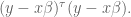
Now we appeal to an old calculus idea, namely that we can find the minimum of an upward-sloping function by locating where its derivative is zero.
Moreover, the derivative of 


Adding a prior on the variance, or penalizing large coefficients
There are various ways people go about adding a diagonal prior – and various ways people explain why they’re doing it. For the sake of simplicity I’ll use one “tuning parameter” for this prior, called 
In other words, we can think of trying to minimize the following more complicated sum:
Here the 
When we minimize this, we are simultaneously trying to find a “good fit” in the sense of a linear regression, and trying to find that good fit with small coefficients, since the sum on the right grows larger as the coefficients get bigger. The extent to which we care more about the first goal or the second is just a question about how large 

How do we minimize that guy? Same idea, where we rewrite it in vector form first:

Again, we set the derivative to zero and ignore the factor of 2 to get:

Since 
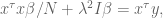

which of course can be rewritten as

If you have a prior on the actual values of the coefficents of
Next I want to talk about a slightly fancier version of the same idea, namely when you have some idea of what you think the coefficients of 

We vectorize as

Again, we set the derivative to zero and ignore the factor of 2 to get:

so we can conclude:

which can be rewritten as

Buying organic doesn’t make you better than me
There was a recent study published here which described how people who viewed organic foods with annoyingly self-righteous names actually behave more selfishly than people who viewed “comfort food” or other, bland categories of food. The abstract:
Recent research has revealed that specific tastes can influence moral processing, with sweet tastes inducing prosocial behavior and disgusting tastes harshening moral judgments. Do similar effects apply to different food types (comfort foods, organic foods, etc.)? Although organic foods are often marketed with moral terms (e.g., Honest Tea, Purity Life, and Smart Balance), no research to date has investigated the extent to which exposure to organic foods influences moral judgments or behavior. After viewing a few organic foods, comfort foods, or control foods, participants who were exposed to organic foods volunteered significantly less time to help a needy stranger, and they judged moral transgressions significantly harsher than those who viewed nonorganic foods. These results suggest that exposure to organic foods may lead people to affirm their moral identities, which attenuates their desire to be altruistic.
I read the original study (and also a hilarious post riffing on it from jezebel.com), and found it interesting that the experimenters at least claimed to be unsure of the outcome of the study in advance (although they did cite another study in which people were more likely to cheat and steal after purchasing “green” products).
Specifically, they thought one of two things could happen: that the sense of elevation cause by staring at the organic labels could make them feel like part of a larger community and therefore more willing to volunteer, or else the “moral piggybacking” on a perceived good deed (i.e. organic food is good for the environment) would make them feel like they’d already done enough, and be less likely to be nice. It turns out the latter.
[As an aside, another study cited was one in which people assumed there were fewer calories in chocolate which was described as “fair trade”, which explains something to me about why those kinds of labels are so popular and also so ripe for fraud.]
The results of this study resonates with me: ever since Whole Foods opened I’ve had the impression that the people shopping there thought they’d done enough for the world simply by paying too much for produce and not being able to buy Cheerios (a pet peeve of mine). Haven’t you noticed how rude Whole Foods shoppers are? I’d rather be in a Stop and Shop check-out line any day.
In other words, I’m going through a major case of confirmation bias here. I’ve been a huge skeptic about the organic food movement since it began when I was in college at Berkeley. I’ve challenged a whole bunch of my friends on this (yes I’m an asshole) and I’ve noticed there are essentially two camps. One camp defends organic as good for the environment, the other camp defends organic as more nutritious.
For the environmentalists, my argument is that local produce is better than California organic produce, given that it’s been shipped across the country. It seems silly to me to be able to purchase organic blueberries imported from somewhere instead of locally grown blueberries. In fact I’m not sure where there’s good evidence that organic, locally grown produce is better for the environment than just locally grown produce.
The other camp defends organic as more nutritious, but that really drives me completely nuts, because if you flip that around the message is that we can let the poor people eat the toxic vegetables while we rich people eat the healthy stuff. It’s crazy! If there really is toxicity in our standard produce, then this is a huge problem for the country and we need to address it directly, rather than making a certain class of very expensive food.
Stop, Question, and Frisk policy getting stopped, questioned, and frisked
I’m happy to see that Federal District Court Judge Shira A. Scheindlin has granted class-action status to a lawsuit filed in January 2008 by the Center for Constitutional Rights which challenged the New York Police Department’s stop-and-frisk tactics.
The practice has been growing considerably in the last few years by way of a quota system for officers: an estimated 300,000 people have been stopped and frisked in New York City so far this year.
From the New York Times article on the class-action lawsuit:
In granting class-action status to the case, which was filed in January 2008 by the Center for Constitutional Rights on behalf of four plaintiffs, the judge wrote that she was giving voice to the voiceless.
“The vast majority of New Yorkers who are unlawfully stopped will never bring suit to vindicate their rights,” Judge Scheindlin wrote.
The judge said the evidence presented in the case showed that the department had a “policy of establishing performance standards and demanding increased levels of stops and frisks” that has led to an exponential growth in the number of stops.
But the judge used her strongest language in condemning the city’s position that a court-ordered injunction banning the stop-and-frisk practice would represent “judicial intrusion” and could not “guarantee that suspicionless stops would never occur or would only occur in a certain percentage of encounters.”
Judge Scheindlin said the city’s attitude was “cavalier,” and added that “suspicionless stops should never occur.”
I feel pretty awesome about this progress, since I was the data wrangler on the Data Without Borders datadive weekend and worked with the NYCLU to examine Stop, Question, and Frisk data. Some of that analysis, I’m guessing, has helped give ammunition to people trying to stop the policy – here is the wiki we made that weekend, and here’s another post I wrote a few weeks later.
For example, if you look at this editorial from the New York Times from a few days ago, you see a similar kind of analysis:
Over time, the program has grown to alarming proportions. There were fewer than 100,000 stops in 2002, but the police department carried out nearly 700,000 in 2011 and appears to be on track to exceed that number this year. About 85 percent of those stops involved blacks and Hispanics, who make up only about half the city’s population. Judge Scheindlin said the evidence showed that the unlawful stops resulted from “the department’s policy of establishing performance standards and demanding increased levels of stops and frisks.”
She noted that police officers had conducted tens of thousands of clearly unlawful stops in every precinct of the city, and that in nearly 36 percent of stops in 2009, officers had failed to list an acceptable “suspected crime.” The police are required to have a reasonable suspicion to make a stop. Only 5.37 percent of all stops between 2004 and 2009, the period of data considered by the court, resulted in arrests, an indication that a vast majority of people stopped did nothing wrong. Judge Scheindlin rebuked the city for a “deeply troubling apathy toward New Yorkers’ most fundamental constitutional rights.” The message of this devastating ruling is clear: The city must reform its abusive stop-and-frisk policy.
Woohoo! This is a great example of data analysis where it’s actually used to protect people instead of exploit them, which is pretty rare. It’s also a cool example of how open source data has been used to probe shady practices- but note that there was a separate lawsuit to force the NYPD to open source this Stop, Question, and Frisk data. They did not do it willingly, and they still don’t have the first few years of it publicly available.
Here’s another thing we could do with such data. My friend Catalina and I were talking yesterday about one of the consequences of the Stop, Question, and Frisk data as follows. From a Time Magazine article on Trayvon Martin:
in the U.S., African Americans and whites take drugs at about the same rate, but black youth are twice as likely to be arrested for it and more than five times more likely to be prosecuted as an adult for drug crimes. In New York City, 87% of residents arrested under the police department’s “stop and frisk” policy are black or Hispanic.
I’d love to see a study that breaks this down in a kind of dual way. If you’re a NYC teenager walking down the street in your own neighborhood with a joint in your pocket, what are your chances of getting put in jail a) if you’re white, b) if you’re black, c) if you’re hispanic, or d) if you’re asian?
I think those numbers would really bring home the kind of policy that we’re dealing with here. Let’s see some grad student theses coming out of this data set.
VAM versus what?
A few astute readers pointed out to me that in the past few days I both slammed the Value-added teacher’s model (VAM) and complained about people who reject something without providing an alternative. Good point, and today I’d like to start that discussion.
What should we be doing instead of VAM?
First of all, I do think that not rating teachers at all is better than the current system. So my “compare the the status quo” argument goes through in this instance. Namely, VAM is actively discouraging teachers whereas leaving them alone entirely would neither discourage or encourage anyone. So better than this.
At the same time, I am a realist, and I think there should be, ultimately, a system of evaluating teachers, just as there is a system for evaluating me at work. The difference between my workplace, of 45 people, and the NYC public schools is scale. It makes sense to have a very large and consistent evaluation system in the NYC public schools, whereas my job can have an ad hoc inconsistent system without it being a problem.
There’s another problem which is nearly impossible to tease from this discussion. Namely, the fact that what’s going on in NYC is a disingenuous political game between Bloomberg and the teacher’s union. Just to emphasize how important that fight is, let’s keep in mind that as of now, although the union is much weaker than it historically has been, it still has the tenure system. So any model, VAM or not, of evaluation is somewhat irrelevant for “removing bad teachers” given that they have tenure and tenure still means something.
Probably the best way to decouple the “Bloomberg vs. union/tenure” issue (a massive one here in NYC) from the “VAM versus other” question is to think nationally rather than citywide.
The truth is, the VAM is being tried out all over the country (although I don’t have hard numbers on this) and the momentum is for it to be used more and more. I predict within 10 years it will be done systematically everywhere in the country.
And, sadly, that’s kind of my prediction whether or not the underlying model is any good or not! The truth is, there is a large contingent of technocrats who want control over the evaluation system and believe in the models, whether or not they are producing pure noise or not. In other words, they believe in “data driven decisioning” as a holy grail even though there’s scant evidence that this will work in schools. And they also don’t want to back down now, even though the model sucks, because they feel like they’ll be losing momentum on the overall data-driven approach.
One thing I know for sure is that we should continue to be aware of how badly the current models are, and I want to set up an open source version of the models (see this post to get an idea how it could work) to exhibit that. In other words, even if we don’t turn off the models altogether, can’t we at least minimize their importance while their quality is bad? The first step is to plainly exhibit how bad they are.
It’s hard for me to decide what to do next, though. I’m essentially a modeler who is hugely skeptical of models. In fact, I don’t think using purely quantitative models to evaluate teachers is the right thing to do, period. Yet I feel like if it’s definitely going to happen, better for people like me to be in the middle of it, pointing out how bad the proposed (or in use) models are actually performing, and improving them.
One thing I know I’d do if I were to be put in charge of creating a better model: I’d train on data where the teacher is actually rated as a good teacher or not. In other words, I wouldn’t proxy “good teacher” by “if your students scored better than expected on tests”. A good model would be trained on data where there would be an expert teacher scorer, who would go into 500 classrooms and carefully evaluate the actual teachers, based on things like whether the teacher asked questions, or got the kids engaged, or talked too much or too little, or imposed too much busy work, etc. Then the model would be trying to mimic this expert.
Of course there are lots of really complicated issues to sort out- and they are *totally unavoidable*. This is why I’m so skeptical of models, by the way: people think you can simplify stuff when you actually can’t. There’s nothing simple about teaching and whether someone’s a good teacher. It’s just plain complex. A simple model will be losing too much information.
Here’s one. Different people think good teaching is different. A possible solution: maybe we could have 5 different “expert models” based on different people’s definitions of good teaching, and every teacher could be evaluated based on every model. Still need to find those 5 experts that teachers trust.
Here’s another. The kind of teacher-specific attributes collected for this test would be different from the VAM- things that happen inside a classroom (like percentage of time teacher talks vs. student, the tone of the discussion, the number and percentage of kids involved in the discussion, etc,) and are harder to capture accurately. These are technological hurdles that are hard.
I think one of the most important questions is whether we can come up with an evaluation system that would be sufficiently reasonable and transparent that the teachers themselves would get on board.
I’d to hear more ideas.


