Archive
Minorities possible unfairly disqualified from opening bank accounts
My friend Frank Pasquale sent me this article over twitter, about New York State attorney general Eric T. Schneiderman’s investigation into possibly unfair practices by big banks using opaque and sometimes erroneous databases to disqualify people from opening accounts.
Not much hard information is given in the article but we know that negative reports stemming from the databases have effectively banished more than a million lower-income Americans from the financial system, and we know that the number of “underbanked” people in this country has grown by 10% since 2009. Underbanked people are people who are shut out of the normal banking system and have to rely on the underbelly system including check cashing stores and payday lenders.
I can already hear the argument of my libertarian friends: if I’m a bank, and I have reason to suspect you have messed up with your finances in the past, I don’t offer you services. Done and done. Oh, and if I’m a smart bank that figures out some of these so-called “past mistakes” are actually erroneously reported, then I make extra money by serving those customers that are actually good when they look bad. And the free market works.
Two responses to this. First, at this point big banks are really not private companies, being on the taxpayer dole. In response they should reasonably be expected to provide banking services to all of not most people as part of a service. Of course this is a temporary argument, since nobody actually likes the fact that the banks aren’t truly private companies.
The second, more interesting point – at least to me – is this. We care about and defend ourselves from our constitutional rights being taken away but we have much less energy to defend ourselves against good things not happening to us.
In other words, it’s not written into the constitution that we all deserve a good checking account, nor a good college education, nor good terms on a mortgage, and so on. Even so, in a large society such as ours, such things are basic ingredients for a comfortable existence. Yet these services are rare if not nonexistent for a huge and swelling part of our society, resulting in a degradation of opportunity for the poor.
The overall effect is heinous, and at some point does seem to rise to the level of a constitutional right to opportunity, but I’m no lawyer.
In other words, instead of only worrying about the truly bad things that might happen to our vulnerable citizens, I personally spend just as much time worrying about the good things that might not happen to our vulnerable citizens, because from my perspective lots of good things not happening add up to bad things happening: they all narrow future options.
Should lawmakers use algorithms?
Here is an idea I’ve been hearing floating around the big data/ tech community: the idea of having algorithms embedded into law.
The argument for is pretty convincing on its face: Google has gotten its algorithms to work better and better over time by optimizing correctly and using tons of data. To some extent we can think of their business strategies and rules as a kind of “internal regulation”. So why don’t we take a page out of that book and improve our laws and specifically our regulations with constant feedback loops and big data?
No algos in law
There are some concerns I have right off the bat about this concept, putting aside the hugely self-serving dimension of it.
First of all, we would be adding opacity – of the mathematical modeling kind – to an already opaque system of law. It’s hard enough to read the legalese in a credit card contract without there also being a black box algorithm to make it impossible.
Second of all, whereas the incentives in Google are often aligned with the algorithm “working better”, whatever that means in any given case, the incentives of the people who write laws often aren’t.
So, for example, financial regulation is largely written by lobbyists. If you gave them a new tool, that of adding black box algorithms, then you could be sure they would use it to further obfuscate what is already a hopelessly complicated set of rules, and on top of it they’d be sure to measure the wrong thing and optimize to something random that would not interfere with their main goal of making big bets.
Right now lobbyists are used so heavily in part because they understand the complexity of their industries more than the lawmakers themselves. In other words, they actually add value in a certain way (besides in the monetary way). Adding black boxes would emphasize this asymmetric information problem, which is a terrible idea.
Third, I’m worried about the “black box” part of algorithms. There’s a strange assumption among modelers that you have to make algorithms secret or else people will game them. But as I’ve said before, if people can game your model, that just means your model sucks, and specifically that your proxies are not truly behavior-based.
So if it pertains to a law against shoplifting, say, you can’t have an embedded model which uses the proxy of “looking furtive and having bulges in your clothes.” You actually need to have proof that someone stole something.
If you think about that example for a moment, it’s absolutely not appropriate to use poor proxies in law, nor is it appropriate to have black boxes at all – we should all know what our laws are. This is true for regulation as well, since it’s after all still law which affects how people are expected to behave.
And by the way, what counts as a black box is to some extent in the eye of the beholder. It wouldn’t be enough to have the source code available, since that’s only accessible to a very small subset of the population.
Instead, anyone who is under the expectation of following a law should also be able to read and understand the law. That’s why the CFPB is trying to make credit card contracts be written in Plain English. Similarly, regulation law should be written in a way so that the employees of the regulator in question can understand it, and that means you shouldn’t have to have a Ph.D. in a quantitative field and know python.
Algos as tools
Here’s where algorithms may help, although it is still tricky: not in the law itself but in the implementation of the law. So it makes sense that the SEC has algorithms trying to catch insider trading – in fact it’s probably the only way for them to attempt to catch the bad guys. For that matter they should have many more algorithms to catch other kinds of bad guys, for example to catch people with suspicious accounting or consistently optimistic ratings.
In this case proxies are reasonable, but on the other hand it doesn’t translate into law but rather into a ranking of workflow for the people at the regulatory agency. In other words the SEC should use algorithms to decide which cases to pursue and on what timeframe.
Even so, there are plenty of reasons to worry. One could view the “Stop & Frisk” strategy in New York as following an algorithm as well, namely to stop young men in high-crime areas that have “furtive motions”. This algorithm happens to single out many innocent black and latino men.
Similarly, some of the highly touted New York City open data projects amount to figuring out that if you focus on looking for building code violations in high-crime areas, then you get a better hit rate. Again, the consequence of using the algorithm is that poor people are targeted at a higher rate for all sorts of crimes (key quote from the article: “causation is for other people”).
Think about this asymptotically: if you live in a nice neighborhood, the limited police force and inspection agencies never check you out since their algorithms have decided the probability of bad stuff happening is too low to bother. If, on the other hand, you are poor and live in a high-crime area, you get checked out daily by various inspectors, who bust you for whatever.
Said this way, it kind of makes sense that white kids smoke pot at the same rate as black kids but are almost never busted for it.
There are ways to partly combat this problem, as I’ve described before, by using randomization.
Conclusion
It seems to me that we can’t have algorithms directly embedded in laws, because of the highly opaque nature of them together with commonly misaligned incentives. They might be useful as tools for regulators, but the regulators who choose to use internal algorithms need to carefully check that their algorithms don’t have unreasonable and biased consequences, which is really hard.
Educational accountability scores get politically manipulated again
My buddy Jordan Ellenberg just came out with a fantastic piece in Slate entitled “The Case of the Missing Zeroes: An astonishing act of statistical chutzpah in the Indiana schools’ grade-changing scandal.”
Here are the leading sentences of the piece:
Florida Education Commissioner Tony Bennett resigned Thursday amid claims that, in his former position as superintendent of public instruction in Indiana, he manipulated the state’s system for evaluating school performance. Bennett, a Republican who created an A-to-F grading protocol for Indiana schools as a way to promote educational accountability, is accused of raising the mark for a school operated by a major GOP donor.
Jordan goes on to explain exactly what happened and how that manipulation took place. Turns out it was a pretty outrageous and easy-to-understand lie about missing zeroes which didn’t make any sense. You should read the whole thing, Jordan is a great writer and his fantasy about how he would deal with a student trying the same scam in his calculus class is perfect.
A few comments to make about this story overall.
- First of all, it’s another case of a mathematical model being manipulated for political reasons. It just happens to be a really simple mathematical model in this case, namely a weighted average of scores.
- In other words, the lesson learned for corrupt politicians in the future may well to be sure the formulae are more complicated and thus easier to game.
- Or in other words, let’s think about other examples of this kind of manipulation, where people in power manipulate scores after the fact for their buddies. Where might it be happening now? Look no further than the Value-Added Model for teachers and schools, which literally nobody understands or could prove is being manipulated in any given instance.
- Taking a step further back, let’s remind ourselves that educational accountability models in general are extremely ripe for gaming and manipulation due to their high stakes nature. And the question of who gets the best opportunity to manipulate their scores is, as shown in this example of the GOP-donor-connected school, often a question of who has the best connections.
- In other words, I wonder how much the system can be trusted to give us a good signal on how well schools actually teach (at least how well they teach to the test).
- And if we want that signal to be clear, maybe we should take away the high stakes and literally measure it, with no consequences. Then, instead of punishing schools with bad scores, we could see how they need help.
- The conversation doesn’t profit from our continued crazy high expectations and fundamental belief in the existence of a silver bullet, the latest one being the Kipp Charter Schools – read this reality check if you’re wondering what I’m talking about (hat tip Jordan Ellenberg).
- As any statistician could tell you, any time you have an “educational experiment” involving highly motivated students, parents, and teachers, it will seem like a success. That’s called selection bias. The proof of the pudding lies in the scaling up of the method.
- We need to think longer term and consider how we’re treating good teachers and school administration who have to live under arbitrary and unfair systems. They might just leave.
Analyzing the complexity of the Stacks Project graphs
So yesterday I told you about the cool new visualizations now available on Johan’s Stack Project.
But how do we use these visualizations to infer something about either mathematics or, at the very least, the way we think about mathematics? Here’s one way we thought of with Pieter.
So, there’s a bunch of results, and each of them has its own subgraph of the entire graph which positions that result as the “base node” and shows all the other results which it logically depends on.
And each of those graphs has structure and attributes, the stupidest two of which are the just counts of the nodes and edges. So for each result, we have an ordered pair (#nodes, #edges). What can we infer about mathematics from these pairs?
Here’s a scatter plot of the nodes-vs-edges for each of the 10,445 results (email me if you want to play with this data yourself):
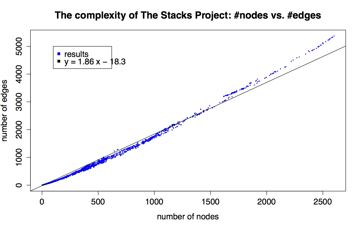
I also put a best-fit line in, just to illustrate that the scatter plot is super linear but not perfectly linear.
So there are a bunch of comments I can make about this, but I’ll limit myself to the following:
- There are a lot of points at (1,0), corresponding to remarks, axioms, beginning lemmas, definitions, and tags for sections.
- As a data person, let me just say that data is never this clean. There’s something going on, some internal structure to these graphs that we should try to understand.
- By “clean” I’m not exactly referring to the fact that things look pretty linear, although that’s weird and we should think about that. What I really mean is that things are so close to the curve that is being approximated. They’re all within a very tight border of this imaginary line. It’s super amazing.
- Let’s pretend it’s just plain straight. Does that make sense, that as graphs get more complex the edges don’t get more dense than some multiple (1.86) of of the number of nodes?
- Kind of: remember, we don’t depict all logical dependency edges, just the ones that are directly referred to in the proof of a result. So right off the bat you are less surprised that the edges aren’t growing quadratically in the number of nodes, even though the number of possible edges is of course quadratic in the number of nodes.
- Think about it this way: assume that every result that requires proof (so, that’s not a (1,0) result) refers to exactly 2 other results in its proof. Then those two child results each correspond to some subgraph of the entire graph, and say their subgraphs each have something like twice as many edges as nodes. Then, ignoring overlap, we’d see two graphs with a 2:1 ratio, then we’d see that parent node, plus two edges leading to each result, which is also a 2:1 ratio, and the disjoint union of all those graphs gives us a large graph with a 2:1 ratio.
- Then if you imagine now allowing the overlap, the ratio goes down a bit on average. In this toy model, the discrepancy between 2.0 and the slope we actually see, 1.86, is a measurement of the collapse of the two child graphs, which can be taken as a proxy for how much the two supporting results overlap as notions.
- Of course, not every result has exactly two children.
- Plus it doesn’t really explain how ridiculously consistent the plot above is. What would?
- If you think about it, the only real explanation of the consistency above is my husband brain.
- In other words, he’s humming along, thinking about stacks, and at some point, when he thinks things have gotten complicated enough, he says to himself “It’s time to wrap this stuff up and call it a result!” and then he does so. That moment, when he’s decided things are getting complicated enough, is very consistent internally to his brain.
- In other words, if someone else created the stacks project, I’d expect to see another kind of plot, possibly also very consistent, but possibly with a different slope.
- Also it’d be interesting to compare this plot to another kind of citation network graph, like the papers in the arXiv. Has anyone made that?
The Stacks Project gets ever awesomer with new viz
Crossposted on Not Even Wrong.
Here’s a completely biased interview I did with my husband A. Johan de Jong, who has been working with Pieter Belmans on a very cool online math project using d3js. I even made up some of his answers (with his approval).
Q: What is the Stacks Project?
A: It’s an open source textbook and reference for my field, which is algebraic geometry. It builds foundations starting from elementary college algebra and going up to algebraic stacks. It’s a self-contained exposition of all the material there, which makes it different from a research textbook or the experience you’d have reading a bunch of papers.
We were quite neurotic setting it up – everything has a proof, other results are referenced explicitly, and it’s strictly linear, which is to say there’s a strict ordering of the text so that all references are always to earlier results.
Of course the field itself has different directions, some of which are represented in the stacks project, but we had to choose a way of presenting it which allowed for this idea of linearity (of course, any mathematician thinks we can do that for all of mathematics).
Q: How has the Stacks Project website changed?
A: It started out as just a place you could download the pdf and tex files, but then Pieter Belmans came on board and he added features such as full text search, tag look-up, and a commenting system. In this latest version, we’ve added a whole bunch of features, but the most interesting one is the dynamic generation of dependency graphs.
We’ve had some crude visualizations for a while, and we made t-shirts from those pictures. I even had this deal where, if people found mathematical mistakes in the Stacks Project, they’d get a free t-shirt, and I’m happy to report that I just last week gave away my last t-shirt. Here’s an old picture of me with my adorable son (who’s now huge).

Q: Talk a little bit about the new viz.
A: First a word about the tags, which we need to understand the viz.
Every mathematical result in the Stacks Project has a “tag”, which is a four letter code, and which is a permanent reference for that result, even as other results are added before or after that one (by the way, Cathy O’Neil figured this system out).
The graphs show the logical dependencies between these tags, represented by arrows between nodes. You can see this structure in the above picture already.
So for example, if tag ABCD refers to Zariski’s Main Theorem, and tag ADFG refers to Nakayama’s Lemma, then since Zariski depends on Nakayama, there’s a logical dependency, which means the node labeled ABCD points to the node labeled ADFG in the entire graph.
Of course, we don’t really look at the entire graph, we look at the subgraph of results which a given result depends on. And we don’t draw all the arrows either, we only draw the arrows corresponding to direct references in the proofs. Which is to say, in the subgraph for Zariski, there will be a path from node ABCD to node ADFG, but not necessarily a direct link.
Q: Can we see an example?
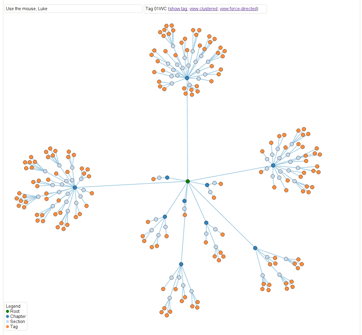
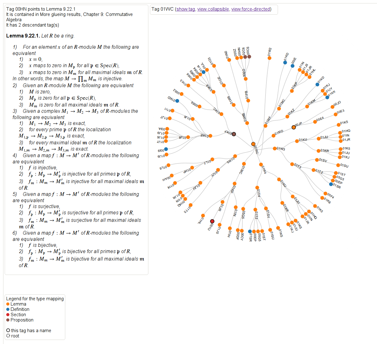
Let’s move to an example for result 01WC, which refers to the proof that “a locally projective morphism is proper”.
First, there are two kinds of heat maps. Here’s one that defines distance as the maximum (directed) distance from the root node. In other words, how far down in the proof is this result needed? In this case the main result 01WC is bright red with a black dotted border, and any result that 01WC depends on is represented as a node. The edges are directed, although the arrows aren’t drawn, but you can figure out the direction by how the color changes. The dark blue colors are the leaf nodes that are farthest away from the root.
Another way of saying this is that the redder results are the results that are closer to it in meaning and sophistication level.
Note if we had defined the distance as the minimum distance from the root node (to come soon hopefully), then we’d have a slightly different and also meaningful way of thinking about “redness” as “relevance” to the root node.
This is a screenshot but feel free to play with it directly here. For all of the graphs, hovering over a result will cause the statement of the result to appear, which is awesome.
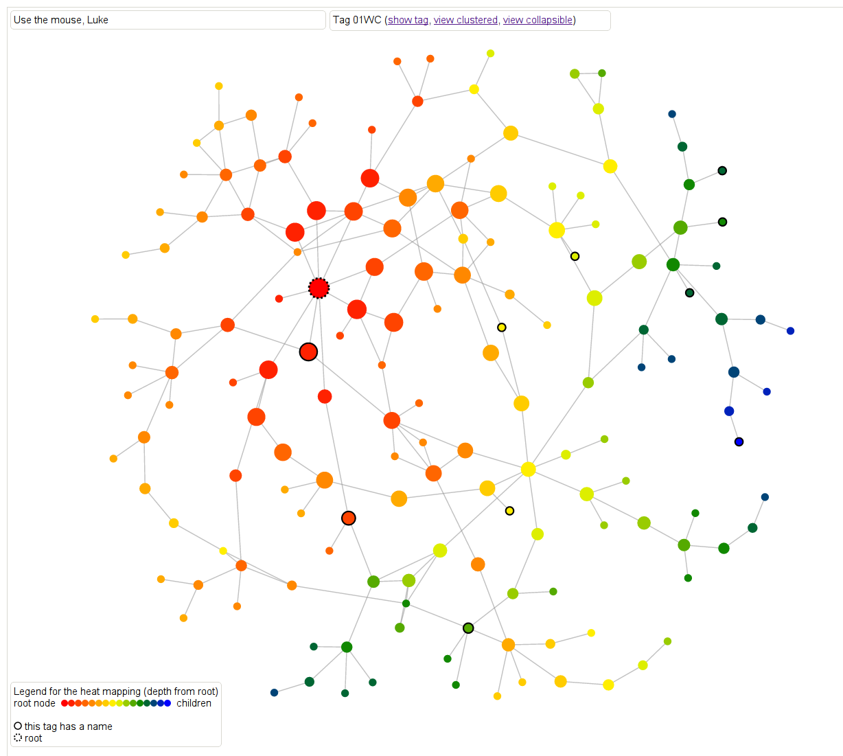
Next, let’s look at another kind of heat map where the color is defined as maximum distance from some leaf note in the overall graph. So dark blue nodes are basic results in algebra, sheaves, sites, cohomology, simplicial methods, and other chapters. The link is the same, you can just toggle between the different metric.

Next we delved further into how results depend on those different topics. Here, again for the same result, we can see the extent to which that result depends on the different on results from the various chapters. If you scroll over the nodes you can see more details. This is just a screenshot but you can play with it yourself here and you can collapse it in various ways corresponding to the internal hierarchy of the project.
Finally, we have a way of looking at the logical dependency graph directly, where result node is labeled with a tag and colored by “type”: whether it’s a lemma, proposition, theorem, or something else, and it also annotates the results which have separate names. Again a screenshot but play with it here, it rotates!
Check out the whole project here, and feel free to leave comments using the comment feature!
PyData talk today
Not much time because I’m giving a keynote talk at the PyData 2013 conference in Cambridge today, which is being held at the Microsoft NERD conference center.
It’s gonna be videotaped so I’ll link to that when it’s ready.
My title is “Storytelling With Data” but for whatever reason on the schedule handed out yesterday the name had been changed to “Scalable Storytelling With Data”. I’m thinking of addressing this name change in my talk – one of the points of the talk, in fact, is that with great tools, we don’t need to worry too much about the scale.
Plus since it’s Sunday morning I’m going to make an effort to tie my talk into an old testament story, which is totally bizarre since I’m not at all religious but for some reason it feels right. Please wish me luck.
Proprietary credit score model now embedded in law
I’ve blogged before about how I find it outrageous that the credit scoring models are proprietary, considering the impact they have on so many lives.
The argument given for keeping them secret is that otherwise people would game the models, but that really doesn’t make sense.
After all, the models that the big banks have to deal with through regulation aren’t secret, and they game those models all the time. It’s one of the main functions of the banks, in fact, to figure out how to game the models. So either we don’t mind gaming or we don’t hold up our banks to the same standards as our citizens.
Plus, let’s say the models were open and people started gaming the credit score models – what would that look like? A bunch of people paying their electricity bill on time?
Let’s face it: the real reason the models are secret is that the companies who set them up make more money that way, pretending to have some kind of secret sauce. What they really have, of course, is a pretty simple model and access to an amazing network of up-to-date personal financial data, as well as lots of clients.
Their fear is that, if their model gets out, anyone could start a credit scoring agency, but actually it wouldn’t be so easy – if I wanted to do it, I’d have to get all that personal data on everyone. In fact, if I could get all that personal data on everyone, including the historical data, I could easily build a credit scoring model.
So anyhoo, it’s all about money, that and the fact that we’re living under the assumption that it’s appropriate for credit scoring companies to wield all this power over people’s lives, including their love lives.
It’s like we have a secondary system of secret laws where we don’t actually get to see the rules, nor do we get to point out mistakes or reasonably refute them. And if you’re thinking “free credit report,” let’s be clear that that only tells you what data goes in to the model, it doesn’t tell you how it’s used.
As it turns out, though, it’s now more than like a secondary system of laws – it’s become embedded in our actual laws. Somehow the proprietary credit scoring company Equifax is now explicitly part of our healthcare laws. From this New York Times article (hat tip Matt Stoller):
Federal officials said they would rely on Equifax — a company widely used by mortgage lenders, social service agencies and others — to verify income and employment and could extend the initial 12-month contract, bringing its potential value to $329.4 million over five years.
Contract documents show that Equifax must provide income information “in real time,” usually within a second of receiving a query from the federal government. Equifax says much of its information comes from data that is provided by employers and updated each payroll period.
Under the contract, Equifax can use sources like credit card applications but must develop a plan to indicate the accuracy of data and to reduce the risk of fraud.
Thanks Equifax, I guess we’ll just trust you on all of this.
Math fraud in pensions
I wrote a post three months ago talking about how we don’t need better models but we need to stop lying with our models. My first example was municipal debt and how various towns and cities are in deep debt partly because their accounting for future pension obligations allows them to be overly optimistic about their investments and underfund their pension pots.
This has never been more true than it is right now, and as this New York Times Dealbook article explains, was a major factor in Detroit’s bankruptcy filing this past week. But don’t make any mistake: even in places where they don’t end up declaring bankruptcy, something is going to shake out because of these broken models, and it isn’t going to be extra money for retired civil servants.
It all comes down to wanting to avoid putting required money away and hiring quants (in this case actuaries) to make that seem like it’s mathematically acceptable. It’s a form of mathematical control fraud. From the article:
When a lender calculates the value of a mortgage, or a trader sets the price of a bond, each looks at the payments scheduled in the future and translates them into today’s dollars, using a commonplace calculation called discounting. By extension, it might seem that an actuary calculating a city’s pension obligations would look at the scheduled future payments to retirees and discount them to today’s dollars.
But that is not what happens. To calculate a city’s pension liabilities, an actuary instead projects all the contributions the city will probably have to make to the pension fund over time. Many assumptions go into this projection, including an assumption that returns on the investments made by the pension fund will cover most of the plan’s costs. The greater the average annual investment returns, the less the city will presumably have to contribute. Pension plan trustees set the rate of return, usually between 7 percent and 8 percent.
In addition, actuaries “smooth” the numbers, to keep big swings in the financial markets from making the pension contributions gyrate year to year. These methods, actuarial watchdogs say, build a strong bias into the numbers. Not only can they make unsustainable pension plans look fine, they say, but they distort the all-important instructions actuaries give their clients every year on how much money to set aside to pay all benefits in the future.
One caveat: if the pensions have actually been making between 7 percent and 8 percent on their investments every year then all is perhaps well. But considering that they typically invest in bonds, not stocks – which is a good thing – we’re likely seeing much smaller returns than that, which means their yearly contributions to the local pension plans are in dire straits.
What’s super interesting about this article is that it goes into the action on the ground inside the Actuary community, since their reputations are at stake in this battle:
A few years ago, with the debate still raging and cities staggering through the recession, one top professional body, the Society of Actuaries, gathered expert opinion and realized that public pension plans had come to pose the single largest reputational risk to the profession. A Public Plans Reputational Risk Task Force was convened. It held some meetings, but last year, the matter was shifted to a new body, something called the Blue Ribbon Panel, which was composed not of actuaries but public policy figures from a number of disciplines. Panelists include Richard Ravitch, a former lieutenant governor of New York; Bradley Belt, a former executive director of the Pension Benefit Guaranty Corporation; and Robert North, the actuary who shepherds New York City’s five big public pension plans.
I’m not sure what happened here, but it seems like a bunch of people in a profession, the actuaries, got worried that they were being used by politicians, and decided to investigate, but then that initiative got somehow replaced by a bunch of politicians. I’d love to talk to someone on the inside about this.
The Stop and Frisk sleight of hand
I’m finishing up an essay called “On Being a Data Skeptic” in which I catalog different standard mistakes people make with data – sometimes unintentionally, sometimes intentionally.
It occurred to me, as I wrote it, and as I read the various press conferences with departing mayor Bloomberg and Police Commissioner Raymond Kelly when they addressed the Stop and Frisk policy, that they are guilty of making one of these standard mistakes. Namely, they use a sleight of hand with respect to the evaluation metric of the policy.
Recall that an evaluation metric for a model is the way you decide whether the model works. So if you’re predicting whether someone would like a movie, you should go back and check whether your recommendations were good, and revise your model if not. It’s a crucial part of the model, and a poor choice for it can have dire consequences – you could end up optimizing to the wrong thing.
[Aside: as I’ve complained about before, the Value Added Model for teachers doesn’t have an evaluation method of record, which is a very bad sign indeed about the model. And that’s a Bloomberg brainchild as well.]
So what am I talking about?
Here’s the model: stopping and frisking suspicious-looking people in high-crime areas will improve the safety and well-being of the city as a whole.
Here’s Bloomberg/Kelly’s evaluation method: the death rate by murder has gone down in New York during the policy. However, that rate is highly variable and depends just as much on whether there’s a crack epidemic going on as anything else. Or maybe it’s improved medical care. Truth is people don’t really know. In any case ascribing credit for the plunging death rate to Stop and Frisk is a tenuous causal argument. Plus since Stop and Frisk events have decreased drastically recently, we haven’t seen the murder rate shoot up.
Here’s another possible evaluation method: trust in the police. And considering that 400,000 innocent black and Latino New Yorkers were stopped last year under this policy (here are more stats), versus less than 50,000 whites, and most of them were young men, it stands to reason that the average young minority male feels less trust towards police than the average young white male. In fact, this is an amazing statistic put together by the NYCLU from 2011:
The number of stops of young black men exceeded the entire city population of young black men (168,126 as compared to 158,406).
If I’m a black guy I have an expectation of getting stopped and frisked at least once per year. How does that make me trust cops?
Let’s choose an evaluation method closer to what we can actually control, and let’s optimize to it.
Update: a guest columnist fills in for David Brooks, hopefully not for the last time, and gives us his take on Kelly, Obama, and racial profiling.
Money in politics: the BFF project
This is a guest post by Peter Darche, an engineer at DataKind and recent graduate of NYU’s ITP program. At ITP he focused primarily on using personal data to improve personal social and environmental impact. Prior to graduate school he taught in NYC public schools with Teach for America and Uncommon Schools.
We all ‘know’ that money influences the way congressmen and women legislate; at least we certainly believe it does. According to poll conducted by law professor Larry Lessig for his book Republic Lost, 75% of respondents (Republican and Democrat) said that ‘money buys results in Congress.’
And we have good reason to believe so. With astronomical sums of campaign money flowing into the system and costly, public-welfare reducing legislation coming out, it’s the obvious explanation.
But what does that explanation really tell us? Yes, a congresswoman’s receiving millions dollars from an industry then voting with that industry’s interests reeks of corruption. But, when that industry is responsible for 80% of her constituents’ jobs the causation becomes much less clear and the explanation much less informative.
The real devil is in the details. It is in the ways that money has shaped her legislative worldview over time and in the small, particular actions that tilt her policy one way rather than another.
In the past finding these many and subtle ways would have taken a herculean effort: untold hours collecting campaign contributions, voting records, speeches, and so on. Today however, due to the efforts of organizations like the Sunlight Foundation and Center for Responsive Politics, this information is online and programmatically accessible; you can write a few lines of code and have a computer gather it all for you.
The last few months Cathy O’Neil, Lee Drutman (a Senior Fellow at the Sunlight Foundation), myself and others have been working on a project that leverages these data sources to attempt to unearth some of these particular facts. By connecting all the avenues by which influence is exerted on the legislative process to the actions taken by legislators, we’re hoping to find some of the detailed ways money changes behavior over time.
The ideas is this: first, find and aggregate what data exists related to the ways influence can be exerted on the legislative process (data on campaign contributions, lobbying contributions, etc), then find data that might track influence manifesting itself in the legislative process (bill sponsorships, co-sponsorships, speeches, votes, committee memberships, etc). Finally, connect the interest group or industry behind the influence to the policies and see how they change over time.
One immediate and attainable goal for this project, for example, is to create an affinity score between legislators and industries, or in other words a metric that would indicate the extent to which a given legislator is influenced by and acts in the interest of a given industry.
So far most of our efforts have focused on finding, collecting, and connecting the records of influence and legislative behavior. We’ve pulled in lobbying and campaign contribution data, as well as sponsored legislation, co-sponsored legislation, speeches and votes. We’ve connected the instances of influence to legislative actions for a given legislator and visualized it on a timeline showing the entirety of a legislator’s career.
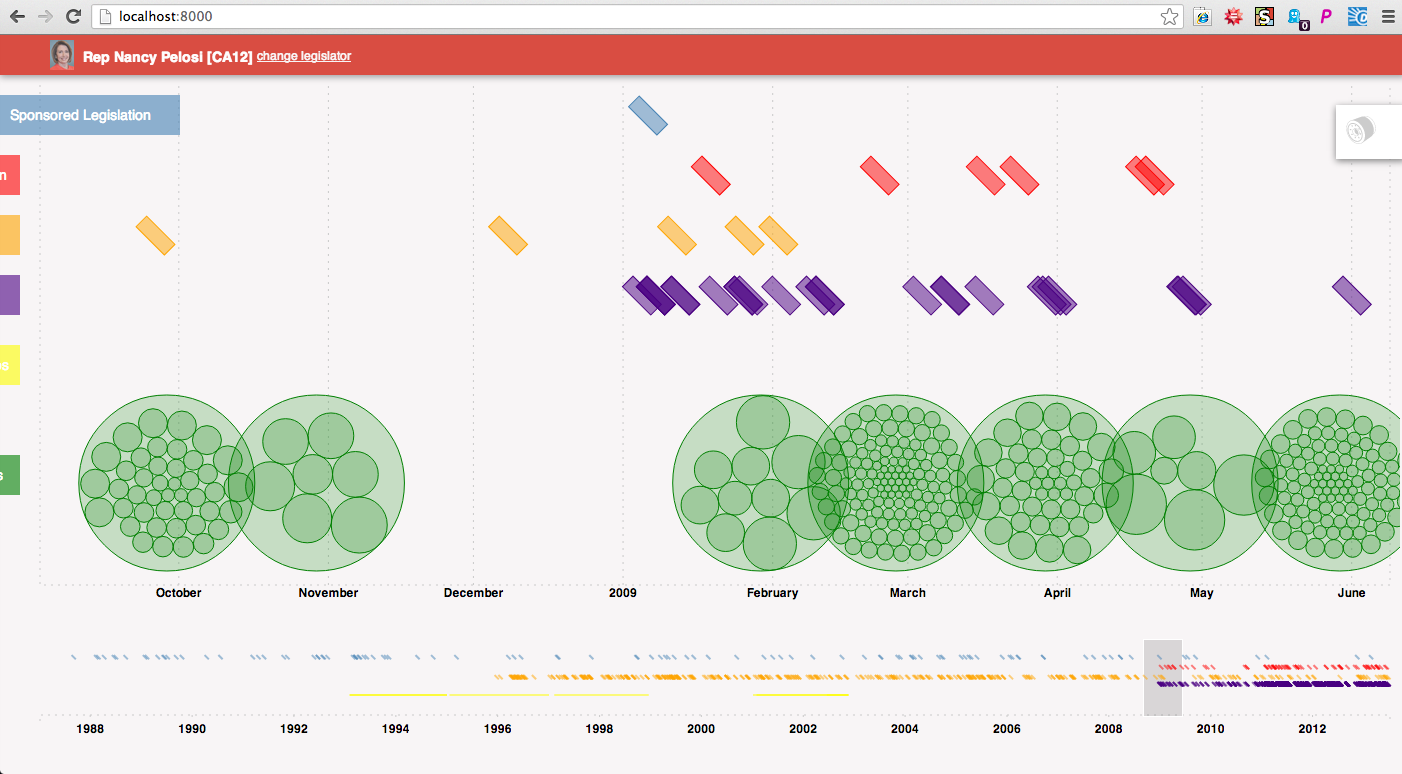
Here’s an example of how one might use the timeline. The example below is of Nancy Pelosi’s career. Each green circle represents a campaign contribution she received, and is grouped within a larger circle by the month it was recorded by the FEC. Above are colored rectangles representing legislative actions she took during the time-period in focus (indigo are votes, orange speeches, red co-sponsored bills, blue sponsored bills). Some of the green circles are highlighted because the events have been filtered for connection to health professionals.
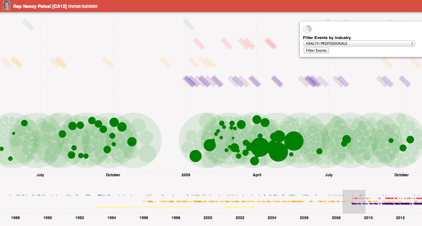
Changing the filter to Health Services/HMOs, we see different contributions coming from that industry as well as a co-sponsored bill related to that industry.
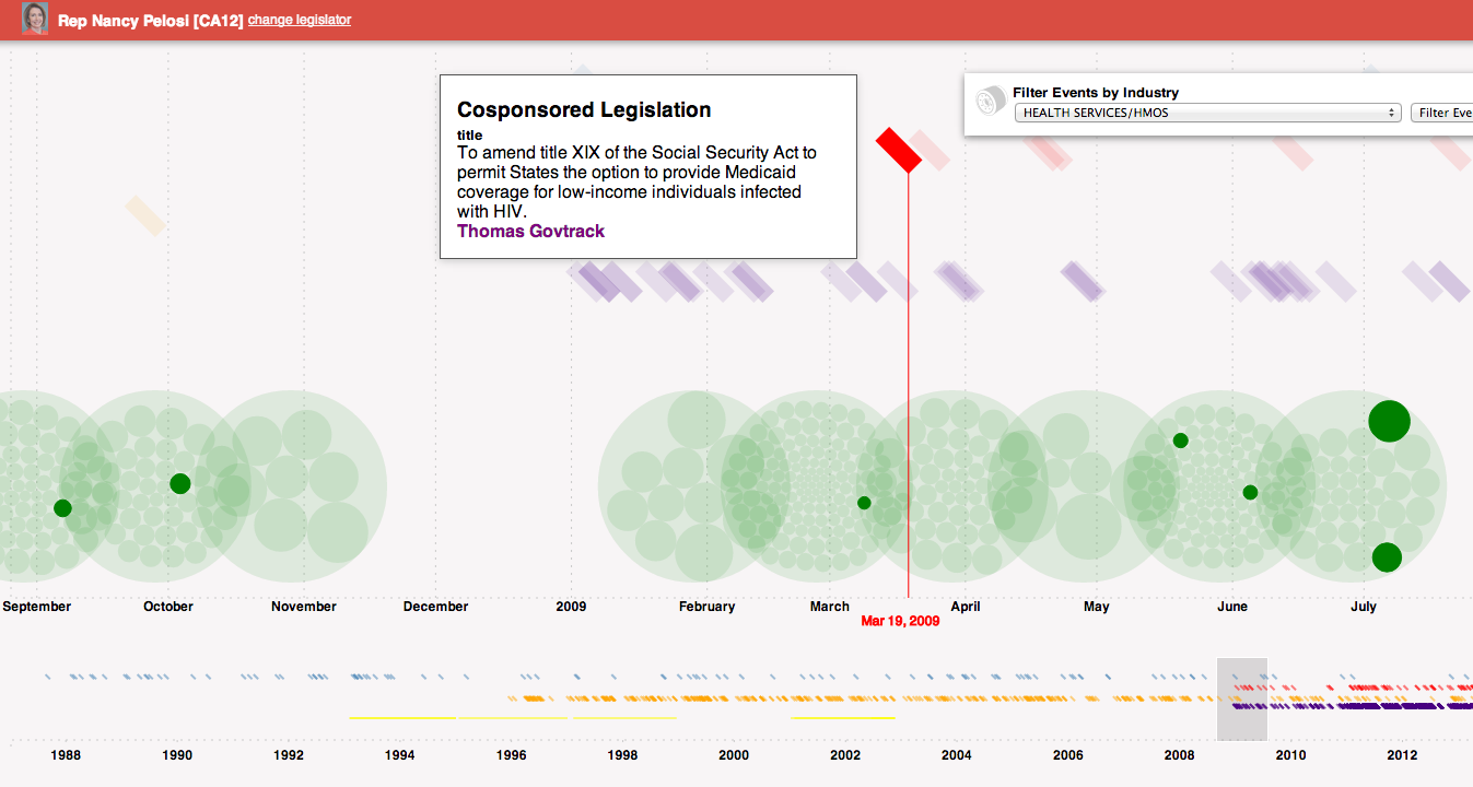
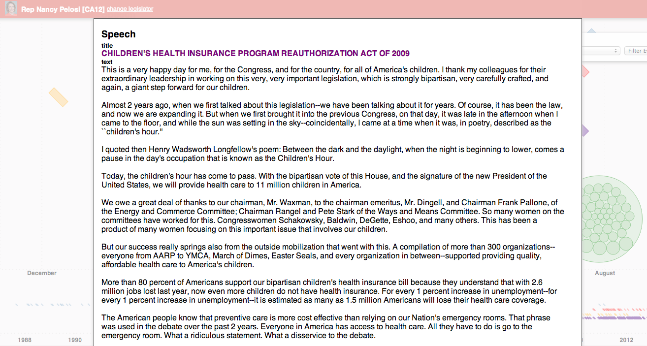
Mousing over the bill indicates its a proposal to amend the Social Security act to provide Medicaid coverage to low-income individuals with HIV. Further, looking around at speeches, one can see a relevant speech about the children’s health insurance. Clicking on the speech reveals the text.
By combining data about various events, and allowing users to filter and dive into them, we’re hoping to leverage our natural pattern-seeking capabilities to find specific hypotheses to test. Once an interesting pattern has been found, the tool would allow one to download the data and conduct analyses.
Again, It’s just start, and the timeline and other project related code are internal prototypes created to start seeing some of the connections. We wanted to open it up to you all though to see what you all think and get some feedback. So, with it’s pre-alphaness in mind, what do you think about the project generally and the timeline specifically? What works well – helps you gain insights or generate hypotheses about the connection between money and politics – and what other functionality would you like to see?
The demo version be found here with data for the following legislators:
- Nancy Pelosi
- John Boehner
- Cathy McMorris Rodgers
- John Boehner
- Eric Cantor
- James Lankford
- John Cornyn
- Nancy Pelosi
- James Clyburn
- Kevin McCarthy
- Steny Hoyer
Note: when the timeline is revealed, click and drag over content at the bottom of the timeline to reveal the focus events.
THIS REQUIRES YOUR MOCKERY
My title today is the subject line of a message I received from my buddy Jordan Ellenberg. Thanks for making things so easy for me to blog this morning, Jordan!
So here’s the subject: a Silicon Valley entrepreneur’s self-help book, including advice on how to quantify and measure your sex life, among other things – every other thing, in fact.
Just in case you’ve missed it, there’s a movement afoot among certain people to collect data about themselves on the level of heart rate, daily exercise and eating patterns, and the like, with the goal of self-improvement.
It’s got a name – the Quantified Self movement – and if I haven’t mentioned it before, it’s because honestly, it’s too easy, and I generally speaking like a challenge.
I saw a bunch of these guys at the health analytics conference I went to a couple of months ago, and let me tell you, they’re weird, and they know it, and they don’t care.
They honestly feel sorry for people who don’t have a Ironman Triathlon (or four) to train for via wireless excel spreadsheets. I mean, how do those people know whether they’ve actually improved? How do they know if they’ve eaten enough carbs? How do they know if they’ve slept??
As far as these Quantified Selfers (QSers) are concerned, it’s only a matter of time before everyone is, like them, making themselves perfect, and they’re the vanguard with nothing to be defensive about.
So anyhoo, those QS guys are convinced that they’re accomplishing something with all of their number collecting and crunching, like maybe they’ll live forever or something (after curing cancer), and they’re just so douchey I feel sorry for them. Blogging about them and trashing them would be like a mean older kid in the playground telling a bunch of little kids that there’s no Santa Claus.
Why do that? Why pop their bubble?
Here’s why: it’s just plain fun, especially now that they’ve ventured into sexy territory with their spreadsheets.
Here are a couple of questions for the Quantified Sexual Selfers (QSSers) in the audience, please get back to me.
- Yes or no: nothing says “hot ‘n’ steamy” like a fitbit readout of historical orgasms.
- Where does the sensor band get attached, and does it come with a vibrating option?
- Are your orgasms more satisfying before or after syncing your daily data with Stephen Wolfram’s?
- What’s your metric of success, and how do you know your girlfriend ain’t gaming the system?
On being a data science skeptic: due out soon
A few months ago, at the end of January, I wrote a post about Bill Gates naive views on the objectivity of data. One of the commenters, “CitizensArrest,” asked me to take a look at a related essay written by Susan Webber entitled “Management’s Great Addiction: It’s time we recognized that we just can’t measure everything.”
Webber’s essay is really excellent, not to mention impressively prescient considering it was published in 2006, before the credit crisis. The format of the essay is simple: it brings up and explains various dangers in the context of measurement and modeling of business data, and calls for finding a space in business for skepticism. What an idea! Imagine if that had actually happened in finance when it should have back in 2006.
Please go read her essay, it’s short.
Recently, when O’Reilly asked me to write an essay, I thought back to this short piece and decided to use it as a template for explaining why I think there’s a just-as-desperate need for skepticism in 2013 here in the big data world as there was back then in finance.
Whereas most of Webber’s essay talks about people blindly accepting numbers as true, objective, precise, and important, and the related tragic consequences, I’ve added a small wrinkle to this discussion. Namely, I also devote concern over the people who underestimate the power of data.
Most of this disregard for unintended consequences is blithe and unintentional (and some of it isn’t), but even so it can be hugely damaging, especially to the individuals being modeled: think foreclosed homes due to crappy housing-related models in the past, and think creepy models and the death spiral of modeling for the present and future.
Anyhoo, I’m actively writing it now, and it’ll be coming out soon. Stay tuned!
Measuring Up by Daniel Koretz
This is a guest post by Eugene Stern.
Now that I have kids in school, I’ve become a lot more familiar with high-stakes testing, which is the practice of administering standardized tests with major consequences for students who take them (you have to pass to graduate), their teachers (who are often evaluated based on standarized test results), and their school districts (state funding depends on test results). To my great chagrin, New Jersey, where I live, is in the process of putting such a teacher evaluation system in place (for a lot more detail and criticism, see here).
The excellent John Ewing pointed me to a pretty comprehensive survey of standardized testing called “Measuring Up,” by Harvard Ed School prof Daniel Koretz, who teaches a course there about this stuff. If you have any interest in the subject, the book is very much worth your time. But in case you don’t get to it, or just to whet your appetite, here are my top 10 takeaways:
-
Believe it or not, most of the people who write standardized tests aren’t idiots. Building effective tests is a difficult measurement problem! Koretz makes an analogy to political polling, which is a good reminder that a test result is really a sample from a distribution (if you take multiple versions of a test designed to measure the same thing, you won’t do exactly the same each time), and not an absolute measure of what someone knows. It’s also a good reminder that the way questions are phrased can matter a great deal.
-
The reliability of a test is inversely related to the standard deviation of this distribution: a test is reliable if your score on it wouldn’t vary very much from one instance to the next. That’s a function of both the test itself and the circumstances under which people take it. More reliability is better, but the big trade-off is that increasing the sophistication of the test tends to decrease reliability. For example, tests with free form answers can test for a broader range of skills than multiple choice, but they introduce variability across graders, and even the same person may grade the same test differently before and after lunch. More sophisticated tasks also take longer to do (imagine a lab experiment as part of a test), which means fewer questions on the test and a smaller cross-section of topics being sampled, again meaning more noise and less reliability.
-
A complementary issue is bias, which is roughly about people doing better or worse on a test for systematic reasons outside the domain being tested. Again, there are trade-offs: the more sophisticated the test, the more extraneous skills beyond those being tested it may be bringing in. One common way to weed out such questions is to look at how people who score the same on the overall test do on each particular question: if you get variability you didn’t expect, that may be a sign of bias. It’s harder to do this for more sophisticated tests, where each question is a bigger chunk of the overall test. It’s also harder if the bias is systematic across the test.
-
Beyond the (theoretical) distribution from which a single student’s score is a sample, there’s also the (likely more familiar) distribution of scores across students. This depends both on the test and on the population taking it. For example, for many years, students on the eastern side of the US were more likely to take the SAT than those in the west, where only students applying to very selective eastern colleges took the test. Consequently, the score distributions were very different in the east and the west (and average scores tended to be higher in the west), but this didn’t mean that there was bias or that schools in the west were better.
-
The shape of the score distribution across students carries important information about the test. If a test is relatively easy for the students taking it, scores will be clustered to the right of the distribution, while if it’s hard, scores will be clustered to the left. This matters when you’re interpreting results: the first test is worse at discriminating among stronger students and better at discriminating among weaker ones, while the second is the reverse.
-
The score distribution across students is an important tool in communicating results (you may not know right away what a score of 600 on a particular test means, but if you hear it’s one standard deviation above a mean of 500, that’s a decent start). It’s also important for calibrating tests so that the results are comparable from year to year. In general, you want a test to have similar means and variances from one year to the next, but this raises the question of how to handle year-to-year improvement. This is particularly significant when educational goals are expressed in terms of raising standardized test scores.
-
If you think in terms of the statistics of test score distributions, you realize that many of those goals of raising scores quickly are deluded. Koretz has a good phrase for this: the myth of the vanishing variance. The key observation is that test score distributions are very wide, on all tests, everywhere, including countries that we think have much better education systems than we do. The goals we set for student score improvement (typically, a high fraction of all students taking a test several years from now are supposed to score above some threshold) imply a great deal of compression at the lower end of this distribution – compression that has never been seen in any country, anywhere. It sounds good to say that every kid who takes a certain test in four years will score as proficient, but that corresponds to a score distribution with much less variance than you’ll ever see. Maybe we should stop lying to ourselves?
-
Koretz is highly critical of the recent trend to report test results in terms of standards (e.g., how many students score as “proficient”) instead of comparisons (e.g., your score is in the top 20% of all students who took the test). Standards and standard-based reporting are popular because it’s believed that American students’ performance as a group is inadequate. The idea is that being near the top doesn’t mean much if the comparison group is weak, so instead we should focus on making sure every student meets an absolute standard needed for success in life. There are three (at least) problems with this. First, how do you set a standard – i.e., what does proficient mean, anyway? Koretz gives enough detail here to make it clear how arbitrary the standards are. Second, you lose information: in the US, standards are typically expressed in terms of just four bins (advanced, proficient, partially proficient, basic), and variation inside the bins is ignored. Third, even standards-based reporting tends to slide back into comparisons: since we don’t know exactly what proficient means, we’re happiest when our school, or district, or state places ahead of others in the fraction of students classified as proficient.
-
Koretz’s other big theme is score inflation for high-stakes tests: if everyone is evaluated based on test scores, everyone has an incentive to get those scores up, whether or not that actually has much correlation with learning. If you remember anything from the book or from this post, remember this phrase: sawtooth pattern. The idea is that when a new high-stakes standardized test appears, average scores start at some base level, go up quickly as people figure out how to game the test, then plateau. If the test is replaced with another, the same thing happens: base, rapid growth, plateau. Repeat ad infinitum. Koretz and his collaborators did a nice experiment in which they went back to a school district in which one high-stakes test had been replaced with another and administered the first test several years later. Now that teachers weren’t teaching to the first test, scores on it reverted back to the original base level. Moral: score inflation is real, pervasive, and unavoidable, unless we bite the bullet and do away with high-stakes tests.
-
While Koretz is sympathetic toward test designers, who live the complexity of standardized testing every day, he is harsh on those who (a) interpret and report on test results and (b) set testing and education policy, without taking that complexity into account. Which, as he makes clear, is pretty much everyone who reports on results and sets policy.
Final thoughts
If you think it’s a good idea to make high-stakes decisions about schools and teachers based on standardized test results, Koretz’s book offers several clear warnings.
First, we should expect any high-stakes test to be gamed. Worse yet, the more reliable tests, being more predictable, are probably easier to game (look at the SAT prep industry).
Second, the more (statistically) reliable tests, by their controlled nature, cover only a limited sample of the domain we want students to learn. Tests trying to cover more ground in more depth (“tests worth teaching to,” in the parlance of the last decade) will necessarily have noisier results. This noise is a huge deal when you realize that high-stakes decisions about teachers are made based on just two or three years of test scores.
Third, a test that aims to distinguish “proficiency” will do a worse job of distinguishing students elsewhere in the skills range, and may be largely irrelevant for teachers whose students are far away from the proficiency cut-off. (For a truly distressing example of this, see here.)
With so many obstacles to rating schools and teachers reliably based on standardized test scores, is it any surprise that we see results like this?
How to be wrong
My friend Josh Vekhter sent me this blog post written by someone who calls herself celandine13 and tutors students with learning disabilities.
In the post, she reframes the concept of mistake or “being bad at something” as often stemming from some fundamental misunderstanding or poor procedure:
Once you move it to “you’re performing badly because you have the wrong fingerings,” or “you’re performing badly because you don’t understand what a limit is,” it’s no longer a vague personal failing but a causal necessity. Anyone who never understood limits will flunk calculus. It’s not you, it’s the bug.
This also applies to “lazy.” Lazy just means “you’re not meeting your obligations and I don’t know why.” If it turns out that you’ve been missing appointments because you don’t keep a calendar, then you’re not intrinsically “lazy,” you were just executing the wrong procedure. And suddenly you stop wanting to call the person “lazy” when it makes more sense to say they need organizational tools.
And she wants us to stop with the labeling and get on with the understanding of why the mistake was made and addressing that, like she does when she tutors students. She even singles out certain approaches she considers to be flawed from the start:
This is part of why I think tools like Knewton, while they can be more effective than typical classroom instruction, aren’t the whole story. The data they gather (at least so far) is statistical: how many questions did you get right, in which subjects, with what learning curve over time? That’s important. It allows them to do things that classroom teachers can’t always do, like estimate when it’s optimal to review old material to minimize forgetting. But it’s still designed on the error model. It’s not approaching the most important job of teachers, which is to figure out why you’re getting things wrong — what conceptual misunderstanding, or what bad study habit, is behind your problems. (Sometimes that can be a very hard and interesting problem. For example: one teacher over many years figured out that the grammar of Black English was causing her students to make conceptual errors in math.)
On the one hand I like the reframing: it’s always good to see knee-jerk reactions become more contemplative, and it’s always good to see people trying to help rather than trying to blame. In fact, one of my tenets of real life is that mistakes will be made, and it’s not the mistake that we should be anxious about but how we act to fix the mistake that exposes who we are as people.
I would, however, like to take issue with her anti-example in the case of Knewton, which is an online adaptive learning company. Full disclosure: I interviewed with Knewton before I took my current job, and I like the guys who work there. But, I’d add, I like them partly because of the healthy degree of skepticism they take with them to their jobs.
What the blogwriter celandine13 is pointing out, correctly, is that understanding causality is pretty awesome when you can do it. If you can figure out why someone is having trouble learning something, and if you can address that underlying issue, then fixing the consequences of that issue get a ton easier. Agreed, but I have three points to make:
- First, a non-causal data mining engine such as Knewton will also stumble upon a way to fix the underlying problem by dint of having a ton of data and noting that people who failed a calculus test, say, did much better after having limits explained to them in a certain way. This is much like the spellcheck engine of Google works by keeping track of previous spelling errors, and not by mind reading how people think about spelling wrong.
- Second, it’s not always easy to find the underlying cause of bad testing performance, even if you’re looking for it directly. I’m not saying it’s fruitless – tutors I know are incredibly good at that – but there’s room for both “causality detectives” and tons of smart data mining in this field.
- Third, it’s definitely not always easy to address the underlying cause of bad test performance. If you find out that the grammar of Black English affects students’ math test scores, what do you do about it?
Having said all that, I’d like to once more agree with the underlying message that a mistake is a first and foremost a signal rather than a reflection of someone’s internal thought processes. The more we think of mistakes as learning opportunities the faster we learn.
Tonight: first Data Skeptics Meetup, Suresh Naidu
I’m psyched to see Suresh Naidu tonight in the first Data Skeptics Meetup. He’s talking about Political Uses and Abuses of Data and his abstract is this:
While a lot has been made of the use of technology for election campaigns, little discussion has focused on other political uses of data. From targeting dissidents and tax-evaders to organizing protests, the same datasets and analytics that let data scientists do prediction of consumer and voter behavior can also be used to forecast political opponents, mobilize likely leaders, solve collective problems and generally push people around. In this discussion, Suresh will put this in a 1000 year government data-collection perspective, and talk about how data science might be getting used in authoritarian countries, both by regimes and their opponents.
Given the recent articles highlighting this kind of stuff, I’m sure the topic will provoke a lively discussion – my favorite kind!
Unfortunately the Meetup is full but I’d love you guys to give suggestions for more speakers and/or more topics.
The politics of data mining
At first glance, data miners inside governments, start-ups, corporations, and political campaigns are all doing basically the same thing. They’ll all need great engineering infrastructure, good clean data, a working knowledge of statistical techniques and enough domain knowledge to get things done.
We’ve seen recent articles that are evidence for this statement: Facebook data people move to the NSA or other government agencies easily, and Obama’s political campaign data miners have launched a new data mining start-up. I am a data miner myself, and I could honestly work at any of those places – my skills would translate, if not my personality.
I do think there are differences, though, and here I’m not talking about ethics or trust issues, I’m talking about pure politics[1].
Namely, the world of data mining is divided into two broad categories: people who want to cause things to happen and people who want to prevent things from happening.
I know that sounds incredibly vague, so let me give some examples.
In start-ups, irrespective of what you’re actually doing (what you’re actually doing is probably incredibly banal, like getting people to click on ads), you feel like you’re the first person ever to do it, at least on this scale, or at least with this dataset, and that makes it technically challenging and exciting.
Or, even if you’re not the first, at least what you’re creating or building is state-of-the-art and is going to be used to “disrupt” or destroy lagging competition. You feel like a motherfucker, and it feels great[2]!
The same thing can be said for Obama’s political data miners: if you read this article, you’ll know they felt like they’d invented a new field of data mining, and a cult along with it, and it felt great! And although it’s probably not true that they did something all that impressive technically, in any case they did a great job of applying known techniques to a different data set, and they got lots of people to allow access to their private information based on their trust of Obama, and they mined the fuck out of it to persuade people to go out and vote and to go out and vote for Obama.
Now let’s talk about corporations. I’ve worked in enough companies to know that “covering your ass” is a real thing, and can overwhelm a given company’s other goals. And the larger the company, the more the fear sets in and the more time is spent covering one’s ass and less time is spent inventing and staying state-of-the-art. If you’ve ever worked in a place where it takes months just to integrate two different versions of SalesForce you know what I mean.
Those corporate people have data miners too, and in the best case they are somewhat protected from the conservative, risk averse, cover-your-ass atmosphere, but mostly they’re not. So if you work for a pharmaceutical company, you might spend your time figuring out how to draw up the numbers to make them look good for the CEO so he doesn’t get axed.
In other words, you spend your time preventing something from happening rather than causing something to happen.
Finally, let’s talk about government data miners. If there’s one thing I learned when I went to the State Department Tech@State “Moneyball Diplomacy” conference a few weeks back, it’s that they are the most conservative of all. They spend their time worrying about a terrorist attack and how to prevent it. It’s all about preventing bad things from happening, and that makes for an atmosphere where causing good things to happen takes a rear seat.
I’m not saying anything really new here; I think this stuff is pretty uncontroversial. Maybe people would quibble over when a start-up becomes a corporation (my answer: mostly they never do, but certainly by the time of an IPO they’ve already done it). Also, of course, there are ass-coverers in start-ups and there are risk-takers in corporation and maybe even in government, but they don’t dominate.
If you think through things in this light, it makes sense that Obama’s data miners didn’t want to stay in government and decided to go work on advertising stuff. And although they might have enough clout and buzz to get hired by a big corporation, I think they’ll find it pretty frustrating to be dealing with the cover-my-ass types that will hire them. It also makes sense that Facebook, which spends its time making sure no other social network grows enough to compete with it, works so well with the NSA.
1. If you want to talk ethics, though, join me on Monday at Suresh Naidu’s Data Skeptics Meetup where he’ll be talking about Political Uses and Abuses of Data.
Guest post, The Vortex: A Cookie Swapping Game for Anti-Surveillance
This is a guest post by Rachel Law, a conceptual artist, designer and programmer living in Brooklyn, New York. She recently graduated from Parsons MFA Design&Technology. Her practice is centered around social myths and how technology facilitates the creation of new communities. Currently she is writing a book with McKenzie Wark called W.A.N.T, about new ways of analyzing networks and debunking ‘mapping’.
Let’s start with a timely question. How would you like to be able to change how you are identified by online networks? We’ll talk more about how you’re currently identified below, but for now just imagine having control over that process for once – how would that feel? Vortex is something I’ve invented that will try to make that happen.
Namely, Vortex is a data management game that allows players to swap cookies, change IPs and disguise their locations. Through play, individuals experience how their browser changes in real time when different cookies are equipped. Vortex is a proof of concept that illustrates how network collisions in gameplay expose contours of a network determined by consumer behavior.
What happens when users are allowed to swap cookies?
These cookies, placed by marketers to track behavioral patterns, are stored on our personal devices from mobile phones to laptops to tablets, as a symbolic and data-driven signifier of who we are. In other words, to the eyes of the database, the cookies are us. They are our identities, controlling the way we use, browse and experience the web. Depending on cookie type, they might follow us across multiple websites, save entire histories about how we navigate and look at things and pass this information to companies while still living inside our devices.
If we have the ability to swap cookies, the debate on privacy shifts from relying on corporations to follow regulations to empowering users by giving them the opportunity to manage how they want to be perceived by the network.
What are cookies?
The corporate technological ability to track customers and piece together entire personal histories is a recent development. While there are several ways of doing so, the most common and prevalent method is with HTTP cookies. Invented in 1994 by a computer programmer, Lou Montulli, HTTP cookies were originally created with the shopping cart system as a way for the computer to store the current state of the session, i.e. how many items existed in the cart without overloading the company’s server. These session histories were saved inside each user’s computer or individual device, where companies accessed and updated consumer history constantly as a form of ‘internet history’. Information such as where you clicked, how to you clicked, what you clicked first, your general purchasing history and preferences were all saved in your browsing history and accessed by companies through cookies.
Cookies were originally implemented to the general public without their knowledge until the Financial Times published an article about how they were made and utilized on websites without user knowledge on February 12th, 1996 . This revelation led to a public outcry over privacy issues, especially since data was being gathered without the knowledge or consent of users. In addition, corporations had access to information stored on personal computers as the cookie sessions were stored on your computer and not their servers.
At the center of the debate was the issue on third-party cookies, also known as “persistent” or “tracking” cookies. When you are browsing a webpage, there may be components on the page that are hosted on the same server, but different domain. These external objects then pass cookies to you if you click an image, link or article. They are then used by advertising and media mining corporations to track users across multiple sites to garner more knowledge about the users browsing patterns to create more specific and targeted advertising.
In August 2013, Wall Street Journal ran an article on how Mac users were being unfairly targeted by travel site Orbitz with advertisements that were 13% more expensive than PC users. New York Times followed it up with a similar article in November 2012 about how the data collected and re-sold to advertisers. These advertisers would analyze users buying habits to create micro-categories where the personal experiences were tailored to maximize potential profits.
What does that mean for us?
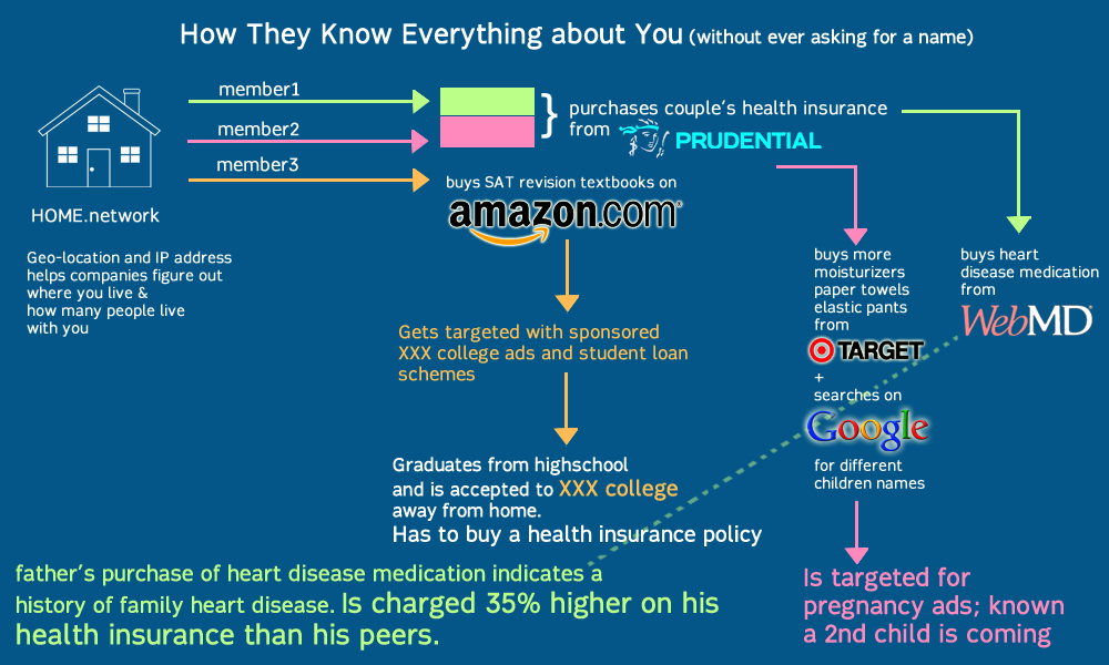
The current state of today’s internet is no longer the same as the carefree 90s of ‘internet democracy’ and utopian ‘cyberspace’. Mediamining exploits invasive technologies such as IP tracking, geolocating and cookies to create specific advertisements targeted to individuals. Browsing is now determined by your consumer profile what you see, hear and the feeds you receive are tailored from your friends’ lists, emails, online purchases etc. The ‘Internet’ does not exist. Instead, it is many overlapping filter bubbles which selectively curate us into data objects to be consumed and purchased by advertisers.
This information, though anonymous, is built up over time and used to track and trace an individual’s history – sometimes spanning an entire lifetime. Who you are, and your real name is irrelevant in the overall scale of collected data, depersonalizing and dehumanizing you into nothing but a list of numbers on a spreadsheet.
The superstore Target, provides a useful case study for data profiling in its use of statisticians on their marketing teams. In 2002, Target realized that when a couple is expecting a child, the way they shop and purchase products changes. But they needed a tool to be able to see and take advantage of the pattern. As such, they asked mathematicians to come up with algorithms to identify behavioral patterns that would indicate a newly expectant mother and push direct marketing materials their way. In a public relations fiasco, Target had sent maternity and infant care advertisements to a household, inadvertedly revealing that their teenage daughter was pregnant before she told her parents .
This build-up of information creates a ‘database of ruin’, enough information that marketers and advertisers know more about your life and predictive patterns than any single entity. Databases that can predict whether you’re expecting, or when you’ve moved, or what stage of your life or income level you’re at… information that you have no control over where it goes to, who is reading it or how it is being used. More importantly, these databases have collected enough information that they know secrets such as family history of illness, criminal or drug records or other private information that could potentially cause harm upon the individual data point if released – without ever needing to know his or her name.
What happens now is two terrifying possibilities:
- Corporate databases with information about you, your family and friends that you have zero control over, including sensitive information such as health, criminal/drug records etc. that are bought and re-sold to other companies for profit maximization.
- New forms of discrimination where your buying/consumer habits determine which level of internet you can access, or what kind of internet you can experience. This discrimination is so insidious because it happens on a user account level which you cannot see unless you have access to other people’s accounts.
Here’s a visual describing this process:
What can Vortex do, and where can I download a copy?
As Vortex lives on the browser, it can manage both pseudo-identities (invented) as well as ‘real’ identities shared with you by other users. These identity profiles are created through mining websites for cookies, swapping them with friends as well as arranging and re-arranging them to create new experiences. By swapping identities, you are essentially ‘disguised’ as someone else – the network or website will not be able to recognize you. The idea is that being completely anonymous is difficult, but being someone else and hiding with misinformation is easy.
This does not mean a death knell for online shopping or e-commerce industries. For instance, if a user decides to go shoe-shopping for summer, he/she could equip their browser with the cookies most associated and aligned with shopping, shoes and summer. Targeted advertising becomes a targeted choice for both advertisers and users. Advertisers will not have to worry about misinterpreting or mis-targeting inappropriate advertisements i.e. showing tampon advertisements to a boyfriend who happened to borrow his girlfriend’s laptop; and at the same time users can choose what kind of advertisements they want to see. (i.e. Summer is coming, maybe it’s time to load up all those cookies linked to shoes and summer and beaches and see what websites have to offer; or disable cookies it completely if you hate summer apparel.)
Currently the game is a working prototype/demo. The code is licensed under creative commons and will be available on GitHub by the end of summer. I am trying to get funding to make it free, safe & easy to use; but right now I’m broke from grad school and a proper back-end to be built for creating accounts that is safe and cannot be intercepted. If you have any questions on technical specs or interest in collaborating to make it happen – particularly looking for people versed in python/mongodb, please email me: Rachel@milkred.net.
Moneyball Diplomacy
I’m on a train again to D.C. to attend a conference on how to use big data to enhance U.S. diplomacy and development.
I’ll be on a panel in the afternoon called Diving Into Data, which has the following blurb attached to it:
Facebook processes over 500 terabytes of data each day. More than a half billion tweets are sent daily. And so the volume of data grows. Much of this data is superfluous and is of little value to foreign policy and development experts. But a portion does contain significant information and the challenge is how to find and make use of that data. What will a rigorous economic analysis of this data reveal and how could the findings be effectively applied? Looking beyond real-time awareness and some of the other well know uses of big data, this panel will explore how a more thorough in-depth analysis of big data could prove useful in providing insights and trends that could be applied in the formulation and implementation of foreign policy.
Also on the schedule today, two keynote speakers: Nassim Taleb, author of a few books I haven’t read but everyone else has, and Kenneth Neil Cukier, author of a “big data” article I really didn’t like which was published in Foreign Affairs and which I blogged about here under the title of “The rise of big brother, big data”.
The full schedule of the day is here.
Speaking of big brother, this conference will be particularly interesting to me considering the remarkable amount of news we’ve been learning about this week centered on the U.S. as a surveillance state. Actually nothing I’ve read has surprised me, considering what I learned when I read this opinion piece on the subject, and when I watched this video with former NSA mathematician-turned whistleblower, which I blogged about here back in August 2012.
Book out for early review
I’m happy to say that the book I’m writing with Rachel Schutt called Doing Data Science is officially out for early review. That means a few chapters which we’ve deemed “ready” have been sent to some prominent people in the field to see what they think. Thanks, prominent and busy people!
It also means that things are (knock on wood) wrapping up on the editing side. I’m cautiously optimistic that this book will be a valuable resource for people interested in what data scientists do, especially people interested in switching fields. The range of topics is broad, which I guess means that the most obvious complaint about the book will be that we didn’t cover things deeply enough, and perhaps that the level of pre-requisite assumptions is uneven. It’s hard to avoid.
Thanks to my awesome editor Courtney Nash over at O’Reilly for all her help!
And by the way, we have an armadillo on our cover, which is just plain cool:
How proxies fail
A lot of the time perfectly well-meaning data goals end up terribly wrong. Certain kinds of these problems stem from the same issue, namely using proxies.
Here’s how it works. People focus on a problem. It’s a real problem, but it’s hard to collect data on the exact question that one would like (how well are students learning? how well is the company functioning? how do we measure risk?).
People have trouble measuring the object in question directly, so they reasonably ask, how do we measure this problem?
They’re smart, so they come up with something, say some metric (standardized test scores, shareprice, VaR). It’s not perfect, though, and so they discuss in detail all the inadequacies with the metric. Even so, they’d really like to address this issue, so they decide to try it.
Then they start using it – hey, it works pretty well in spite of its known issues! We have something to focus on, to improve on!
Then two things happen. First, the people who were so thoughtful at the beginning slowly forget inadequacies of the metric, or are replaced by people who never had that conversation. Slowly the community involved with this proxy starts thinking this thing is a perfect measurement of the thing we actually care about. For all intents and purposes, of course, it is, because that’s what we’re measuring, and that’s how their paycheck is defined.
Second, the discrepancy between the proxy and the original underlying problem becomes more and more of a problem itself, and as people game the proxy, the effectiveness of the proxy is weakened. It no longer does a good job as a stand-in for the original problem, due to gaming and intense focus on the proxy. Sadly, that original problem, which was important, is ignored.
This is a tough problem to solve because we always have the urge to address problems, and we always make do with imperfect proxies and metrics. My guess at the best way to deal with the ensuing problems is to always have a minimum number of different ways to look at and quantify a problem, and to keep in mind each of their inadequacies. Have a dashboard approach, and of course always be on the look-out for metrics that are being gamed. It’s a hard sell of course because it requires deeper understanding and thoughtful interpretation.


