Archive
Huma’s Little Weiner Problem
This is a guest post by my friend Laura Strausfeld.
As an unlicensed psychotherapist, here’s my take on why Huma Abedin is supporting her husband Anthony Weiner’s campaign for mayor:
It’s all about the kid.
Jordan Weiner is 19 months old. When he’s 8 or 9—or 5, and wearing google glasses—maybe he’ll google his name and read about his father’s penis. Either that, or one of his buddies at school may ask him about his father’s penis. Jordan might then ask his mommy and daddy about his father’s penis and they’ll tell him either 1) your daddy was a great politician, but had to resign from Congress because he admitted to showing people his penis, which we recommend you don’t do, especially when you’re a grownup and on twitter; or 2) your daddy was a great politician and ran a very close race for mayor—that’s right, your daddy was almost mayor of New York City!—but he lost because people said he showed people his penis and that’s none of anybody’s business.
Let’s look at this from Huma’s perspective. She’s got a child for a husband, with a weird sexual addiction that on the positive side, doesn’t appear to carry the threat of STDs. But her dilemma is not about her marriage. The marriage is over. What she cares about is Jordan. And this is where she’s really fucked. Whatever happens, Anthony will always be her child’s father.
That bears repeating. You’ve got a child you love more than anything in the world, will sacrifice anything for, and will always now be stigmatized as the son of a celebrity-sized asshole. What are your choices?
The best scenario for Huma is if Anthony becomes mayor. Then she can divorce his ass, get primary custody and protect her child from growing up listening to penis jokes about his loser father. There will be jokes, but at least they’ll be about the mayor’s penis. And with a whole lot of luck, they might even be about how his father’s penis was a lot smaller in the mind of the public than his policies.
Weiner won’t get my vote, however. And for that, I apologize to you, Jordan. You have my sympathy, Huma.
Money in politics: the BFF project
This is a guest post by Peter Darche, an engineer at DataKind and recent graduate of NYU’s ITP program. At ITP he focused primarily on using personal data to improve personal social and environmental impact. Prior to graduate school he taught in NYC public schools with Teach for America and Uncommon Schools.
We all ‘know’ that money influences the way congressmen and women legislate; at least we certainly believe it does. According to poll conducted by law professor Larry Lessig for his book Republic Lost, 75% of respondents (Republican and Democrat) said that ‘money buys results in Congress.’
And we have good reason to believe so. With astronomical sums of campaign money flowing into the system and costly, public-welfare reducing legislation coming out, it’s the obvious explanation.
But what does that explanation really tell us? Yes, a congresswoman’s receiving millions dollars from an industry then voting with that industry’s interests reeks of corruption. But, when that industry is responsible for 80% of her constituents’ jobs the causation becomes much less clear and the explanation much less informative.
The real devil is in the details. It is in the ways that money has shaped her legislative worldview over time and in the small, particular actions that tilt her policy one way rather than another.
In the past finding these many and subtle ways would have taken a herculean effort: untold hours collecting campaign contributions, voting records, speeches, and so on. Today however, due to the efforts of organizations like the Sunlight Foundation and Center for Responsive Politics, this information is online and programmatically accessible; you can write a few lines of code and have a computer gather it all for you.
The last few months Cathy O’Neil, Lee Drutman (a Senior Fellow at the Sunlight Foundation), myself and others have been working on a project that leverages these data sources to attempt to unearth some of these particular facts. By connecting all the avenues by which influence is exerted on the legislative process to the actions taken by legislators, we’re hoping to find some of the detailed ways money changes behavior over time.
The ideas is this: first, find and aggregate what data exists related to the ways influence can be exerted on the legislative process (data on campaign contributions, lobbying contributions, etc), then find data that might track influence manifesting itself in the legislative process (bill sponsorships, co-sponsorships, speeches, votes, committee memberships, etc). Finally, connect the interest group or industry behind the influence to the policies and see how they change over time.
One immediate and attainable goal for this project, for example, is to create an affinity score between legislators and industries, or in other words a metric that would indicate the extent to which a given legislator is influenced by and acts in the interest of a given industry.
So far most of our efforts have focused on finding, collecting, and connecting the records of influence and legislative behavior. We’ve pulled in lobbying and campaign contribution data, as well as sponsored legislation, co-sponsored legislation, speeches and votes. We’ve connected the instances of influence to legislative actions for a given legislator and visualized it on a timeline showing the entirety of a legislator’s career.
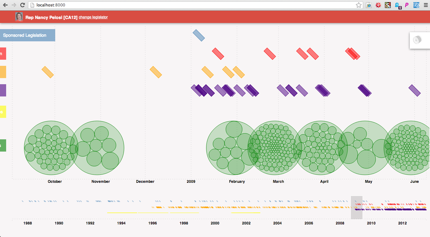
Here’s an example of how one might use the timeline. The example below is of Nancy Pelosi’s career. Each green circle represents a campaign contribution she received, and is grouped within a larger circle by the month it was recorded by the FEC. Above are colored rectangles representing legislative actions she took during the time-period in focus (indigo are votes, orange speeches, red co-sponsored bills, blue sponsored bills). Some of the green circles are highlighted because the events have been filtered for connection to health professionals.
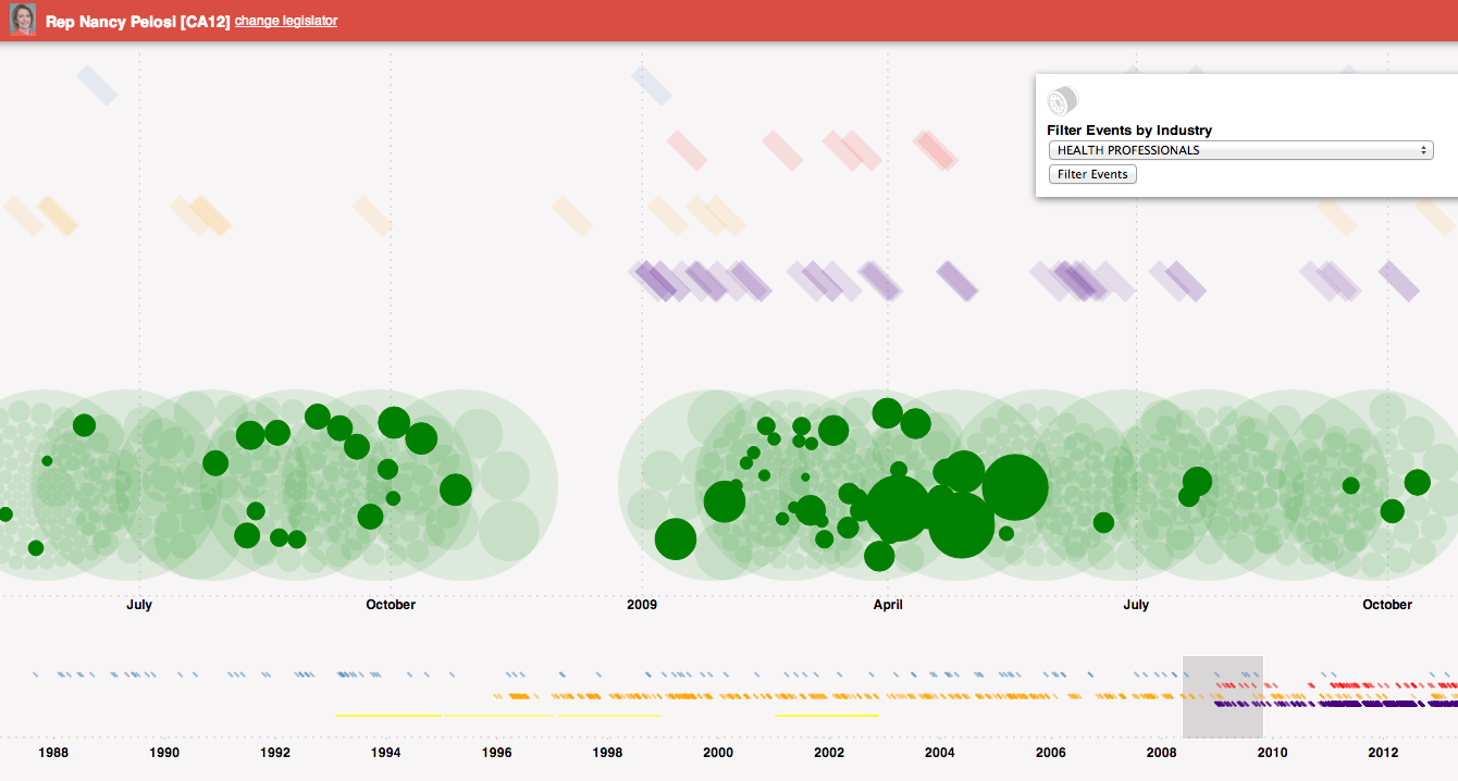
Changing the filter to Health Services/HMOs, we see different contributions coming from that industry as well as a co-sponsored bill related to that industry.
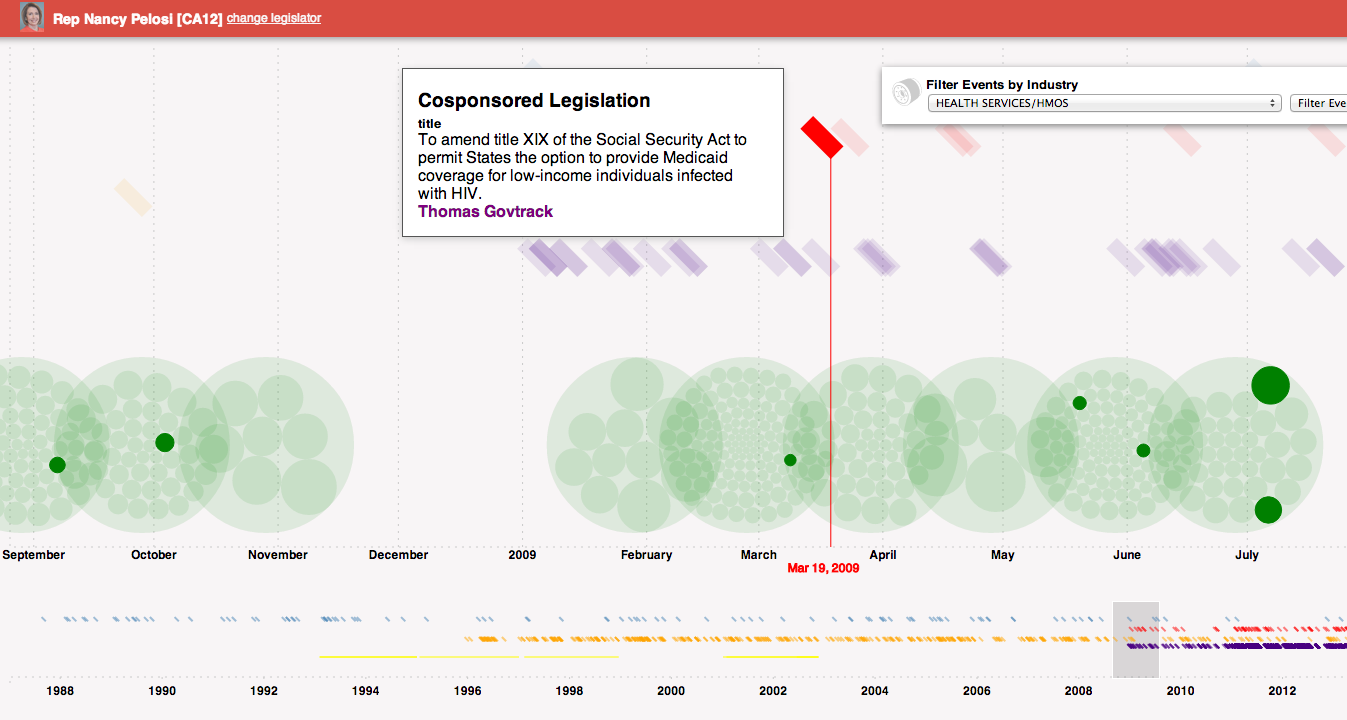
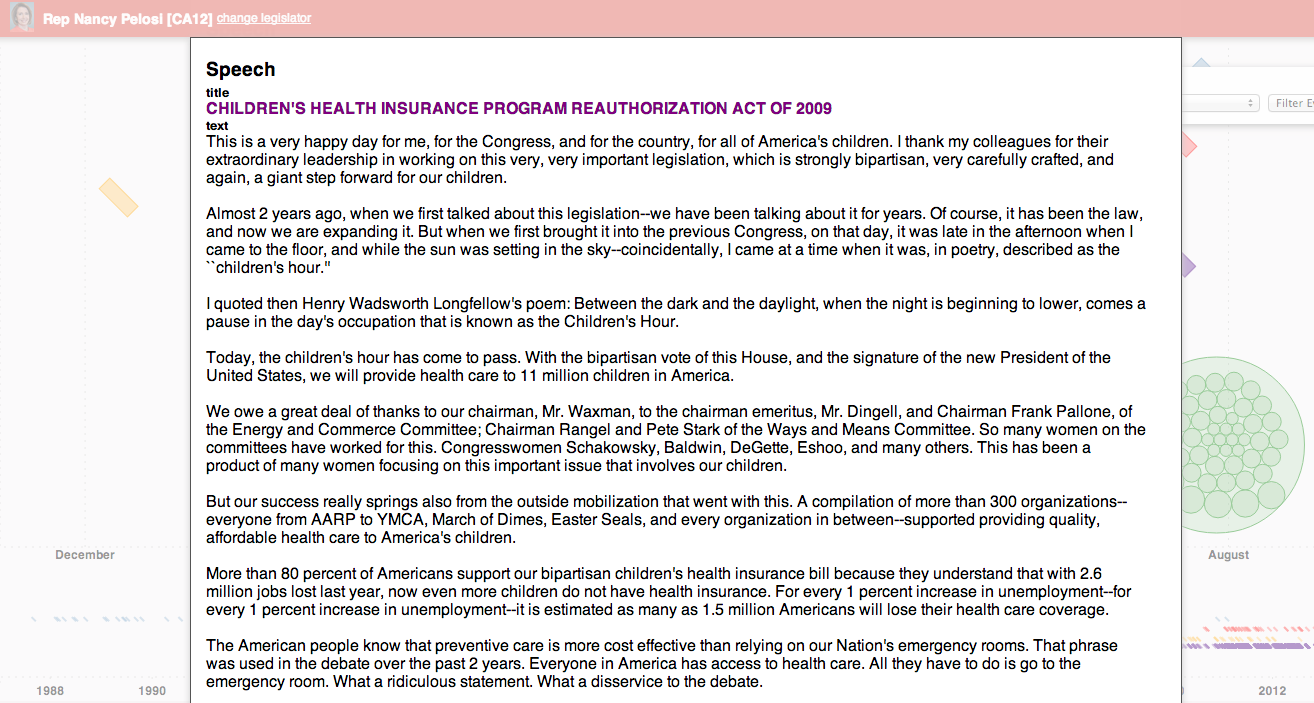
Mousing over the bill indicates its a proposal to amend the Social Security act to provide Medicaid coverage to low-income individuals with HIV. Further, looking around at speeches, one can see a relevant speech about the children’s health insurance. Clicking on the speech reveals the text.
By combining data about various events, and allowing users to filter and dive into them, we’re hoping to leverage our natural pattern-seeking capabilities to find specific hypotheses to test. Once an interesting pattern has been found, the tool would allow one to download the data and conduct analyses.
Again, It’s just start, and the timeline and other project related code are internal prototypes created to start seeing some of the connections. We wanted to open it up to you all though to see what you all think and get some feedback. So, with it’s pre-alphaness in mind, what do you think about the project generally and the timeline specifically? What works well – helps you gain insights or generate hypotheses about the connection between money and politics – and what other functionality would you like to see?
The demo version be found here with data for the following legislators:
- Nancy Pelosi
- John Boehner
- Cathy McMorris Rodgers
- John Boehner
- Eric Cantor
- James Lankford
- John Cornyn
- Nancy Pelosi
- James Clyburn
- Kevin McCarthy
- Steny Hoyer
Note: when the timeline is revealed, click and drag over content at the bottom of the timeline to reveal the focus events.
Measuring Up by Daniel Koretz
This is a guest post by Eugene Stern.
Now that I have kids in school, I’ve become a lot more familiar with high-stakes testing, which is the practice of administering standardized tests with major consequences for students who take them (you have to pass to graduate), their teachers (who are often evaluated based on standarized test results), and their school districts (state funding depends on test results). To my great chagrin, New Jersey, where I live, is in the process of putting such a teacher evaluation system in place (for a lot more detail and criticism, see here).
The excellent John Ewing pointed me to a pretty comprehensive survey of standardized testing called “Measuring Up,” by Harvard Ed School prof Daniel Koretz, who teaches a course there about this stuff. If you have any interest in the subject, the book is very much worth your time. But in case you don’t get to it, or just to whet your appetite, here are my top 10 takeaways:
-
Believe it or not, most of the people who write standardized tests aren’t idiots. Building effective tests is a difficult measurement problem! Koretz makes an analogy to political polling, which is a good reminder that a test result is really a sample from a distribution (if you take multiple versions of a test designed to measure the same thing, you won’t do exactly the same each time), and not an absolute measure of what someone knows. It’s also a good reminder that the way questions are phrased can matter a great deal.
-
The reliability of a test is inversely related to the standard deviation of this distribution: a test is reliable if your score on it wouldn’t vary very much from one instance to the next. That’s a function of both the test itself and the circumstances under which people take it. More reliability is better, but the big trade-off is that increasing the sophistication of the test tends to decrease reliability. For example, tests with free form answers can test for a broader range of skills than multiple choice, but they introduce variability across graders, and even the same person may grade the same test differently before and after lunch. More sophisticated tasks also take longer to do (imagine a lab experiment as part of a test), which means fewer questions on the test and a smaller cross-section of topics being sampled, again meaning more noise and less reliability.
-
A complementary issue is bias, which is roughly about people doing better or worse on a test for systematic reasons outside the domain being tested. Again, there are trade-offs: the more sophisticated the test, the more extraneous skills beyond those being tested it may be bringing in. One common way to weed out such questions is to look at how people who score the same on the overall test do on each particular question: if you get variability you didn’t expect, that may be a sign of bias. It’s harder to do this for more sophisticated tests, where each question is a bigger chunk of the overall test. It’s also harder if the bias is systematic across the test.
-
Beyond the (theoretical) distribution from which a single student’s score is a sample, there’s also the (likely more familiar) distribution of scores across students. This depends both on the test and on the population taking it. For example, for many years, students on the eastern side of the US were more likely to take the SAT than those in the west, where only students applying to very selective eastern colleges took the test. Consequently, the score distributions were very different in the east and the west (and average scores tended to be higher in the west), but this didn’t mean that there was bias or that schools in the west were better.
-
The shape of the score distribution across students carries important information about the test. If a test is relatively easy for the students taking it, scores will be clustered to the right of the distribution, while if it’s hard, scores will be clustered to the left. This matters when you’re interpreting results: the first test is worse at discriminating among stronger students and better at discriminating among weaker ones, while the second is the reverse.
-
The score distribution across students is an important tool in communicating results (you may not know right away what a score of 600 on a particular test means, but if you hear it’s one standard deviation above a mean of 500, that’s a decent start). It’s also important for calibrating tests so that the results are comparable from year to year. In general, you want a test to have similar means and variances from one year to the next, but this raises the question of how to handle year-to-year improvement. This is particularly significant when educational goals are expressed in terms of raising standardized test scores.
-
If you think in terms of the statistics of test score distributions, you realize that many of those goals of raising scores quickly are deluded. Koretz has a good phrase for this: the myth of the vanishing variance. The key observation is that test score distributions are very wide, on all tests, everywhere, including countries that we think have much better education systems than we do. The goals we set for student score improvement (typically, a high fraction of all students taking a test several years from now are supposed to score above some threshold) imply a great deal of compression at the lower end of this distribution – compression that has never been seen in any country, anywhere. It sounds good to say that every kid who takes a certain test in four years will score as proficient, but that corresponds to a score distribution with much less variance than you’ll ever see. Maybe we should stop lying to ourselves?
-
Koretz is highly critical of the recent trend to report test results in terms of standards (e.g., how many students score as “proficient”) instead of comparisons (e.g., your score is in the top 20% of all students who took the test). Standards and standard-based reporting are popular because it’s believed that American students’ performance as a group is inadequate. The idea is that being near the top doesn’t mean much if the comparison group is weak, so instead we should focus on making sure every student meets an absolute standard needed for success in life. There are three (at least) problems with this. First, how do you set a standard – i.e., what does proficient mean, anyway? Koretz gives enough detail here to make it clear how arbitrary the standards are. Second, you lose information: in the US, standards are typically expressed in terms of just four bins (advanced, proficient, partially proficient, basic), and variation inside the bins is ignored. Third, even standards-based reporting tends to slide back into comparisons: since we don’t know exactly what proficient means, we’re happiest when our school, or district, or state places ahead of others in the fraction of students classified as proficient.
-
Koretz’s other big theme is score inflation for high-stakes tests: if everyone is evaluated based on test scores, everyone has an incentive to get those scores up, whether or not that actually has much correlation with learning. If you remember anything from the book or from this post, remember this phrase: sawtooth pattern. The idea is that when a new high-stakes standardized test appears, average scores start at some base level, go up quickly as people figure out how to game the test, then plateau. If the test is replaced with another, the same thing happens: base, rapid growth, plateau. Repeat ad infinitum. Koretz and his collaborators did a nice experiment in which they went back to a school district in which one high-stakes test had been replaced with another and administered the first test several years later. Now that teachers weren’t teaching to the first test, scores on it reverted back to the original base level. Moral: score inflation is real, pervasive, and unavoidable, unless we bite the bullet and do away with high-stakes tests.
-
While Koretz is sympathetic toward test designers, who live the complexity of standardized testing every day, he is harsh on those who (a) interpret and report on test results and (b) set testing and education policy, without taking that complexity into account. Which, as he makes clear, is pretty much everyone who reports on results and sets policy.
Final thoughts
If you think it’s a good idea to make high-stakes decisions about schools and teachers based on standardized test results, Koretz’s book offers several clear warnings.
First, we should expect any high-stakes test to be gamed. Worse yet, the more reliable tests, being more predictable, are probably easier to game (look at the SAT prep industry).
Second, the more (statistically) reliable tests, by their controlled nature, cover only a limited sample of the domain we want students to learn. Tests trying to cover more ground in more depth (“tests worth teaching to,” in the parlance of the last decade) will necessarily have noisier results. This noise is a huge deal when you realize that high-stakes decisions about teachers are made based on just two or three years of test scores.
Third, a test that aims to distinguish “proficiency” will do a worse job of distinguishing students elsewhere in the skills range, and may be largely irrelevant for teachers whose students are far away from the proficiency cut-off. (For a truly distressing example of this, see here.)
With so many obstacles to rating schools and teachers reliably based on standardized test scores, is it any surprise that we see results like this?
Why Education Isn’t Like Sports
This is a guest post by Eugene Stern.
Sometimes you learn just as much from a bad analogy as from a good one. At least you learn what people are thinking.
The other day I read this response to this NYT article. The original article asked whether the Common Core-based school reforms now being put in place in most states are really a good idea. The blog post criticized the article for failing to break out four separate elements of the reforms: standards (the Core), curriculum (what’s actually taught), assessment (testing), and accountability (evaluating how kids and educators did). If you have an issue with the reforms, you’re supposed to say exactly which aspect you have an issue with.
But then, at the end of the blog post, we get this:
A track and field metaphor might help: The standard is the bar that students must jump over to be competitive. The curriculum is the training program coaches use to help students get over the bar. The assessment is the track meet where we find out how high everyone can jump. And the accountability system is what follows after its all over and we want to figure out what went right, what went wrong, and what it will take to help kids jump higher.
Really?
In track, jumping over the bar is the entire point. You’re successful if you clear the bar, you’ve failed if you don’t. There are no other goals in play. So the standard, the curriculum, and the assessment might be nominally different, but they’re completely interdependent. The standard is defined in terms of the assessment, and the only curriculum that makes sense is training for the assessment.
Education has a lot more to it. The Common Core is a standard covering two academic dimensions: math and English/language arts/literacy. But we also want our kids learning science, and history, and music, and foreign languages, and technology, as well as developing along non-academic dimensions: physically, socially, morally, etc. (If a school graduated a bunch of high academic achievers that couldn’t function in society, or all ended up in jail for insider trading, we probably wouldn’t call that school successful.)
In Cathy’s terminology from this blog post, the Common Core is a proxy for the sum total of what we care about, or even just for the academic component of what we care about.
Then there’s a second level of proxying when we go from the standard to the assessment. The Common Core requirements are written to require general understanding (for example: kindergarteners should understand the relationship between numbers and quantities and connect counting to cardinality). A test that tries to measure that understanding can only proxy it imperfectly, in terms of a few specific questions.
Think that’s obvious? Great! But hang on just a minute.
The real trouble with the sports analogy comes when we get to the accountability step and forget all the proxying we did. “After it’s all over and we want to figure out what went right (and) what went wrong,” we measure right and wrong in terms of the assessment (the test). In sports, where the whole point is to do well on the assessment, it may make sense to change coaches if the team isn’t winning. But when we deny tenure to or fire teachers whose students didn’t do well enough on standardized tests (already in place in New York, now proposed for New Jersey as well), we’re treating the test as the whole point, rather than a proxy of a proxy. That incentivizes schools to narrow the curriculum to what’s included in the standard, and to teach to the test.
We may think it’s obvious that sports and education are different, but the decisions we’re making as a society don’t actually distinguish them.
Guest post, The Vortex: A Cookie Swapping Game for Anti-Surveillance
This is a guest post by Rachel Law, a conceptual artist, designer and programmer living in Brooklyn, New York. She recently graduated from Parsons MFA Design&Technology. Her practice is centered around social myths and how technology facilitates the creation of new communities. Currently she is writing a book with McKenzie Wark called W.A.N.T, about new ways of analyzing networks and debunking ‘mapping’.
Let’s start with a timely question. How would you like to be able to change how you are identified by online networks? We’ll talk more about how you’re currently identified below, but for now just imagine having control over that process for once – how would that feel? Vortex is something I’ve invented that will try to make that happen.
Namely, Vortex is a data management game that allows players to swap cookies, change IPs and disguise their locations. Through play, individuals experience how their browser changes in real time when different cookies are equipped. Vortex is a proof of concept that illustrates how network collisions in gameplay expose contours of a network determined by consumer behavior.
What happens when users are allowed to swap cookies?
These cookies, placed by marketers to track behavioral patterns, are stored on our personal devices from mobile phones to laptops to tablets, as a symbolic and data-driven signifier of who we are. In other words, to the eyes of the database, the cookies are us. They are our identities, controlling the way we use, browse and experience the web. Depending on cookie type, they might follow us across multiple websites, save entire histories about how we navigate and look at things and pass this information to companies while still living inside our devices.
If we have the ability to swap cookies, the debate on privacy shifts from relying on corporations to follow regulations to empowering users by giving them the opportunity to manage how they want to be perceived by the network.
What are cookies?
The corporate technological ability to track customers and piece together entire personal histories is a recent development. While there are several ways of doing so, the most common and prevalent method is with HTTP cookies. Invented in 1994 by a computer programmer, Lou Montulli, HTTP cookies were originally created with the shopping cart system as a way for the computer to store the current state of the session, i.e. how many items existed in the cart without overloading the company’s server. These session histories were saved inside each user’s computer or individual device, where companies accessed and updated consumer history constantly as a form of ‘internet history’. Information such as where you clicked, how to you clicked, what you clicked first, your general purchasing history and preferences were all saved in your browsing history and accessed by companies through cookies.
Cookies were originally implemented to the general public without their knowledge until the Financial Times published an article about how they were made and utilized on websites without user knowledge on February 12th, 1996 . This revelation led to a public outcry over privacy issues, especially since data was being gathered without the knowledge or consent of users. In addition, corporations had access to information stored on personal computers as the cookie sessions were stored on your computer and not their servers.
At the center of the debate was the issue on third-party cookies, also known as “persistent” or “tracking” cookies. When you are browsing a webpage, there may be components on the page that are hosted on the same server, but different domain. These external objects then pass cookies to you if you click an image, link or article. They are then used by advertising and media mining corporations to track users across multiple sites to garner more knowledge about the users browsing patterns to create more specific and targeted advertising.
In August 2013, Wall Street Journal ran an article on how Mac users were being unfairly targeted by travel site Orbitz with advertisements that were 13% more expensive than PC users. New York Times followed it up with a similar article in November 2012 about how the data collected and re-sold to advertisers. These advertisers would analyze users buying habits to create micro-categories where the personal experiences were tailored to maximize potential profits.
What does that mean for us?
The current state of today’s internet is no longer the same as the carefree 90s of ‘internet democracy’ and utopian ‘cyberspace’. Mediamining exploits invasive technologies such as IP tracking, geolocating and cookies to create specific advertisements targeted to individuals. Browsing is now determined by your consumer profile what you see, hear and the feeds you receive are tailored from your friends’ lists, emails, online purchases etc. The ‘Internet’ does not exist. Instead, it is many overlapping filter bubbles which selectively curate us into data objects to be consumed and purchased by advertisers.
This information, though anonymous, is built up over time and used to track and trace an individual’s history – sometimes spanning an entire lifetime. Who you are, and your real name is irrelevant in the overall scale of collected data, depersonalizing and dehumanizing you into nothing but a list of numbers on a spreadsheet.
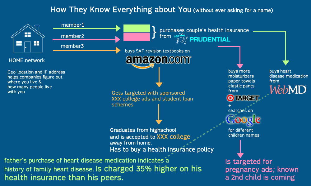
The superstore Target, provides a useful case study for data profiling in its use of statisticians on their marketing teams. In 2002, Target realized that when a couple is expecting a child, the way they shop and purchase products changes. But they needed a tool to be able to see and take advantage of the pattern. As such, they asked mathematicians to come up with algorithms to identify behavioral patterns that would indicate a newly expectant mother and push direct marketing materials their way. In a public relations fiasco, Target had sent maternity and infant care advertisements to a household, inadvertedly revealing that their teenage daughter was pregnant before she told her parents .
This build-up of information creates a ‘database of ruin’, enough information that marketers and advertisers know more about your life and predictive patterns than any single entity. Databases that can predict whether you’re expecting, or when you’ve moved, or what stage of your life or income level you’re at… information that you have no control over where it goes to, who is reading it or how it is being used. More importantly, these databases have collected enough information that they know secrets such as family history of illness, criminal or drug records or other private information that could potentially cause harm upon the individual data point if released – without ever needing to know his or her name.
What happens now is two terrifying possibilities:
- Corporate databases with information about you, your family and friends that you have zero control over, including sensitive information such as health, criminal/drug records etc. that are bought and re-sold to other companies for profit maximization.
- New forms of discrimination where your buying/consumer habits determine which level of internet you can access, or what kind of internet you can experience. This discrimination is so insidious because it happens on a user account level which you cannot see unless you have access to other people’s accounts.
Here’s a visual describing this process:
What can Vortex do, and where can I download a copy?
As Vortex lives on the browser, it can manage both pseudo-identities (invented) as well as ‘real’ identities shared with you by other users. These identity profiles are created through mining websites for cookies, swapping them with friends as well as arranging and re-arranging them to create new experiences. By swapping identities, you are essentially ‘disguised’ as someone else – the network or website will not be able to recognize you. The idea is that being completely anonymous is difficult, but being someone else and hiding with misinformation is easy.
This does not mean a death knell for online shopping or e-commerce industries. For instance, if a user decides to go shoe-shopping for summer, he/she could equip their browser with the cookies most associated and aligned with shopping, shoes and summer. Targeted advertising becomes a targeted choice for both advertisers and users. Advertisers will not have to worry about misinterpreting or mis-targeting inappropriate advertisements i.e. showing tampon advertisements to a boyfriend who happened to borrow his girlfriend’s laptop; and at the same time users can choose what kind of advertisements they want to see. (i.e. Summer is coming, maybe it’s time to load up all those cookies linked to shoes and summer and beaches and see what websites have to offer; or disable cookies it completely if you hate summer apparel.)
Currently the game is a working prototype/demo. The code is licensed under creative commons and will be available on GitHub by the end of summer. I am trying to get funding to make it free, safe & easy to use; but right now I’m broke from grad school and a proper back-end to be built for creating accounts that is safe and cannot be intercepted. If you have any questions on technical specs or interest in collaborating to make it happen – particularly looking for people versed in python/mongodb, please email me: Rachel@milkred.net.
Knowing the Pythagorean Theorem
This guest post is by Sue VanHattum, who blogs at Math Mama Writes. She teaches math at Contra Costa College, a community college in the Bay Area, and is working on a book titled Playing With Math: Stories from Math Circles, Homeschoolers, and Passionate Teachers, which will be published soon.
Here’s the Pythagorean Theorem:
In a right triangle, where the lengths of the legs are given by
and
, and the length of the hypotenuse is given by
, we have

Do you remember when you first learned about it? Do you remember when you first proved it?
I have no idea when or where I first saw it. It feels like something I’ve always ‘known’. I put known in quotes because in math we prove things, and I used the Pythagoeran Theorem for way too many years, as a student and as a math teacher, before I ever thought about proving it. (It’s certainly possible I worked through a proof in my high school geometry class, but my memory kind of sucks and I have no memory of it.)
It’s used in beginning algebra classes as part of terrible ‘pseudo-problems’ like this:
Two cars start from the same intersection with one traveling southbound while the other travels eastbound going 10 mph faster. If after two hours they are 10 times the square root of 24 [miles] apart, how fast was each car traveling?
After years of working through these problems with students, I finally realized I’d never shown them a proof (this seems terribly wrong to me now). I tried to prove it, and didn’t really have any idea how to get started.
This was 10 to 15 years ago, before Google became a verb, so I searched for it in a book. I eventually found it in a high school geometry textbook. Luckily it showed a visually simple proof that stuck with me. There are hundreds of proofs, many of them hard to follow.
There is something wrong with an education system that teaches us ‘facts’ like this one and knocks the desire for deep understanding out of us. Pam Sorooshian, an unschooling advocate, said in a talk to other unschooling parents:
Relax and let them develop conceptual understanding slowly, over time. Don’t encourage them to memorize anything – the problem is that once people memorize a technique or a ‘fact’, they have the feeling that they ‘know it’ and they stop questioning it or wondering about it. Learning is stunted.
She sure got my number! I thought I knew it for all those years, and it took me decades to realize that I didn’t really know it. This is especially ironic – the reason it bears Pythagoras’ name is because the Pythagoreans were the first to prove it (that we know of).
It had been used long before Pythagoras and the Greeks – most famously by the Egyptians. Egyptian ‘rope-pullers’ surveyed the land and helped build the pyramids, using a taut circle of rope with 12 equally-spaced knots to create a 3-4-5 triangle: since 

Ever since the Greeks, proof has been the basis of all mathematics. To do math without understanding why something is true really makes no sense.
Nowadays I feel that one of my main jobs as a math teacher is to get students to wonder and to question. But my own math education left me with lots of ‘knowledge’ that has nothing to do with true understanding. (I wonder what else I have yet to question…) And beginning algebra students are still using textbooks that ‘give’ the Pythagorean Theorem with no justification. No wonder my Calc II students last year didn’t know the difference between an example and a proof.
Just this morning I came across an even simpler proof of the Pythagorean Theorem than the one I have liked best over the past 10 to 15 years. I was amazed that I hadn’t seen it before. Well, perhaps I had seen it but never took it in before, not being ready to appreciate it. I’ll talk about it below.
My old favorite goes like this:
- Draw a square.
- Put a dot on one side (not at the middle).
- Put dots at the same place on each of the other 3 sides.
- Connect them.
- You now have a tilted square inside the bigger square, along with 4 triangles. At this point, you can proceed algebraically or visually.
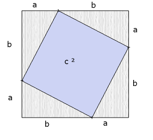
Algebraic version:
- big square = small tilted square + 4 triangles


Visual version:
- Move the triangles around.

- What was
is now
- Also check out Vi Hart’s video showing a paper-folding proof (with a bit of ripping). It’s pretty similar to this one.

To me, that seemed as simple as it gets. Until I saw this:
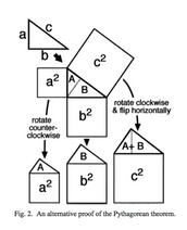
This is an even more visual proof, although it might take a few geometric remarks to make it clear. In any right triangle, the two acute (less than 90 degrees) angles add up to 90 degrees. Is that enough to see that the original triangle, triangle A, and triangle B are all similar? (Similar means they have exactly the same shape, though they may be different sizes.) Which makes the ‘houses with asymmetrical roofs’ also all similar. Since the big ‘house’ has an ‘attic’ equal in size to the two other ‘attics’, its ‘room’ must also be equal in area to the two other ‘rooms’. Wow! (I got this language from Alexander Bogomolny’s blog post about it, which also tells a story about young Einstein discovering this proof.
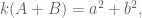
Since all three houses are similar (exact same shape, different sizes), the size of the room is some given multiple of the size of the attic. More properly, area(square) = 


I stumbled on the article in which this appeared (The Step to Rationality, by R. N. Shepard) while trying to find an answer to a question I have about centroids. I haven’t answered my centroid question yet, but I sure was sending out some google love when I found this.
What I love about this proof is that the triangle stay central in our thoughts throughout, and the focus stays on area, which is what this is really about. It’s all about self-similarity, and that’s what makes it so beautiful.
I think that, even though this proof is simpler in terms of steps than my old favorite, it’s a bit harder to see conceptually. So I may stick with the first one when explaining to students. What do you think?
New Jersey at risk of implementing untested VAM-like teacher evaluation model
This is a guest post by Eugene Stern.
A big reason I love this blog is Cathy’s war on crappy models. She has posted multiple times already about the lousy performance of models that rate teachers based on year-to-year changes in student test scores (for example, read about it here). Much of the discussion focuses on the model used in New York City, but such systems have been, or are being, put in place all over the country. I want to let you know about the version now being considered for use across the river, in New Jersey. Once you’ve heard more, I hope you’ll help me try to stop it.
VAM Background
A little background if you haven’t heard about this before. Because it makes no sense to rate teachers based on students’ absolute grades or test scores (not all students start at the same place each year), the models all compare students’ test scores against some baseline. The simplest thing to do is to compare each student’s score on a test given at the end of the school year against their score on a test given at the end of the previous year. Teachers are then rated based on how much their students’ scores improved over the year.
Comparing with the previous year’s score controls for the level at which students start each year, but not for other factors beside the teacher that affect how much they learn. This includes attendance, in-school environment (curriculum, facilities, other students in the class), out-of-school learning (tutoring, enrichment programs, quantity and quality of time spent with parents/caregivers), and potentially much more. Fancier models try to take these into account by comparing each student’s end of year score with a predicted score. The predicted score is based both on the student’s previous score and on factors like those above. Improvement beyond the predicted score is then attributed to the teacher as “value added” (hence the name “value-added models,” or VAM) and turned into a teacher rating in some way, often using percentiles. One such model is used to rate teachers in New York City.
It’s important to understand that there is no single value-added model, rather a family of them, and that the devil is in the details. Two different teacher rating systems, based on two models of the predicted score, may perform very differently – both across the board, and in specific locations. Different factors may be more or less important depending on where you are. For example, income differences may matter more in a district that provides few basic services, so parents have to pay to get extracurriculars for their kids. And of course the test itself matters hugely as well.
Testing the VAM models
Teacher rating models based on standardized tests have been around for 25 years or so, but two things have happened in the last decade:
- Some people started to use the models in formal teacher evaluation, including tenure decisions.
- Some (other) people started to test the models.
This did not happen in the order that one would normally like. Wanting to make “data-driven decisions,” many cities and states decided to start rating teachers based on “data” before collecting any data to validate whether that “data” was any good. This is a bit like building a theoretical model of how cancer cells behave, synthesizing a cancer drug in the lab based on the model, distributing that drug widely without any trials, then waiting around to see how many people die from the side effects.
The full body count isn’t in yet, but the models don’t appear to be doing well so far. To look at some analysis of VAM data in New York City, start here and here. Note: this analysis was not done by the city but by individuals who downloaded the data after the city had to make it available because of disclosure laws.
I’m not aware of any study on the validity of NYC’s VAM ratings done by anyone actually affiliated with the city – if you know of any, please tell me. Again, the people preaching data don’t seem willing to actually use data to evaluate the quality of the systems they’re putting in place.
Assuming you have more respect for data than the mucky-mucks, let’s talk about how well the models actually do. Broadly, two ways a model can fail are being biased and being noisy. The point of the fancier value-added models is to try to eliminate bias by factoring in everything other than the teacher that might affect a student’s test score. The trouble is that any serious attempt to do this introduces a bunch of noise into the model, to the degree that the ratings coming out look almost random.
You’d think that a teacher doesn’t go from awful to great or vice versa in one year, but the NYC VAM ratings show next to no correlation in a teacher’s rating from one year to the next. You’d think that a teacher either teaches math well or doesn’t, but the NYC VAM ratings show next to no correlation in a teacher’s rating teaching a subject to one grade and their rating teaching it to another – in the very same year! (Gary Rubinstein’s blog, linked above, documents these examples, and a number of others.) Again, this is one particular implementation of a general class of models, but using such noisy data to make significant decisions about teachers’ careers seems nuts.
What’s happening in New Jersey
With all this as background, let’s turn to what’s happening in New Jersey.
You may be surprised that the version of the model proposed by Chris Christie‘s administration (the education commissioner is Christie appointee Chris Cerf, who helped put VAM in place in NYC) is about the simplest possible. There is no attempt to factor out bias by trying to model predicted scores, just a straight comparison between this year’s standardized test score and last year’s. For an overview, see this.
In more detail, the model groups together all students with the same score on last year’s test, and represents each student’s progress by their score on this year’s test, viewed as a percentile across this group. That’s it. A fancier version uses percentiles calculated across all students with the same score in each of the last several years. These can’t be calculated explicitly (you may not find enough students that got exactly the same score each the last few years), so they are estimated, using a statistical technique called quantile regression.
By design, both the simple and the fancy version ignore everything about a student except their test scores. As a modeler, or just as a human being, you might find it silly not to distinguish between a fourth grader in a wealthy suburb who scored 600 on a standardized test from a fourth grader in the projects with the same score. At least, I don’t know where to find a modeler who doesn’t find it silly, because nobody has bothered to study the validity of using this model to rate teachers. If I’m wrong, please point me to a study.
Politics and SGP
But here we get into the shell game of politics, where rating teachers based on the model is exactly the proposal that lies at the end of an impressive trail of doubletalk. Follow the bouncing ball.
These models, we are told, differ fundamentally from VAM (which is now seen as somewhat damaged goods politically, I suspect). While VAM tried to isolate teacher contribution, these models do no such thing – they are simply measuring student progress from year to year, which, after all, is what we truly care about. The models have even been rebranded with a new name: student growth percentiles, or SGP. SGP is sold as just describing student progress rather than attributing it to teachers, there can’t be any harm in that, right? – and nothing that needs validation, either. And because SGP is such a clean methodology – if you’re looking for a data-driven model to use for broad “educational assessment,” don’t get yourself into that whole VAM morass, use SGP instead!
Only before you know it, educational assessment turns into, you guessed it, rating teachers. That’s right: because these models aren’t built to rate teachers, they can focus on the things that really matter (student progress), and thus end up being – wait for it – much better for rating teachers! War is peace, friends. Ignorance is strength.
Creators of SGP
You can find a good discussion of SGP’s and their use in evaluation here, and a lot more from the same author, the impressively prolific Bruce Baker, here. Here’s a response from the creators of SGP. They maintain that information about student growth is useful (duh), and agree that differences in SGP’s should not be attributed to teachers (emphasis mine):
Large-scale assessment results are an important piece of evidence but are not sufficient to make causal claims about school or teacher quality.
SGP and teacher evaluations
But guess what?
The New Jersey Board of Ed and state education commissioner Cerf are putting in place a new teacher evaluation code, to be used this coming academic year and beyond. You can find more details here and here.
Summarizing: for math and English teachers in grades 4-8, 30% of their annual evaluation next year would be mandated by the state to come from those very same SGP’s that, according to their creators, are not sufficient to make causal claims about teacher quality. These evaluations are the primary input in tenure decisions, and can also be used to take away tenure from teachers who receive low ratings.
The proposal is not final, but is fairly far along in the regulatory approval process, and would become final in the next several months. In a recent step in the approval process, the weight given to SGP’s in the overall evaluation was reduced by 5%, from 35%. However, the 30% weight applies next year only, and in the future the state could increase the weight to as high as 50%, at its discretion.
Modeler’s Notes
Modeler’s Note #1: the precise weight doesn’t really matter. If the SGP scores vary a lot, and the other components don’t vary very much, SGP scores will drive the evaluation no matter what their weight.
Modeler’s Note #2: just reminding you again that this data-driven framework for teacher evaluation is being put in place without any data-driven evaluation of its effectiveness. And that this is a feature, not a bug – SGP has not been tested as an attribution tool because we keep hearing that it’s not meant to be one.
In a slightly ironic twist, commissioner Cerf has responded to criticisms that SGP hasn’t been tested by pointing to a Gates Foundation study of the effectiveness of… value-added models. The study is here. It draws pretty positive conclusions about how well VAM’s work. A number of critics have argued, pretty effectively, that the conclusions are unsupported by the data underlying the study, and that the data actually shows that VAM’s work badly. For a sample, see this. For another example of a VAM-positive study that doesn’t seem to stand up to scrutiny, see this and this.
Modeler’s Role Play #1
Say you were the modeler who had popularized SGP’s. You’ve said that the framework isn’t meant to make causal claims, then you see New Jersey (and other states too, I believe) putting a teaching evaluation model in place that uses SGP to make causal claims, without testing it first in any way. What would you do?
So far, the SGP mavens who told us that “Large-scale assessment results are an important piece of evidence but are not sufficient to make causal claims about school or teacher quality” remain silent about the New Jersey initiative, as far as I know.
Modeler’s Role Play #2
Now you’re you again, and you’ve never heard about SGP’s and New Jersey’s new teacher evaluation code until today. What do you do?
I want you to help me stop this thing. It’s not in place yet, and I hope there’s still time.
I don’t think we can convince the state education department on the merits. They’ve made the call that the new evaluation system is better than the current one or any alternatives they can think of, they’re invested in that decision, and we won’t change their minds directly. But we can make it easier for them to say no than to say yes. They can be influenced – by local school administrators, state politicians, the national education community, activists, you tell me who else. And many of those people will have more open minds. If I tell you, and you tell the right people, and they tell the right people, the chain gets to the decision makers eventually.
I don’t think I could convince Chris Christie, but maybe I could convince Bruce Springsteen if I met him, and maybe Bruce Springsteen could convince Chris Christie.
VAM-anifesto
I thought we could start with a manifesto – a direct statement from the modeling community explaining why this sucks. Directed at people who can influence the politics, and signed by enough experts (let’s get some big names in there) to carry some weight with those influencers.
Can you help? Help write it, sign it, help get other people to sign it, help get it to the right audience. Know someone whose opinion matters in New Jersey? Then let me know, and help spread the word to them. Use Facebook and Twitter if it’ll help. And don’t forget good old email, phone calls, and lunches with friends.
Or, do you have a better idea? Then put it down. Here. The comments section is wide open. Let’s not fall back on criticizing the politicians for being dumb after the fact. Let’s do everything we can to keep them from doing this dumb thing in the first place.
Shame on us if we can’t make this right.
Mr. Ratings Reformer Goes to Washington: Some Thoughts on Financial Industry Activism
This is a guest post by Marc Joffe, the principal consultant at Public Sector Credit Solutions, an organization that provides data and analysis related to sovereign and municipal securities. Previously, Joffe was a Senior Director at Moody’s Analytics for more than a decade.
Note to readers: for a bit of background on the SEC Credit Ratings Roundtable and the Franken Amendment see this recent mathbabe post.
I just returned from Washington after participating in the SEC’s Credit Ratings Roundtable. The experience was very educational, and I wanted to share what I’ve learned with readers interested in financial industry reform.
First and foremost, I learned that the Franken Amendment is dead. While I am not a proponent of this idea – under which the SEC would have set up a ratings agency assignment authority – I do welcome its intentions and mourn its passing. Thus, I want to take some time to explain why I think this idea is dead, and what financial reformers need to do differently if they want to see serious reforms enacted.
The Franken Amendment, as revised by the Dodd Frank conference committee, tasked the SEC with investigating the possibility of setting up a ratings assignment authority and then executing its decision. Within the SEC, the responsibility for Franken Amendment activities fell upon the Office of Credit Ratings (OCR), a relatively new creature of the 2006 Credit Rating Agency Reform Act.
OCR circulated a request for comments – posting the request on its web site and in the federal register – a typical SEC procedure. The majority of serious comments OCR received came from NRSROs and others with a vested interest in perpetuating the status quo or some close approximation thereof. Few comments came from proponents of the Franken Amendment, and some of those that did were inarticulate (e.g., a note from Joe Sixpack of Anywhere, USA saying that rating agencies are terrible and we just gotta do something about them).
OCR summarized the comments in its December 2012 study of the Franken Amendment. Progressives appear to have been shocked that OCR’s work product was not an originally-conceived comprehensive blueprint for a re-imagined credit rating business. Such an expectation is unreasonable. SEC regulators sit in Washington and New York; not Silicon Valley. There is little upside and plenty of political downside to taking major risks. Regulators are also heavily influenced by the folks they regulate, since these are the people they talk to on a day-to-day basis.
Political theorists Charles Lindblom and Aaron Wildavsky developed a theory that explains the SEC’s policymaking process quite well: it is called incrementalism. Rather than implement brand new ideas, policymakers prefer to make marginal changes by building upon and revising existing concepts.
While I can understand why Progressives think the SEC should “get off its ass” and really fix the financial industry, their critique is not based in the real world. The SEC is what it is. It will remain under budget pressure for the forseeable future because campaign donors want to restrict its activities. Staff will always be influenced by financial industry players, and out-of-the-box thinking will be limited by the prevailing incentives.
Proponents of the Franken Amendment and other Progressive reforms have to work within this system to get their reforms enacted. How? The answer is simple: when a request for comment arises they need to stuff the ballot box with varying and well informed letters supporting reform. The letters need to place proposed reforms within the context of the existing system, and respond to anticipated objections from status quo players. If 20 Progressive academics and Occupy-leaning financial industry veterans had submitted thoughtful, reality-based letters advocating the Franken Amendment, I believe the outcome would have been very different. (I should note that Occupy the SEC has produced a number of comment letters, but they did not comment on the Franken Amendment and I believe they generally send a single letter).
While the Franken Amendment may be dead, I am cautiously optimistic about the lifecycle of my own baby: open source credit rating models. I’ll start by explaining how I ended up on the panel and then conclude by discussing what I think my appearance achieved.
The concept of open source credit rating models is extremely obscure. I suspect that no more than a few hundred people worldwide understand this idea and less than a dozen have any serious investment in it. Your humble author and one person on his payroll, are probably the world’s only two people who actually dedicated more than 100 hours to this concept in 2012.
That said, I do want to acknowledge that the idea of open source credit rating models is not original to me – although I was not aware of other advocacy before I embraced it. Two Bay Area technologists started FreeRisk, a company devoted to open source risk models, in 2009. They folded the company without releasing a product and went on to more successful pursuits. FreeRisk left a “paper” trail for me to find including an article on the P2P Foundation’s wiki. FreeRisk’s founders also collaborated with Cate Long, a staunch advocate of financial markets transparency, to create riski.us – a financial regulation wiki.
In 2011, Cathy O’Neil (a.k.a. Mathbabe) an influential Progressive blogger who has a quantitative finance background ran a post about the idea of open source credit ratings, generating several positive comments. Cathy also runs the Alternative Banking group, an affiliate of Occupy Wall Street that attracts a number of financially literate activists.
I stumbled across Cathy’s blog while Googling “open source credit ratings”, sent her an email, had a positive phone conversation and got an invitation to address her group. Cathy then blogged about my open source credit rating work. This too was picked up on the P2P Foundation wiki, leading ultimately to a Skype call with the leader of the P2P Foundation, Michel Bauwens. Since then, Michel – a popularizer of progressive, collaborative concepts – has offered a number of suggestions about organizations to contact and made a number of introductions.
Most of my outreach attempts on behalf of this idea – either made directly or through an introduction – are ignored or greeted with terse rejections. I am not a proven thought leader, am not affiliated with a major research university and lack a resume that includes any position of high repute or authority. Consequently, I am only a half-step removed from the many “crackpots” that send around their unsolicited ideas to all and sundry.
Thus, it is surprising that I was given the chance to address the SEC Roundtable on May 14. The fact that I was able to get an invitation speaks well of the SEC’s process and is thus worth recounting. In October 2012, SEC Commissioner Dan Gallagher spoke at the Stanford Rock Center on Corporate Governance. He mentioned that the SEC was struggling with the task of implementing Dodd Frank Section 939A, which calls for the replacement of credit ratings in federal regulations, such as those that govern asset selection by money market funds.
After his talk, I pitched him the idea of open source credit ratings as an alternative creditworthiness standard that would satisfy the intentions of 939A. He suggested that I write to Tom Butler, head of the Office of Credit Ratings (OCR) and copy him. This led to a number of phone calls and ultimately a presentation to OCR staff in New York in January. Staff members that joined the meeting were engaged and asked good questions. I connected my proposal to an earlier SEC draft regulation which would have required structured finance issuers to publish cashflow waterall models in Python – a popular open source language.
I walked away from the meeting with the perception that, while they did not want to reinvent the industry, OCR staff were sincerely interested in new ideas that might create incremental improvements. That meeting led to my inclusion in the third panel of the Credit Ratings Roundtable.
For me, the panel discussion itself was mostly positive. Between the opening statement, questions and discussion, I probably had about 8 minutes to express my views. I put across all the points I hoped to make and even received a positive comment from one of the other panelists. On the downside, only one commissioner attended my panel – whereas all five had been present at the beginning of the day when Al Franken, Jules Kroll, Doug Peterson and other luminaries held the stage.
The roundtable generated less media attention than I expected, but I got an above average share of the limited coverage relative to the day’s other 25 panelists. The highlight was a mention in the Wall Street Journal in its pre-roundtable coverage.
Perhaps the fact that I addressed the SEC will make it easier for me to place op-eds and get speaking engagements to promote the open source ratings concept. Only time will tell. Ultimately, someone with a bigger reputation than mine will need to advocate this concept before it can progress to the next level.
Also, the idea is now part of the published record of SEC deliberations. The odds of it getting into a proposed regulation remain long in the near future, but these odds are much shorter than they were prior to the roundtable.
Political scientist John Kingdon coined the term “policy entrepreneurs” to describe people who look for and exploit opportunities to inject new ideas into the policy discussion. I like to think of myself as a policy entrepreneur, although I have a long way to go before I become a successful one. If you have read this far and also have strongly held beliefs about how the financial system should improve, I suggest you apply the concepts of incrementalism and policy entrepreneurship to your own activism.
Eben Moglen teaches us how not to be evil when data-mining
This is a guest post by Adam Obeng, a Ph.D. candidate in the Sociology Department at Columbia University. His work encompasses computational social science, social network analysis and sociological theory (basically anything which constitutes an excuse to sit in front of a terminal for unadvisably long periods of time). This post is Copyright Adam Obeng 2013 and licensed under a (Creative Commons Attribution-ShareAlike 3.0 Unported License). Crossposted on adamobeng.com.
Eben Moglen’s delivery leaves you in no doubt as to the sincerity of this sentiment. Stripy-tied, be-hatted and pocked-squared, he took to the stage at last week’s IDSE Seminar Series event without slides, but with engaging — one might say, prosecutorial — delivery. Lest anyone doubt his neckbeard credentials, he let slip that he had participated in the development of almost certainly the first networked email system in the United States, as well as mentioning his current work for the Freedom Box Foundation and the Software Freedom Law Center.
A superorganism called humankind
The content was no less captivating than the delivery: we were invited to consider the world where every human consciousness is connected by an artificial extra-skeletal nervous system, linking everyone into a new superorganism. What we refer to as data science is the nascent study of flows of neural data in that network. And having access to the data will entirely transform what the social sciences can explain: we will finally have a predictive understanding of human behaviour, based not on introspection but empirical science. It will do for the social sciences what Newton did for physics.
The reason the science of the nervous system – “this wonderful terrible art” – is optimised to study human behaviour is because consumption and entertainment are a large part of economic activity. The subjects of the network don’t own it. In a society which is more about consumption than production, the technology of economic power will be that which affects consumption. Indeed, what we produce becomes information about consumption which is itself used to drive consumption. Moglen is matter-of-fact: this will happen, and is happening.
And it’s also ineluctable that this science will be used to extend the reach of political authority, and it has the capacity to regiment human behaviour completely. It’s not entirely deterministic that it should happen at a particular place and time, but extrapolation from history suggests that somewhere, that’s how it’s going to be used, that’s how it’s going to come out, because it can. Whatever is possible to engineer will eventually be done. And once it’s happened somewhere, it will happen elsewhere. Unlike the components of other super-organisms, humans possess consciousness. Indeed, it is the relationship between sociality and consciousness that we call the human condition. The advent of the human species-being threatens that balance.
The Oppenheimer moment
Moglen’s vision of the future is, as he describes it, both familiar and strange. But his main point, is as he puts it, very modest: unless you are sure that this future is absolutely 0% possible, you should engage in the discussion of its ethics.
First, when the network is wrapped around every human brain, privacy will be nothing more than a relic of the human past. He believes that privacy is critical to creativity and freedom, but really the assumption that privacy – the ability to make decisions independent of the machines – should be preserved is axiomatic.
What is crucial about privacy is that it is not personal, or even bilateral, it is ecological: how others behave determine the meaning of the actions I take. As such, dealing with privacy requires an ecological ethics. It is irrelevant whether you consent to be delivered poisonous drinking water, we don’t regulate such resources by allowing individuals to make desicions about how unsafe they can afford their drinking water to be. Similarly, whether you opt in or opt out of being tracked online is irrelevant.
The existing questions of ethics that science has had to deal with – how to handle human subjects – are of no use here: informed consent is only sufficient when the risks to investigating a human subject produce apply only to that individual.
These ethical questions are for citizens, but perhaps even more so for those in the business of making products from personal information. Whatever goes on to be produced from your data will be trivially traced back to you. Whatever finished product you are used to make, you do not disappear from it. What’s more, the scientists are beholden to the very few secretive holders of data.
Consider, says Moglen,the question of whether punishment deters crime: there will be increasing amounts of data about it, but we’re not even going to ask – because no advertising sale depends on it. Consider also, the prospect of machines training humans, which is already beginning to happen. The Coursera business model is set to do to the global labour market what Google did to the global advertising market: auctioning off the good learners, found via their learning patterns, to to employers. Granted, defeating ignorance on a global scale is within grasp. But there are still ethical questions here, and evil is ethics undealt with.
One of the criticisms often levelled at techno-utopians is that the enabling power of technology can very easily be stymied by the human factors, the politics, the constants of our species, which cannot be overwritten by mere scientific progress. Moglen could perhaps be called a a techno-dystopian, but he has recognised that while the technology is coming, inevitably, how it will affect us depends on how we decide to use it.
But these decisions cannot just be made at the individual level, Moglen pointed out, we’ve changed everything except the way people think. I can’t say that I wholeheartedly agree with either Moglen’s assumptions or his conclusions, but he is obviously asking important questions, and he has shown the form in which they need to be asked.
Another doubt: as a social scientist, I’m also not convinced that having all these data available will make all human behaviour predictable. We’ve catalogued a billion stars, the Large Hadron Collider has produced a hundred thousand million million bytes of data, and yet we’re still trying to find new specific solutions to the three-body problem. I don’t think that just having more data is enough. I’m not convinced, but I don’t think it’s 0% possible.
This post is Copyright Adam Obeng 2013 and licensed under a (Creative Commons Attribution-ShareAlike 3.0 Unported License).
Guest post: Kaisa Taipale visualizes mathematics Ph.D.’s emigration patterns
This is a guest post by Kaisa Taipale. Kaisa got a BS at Caltech, a Ph.D. in math at the University of Minnesota, was a post-doc at MSRI, an assistant professor at St. Olaf College 2010-2012, and is currently visiting Cornell, which is where I met here a couple of weeks ago, and where she told me about her cool visualizations of math Ph.D. emigration patterns and convinced her to write a guest post. Here’s Kaisa on a bridge:

Math data and viz
I was inspired by this older post on Mathbabe, about visualizing the arXiv postings of various math departments.
It got me thinking about tons of interesting questions I’ve asked myself and could answer with visualizations: over time, what’s been coolest on the arXiv? are there any topics that are especially attractive to hiring institutions? There’s tons of work to do!
I had to start somewhere though, and as I’m a total newbie when it comes to data analysis, I decided to learn some skills while focusing on a data set that I have easy non-technical access to and look forward to reading every year. I chose the AMS Annual Survey. I also wanted to stick to questions really close to my thoughts over the last two years, namely the academic job search.
I wanted to learn to use two tools, R and Circos. Why Circos? See the visualizations of college major and career path here – it’s pretty! I’ve messed around with a lot of questions, but in this post I’ll look at two and a half.
Graduating PhDs
Where do graduating PhDs from R1 universities end up, in the short term? I started with graduates of public R1s, as I got my PhD at one.

The PhD-granting institutions are colored green, while academic institutions granting other degrees are in blue. Purple is for business, industry, government, and research institutions. Red is for non-U.S. employment or people not seeking — except for the bright red, which is still seeking. Yellow rounds things out at unknown. Remember, these figures are for immediate plans after graduation rather than permanent employment.
While I was playing with this data (read “learning how to use the reshape and ggplot2 packages”) I noticed that people from private R1s tend to end up at private R1s more often. So I graphed that too.

Does the professoriate in the audience have any idea if this is self-selection or some sort of preference on the part of employers? Also, what happened between 2001 and 2003? I was still in college, and have no idea what historical events are at play here.
Where mathematicians go
For any given year, we can use a circular graph to show us where people go. This is a more clumped version of the above data from 2010 alone, plotted using Circos. (Supplemental table E.4 from the AMS report online.)
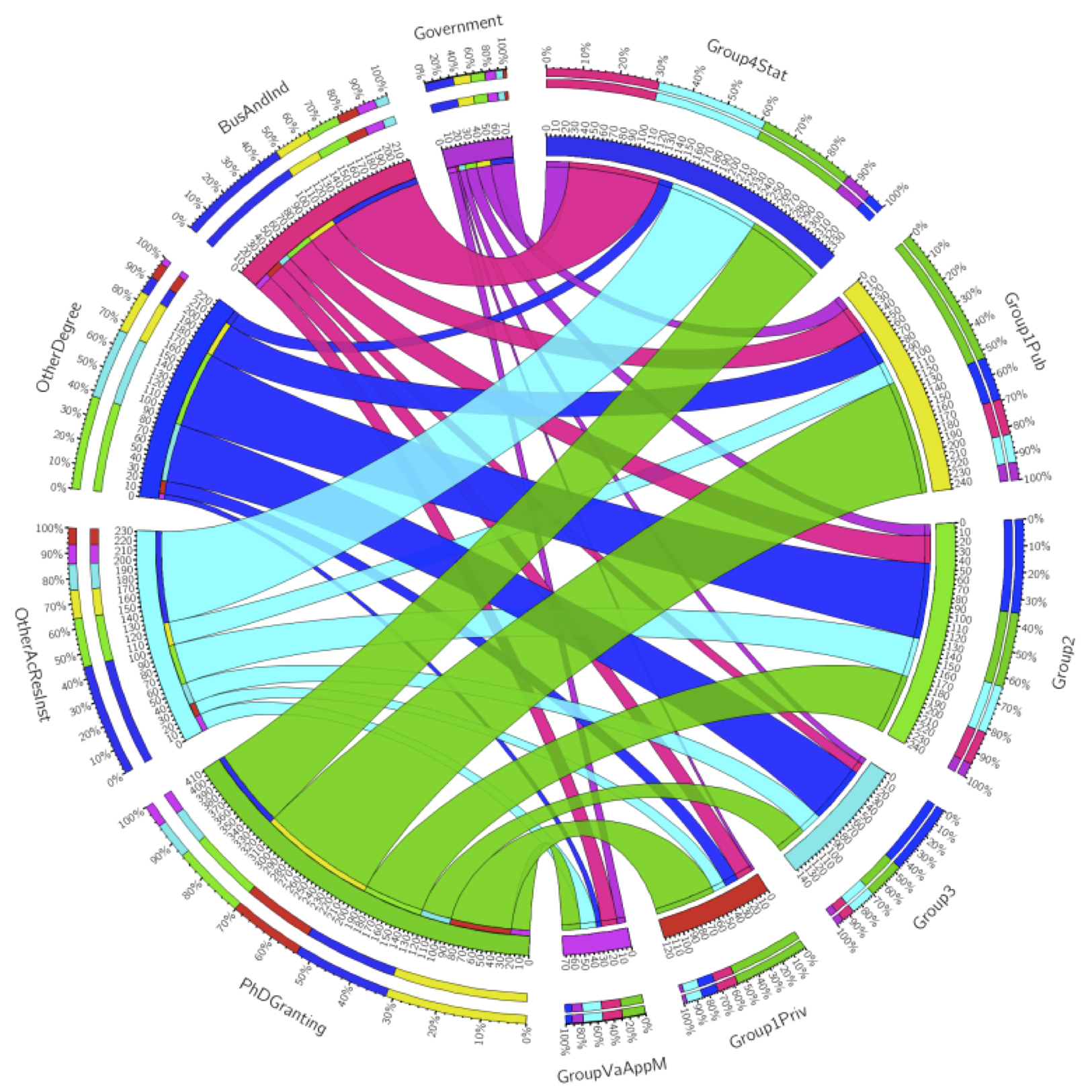
The other question – the question current mathematicians secretly care more about, in a gossipy and potentially catty way – is what fields lead to what fate. We all know algebra and number theory are the purest and most virtuous subjects, and applied math is for people who want to make money or want to make a difference in the world.
[On that note, you might notice that I removed statistics PhDs in the visualization below, and I also removed some of the employment sectors that gained only a few people a year. The stats ribbons are huge and the small sectors are very small, so for looks alone I took them out.]
 Higher resolution version available here.
Wish list
I wish I could animate a series of these to show this view over time as well. Let me know if you know how to do that! Another nice thing I could do would be to set up a webpage in which these visualizations could be explored in a bit more depth. (After finals.)
Also:
- I haven’t computed any numbers for you
- the graphs from R show employment in each field by percentage of graduates instead of total number per category;
- it’s hard to show both data over time and all the data one could explore. But it’s a start.
I should finish with a shout-out to Roger Peng and Jeff Leek, though we’ve never met: I took Peng’s Computing for Data Analysis and much of Leek’s Data Analysis on Coursera (though I’m one of those who didn’t finish the class). Their courses and Stack Overflow taught me almost everything I know about R. As I mentioned above, I’m pretty new to this type of analysis.
What questions would you ask? How can I make the above cooler? Did you learn anything?
Who’s tracking the trackers?
This is a guest post by Josh Snodgrass.
As the Mathbabe noted recently, a lot of companies are collecting a lot of information about you. Thanks to two Firefox add-ons – Collusion (hat tip to Cathy) and NoScript — you can watch the process and even interfere with it to a degree.
Collusion is a beautiful app that creates a network graph of the various companies that have information about your web activity. Here is an example.

On this graph, I can see that nytimes.com has sent info on me to 2mdn.net, linkstorm.net, serving-sys.com, nyt.com and doubleclick.net. Who are these guys? All I know is that they know more about me than I know about them.
Doubleclick is particularly well-informed. They have gotten information on me from nytimes.com, yahoo.com and ft.com. You may not be able to see it on the picture but there are faint links between the nodes. Some (few) of the nodes are sites I have visited. Most of the nodes, especially some of the central ones are data collectors such as doubleclick and googleanalytics. They have gotten info from sites I’ve visited.
This graph is pretty sparse because I cleared all of my cookies recently. If I let it go for a week and the graph will be so crowded it won’t all fit on a screen.
Pretty much everyone is sharing info about me (and presumably you, too). And, I do mean everyone. Mathbabe is a dot near the top. Collusion tells me that mathbabe.org has shared info with google.com, wordpress.com, wp.com, 52shadesofgreed.com, youtube.com and quantserve.com. Google has passed the info on to googleusercontent.com and gstatic.com
I can understand why. WordPress and presumably wp.com are hosting her blog. Google is providing search capabilities. 52shadesofgreed has an ad posted (You can still buy the decks but even better, come to Alt-Banking meetings and get one free). Youtube is providing some content. It is all innocent enough in a way but it means my surfing is being tracked even on non-commercial sites.
These are the conveniences of modern life. Try blocking all cookies and you will find it pretty inconvenient to use the internet. It would be nice to be selective about cookies but that seems very hard. All of this is happening even though I’ve told my browser not to allow third-party cookies. If you look at cookie policies, it seems you have two alternatives:
- Block all cookies and the site won’t work very well
- Allow cookies and we will send your info to whomever we choose (within the law, of course).
So, it would be nice if there were a law that constrained what they do. My impression is that we Americans have virtually no protection. Europe is better from what I understand.
I’ve found another add-on called NoScript that is very helpful but also very disturbing. It tells you about JavaScripts that want to run when you visit a site.
I’m trying to access a site and there are scripts waiting to run from:
- Brightcove.com
- Quantserve.com
- Facebook.com
- Po.st Scorecard.com
- Wxug.com
- Admeld.com
- Googleadservices.com
- Legolas-media.com
- Criteo.com
- Crwdcntrl.com
Clearly a lot of those are about tracking me or showing me ads. As with cookies, if you block all the scripts, the site probably won’t function properly. But the great thing about NoScript is that is makes it easy to allow scripts one by one. So, you can allow the ones that look more legitimate until the site works well enough. Also, you can allow them temporarily.
NoScript and Collusion are great. But mostly they are making me more aware of all the tracking that is going on. And they are also making it clear how hard it is to keep your privacy.
This isn’t just on the internet. Years ago, an economist had an idea about having people put boxes on their cars that would track where they went and charge them for driving, particularly in high congestion times and places. The motivation was to reduce travel that causes a lot of pollution while no one is going anywhere. But people ridiculed the idea. Who would let themselves be tracked everywhere they went.
Well, 40 years later, nearly everyone who has a car has an EZ-pass. And, even if you don’t, they will take a picture of your license plate and keep it on file. All in the name of improving traffic flow.
And, if you use credit cards, there are some big companies that have records of your spending.
What to do about this?
I don’t know.
I like conveniences. Keeping your privacy is hard. DuckDuckGo is a search engine that doesn’t track you (another hat tip to Cathy). But their search results are not as good as Google’s.
Google has all these nice tools that are free. Even if you don’t use them, the web sites you visit surely do. And if they do, google is getting information from them, about you.
This experience has made me even more of a fan of Firefox and add-ons available in it. But what else should I use. And, none of these tools is going to be perfect.
What information gets tracked? A lot of privacy policies say they don’t give out identifying information. But how can we tell?
Just keeping on top of what is going on is hard. For example: what are LSOs? They seem to be a kind of “supercookies”. And Better Privacy seems to be an add-on to help with them.
FT.com’s cookie policy tells me that:
“Our emails may contain a single, campaign-unique “web beacon pixel” to tell us whether our emails are opened and verify any clicks through to links or advertisements within the email”
Who knew that a pixel could do so much?
The truth is, I want to see these sites. So I am enabling scripts (some of them, as few as I can). The question is how to make the tradeoff. Figuring that out is time consuming. I’ve got better things to do with my life.
I’m going to go read a book.
Is That a Math Poem in Your Pocket?
This is a guest post by Becky Jaffe.
Today is National Poem in your Pocket Day, a good day to wear extra pockets.

April also just so happens to be National Poetry Month and Mathematics Awareness Month. Good gods, such abundance! In celebration of the marriage of the left and right hemispheres of the brain, I bring you a selection of poems dedicated to the fine art of mathematics – everything from the mystical to the sassy. Enjoy!
——
from Treatise on Infinite Series by Jacob Bernoulli
Even as the finite encloses an infinite series
And in the unlimited limits appear,
So the soul of immensity dwells in minutia
And in narrowest limits no limits inhere.
What joy to discern the minute in infinity!
The vast to perceive in the small, what divinity!
——
Biblical PI
A Biblical version of pi
Is recorded by some unknown guy
In “Kings,” * where he mentions
A basin’s dimensions —
Not exact, but a pretty good try.
* I Kings 7:23
——
Sir Isaac Newton by Paul Ritger
While studying pressures and suctions,
Sir Isaac performed some deductions,
“Fill a mug to the brim, it
Will then reach a limit,
So easily determined by fluxions.”
——
A New Solution to an Old Problem by Eleanor Ninestein
The Topologist’s child was quite hyper
‘Til she wore a Moebius diaper.
The mess on the inside
Was thus on the outside
And it was easy for someone to wipe her.
——
Threes by John Atherton
I think that I shall never c
A # lovelier than 3;
For 3 < 6 or 4,
And than 1 it’s slightly more.
All things in nature come in 3s,
Like … , trio’s, Q.E.D.s;
While $s gain more dignity
if augmented 3 x 3 —
A 3 whose slender curves are pressed
By banks, for compound interest;
Oh, would that, paying loans or rent,
My rates were only 3%!
3² expands with rapture free,
And reaches toward infinity;
3 complements each x and y,
And intimately lives with pi.
A circle’s # of °
Are best ÷ up by 3s,
But wrapped in dim obscurity
Is the square root of 3.
Atoms are split by men like me,
But only God is 1 in 3.
——
Valentine
You disintegrate my differential,
You dislocate my focus.
My pulse goes up like an exponential
whenever you cross my locus.
Without you, sets are null and void —
so won’t you be my cardioid?
——
An Integral Limerick by Betsy Devine and Joel E. Cohen
Here’s a limerick —
Which, of course, translates to:
Integral z-squared dz
from 1 to the cube root of 3
times the cosine
of three pi over 9
equals log of the cube root of ‘e’.
——
PROF OF PROFS By Geoffrey Brock
I was a math major—fond of all things rational.
It was the first day of my first poetry class.
The prof, with the air of a priest at Latin mass,
told us that we could “make great poetry personal,”
could own it, since poetry we memorize sings
inside us always. By way of illustration
he began reciting Shelley with real passion,
but stopped at “Ozymandias, King of Kings;
Look on my Works, ye Mighty, and despair!”—
because, with that last plosive, his top denture
popped from his mouth and bounced off an empty chair.
He blinked, then offered, as postscript to his lecture,
a promise so splendid it made me give up math:
“More thingth like that will happen in thith clath.”
——
The last poem in today’s guest post is by a mathematician who proved the Kissing Circles Theorem, which states that if four circles are all tangent to each other, then they must intersect at six distinct points. Frederick Soddy wrote up his proof in the form of a poem, published in 1936 in Nature magazine.

The Kiss Precise By Frederick Soddy
For pairs of lips to kiss maybe
Involves no trigonometry.
This not so when four circles kiss
Each one the other three.
To bring this off the four must be
As three in one or one in three.
If one in three, beyond a doubt
Each gets three kisses from without.
If three in one, then is that one
Thrice kissed internally.
Four circles to the kissing come.
The smaller are the benter.
The bend is just the inverse of
The distance form the center.
Though their intrigue left Euclid dumb
There’s now no need for rule of thumb.
Since zero bend’s a dead straight line
And concave bends have minus sign,
The sum of the squares of all four bends
Is half the square of their sum.
To spy out spherical affairs
An oscular surveyor
Might find the task laborious,
The sphere is much the gayer,
And now besides the pair of pairs
A fifth sphere in the kissing shares.
Yet, signs and zero as before,
For each to kiss the other four
The square of the sum of all five bends
Is thrice the sum of their squares.
in Nature, June 20, 1936
——
The publication of this proof was followed six months later with an additional verse by Thorold Gosset, who generalized the case.
The Kiss Precise (generalized) by Thorold Gosset
And let us not confine our cares
To simple circles, planes and spheres,
But rise to hyper flats and bends
Where kissing multiple appears,
In n-ic space the kissing pairs
Are hyperspheres, and Truth declares,
As n + 2 such osculate
Each with an n + 1 fold mate
The square of the sum of all the bends
Is n times the sum of their squares.
in Nature, January 9, 1937.
——
This was further amended by Fred Lunnon, who added a final verse:
The Kiss Precise (Further Generalized) by Fred Lunnon
How frightfully pedestrian
My predecessors were
To pose in space Euclidean
Each fraternising sphere!
Let Gauss’ k squared be positive
When space becomes elliptic,
And conversely turn negative
For spaces hyperbolic:
Squared sum of bends is sum times n
Of twice k squared plus squares of bends.
——
These three raised the bar for presentation of mathematical proof and dialogue, throwing down the gauntlet to modern mathematicians to versify their findings. Who, dear readers, is up for the challenge?
Happy Poem in Your Pocket Day!
Tax haven in comedy: the Caymans (#OWS)
This is a guest post by Justin Wedes. A graduate of the University of Michigan with degrees in Physics and Linguistics with High Honors, Justin has taught formerly truant and low-income youth in subjects ranging from science to media literacy and social justice activism. A founding member of the New York City General Assembly (NYCGA), the group that brought you Occupy Wall Street, Justin continues his education activism with the Grassroots Education Movement, Class Size Matters, and now serves as the Co-Principal of the Paul Robeson Freedom School.
Yesterday was tax day, when millions of Americans fulfilled that annual patriotic ritual that funds roads, schools, libraries, hospitals, and all those pesky social services that regular people rely upon each day to make our country liveable.
Millions of Americans, yes, but not ALL Americans.
Some choose to help fund roads, schools, libraries, hospitals in other places instead. Like the Cayman Islands.
Don’t get me wrong – I love Caymanians. Beautifully hospitable people they are, and they enjoy arguably the most progressive taxes in the world: zero income tax and only the rich pay when they come to work – read “cook the books” – on their island for a few days a year. School is free, health care guaranteed to all who work. It’s a beautiful place to live, wholly subsidized by the 99% in developed countries like yours and mine.
When they stash their money abroad and don’t pay taxes while doing business on our land, using our workforce and electrical grids and roads and getting our tax incentives to (not) create jobs, WE pay.
We small businesses.
We students.
We nurses.
We taxpayers.
I went down to the Caymans myself to figure out just how easy it is to open an offshore tax haven and start helping Caymanians – and myself – rather than Americans.
Here’s what happened:
Guest post by Julia Evans: How I got a data science job
This is a guest post by Julia Evans. Julia is a data scientist & programmer who lives in Montréal. She spends her free time these days playing with data and running events for women who program or want to — she just started a Montréal chapter of pyladies to teach programming, and co-organize a monthly meetup called Montréal All-Girl Hack Night for women who are developers.
I asked mathbabe a question a few weeks ago saying that I’d recently started a data science job without having too much experience with statistics, and she asked me to write something about how I got the job. Needless to say I’m pretty honoured to be a guest blogger here 🙂 Hopefully this will help someone!
Last March I decided that I wanted a job playing with data, since I’d been playing with datasets in my spare time for a while and I really liked it. I had a BSc in pure math, a MSc in theoretical computer science and about 6 months of work experience as a programmer developing websites. I’d taken one machine learning class and zero statistics classes.
In October, I left my web development job with some savings and no immediate plans to find a new job. I was thinking about doing freelance web development. Two weeks later, someone posted a job posting to my department mailing list looking for a “Junior Data Scientist”. I wrote back and said basically “I have a really strong math background and am a pretty good programmer”. This email included, embarrassingly, the sentence “I am amazing at math”. They said they’d like to interview me.
The interview was a lunch meeting. I found out that the company (Via Science) was opening a new office in my city, and was looking for people to be the first employees at the new office. They work with clients to make predictions based on their data.
My interviewer (now my manager) asked me about my role at my previous job (a little bit of everything — programming, system administration, etc.), my math background (lots of pure math, but no stats), and my experience with machine learning (one class, and drawing some graphs for fun). I was asked how I’d approach a digit recognition problem and I said “well, I’d see what people do to solve problems like that, and I’d try that”.
I also talked about some data visualizations I’d worked on for fun. They were looking for someone who could take on new datasets and be independent and proactive about creating model, figuring out what is the most useful thing to model, and getting more information from clients.
I got a call back about a week after the lunch interview saying that they’d like to hire me. We talked a bit more about the work culture, starting dates, and salary, and then I accepted the offer.
So far I’ve been working here for about four months. I work with a machine learning system developed inside the company (there’s a paper about it here). I’ve spent most of my time working on code to interface with this system and make it easier for us to get results out of it quickly. I alternate between working on this system (using Java) and using Python (with the fabulous IPython Notebook) to quickly draw graphs and make models with scikit-learn to compare our results.
I like that I have real-world data (sometimes, lots of it!) where there’s not always a clear question or direction to go in. I get to spend time figuring out the relevant features of the data or what kinds of things we should be trying to model. I’m beginning to understand what people say about data-wrangling taking up most of their time. I’m learning some statistics, and we have a weekly Friday seminar series where we take turns talking about something we’ve learned in the last few weeks or introducing a piece of math that we want to use.
Overall I’m really happy to have a job where I get data and have to figure out what direction to take it in, and I’m learning a lot.
Guest post: Divest from climate change
This is a guest post by Akhil Mathew, a junior studying mathematics at Harvard. He is also a blogger at Climbing Mount Bourbaki.
Climate change is one of those issues that I heard about as a kid, and I assumed naturally that scientists, political leaders, and the rest of the world would work together to solve it. Then I grew up and realized that never happened.
Carbon dioxide emissions are continuing to rise and extreme weather is becoming normal. Meanwhile, nobody in politics seems to want to act, even when major scientific organizations — and now the World Bank — have warned us in the strongest possible terms that the current path towards 
A little frustrated, I decided to show up last fall at my school’s umbrella environmental group to hear about the various programs. Intrigued by a curious-sounding divestment campaign, I went to the first meeting. I had zero knowledge of or experience with the climate movement, and did not realize what it was going to become.
Divestment from fossil fuel companies is a simple and brilliant idea, popularized by Bill McKibben’s article “Global Warming’s Terrifying New Math.” As McKibben observes, there are numerous reasons to divest, both ethical and economic. The fossil fuel reserves of these companies — a determinant of their market value — are five(!) times what scientists estimate can be burned to stay within 2 degree warming.
Investing in fossil fuels is therefore a way of betting on climate change. It’s especially absurd for universities to invest in them, when much of the research on climate change took place there. The other side of divestment is symbolic. It’s not likely that Congress will be able to pass a cap-and-trade or carbon tax system anytime soon, especially when fossil fuel companies are among the biggest contributors to political campaigns.
A series of university divestments would draw attention to the problem. It would send a message to the world: that fossil fuel companies should be shunned, for basing their business model on climate change and then for lying about its dangers. This reason echoes the apartheid divestment campaigns of the 1980s. With support from McKibben’s organization 350.org, divestment took off last fall to become a real student movement, and today, over 300 American universities have active divestment campaigns from their students. Four universities — Unity College, Hampshire College, Sterling College, and College of the Atlantic — have already divested. Divestment is spreading both to Canadian universities and to other non-profit organizations. We’ve been covered in the New York Times, endorsed by Al Gore, and, on the other hand, recently featured in a couple of rants by Fox News.
Divest Harvard
At Harvard, we began our fall semester with a small group of us quietly collecting student petition signatures, mostly by waiting outside the dining halls, but occasionally by going door-to-door among dorms. It wasn’t really clear how many people supported us: we received a mix of enthusiasm, indifference, and occasional amusement from other students.
But after enough time, we made it to 1,000 petition signatures. That was enough to allow us to get a referendum on the student government ballot. The ballot is primarily used to elect student government leaders, but it was our campaign that rediscovered the use of referenda as a tool of student activism. (Following us, two other worthy campaigns — one on responsible investment more generally and one about sexual assault — also created their own referenda.)
After a week of postering and reaching out to student groups, our proposition—that Harvard should divest—won with 72% of the undergraduate student vote. That was a real turning point for us. On the one hand, having people vote on a referendum isn’t the same as engaging in the one-on-one conversations that we did when convincing people to sign our petition. On the other hand, the 72% showed that we had a real majority in support.
The statistic was quickly picked up by the media, since we were the first school to win a referendum on divestment (UNC has since had a winning referendum with 77% support). That was when the campaign took off. People began to take us seriously.
The Harvard administration, which had previously said that they had no intention of considering divestment, promised a serious, forty-five minute meeting with us. We didn’t get what we had aimed for — a private meeting with President Drew Faust — but we had acquired legitimacy from the administration. We were hopeful that we might be able to negotiate a compromise, and ended our campaign last fall satisfied, plotting the trajectory of our campaign at our final meeting.

The spring semester started with a flurry of additional activity and new challenges. On the one hand, we had to plan for the meeting with the administration—more precisely, the Corporation Committee on Social Responsibility. (The CCSR is the subgroup of the Harvard Corporation that decides on issues such as divestment.)
But we also knew that the fight couldn’t be won solely within the system. We had to work on building support on campus, from students and faculty, with rallies and speakers; we also had to reach out to alumni and let them know about our campaign. Fortunately, the publicity generated last semester had brought in a larger group of committed students, and we were able to split our organization into working groups to handle the greater responsibilities.
In Februrary, we got our promised meeting with three members the administration. With three representatives from our group meeting with the CCSR, we had a rally with about 40 people outside to show support:
In the meeting, the administration representatives reiterated their concern about climate change, but questioned divestment as a tool.
Unfortunately, since the meeting, they have continued to reiterate their “presumption against divestment” (a phrase they have used with previous movements). This is the debate we—and students across the nation—are going to have to win.
Divestment alone isn’t going to slow the melting of the Arctic, but it’s a powerful tool to draw attention to climate change and force action from our political system—as it did against apartheid in the 1980s.
And there isn’t much time left. One of the most inspirational things I’ve heard this semester was at the Forward on Climate rally in Washington, D.C. last month, which most of our group attended. Addressing a crowd of 40,000 people, Bill McKibben said “All I ever wanted to see was a movement of people to stop climate change, and now I’ve seen it.”
To me, that’s one of the exciting and hopeful aspects about divestment—that it’s a movement of the people. It’s fundamentally an issue of social justice that we’re facing, and our group’s challenge is to convince Harvard to take it seriously enough to stand up against the fossil fuel industry.
In the meantime, our campaign has been trying to build support from student groups, alumni, and faculty. In a surprise turnaround, one of our members convinced alumnus Al Gore to declare his support for the divestment movement at a recent event on campus. We organized a teach-in the Tuesday before last featuring writer and sociologist Juliet Schor.
On April 11, we will be holding a large rally outside Massachusetts Hall to close out the year and to show support for divestment; we’ll be presenting our petition signatures to the administration. Here’s our most recent picture, taken for the National Day of Action, with some supportive friends from the chess club:

Thanks to Joseph Lanzillo for proofreading a draft of this post.
Nerd Nite: A Drunken Venue for Ideas
MathBabe recently wrote an article critical of the elitist nature of Ted Talks, which you can read here. Fortunately for her, and for the hoi polloi everywhere clamoring for populist science edutainment, there is an alternative: Nerd Nite. Once a month, in cities all over the globe, nerds herd into a local bar and turn it into a low-brow forum for innovative science ideas. Think Ted Talks on tequila.
Each month, three speakers present talks for 20-30 minutes, followed by questions and answers from the invariably sold-out audience. The monthly forum gives professional and amateur scientists an opportunity to explain their fairly abstruse specialties accessibly to a lay audience – a valuable skill. Since the emphasis is on science entertainment, it also gives the speakers a chance to present their ideas in a more engaging way: in iambic pentameter, in drag with a tuba, in three-part harmony, or via interpretive dance – an invaluable skill. The resulting atmosphere is informal, delightfully debauched, and refreshingly pro-science.
Slaking our thirst for both science education and mojitos, Nerd Nite started small but quickly went viral. Nerd Nites are now being held in 50 cities, from San Francisco to Kansas City and Auckland to Liberia. You can find the full listing of cities here; if you don’t see one near you, start one!
Last Wednesday night I was twitterpated to be one of three guest nerds sharing the stage at San Francisco’s Nerd Nite. I put the chic back into geek with a biology talk entitled “Genital Plugs, Projectile Penises, and Gay Butterflies: A Naturalist Explains the Birds and the Bees.”

A video recording of the presentation will be available online soon, but in the meantime, here’s a tantalizing clip from the talk, in which Isabella Rossellini explains the mating habits of the bee. Warning: this is scientifically sexy.
I shared the stage with Chris Anderson, who gave a fascinating talk on how the DIY community is building drones out of legos and open-source software. These DIY drones fly below government regulation and can be used for non-military applications, something we hear far too little of in the daily war digest that passes for news. The other speaker was Mark Rosin of the UK-based Guerrilla Science project. This clever organization reaches out to audiences at non-science venues, such as music concerts, and conducts entertaining presentations that teach core science ideas. As part of his presentation Mark used 250 inflated balloons and a bass amp to demonstrate the physics concept of resonance.
If your curiosity has been piqued and you’d like to check out an upcoming Nerd Nite, consider attending the upcoming Nerdtacular, the first Nerd Nite Global Festival, to be held this August 16-18th in Brooklyn, New York.
The global Nerdtacular: Now that’s an idea worth spreading.
Hackprinceton
He-Yo
This Friday, I’ll be participating at HackPrinceton.
My team will be training an EEG to recognize yes and no thoughts for particular electromechanical devices and creating general human brain interface (HBI) architecture.
We’ll be working on allowing you to turn on your phone and navigate various menus with your mind!
There’s lots of cool swag and prizes – the best being jobs at Google and Microsoft. Everyone on the team has experience in the field,* but of course the more the merrier and you’re welcome no matter what you bring (or don’t bring!) to the table.
If you’re interested, email leon.kautsky@gmail.com ASAP!
*So far we’ve got a math Ph.D., a mech engineer, some CS/Operations Research guys and while my field is finance I picked up some neuro/machine learning along the way. If you have nothing to do for the next three days and want to learn something specifically for this competition, I recommend checking out my personal favorites: neurofocus.com, frontiernerds.com or neurogadget.com.
Intermezzo II
One of the saddest moments in my life is when they closed the Penn Station Borders book store to replace it with a store dedicated to the “new teen band” One Direction.
Aunt Orthoptera: Advice from an Arthropod
Greetings from Aunt Orthoptera!

(Photo by Becky Jaffe)
This week I am guest blogging for Aunt Pythia, answering all of your queries from the perspective of a variety of insect species, naturally.
——
Dear Aunt Orthoptera,
My friend just started an advice column. She says she only wants “real” questions. But the membrane between truth and falsity is, as we all know, much more porous and permeable than this reductive boolean schema. What should I do?
Sincerely,
Mergatroid
P.S. I have a friend who always shows up to dinner parties empty-handed. What should I do?
Dear Mergatroid,
As I grant your point entirely, I will address only your postscript. What should you do with a friend who shows up to dinner parties empty-handed? Fill her hands with food. As an ant, I have two stomachs: a “social stomach,” and a private stomach. When I pass one of my sisters on our path, we touch each other’s antennae and communicate our needs via pheromones. If she is hungry, we kiss, a process unimaginatively called “trophallaxis” by your scientists. I feed her from my social stomach, and I trust she will do the same for me later – or if not her, exactly, another sister in whom the twin hungers for self-interest and interdependence coexist.
Anatomy as metaphor,
Aunt Orthoptera aka Ms. Myrmecology

(Photo by Becky Jaffe)
——
Dear Aunt Orthoptera,
I am struggling with emotional loneliness. Do you think it is possible to be happy – or even just productive – in life without a stable romantic relationship? If so, how? I have a couple close friends I can talk with, but they are in their own relationships and they are often too busy to have time to talk. I am in my early thirties and never had a girlfriend despite trying for nearly a decade. I have tried speed-dating, been on eharmony, match, ok cupid, asked friends to set me up, asked out a classmate in grad school, joined meetup groups. I am a nice guy but I have my flaws (nothing horrible) – I am kind of introverted, somewhat boring, and am consumed with my career (I’m untenured). It is so hard to meet people that I am compatible with – especially since I am a shy guy (perhaps it’s not surprising I am a math professor – I LOVE my job, by the way). I found ok cupid to be useful for identifying possibly compatible women but most women don’t respond to my messages. I was lucky to manage to get to go on first (and last) dates with two women I messaged on ok cupid last year, and was interested in going on more dates with both, but both of them declined, even though they both told me I seemed like a good person – “you seem like one of the nicest guys I met” is a direct quote, but that they didn’t feel there was any “chemistry”. This month I have been heartbroken over one of them. All this has been affecting my productivity.
Sincerely,
Singleton
Dear Singleton,
In my anthropological studies of humans, I have observed that you are yearning creatures. Your inexorable primateness destines you to a life of longing for social contact. As a solitary insect, I both pity and admire this craving for connection with your kind. My advice to you is to have compassion for your fundamental humanness. Your yearning for pair bonding is normal; it’s in your nature to want to entangle yourself with another. As creatures born of DNA, pair bonding operates at both the molecular level (e.g. Cytosine pair-bonds with Guanine) and the organismal level (woman to man, man to man, woman to woman).


(Photo: Double Helix by Becky Jaffe)
I suspect there’s another lonely strand of DNA out there for you, worth waiting for.

(Photo by Becky Jaffe)
I hope you find your mate!
Flirting with Sociobiology,
Aunt Orthoptera
——
Dear Aunt Orthoptera,
Do you have any self-soothing advice for when self-doubt, lack of confidence, and depression begin to take over?
Sincerely,
Feeling Very Small
Dear FVS,
As a tiny butterfly, I can assure you that it is ok to feel small. Here is my advice to you when you feel this way: Don’t just stop and smell the flowers, nuzzle in them.

(Photo by Becky Jaffe)
Let your worries float away for a little while and drift toward the sweetest thing you can find. When viewed through a compound lens, the whole world can look like nectar.
Spring springs eternal,
Aunt Orthoptera aka Lady Lepidoptera
——
Dear Aunt Orthoptera,
How will you enquire into that which you do not know?
Meno
Excellent question, Musing Meno.
The answer is: with great patience, dear Grasshopper.

(Photo by Becky Jaffe)
Next week, the inimitable Aunt Pythia will return with human advice for you. You can use the form below to submit questions.
Wishing you harmony in your hive and honey to thrive,
Aunt Orthoptera
Guest Post SuperReview: Intermezzo
I highly recommend That Mitchell and Webb Look.


