Guest Post: In Praise of Globes
This is a guest post by Ernie Davis Professor of Computer Science at NYU. Ernie has a BS in Math from MIT (1977) and a PhD in Computer Science from Yale (1984). He does research in artificial intelligence, knowledge representation, and automated commonsense reasoning. He and his father, Philip Davis, are editors of Mathematics, Substance and Surmise: Views on the Ontology and Meaning of Mathematics, published by Springer.
Any government which genuinely cared about education would see to it that a globe map, at present an expensive rarity, was accessible to every school child.
— George Orwell, “As I Please” February 11, 1944
The decision by the Boston school system to replace maps of the world using the Mercator projection with maps using the Gall-Peters projection has garnered a lot of favorable press from outlets such as NPR, The Guardian, Newsweek, and many others.

Mercator map of the world.

Gall-Peters map of the world.
The pros and cons of these two maps have been debated extensively for many years; there was even an episode of West Wing that dealt with the subject. I would give the current collection of news articles a B for clarity and accuracy. If you read the Guardian article carefully from beginning to end, you can get a clear idea of the issues. But if you only skim the beginning, then phrases like “more accurate map”, and “amend[ing] 500 of distortion” are likely to leave you with the impressions, first, that the Gall-Peters map is indisputably more accurate, and, second, that the Mercator map was devised as an expression of Eurocentrism, neither of which is correct.
I hope that that is not what the students in Boston are being taught about the two maps. Still more, I hope that they are not being taught that these two maps are two competing theories about the geography of the world and that choosing between them is all a matter of your point of view and your political preferences, and that there is no actual truth of the matter. I wish I felt more confident of that.
The well-known truth is this: The Gall-Peters map accurately displays relative area, whereas the Mercator map grossly distorts relative area. However, the Mercator map accurately displays shapes and direction, whereas the Gall-Peters maps substantially distorts those. Each has their strengths and weaknesses.
As an illustration, consider Suriname and Iceland. Both are roughly squarish countries. Suriname’s area is 161,470 square km; it has an east-west span of about 460 km and an almost equal north-south span. Iceland is smaller; it has an area of 102,775 square km; its east-west span is about 390 km and its north-south span is about 300 km (these spans were hand-measured from a map and are not precise).
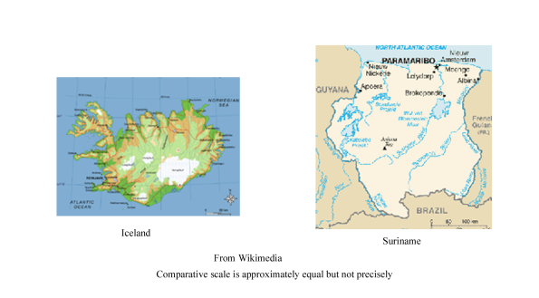
If you take the Gall-Peters map of the world and cut out the maps of Suriname and Iceland, then the relative areas will be correct; Suriname will be about 1.6 times as large as Iceland. However, both will have bad distortion in the aspect ratio in opposite direction; the north-south span Suriname will appear substantially larger than its east-west span; and the north-south span of Iceland will appear very much smaller than its east-west span. Both of these are terrible maps of their individual countries. If you are used to looking at maps of Iceland and then look at Iceland on the Gall-Peters map, it will look seriously wrong, for good reason.
On the other hand, if you take a Mercator map of the world and cut out the maps of Suriname and Iceland, then each one by itself is exactly the right shape; each is a fine map of its individual country. However, Iceland will be 3 times the area of Suriname instead of 2/3 the area.

The explanation of both of these distortions is simple. At the equator, the 460 km east-west span of Suriname corresponds to 4 degrees of longitude. At 64 degrees latitude, the 390 km east-west span of Iceland corresponds to 9 degrees of longitude. However, on both the Gall-Peters map and the Mercator map draw parallels of longitude as vertical lines, so Iceland ends up measuring 2-1/2 times as wide as Suriname on both maps; and, generally, an east-west mile in Iceland is displayed about 2-1/2 times as long as one in Suriname. The two maps adjust the north-south scale in opposite ways, depending on their different purposes. The Gall-Peters map, to preserve the area relation, must make a north-south mile in Suriname 2-1/2 times as long as one in Iceland; it does this, partly by stretching Suriname north-south and partly by shrinking Iceland north-south. The Mercator map, to preserve shape, must keep the ratio of the north-south mile to east-west mile always equal to 1; therefore, a north-south mile in Iceland is also 2-1/2 times as long as a north-south mile in Suriname.
There are other kinds of area-preserving maps besides Gall-Peters, and there are other kinds of shape-preserving maps besides Mercator. And there are many other kinds of maps; this article by Max Galka surveys the Miller, Winkel-Triple, and the Authagraph, which gets his vote. (The Authagraph is quite accurate as regards the land masses; the distortion gets pushed off onto the oceans, so the relative positions of the continents is bizarre.) However, there is absolutely no planar map of the world that can succeed in being both shape preserving and area preserving. There is just no way to perfectly flatten out the surface of a sphere.
§
Most educational debates do not have any final, ideal answer. What should be taught in literature, in history, in science, even in math, are matters of eternal debate, with no possible final resolution that is uncontentious, or apolitical, or value-free. However, this question of the proper way to display the geography of the earth is an exception. The obvious, perfect solution is — drumroll — a globe. A globe is an (essentially) perfect scale model of the geography of the earth, with no distortion of any kind. A child or adult who gets used to consulting a globe on questions of large scale geography, can get an exactly right idea of relative sizes and shapes and relative positions. (They should also have a good atlas, for small-scale geography).
As quoted above, George Orwell said that in 1944 globes were an “expensive rarity”. Presumably in 1944, getting globes to schoolchildren was not the top priority of the British government. But now they are really not expensive. You can get an inexpensive 6-inch globe for $10. You can get a good 11-inch globe for $30. I do find it surprising that none of the articles I’ve seen about the choice of maps even mentions this, best, option.
Of course if you have a globe for reference then it becomes enormously easier to explain how the Mercator, Gall-Peters, and other flat maps work, and what they get right and wrong.
In addition to its huge value in teaching geography, there are all kinds of cool things you can do and teach with a globe, particularly if you take it out of its stand:
- Great circle. You can easily illustrate the great circle path from any point to any other point by stretching a string between them and pulling it tight. No possible planar map correctly represents large scale geodesics.
- Seasons. Apparently a surprisingly large fraction even of college educated people think that the earth is closer to the sun in summer and further in winter. A globe makes it easier to illustrate both that the days are longer and that the light is more direct in the summer than in the winter. You also easily explain the significance of the poles, the equators, and of the polar and tropical circles.
- Astronomy of the earth and the moon. With a second, smaller ball, you can illustrate the interaction of the earth and the moon, and explain things like eclipses. (In fact, you can make a scale model; if you have an 11 inch globe for the earth, then the moon is a 3 inch ball, about 23 feet away.)
- Other celestial astronomy. With some additional props, you can show how the appearance of the night sky changes with latitude and with the time of year. You can explain why latitude has always been easy to determine, whereas the determination of longitude on board ship was one of the major problems for eighteenth century science. You can explain the significance of the ecliptic and the zodiac and the precession of the equinoxes.
- Geometry. Purely from the standpoint of teaching geometry, a globe has the amazing property of being a sphere on which there are thousands of easily identifiable points with memorable names. So an enterprising high school math teacher with good students can use it as a source of examples for an introduction to spherical geometry and thus non-Euclidean geometry. You can also illustrate three-dimensional rotations and the fact that they don’t commute. The original meaning of “geometry”, after all, is “measuring the earth.”
At the minimum, hopefully, early and extensive exposure to globes will deter students from growing up to believe that the earth is flat.


Totally cool. Thank you. I am ordering a globe for my home today.
LikeLiked by 1 person
Great.
My personal favorite is the dymaxion globe projection that is a very accurate projection when flat (or in an isocohedron).
LikeLike
I’ll blame my platonic spelling error on lack of sleep, not ignorance. I meant icosahedron.
The Iceland / Surinam example makes the difference between the projections quite clear and convinces me that the best choice is neither Mercator nor Peters. It’s clear that trying to turn a sphere into a rectangle is a hopeless exercise — so why do it?
If they don’t want something as radical as the dymaxion (which does make directionality odd) what about Winkel-tripel projection? https://en.wikipedia.org/wiki/Winkel_tripel_projection which, National Geographic uses. Many alternatives that are not rectangular seem better than any that are.
I agree a globe is best.
LikeLike
When I was a child I was given a globe as a Christmas present. I was so excited that I threw up.
LikeLiked by 1 person
You left out the most important use of a globe. When the heroine is deciding to strike out to change her life, the globe is the only map she can spin and then stop with her finger. (Everything else needs a dart and is less random.)
LikeLiked by 1 person
For me, the worst options seem to be anything that demands representing the globe as a rectangle. Any pseudocylindrical option which reflects curvature in its outline seems better: e.g., Mollweide, Winkel, Goode, Eckert, Boggs, etc.
https://en.wikipedia.org/wiki/List_of_map_projections#pseudocylindrical
LikeLike
As an illustration of the last point, about teaching geometry, one more awesome thing about globes is that they help you solve my favorite math problem for kids, ever:
A ranger leaves her tent and walks ten miles due south. Wanting to explore a bit, she turns to the left and walks east. After ten miles, she finds herself in completely unfamiliar territory, where she sees a bear! She turns left again and runs (really fast!) to the north. After covering ten miles at a dead run, she finds she is back at her tent.
What color was the bear?
LikeLiked by 1 person
I totally agree. I have been looking at Mercator projections for almost 70 years that make Greenland look almost as large as Russia. A globe has to be in every classroom. One objection that I can hear being made is after x number of years, the names of some of the countries change, e.g. Crimea was in Ukraine until quite recently instead of Russia. A good teacher can turn that into a lesson.
LikeLike