Analyzing the complexity of the Stacks Project graphs
So yesterday I told you about the cool new visualizations now available on Johan’s Stack Project.
But how do we use these visualizations to infer something about either mathematics or, at the very least, the way we think about mathematics? Here’s one way we thought of with Pieter.
So, there’s a bunch of results, and each of them has its own subgraph of the entire graph which positions that result as the “base node” and shows all the other results which it logically depends on.
And each of those graphs has structure and attributes, the stupidest two of which are the just counts of the nodes and edges. So for each result, we have an ordered pair (#nodes, #edges). What can we infer about mathematics from these pairs?
Here’s a scatter plot of the nodes-vs-edges for each of the 10,445 results (email me if you want to play with this data yourself):
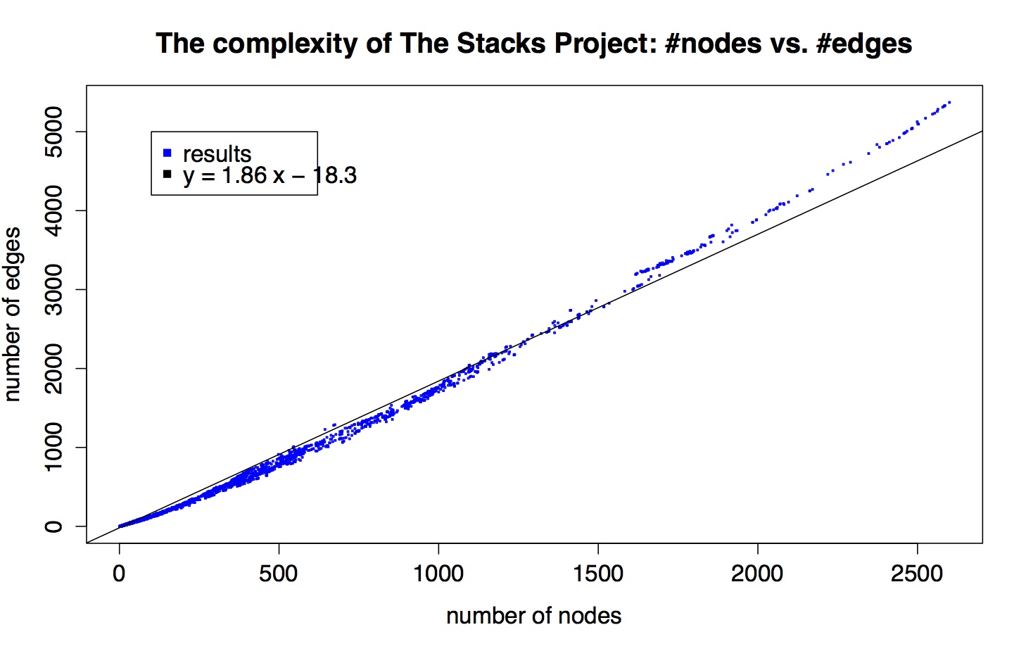
I also put a best-fit line in, just to illustrate that the scatter plot is super linear but not perfectly linear.
So there are a bunch of comments I can make about this, but I’ll limit myself to the following:
- There are a lot of points at (1,0), corresponding to remarks, axioms, beginning lemmas, definitions, and tags for sections.
- As a data person, let me just say that data is never this clean. There’s something going on, some internal structure to these graphs that we should try to understand.
- By “clean” I’m not exactly referring to the fact that things look pretty linear, although that’s weird and we should think about that. What I really mean is that things are so close to the curve that is being approximated. They’re all within a very tight border of this imaginary line. It’s super amazing.
- Let’s pretend it’s just plain straight. Does that make sense, that as graphs get more complex the edges don’t get more dense than some multiple (1.86) of of the number of nodes?
- Kind of: remember, we don’t depict all logical dependency edges, just the ones that are directly referred to in the proof of a result. So right off the bat you are less surprised that the edges aren’t growing quadratically in the number of nodes, even though the number of possible edges is of course quadratic in the number of nodes.
- Think about it this way: assume that every result that requires proof (so, that’s not a (1,0) result) refers to exactly 2 other results in its proof. Then those two child results each correspond to some subgraph of the entire graph, and say their subgraphs each have something like twice as many edges as nodes. Then, ignoring overlap, we’d see two graphs with a 2:1 ratio, then we’d see that parent node, plus two edges leading to each result, which is also a 2:1 ratio, and the disjoint union of all those graphs gives us a large graph with a 2:1 ratio.
- Then if you imagine now allowing the overlap, the ratio goes down a bit on average. In this toy model, the discrepancy between 2.0 and the slope we actually see, 1.86, is a measurement of the collapse of the two child graphs, which can be taken as a proxy for how much the two supporting results overlap as notions.
- Of course, not every result has exactly two children.
- Plus it doesn’t really explain how ridiculously consistent the plot above is. What would?
- If you think about it, the only real explanation of the consistency above is my husband brain.
- In other words, he’s humming along, thinking about stacks, and at some point, when he thinks things have gotten complicated enough, he says to himself “It’s time to wrap this stuff up and call it a result!” and then he does so. That moment, when he’s decided things are getting complicated enough, is very consistent internally to his brain.
- In other words, if someone else created the stacks project, I’d expect to see another kind of plot, possibly also very consistent, but possibly with a different slope.
- Also it’d be interesting to compare this plot to another kind of citation network graph, like the papers in the arXiv. Has anyone made that?


Also interesting to remark is the sudden shift in complexity around 1600 nodes. And the small gap right in front of it. I have no immediate explanation.
It might be interesting to cluster results: there are several “branches” in the Stacks project, each culminating in one “main result” (or several closely related ones). Maybe there is a pattern to see depending on the result. What would happen if you pick one really big result and then only consider the tags required to prove that one?
Now that the website is online I have some time to fiddle with this. By the way, in a few days I will explain how to use the API (jif one wishes to call it that way) that underlies the graphs. And I’ll explain how to generate data about the Stacks project yourself. There is probably a ton of interesting things to discover!
LikeLike
Have you ever looked into the various graphical syntaxes for expressing logical relations, for example, Peirce’s logical graphs or Sowa’s conceptual graphs?
cf. Logical Graphs
LikeLike
Fools rush in. I find this stuff fascinating aesthetically – perhaps in inverse proportion to my ignorance of advanced math. I was utterly engaged by the beauty of the dynamic heat map you showed us yesterday. As I looked at the linearity of today’s graph, I was struck by the same idea you outline in points 9 and 10, namely that it represents the thought processes of a single person. My point being that a rank amateur should never shy away from complexity and have at least some trust in intuitive perceptions. Of course, it was gratifying to have you confirm this. And it might even have been more instructive if I’d been way off base (of course I only scored 2 out of 13). Keep ’em coming.
LikeLike
Is there any sense here of weak-strong ties? macro-micro non-linear scaling? Are all parent-child ties (made to be) “equal” somehow?
LikeLike
One of the insights coming out of C.S. Peirce’s work on logic, which led to his systems of logical graphs, is that negative logical relations are more fundamental than positive logical relations, since the right set of negative relations can generate all possible logical relations, but no set of purely positive relations can do all that. That the gist of it, very roughly speaking, modulo the right definition of positive and negative relations, of course.
That is one of the themes we see in the generative power of the NAND and NNOR operators for propositional calculus, that Peirce discovered early on and dubbed the amphecks.
LikeLike
Hi Mathbabe. You can find some network plots from arXiv here: http://konect.uni-koblenz.de/networks/
Regards, Dan
LikeLike